
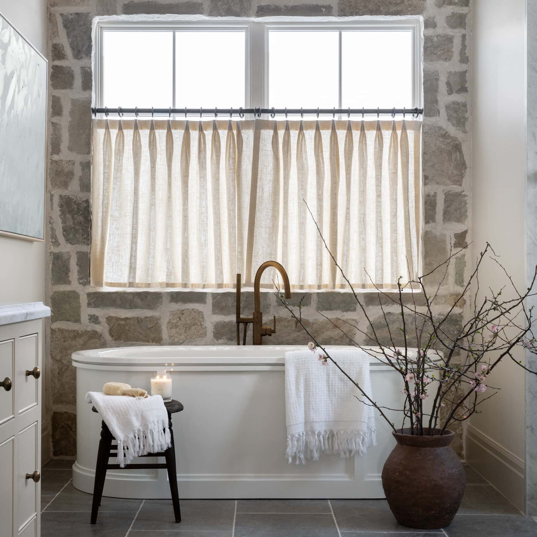


Historic Loft Netflix Remodel
Tips from Episode 5 of "Dream Home Makeover"
03 December 2020 -
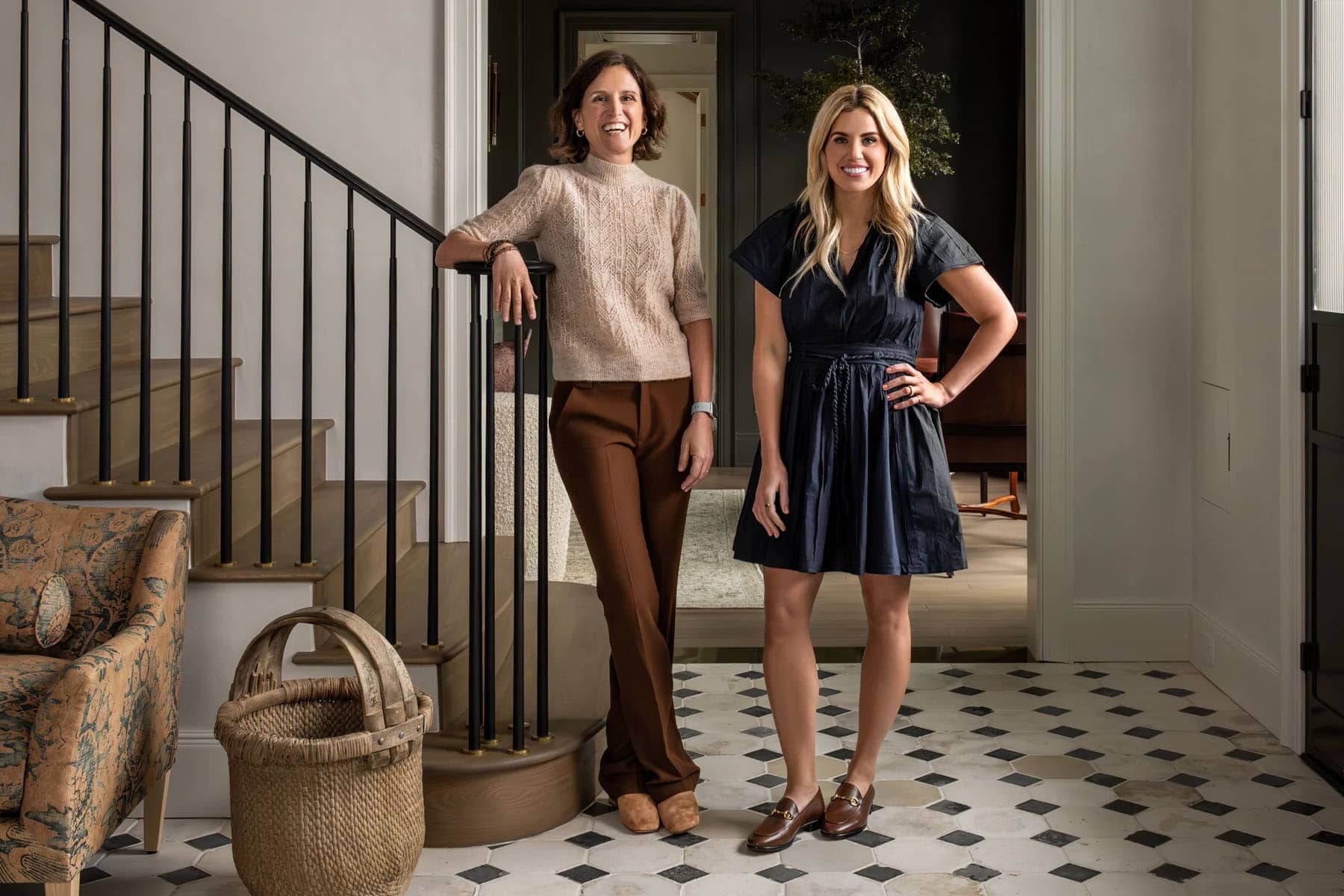
Today, we’re excited to share more details from a recent remodel project in our very own backyard.
This historic remodel is the oldest home we’ve ever worked on, and we were excited to take on the challenge.
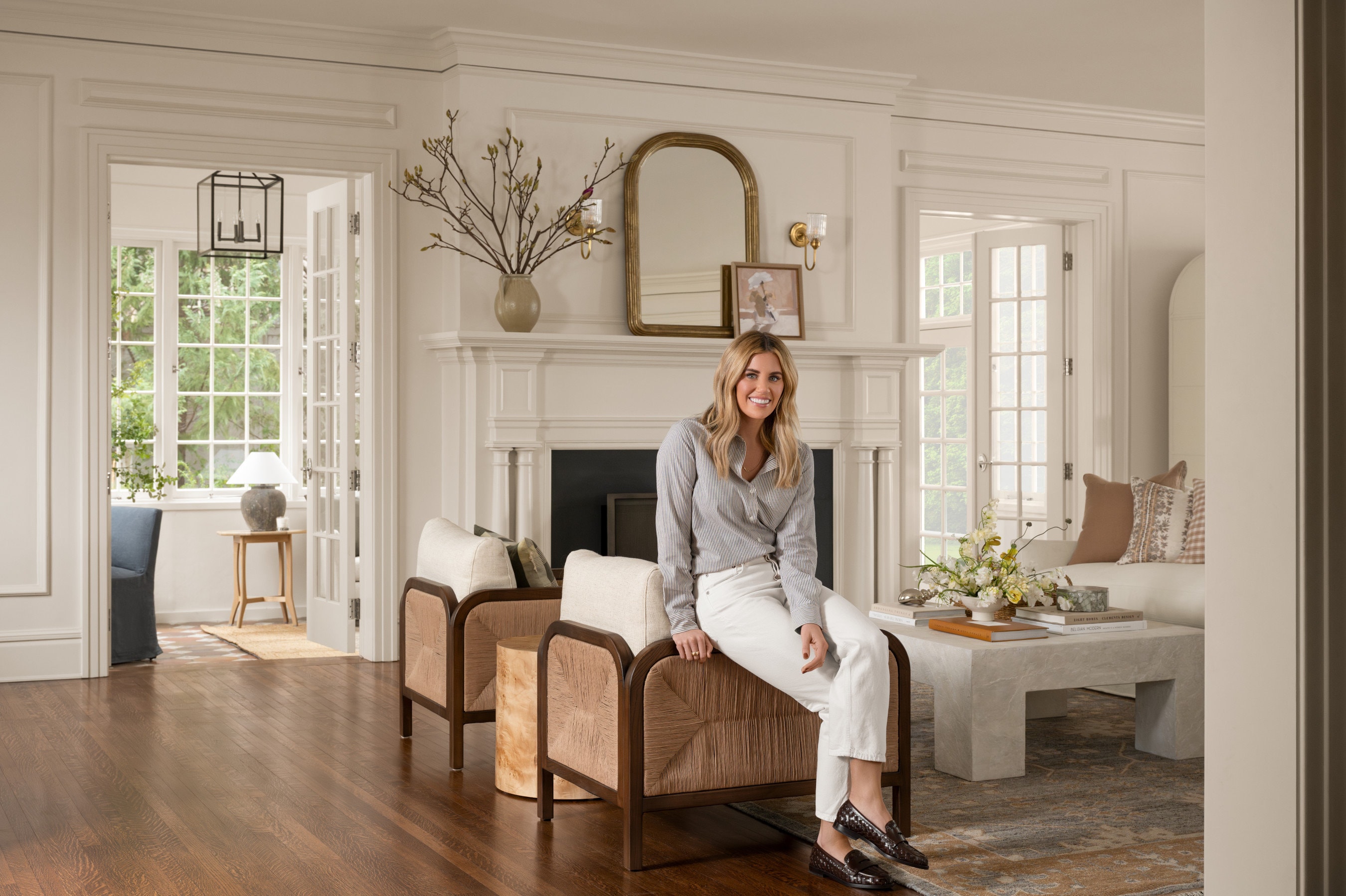
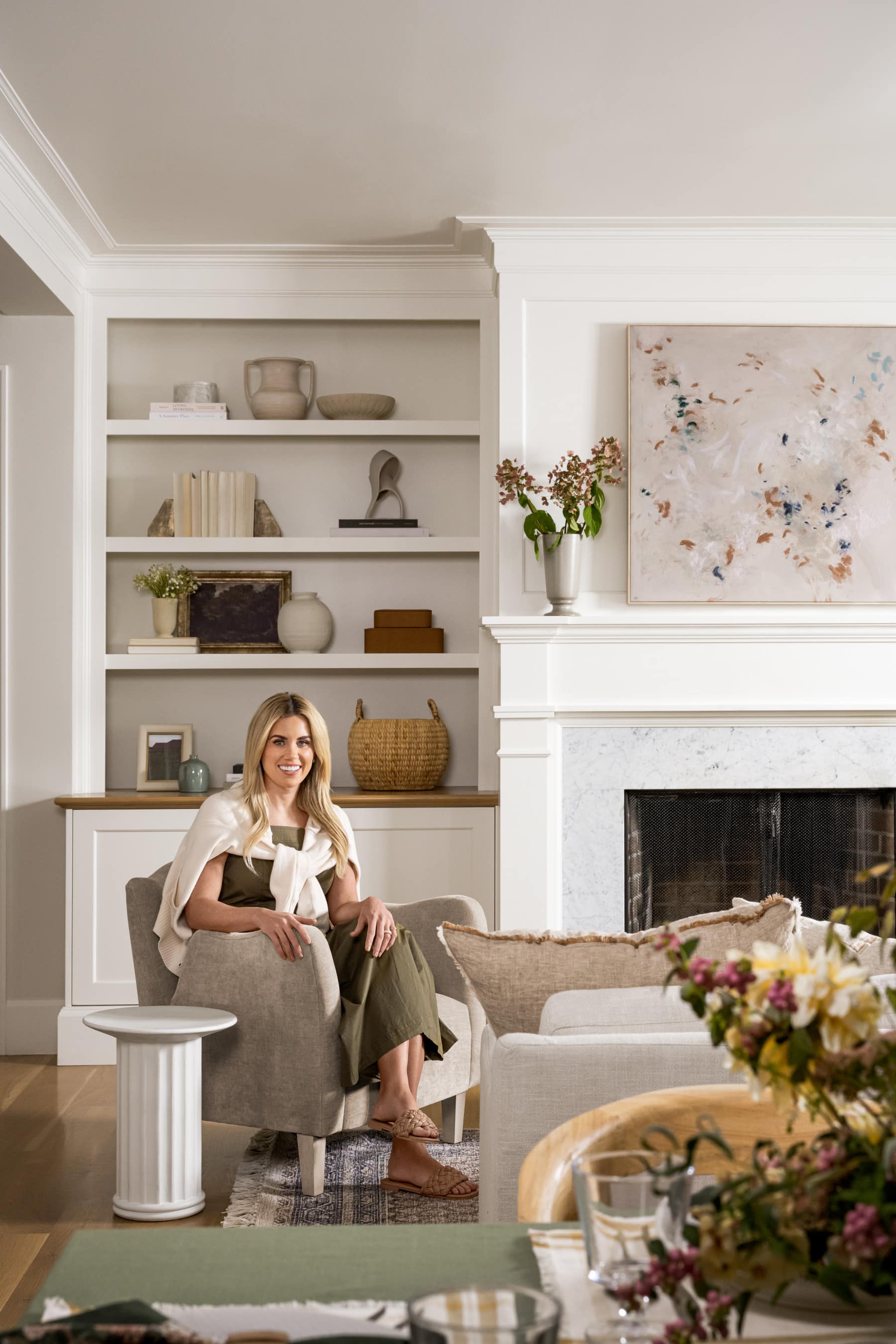
If you’ve watched our Netflix show “Dream Home Makeover,” you might recognize this space from Episode 5, “Historic Home Renovation.”
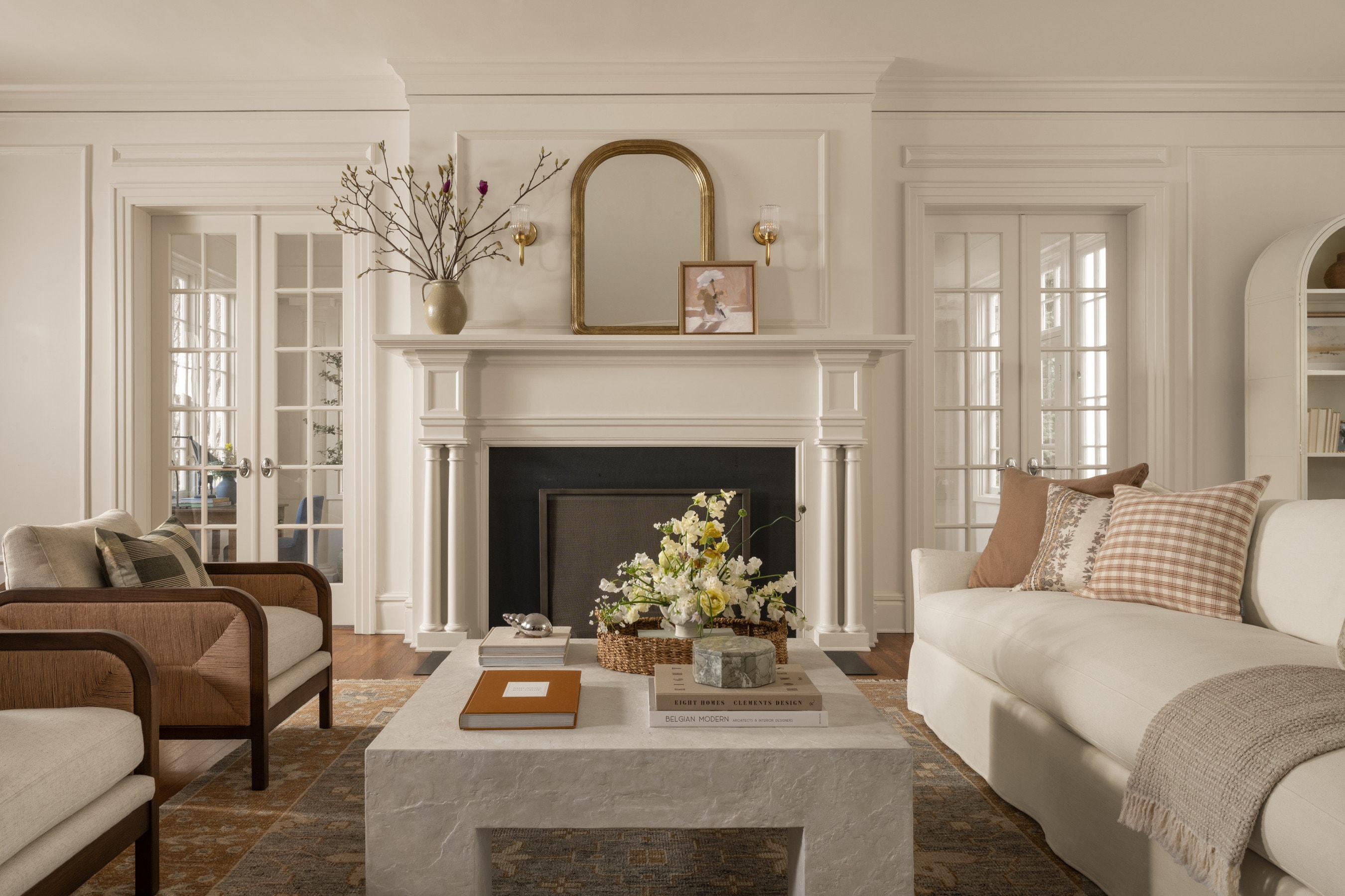
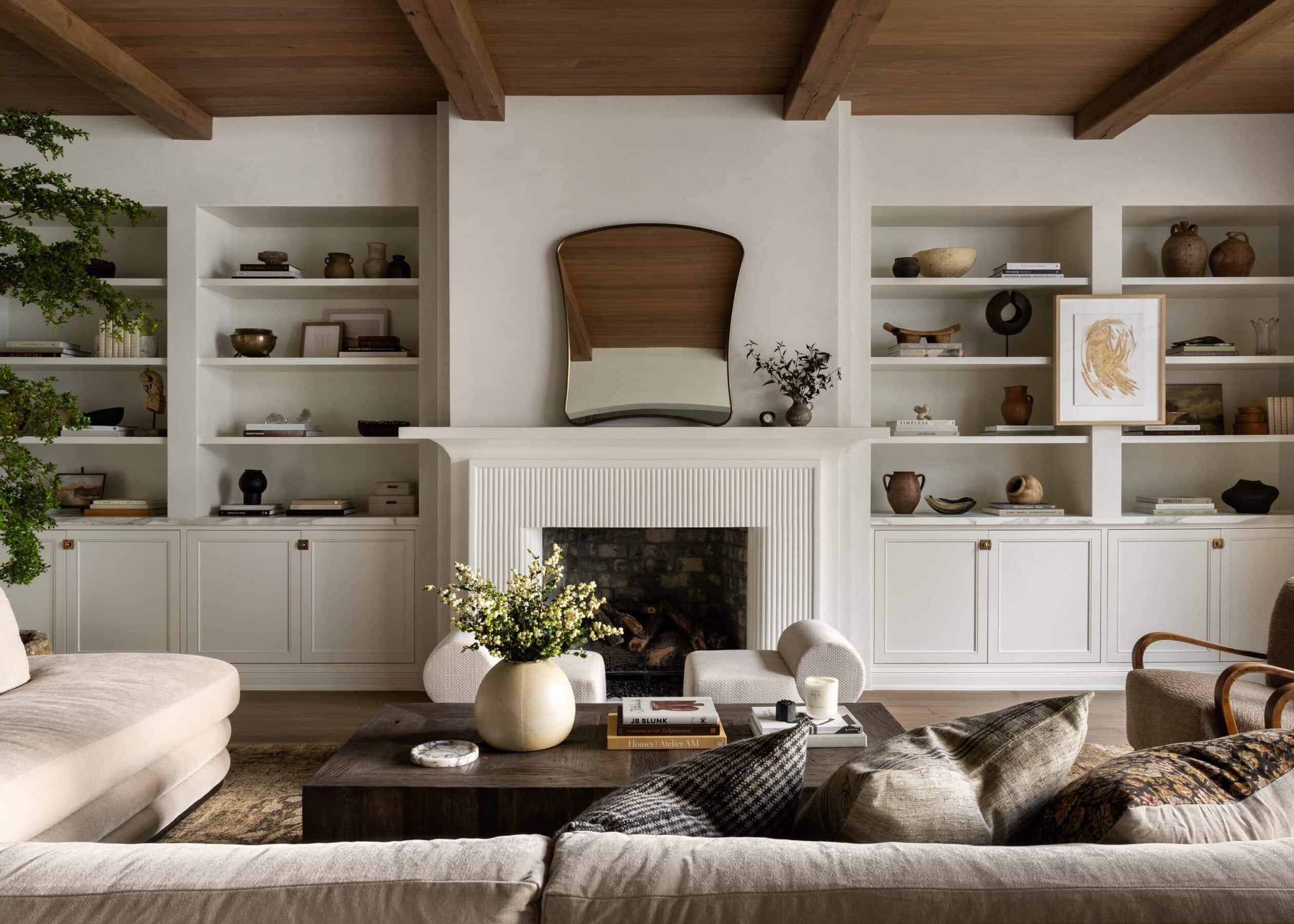
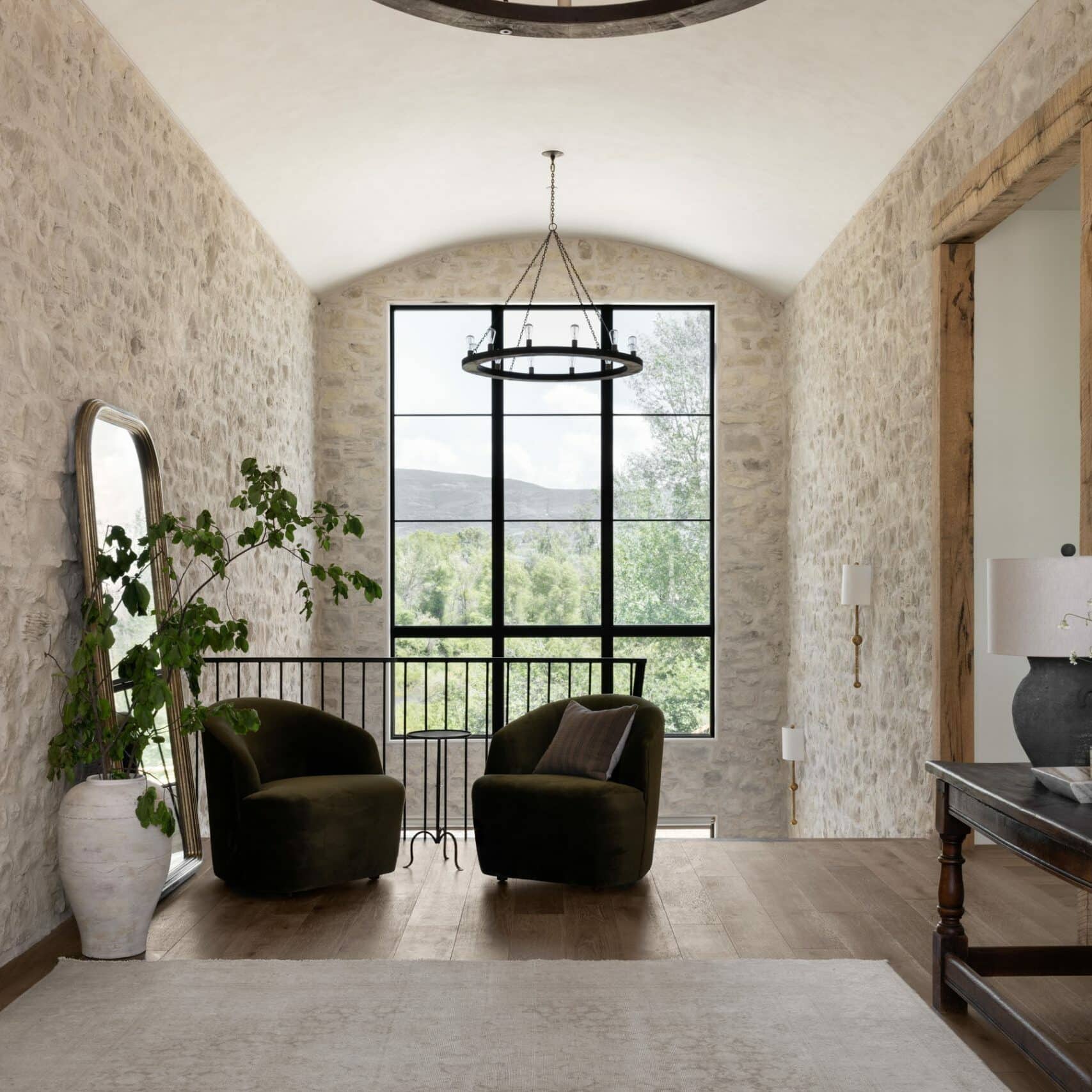
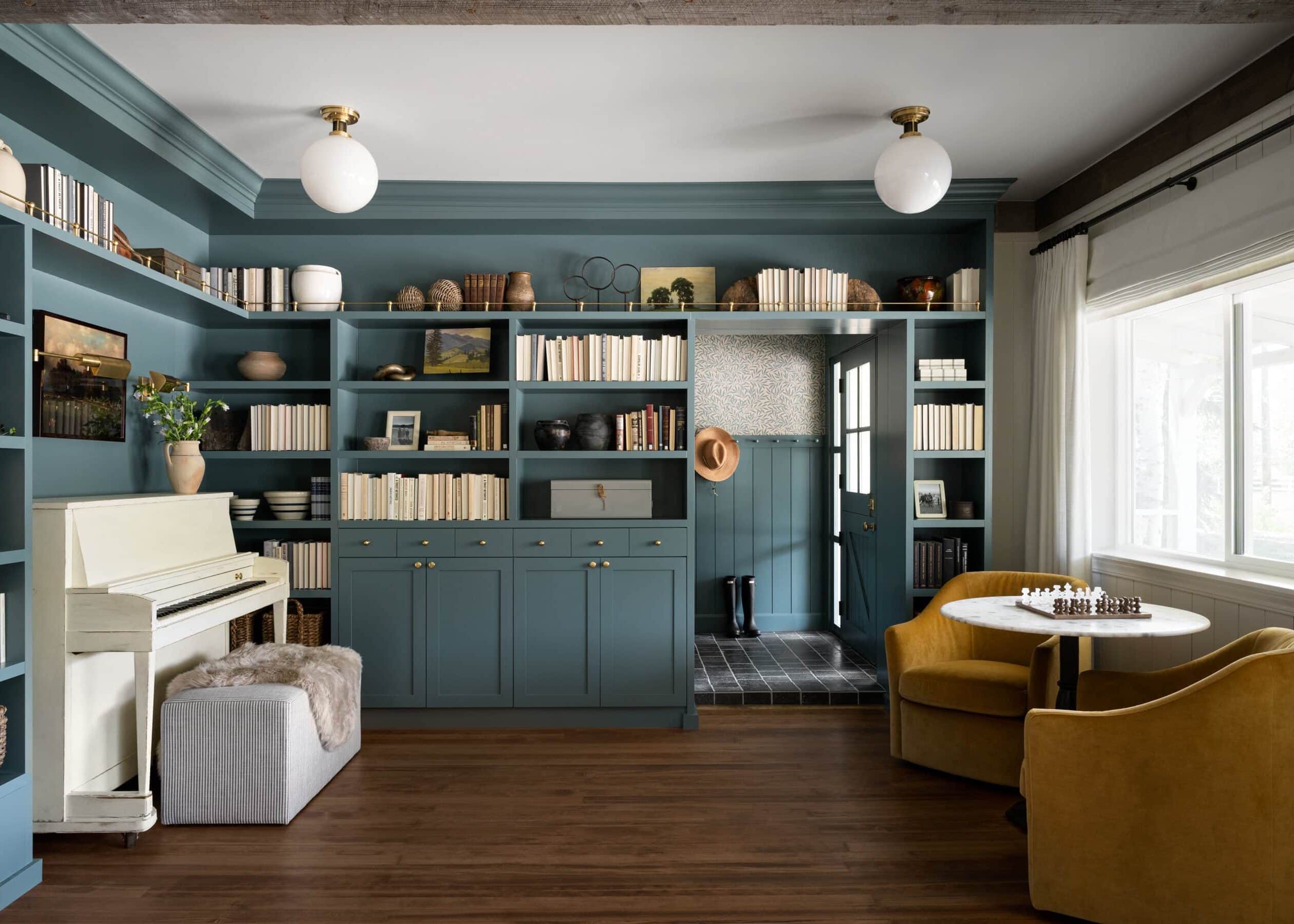
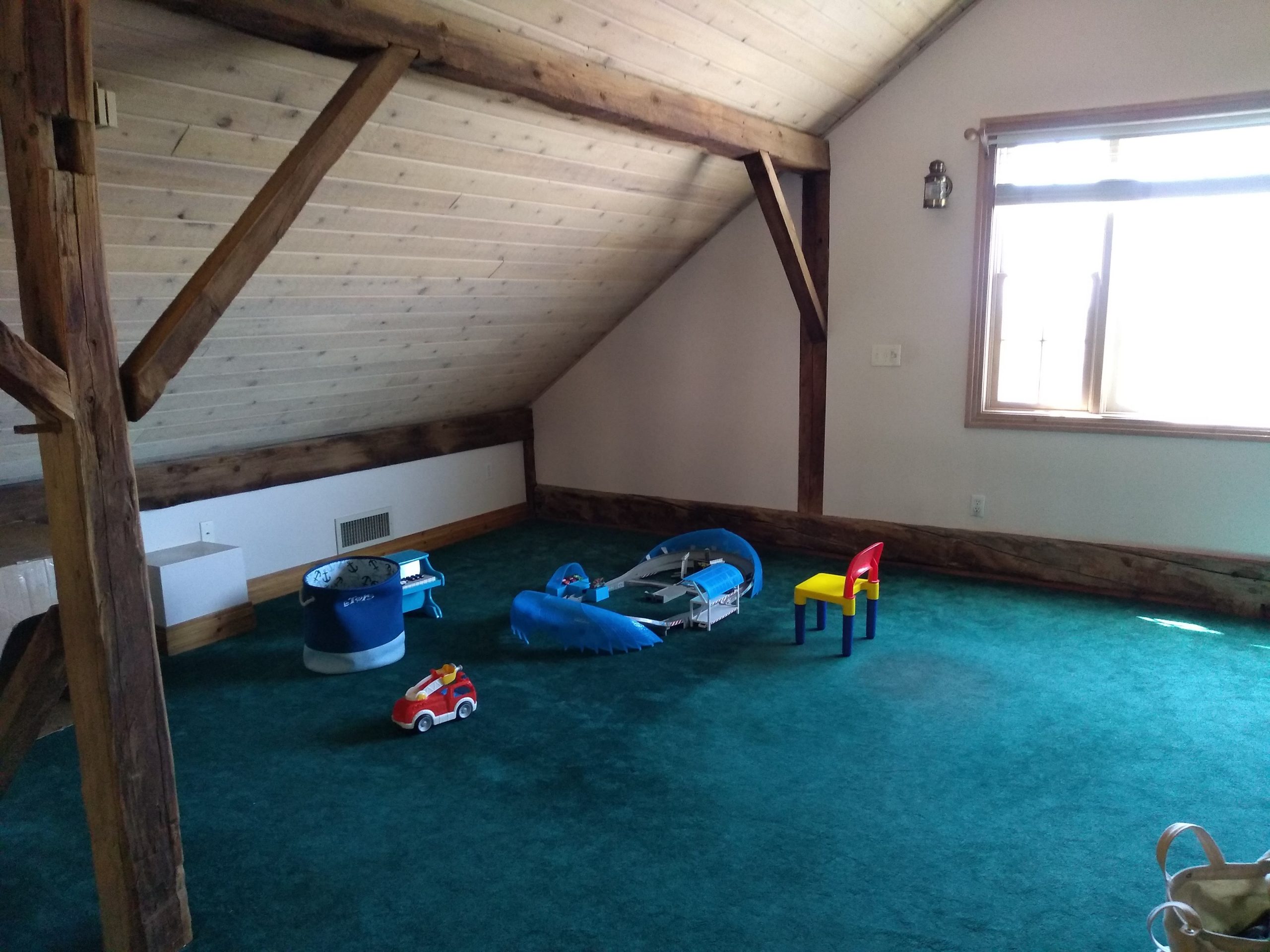
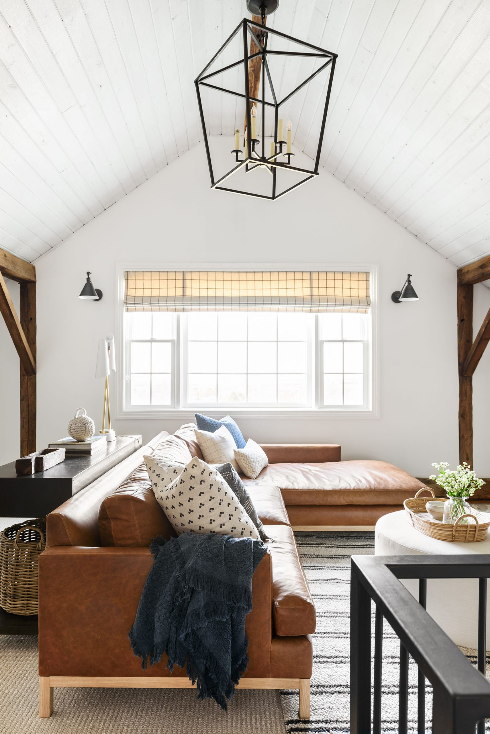
Originally built in 1851, this home is over 150 years old. Our clients had lived there a short five months when we first met with them, and although they loved the history and character of the home, they wanted to add a few updates to create a more personal, comfortable space for their family.
Before

After

Here are a few things we learned while working on this project:
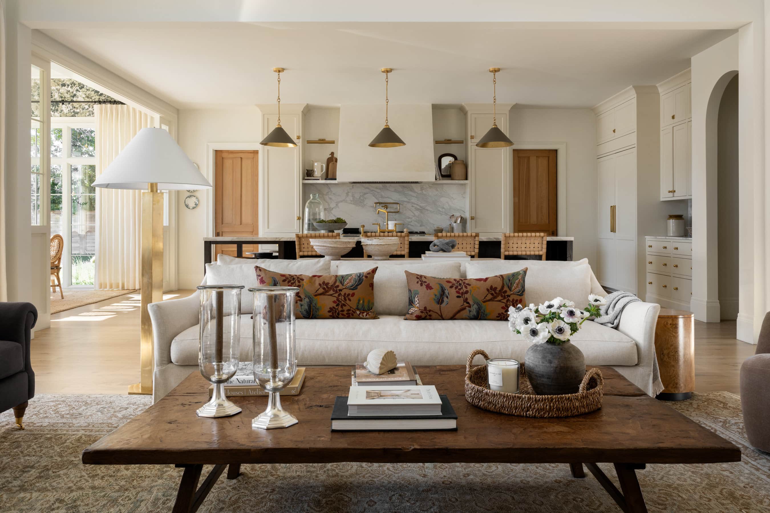
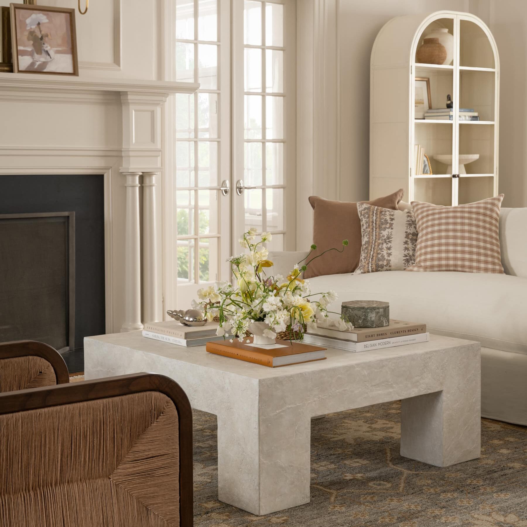
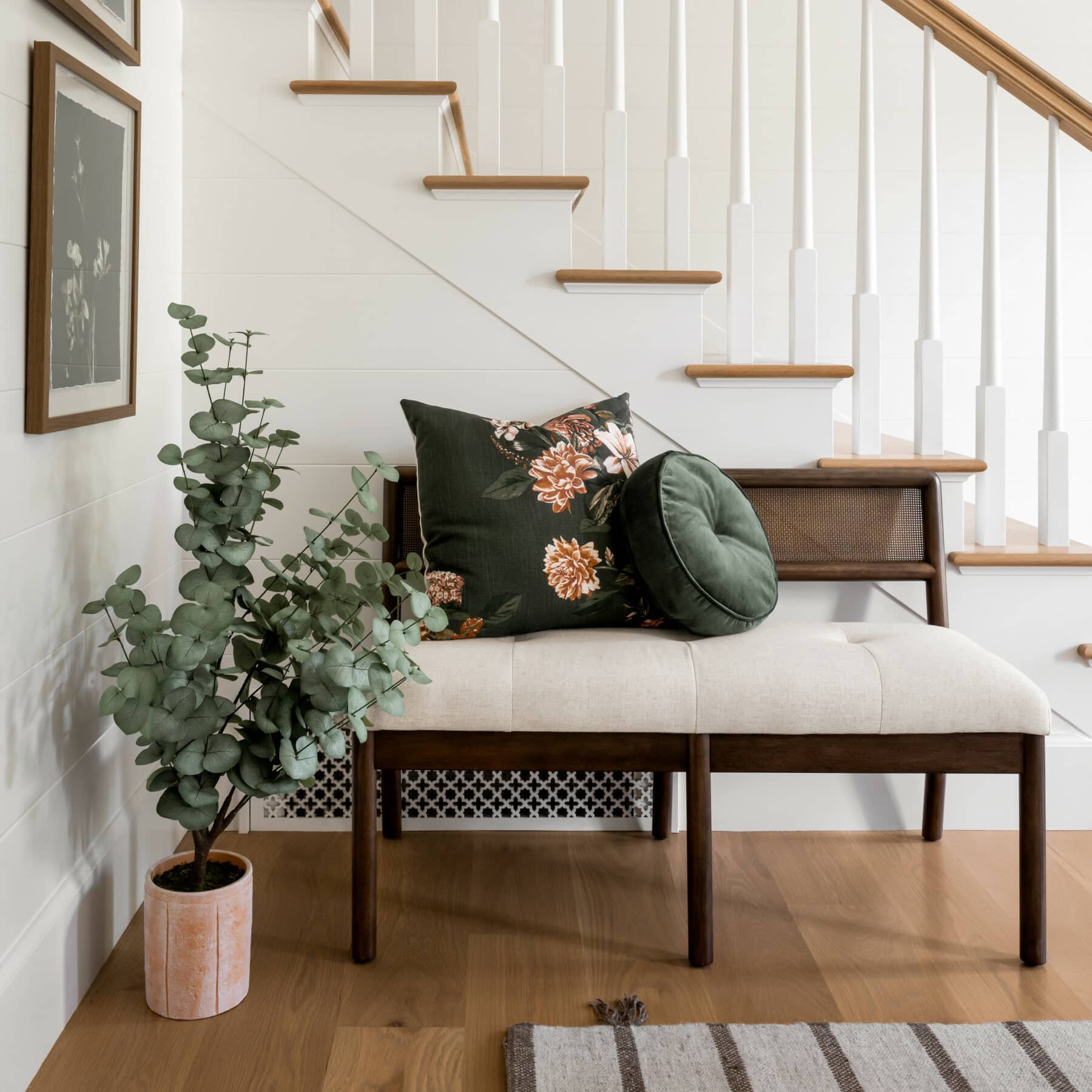
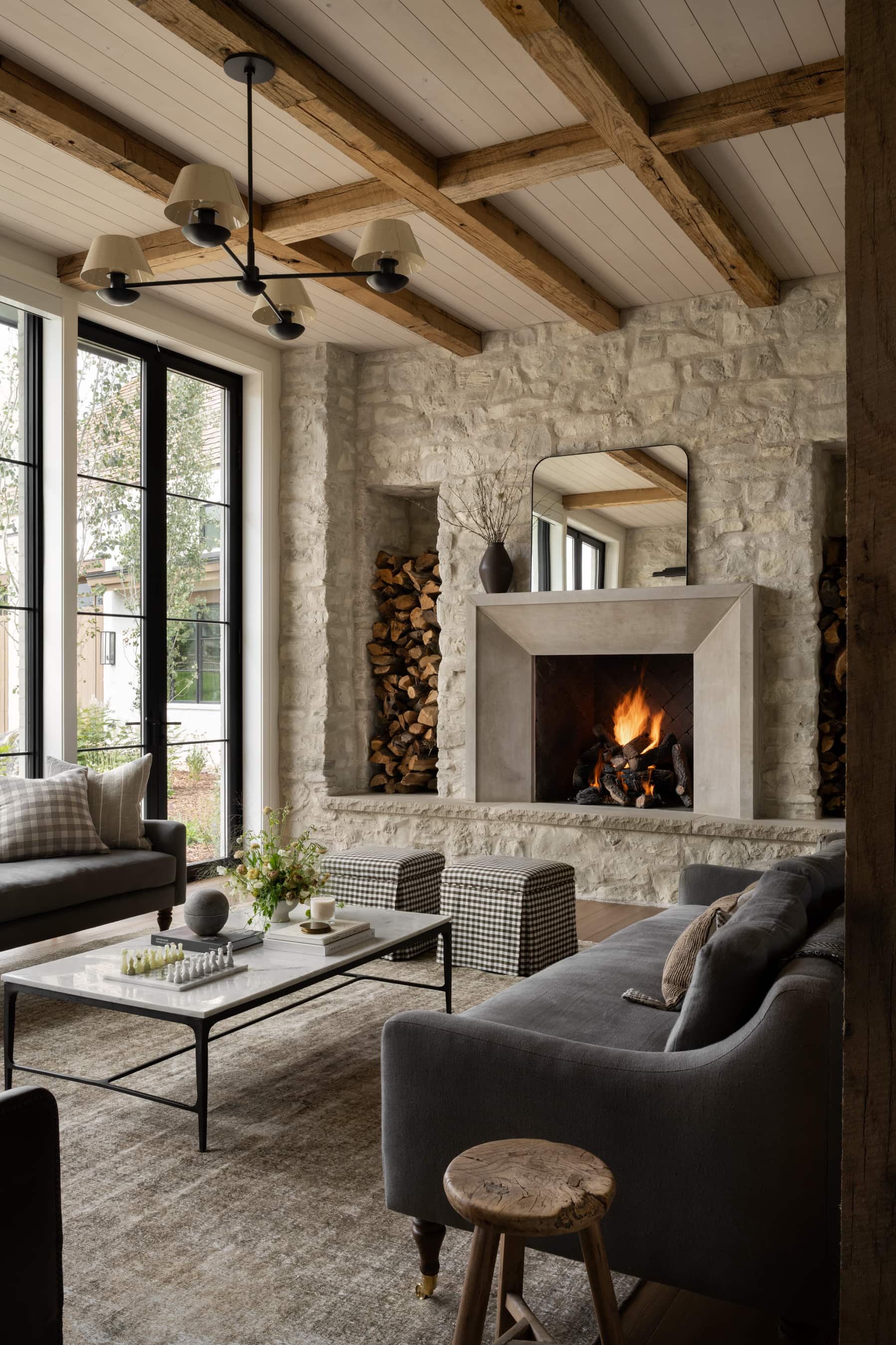
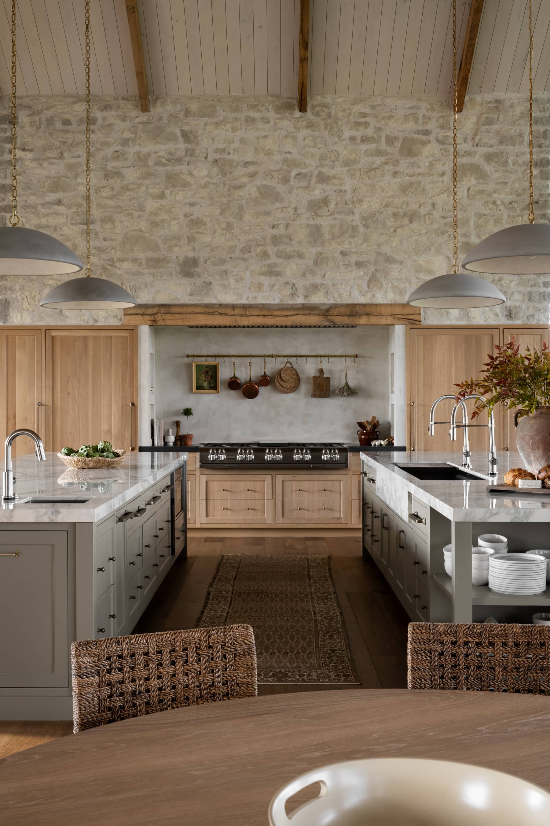
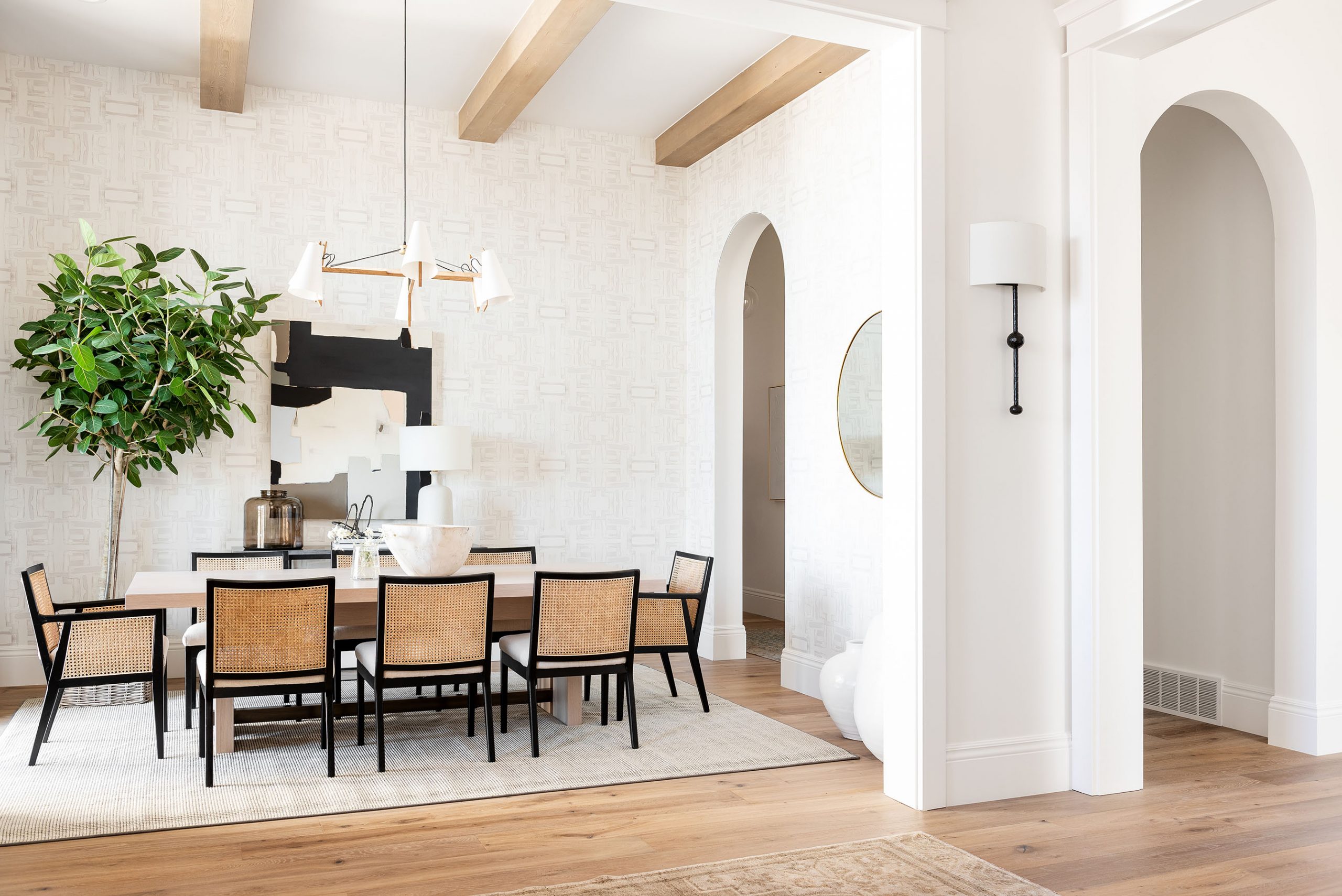
Lesson No. 1 – Balancing the old and new
When it comes to historical remodels, we’ve learned that less is more. Accentuating the elements you want to keep and minimizing the rest takes careful attention to detail.
Although it can be tempting to rip everything out, considering how your home’s original characteristics could look in a new light might keep you from making the mistake of getting rid of something irreplaceable.

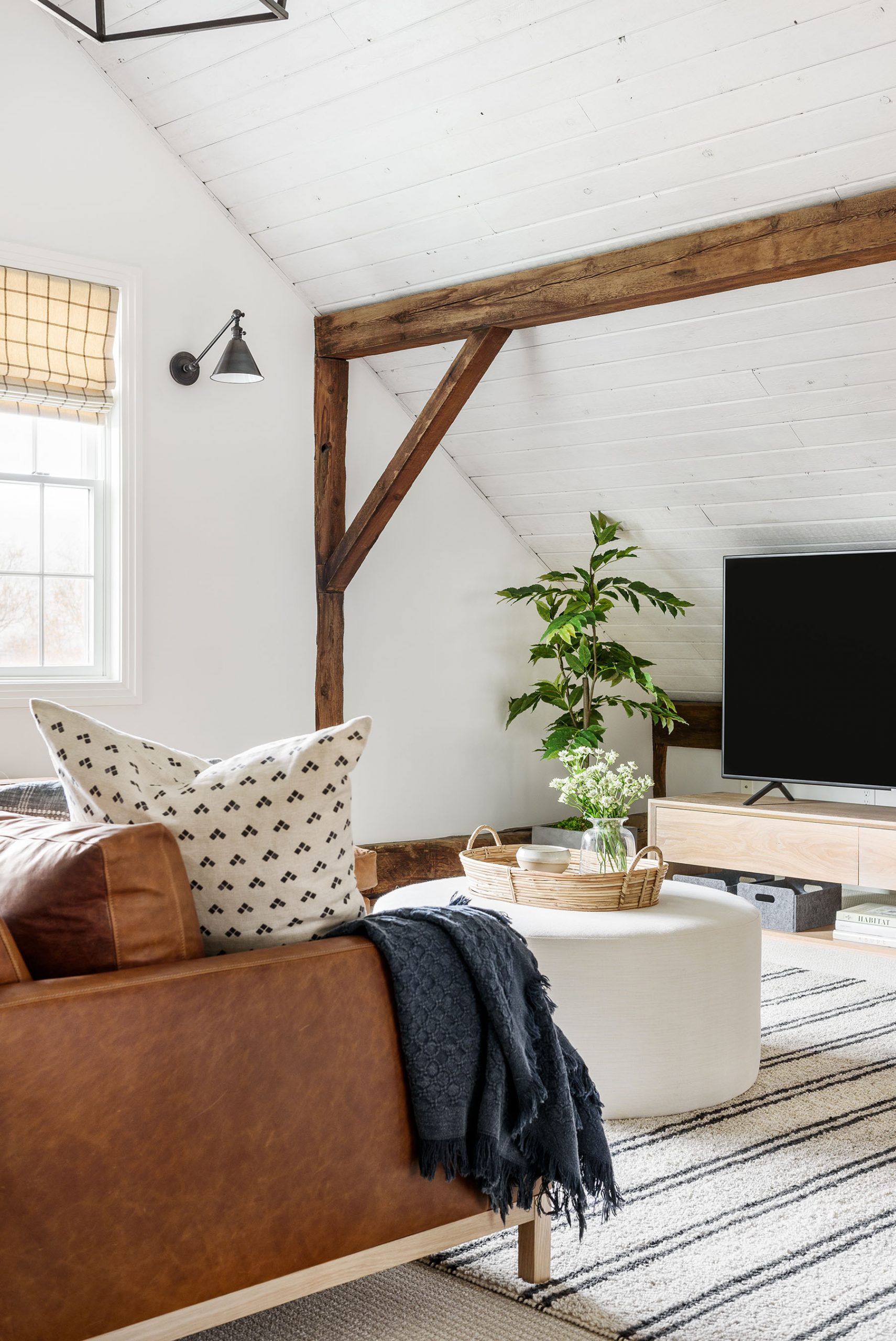
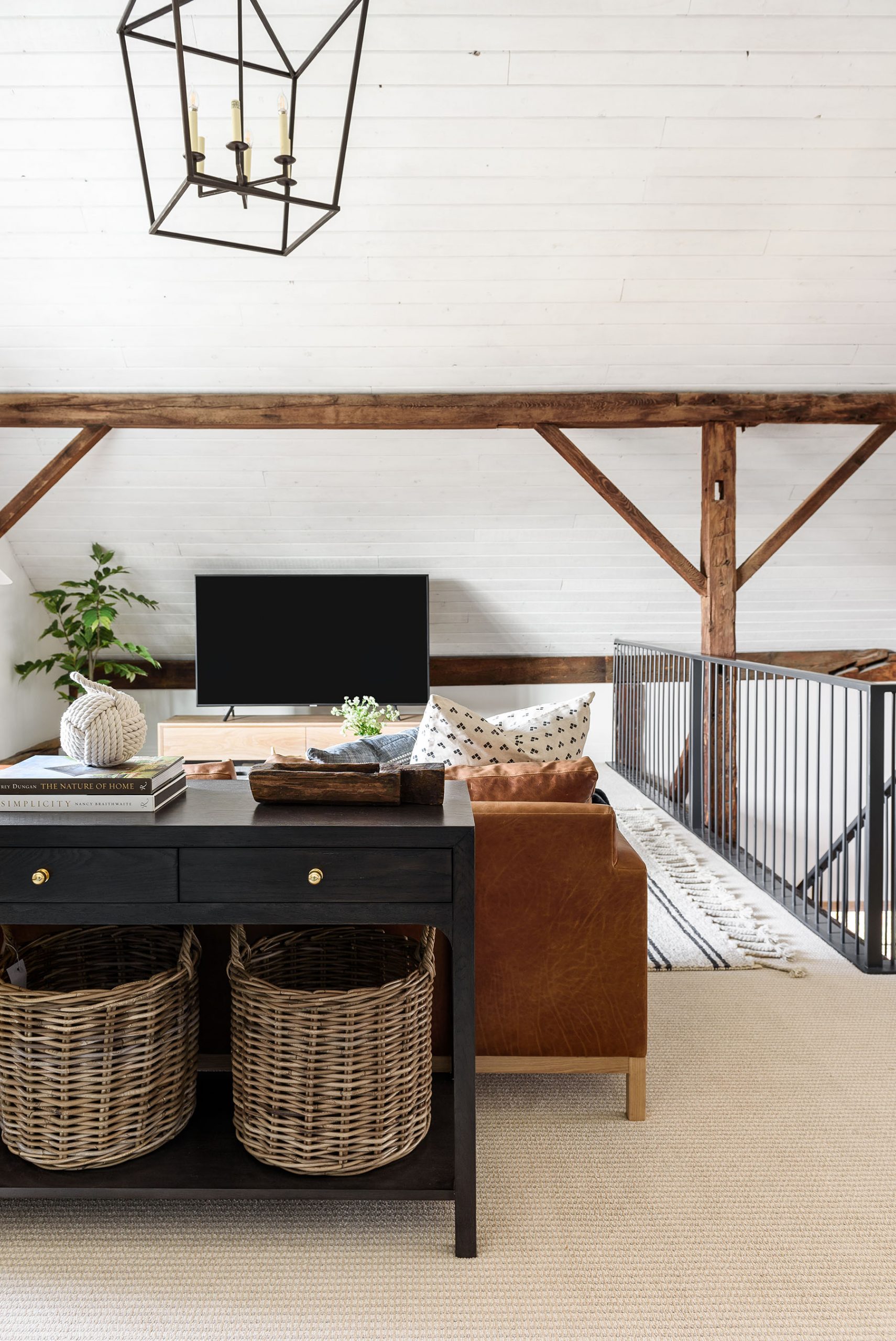
In this project, we knew that we needed to keep the original wood beams. They were so beautiful and added character and history to the home that couldn’t be replicated. By updating a few other surrounding elements that didn’t feel as personal to our clients, we were able to accentuate their beauty and draw the eye into this priceless feature.

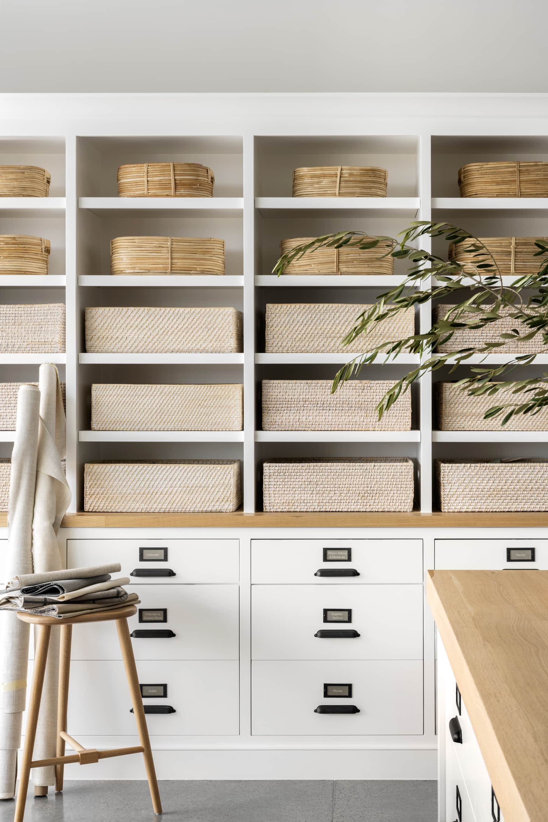
Historic Loft Netflix Remodel
Darlana Lantern

Franca Double Pivoting Task Lamp

Allen Console

Dawson Ottoman

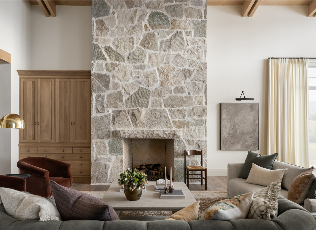
In a new build or a home without a historical element that we want to keep, we like to implement this idea by incorporating vintage pieces to balance out new, more streamlined pieces. You’d be surprised at how much character a vintage rug or even vintage-inspired art piece can bring to any room, from a kitchen to an entryway vignette.
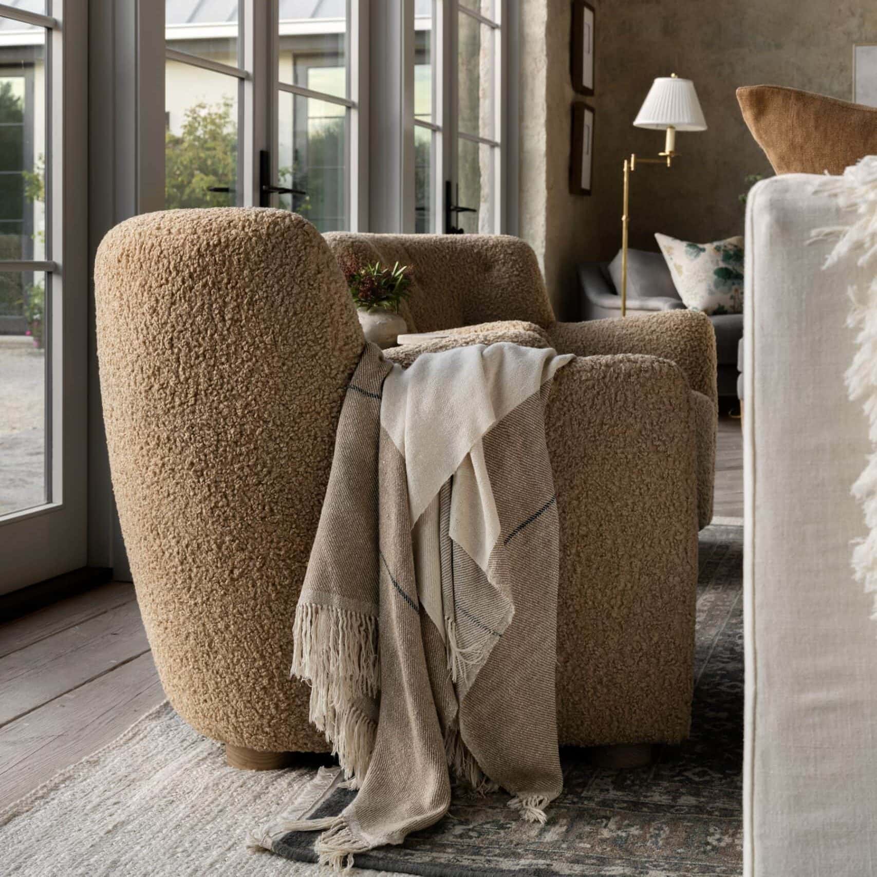
Lesson No. 2 – Adding textiles where it counts
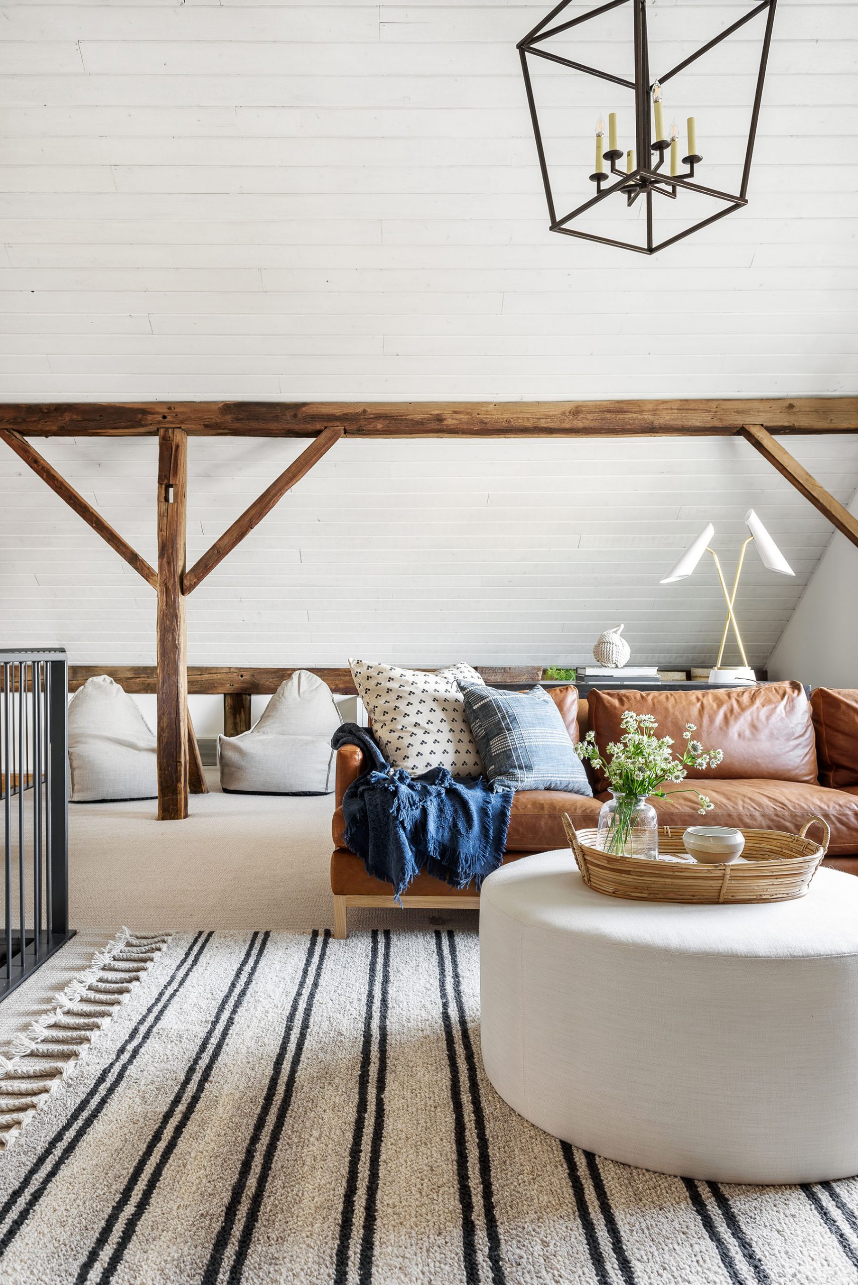
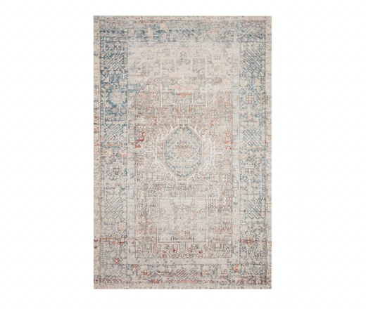
Over the years of working with clients, we’ve noticed that sometimes there’s a misconception that you don’t need a rug when you have carpet. This might sound like a small tip, but it makes a big difference! Not only does putting a rug over your carpet make sense functionally to project your carpet, but it also one of the easiest ways to make a room feel more put-together.

Sometimes when you have a wall-to-wall carpet, and you just put the furniture on top without layering a rug, it can look like everything is floating. Adding a rug creates a cozy, zoned-off feeling for seating spaces, and we always recommend it!
In this space, we used a low-pile carpet that would bring minimal texture to the look without taking away from the overall aesthetic.
For more tips on choosing carpet, read our post here!
Historic Loft Netflix Remodel

Gordes Shag Rug

Edina Plaid Indoor / Outdoor Rug

Zermatt Hand-Knotted Crosses Rug
Jules Collection No. 7
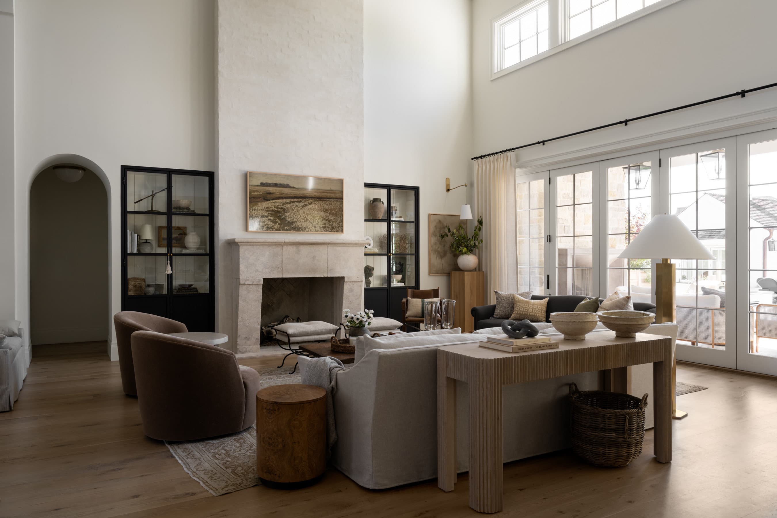
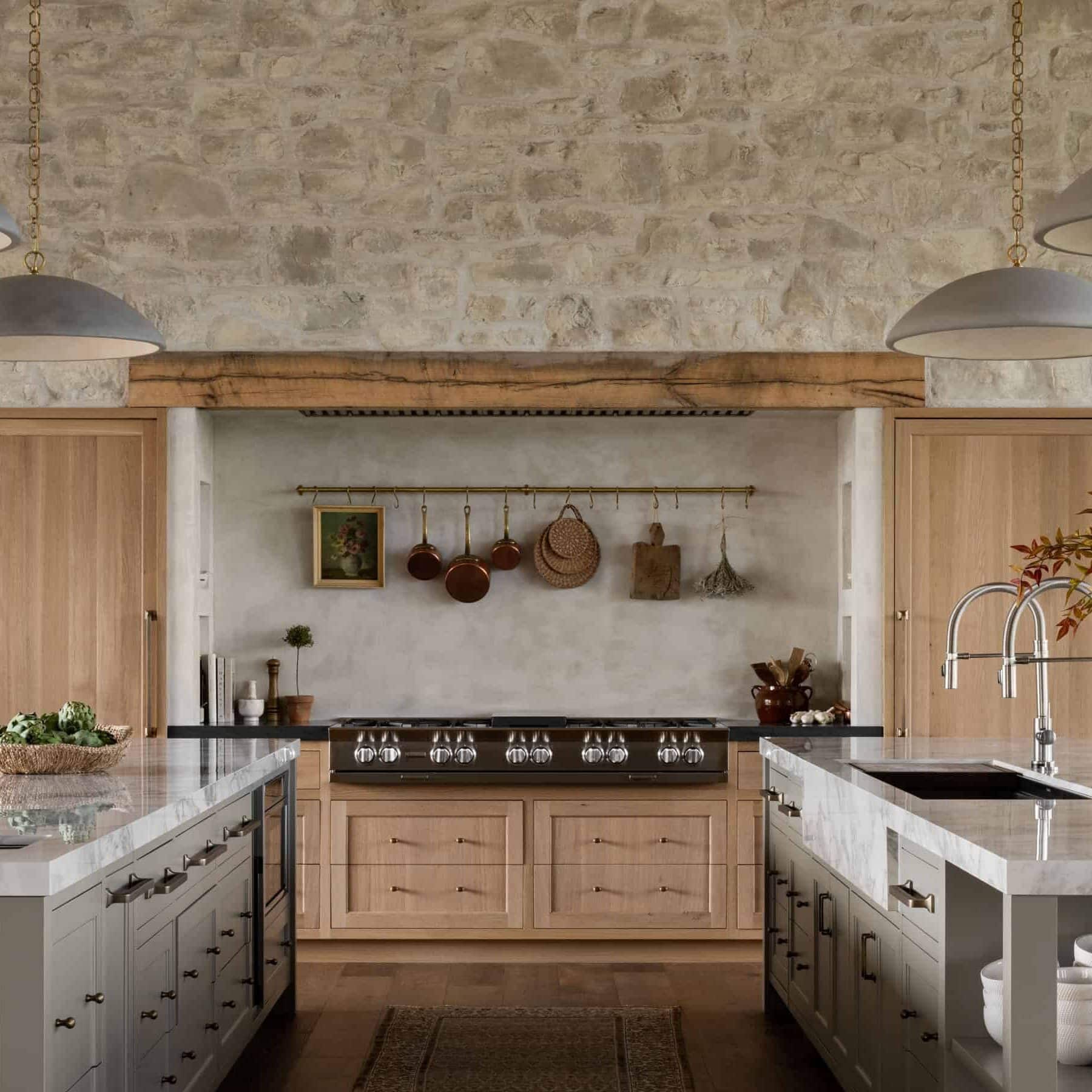
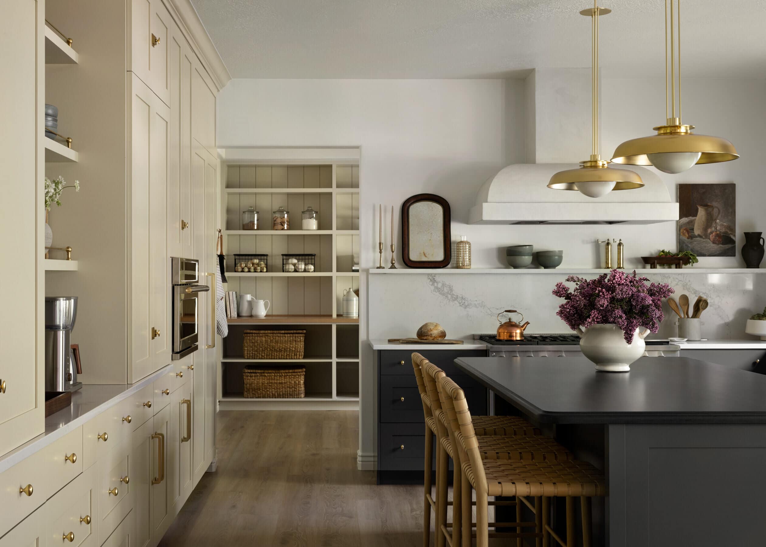
Lesson No. 3 – Narrowing down wood tones gives the eye a resting place
We love a beautiful wood tone just as much as the next design firm, but the truth is, using too many wood tones in one space can take away from the visual impact of it.
In this space, we had these beautiful wood beams against an all-wood ceiling in a slightly different tone, and we knew that if we wanted to achieve the fresh look our clients we’re going for, we would need to brighten it up.
After testing a few different mixes of paint and white-wash, we ended up going with a subtle white-wash that was transparent enough to bring out the knots’ texture while still brightening the home.
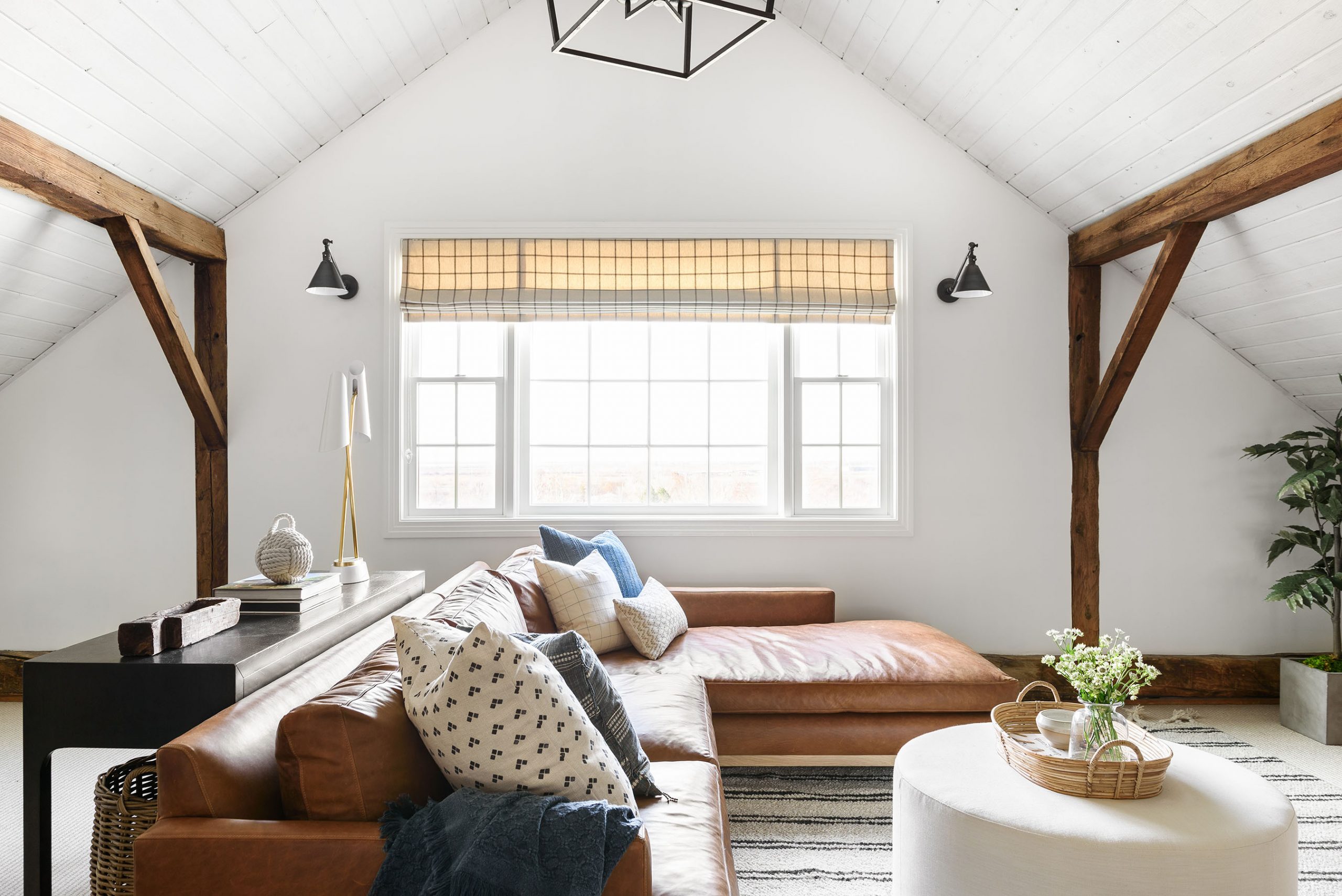


When working with any space, we always try to narrow down our wood tones to balance warm and cool tones. This applies to the big finishes like ceilings, floors, and windows and small finishes like furniture and decor. Typically, we find that using no more than two contrasting wood tones allows your eye to rest. However, there are always exceptions to this rule, and in a more rustic, cabin-feeling space, we might layer in more.
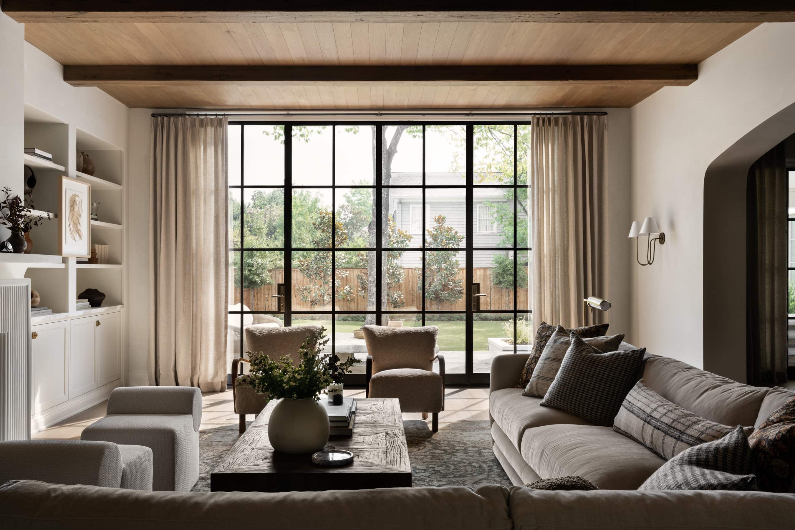
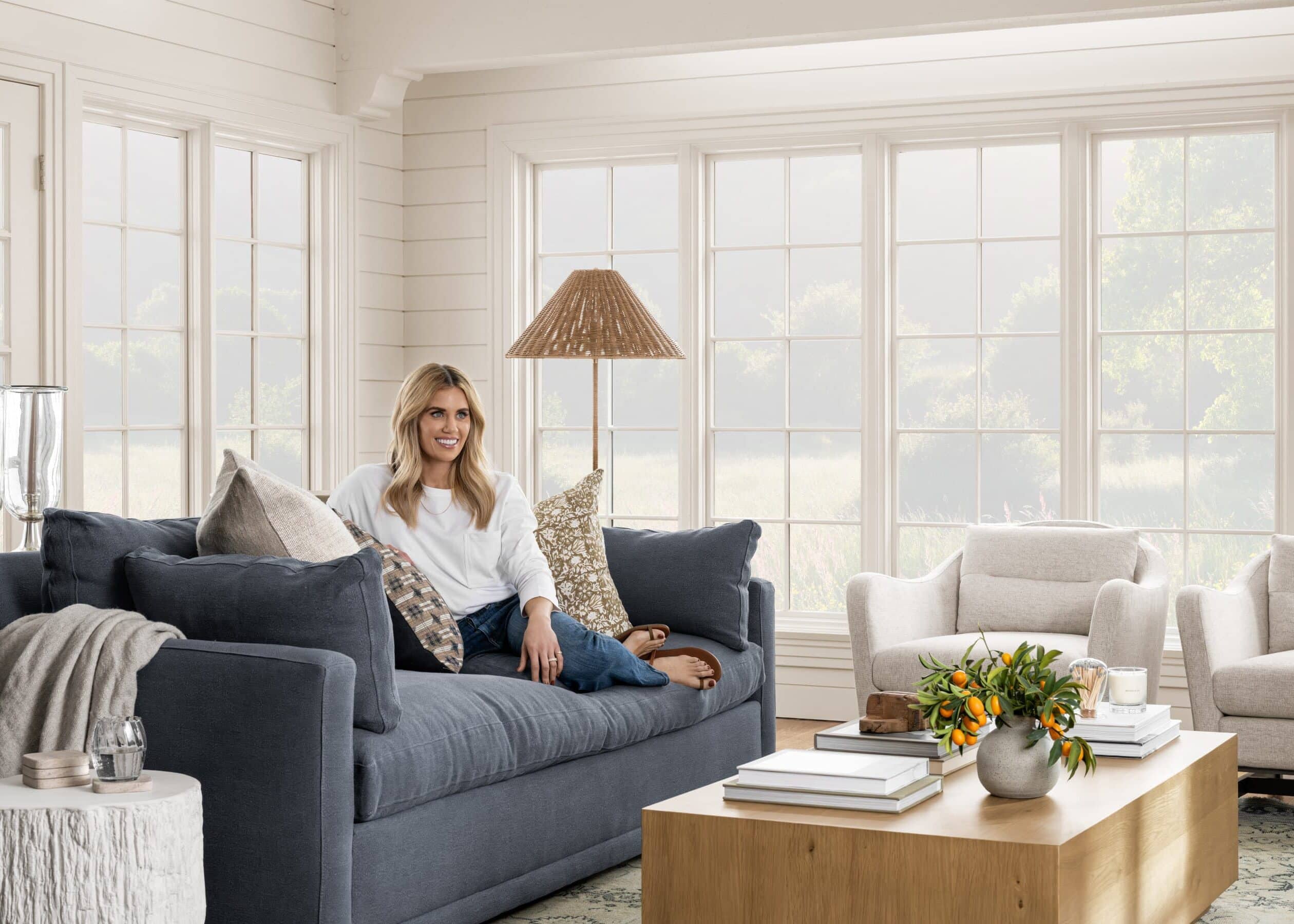
Lesson No. 4 – For kid-friendly spaces, it’s all about the materials
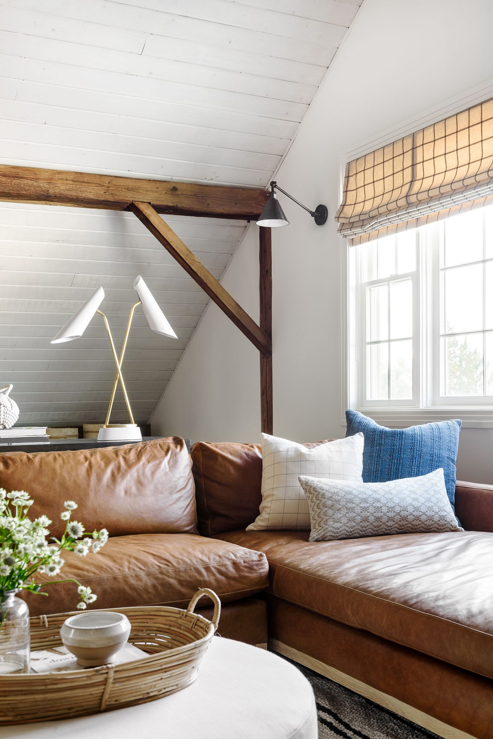
It was important to our clients that this space would become a place where they could rest at the end of the day and spend time with their kids. We wanted to use materials that said, “It’s okay to come lounge here”. When it comes to textiles, leather is always one of our go-to materials. Not only is it durable and comfortable, but it wears beautifully and adds a sense of character to your space.


Historic Loft Netflix Remodel
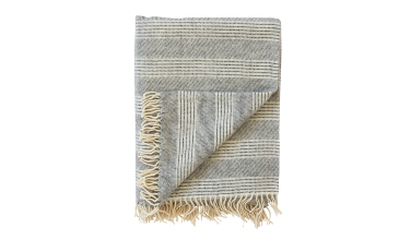
Alpaca Fog Stripe Throw

Dorian Pillow Cover

Linen & Wool Reversible Throw
When we’re designing spaces for families with kids, we often use a material ottoman rather than a coffee table for added comfort and less sharp corners to run into. White might seem like a risky option for a kid’s space, but we’ve found from experience that sometimes it’s actually nice because you can bleach it to spot-clean!
Read our guide for choosing upholstery fabric here.
Lesson No. 5 – Experimenting with furniture layouts
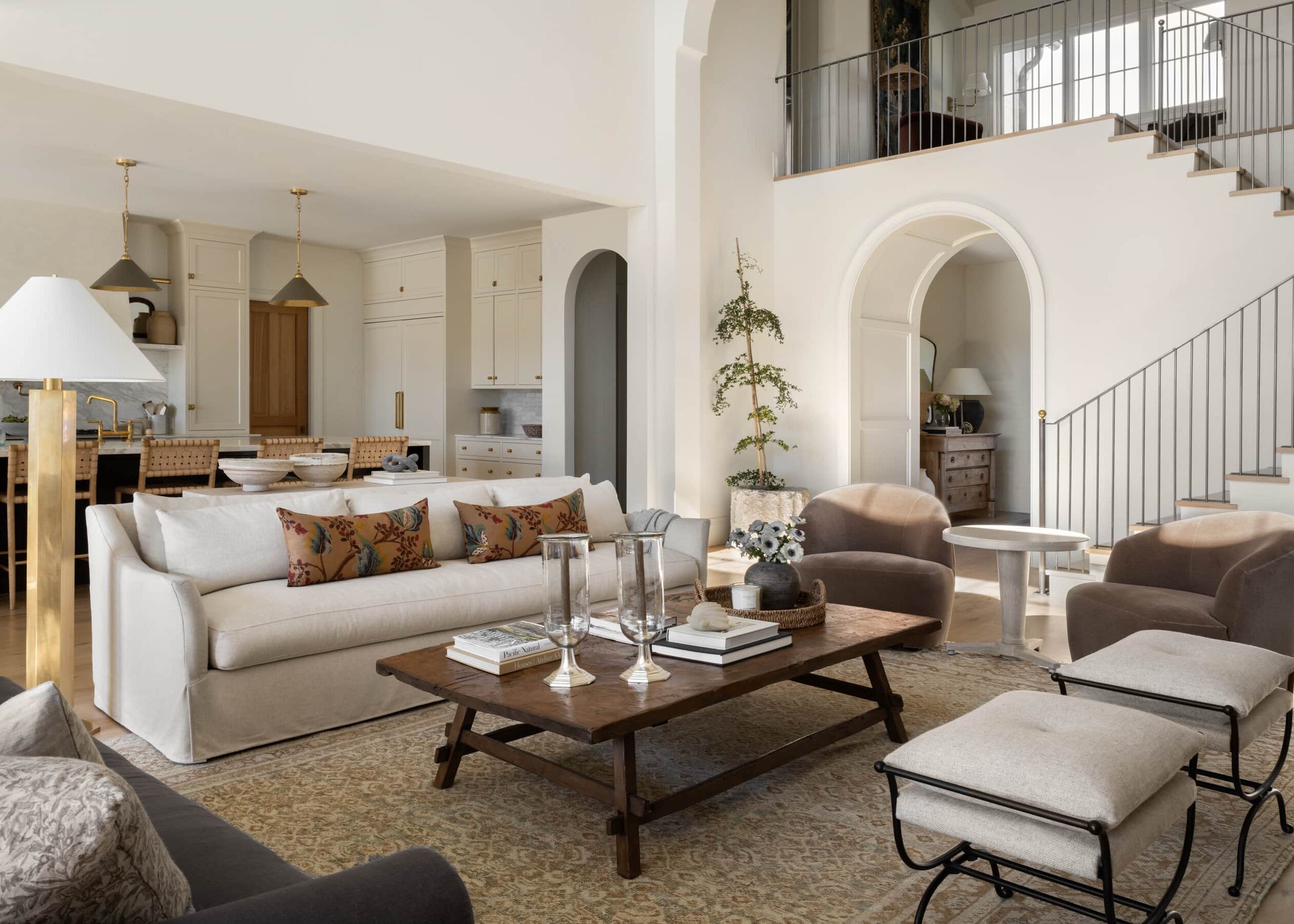
Our clients originally had placed their couch on the back of the wall, and although it may seem counter-intuitive, sometimes moving your couch to the center of the room can actually make your space look larger.
In this space, we could maximize functionality by placing a sofa near the center of the room and creating a play area for the kids behind the couch. Separating these pieces with a console also created a barrier that made them feel distinct. We love that our clients have a multi-purpose space for playing and relaxing.


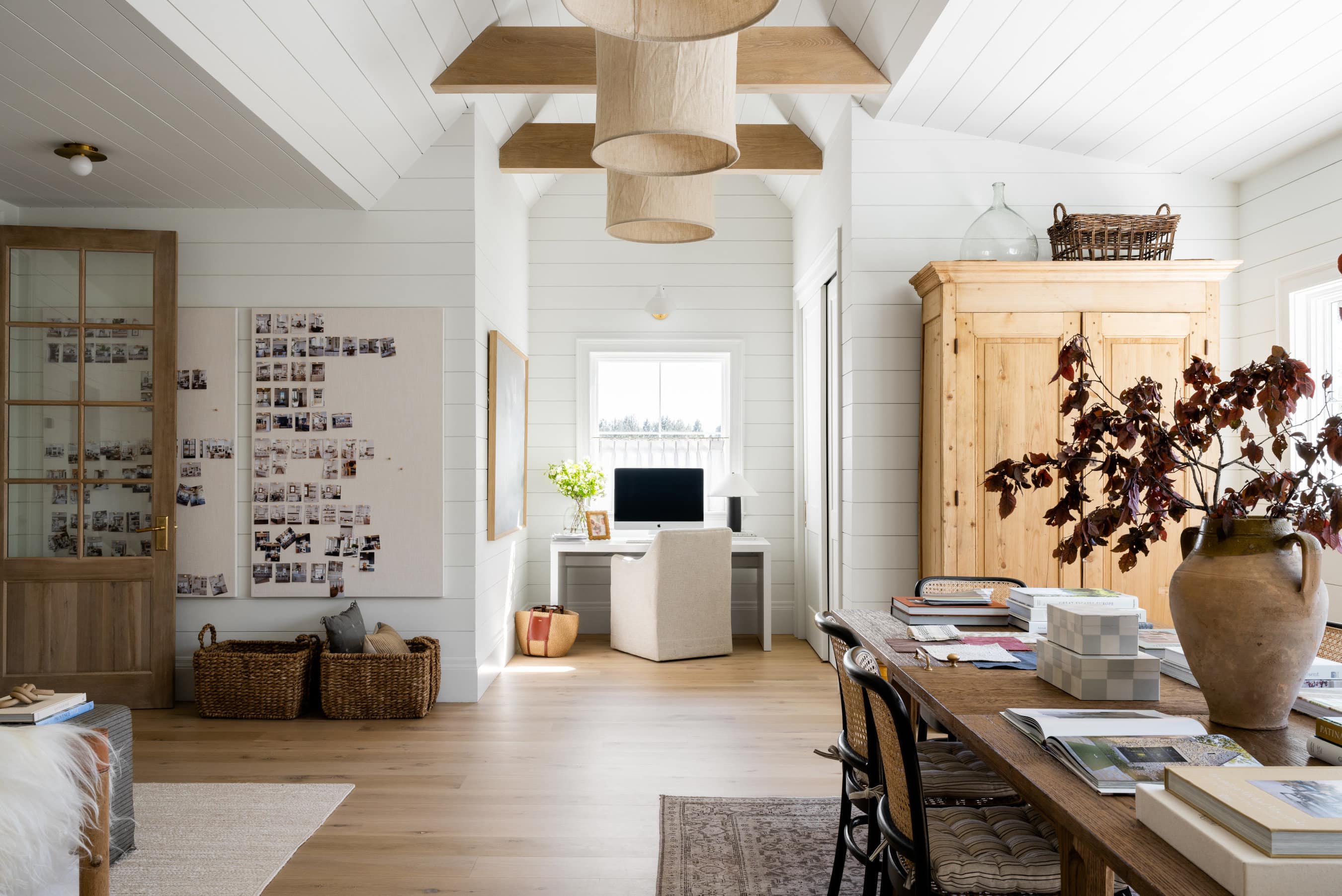
Historic Loft Netflix Remodel

Prosecco Harvest Basket
Woven Rattan Frame

Knot Door Stop

Faux Nandina Tree
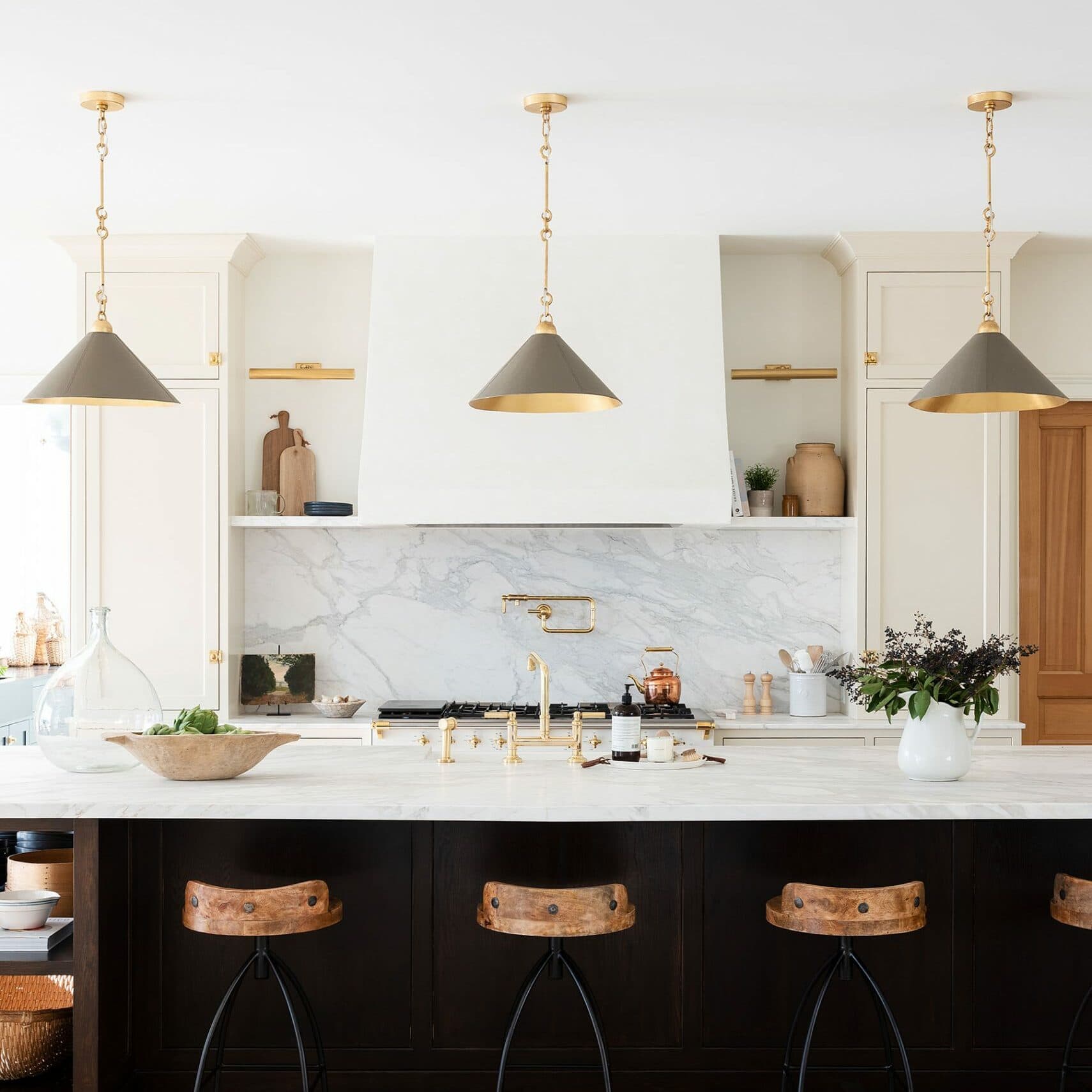
We’d like to thank our partners Anderson Tuftex, Killowen Construction, Benjamin Moore, Lemco Design, Target, and The Shade Store for making this project a success.
You May Also Like