


Modern Lake House: Entry & Dining Photo Tour
See the photo tour of the entry and dining space of our Modern Lake House.
01 November 2018 -
It takes years, many hands, and creative minds to design and build a house this beautiful.
We’re excited to share the Modern Lake House and everything in it, however many things in this home are custom and exclusive to the home. Mostly, we want to walk you through the design process and highlight a few things you can apply in your own home as well. We can’t share all the sources, but trust us—we share and give as much as we can!
Don’t miss the webisode for more!

Design build by Thomas Construction

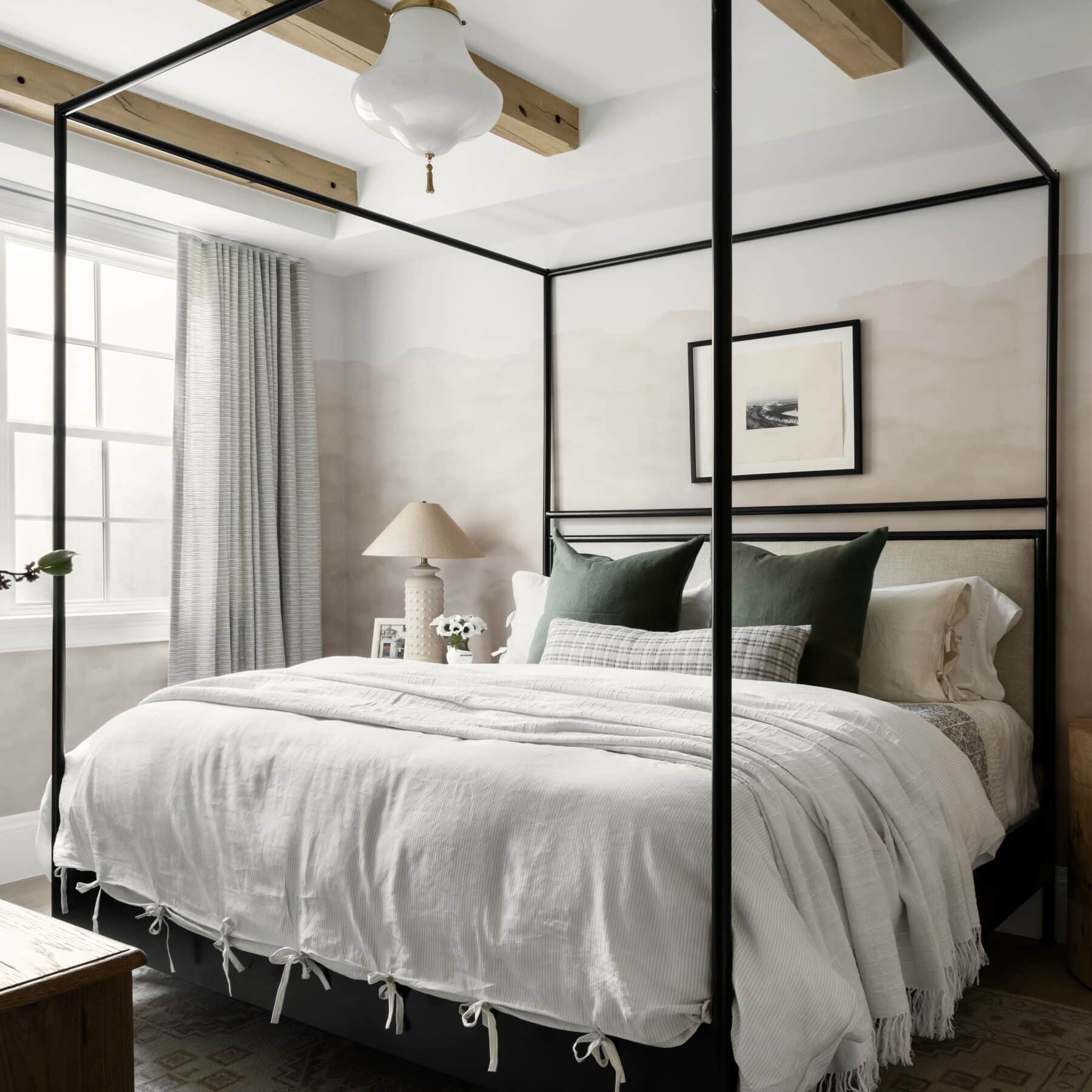
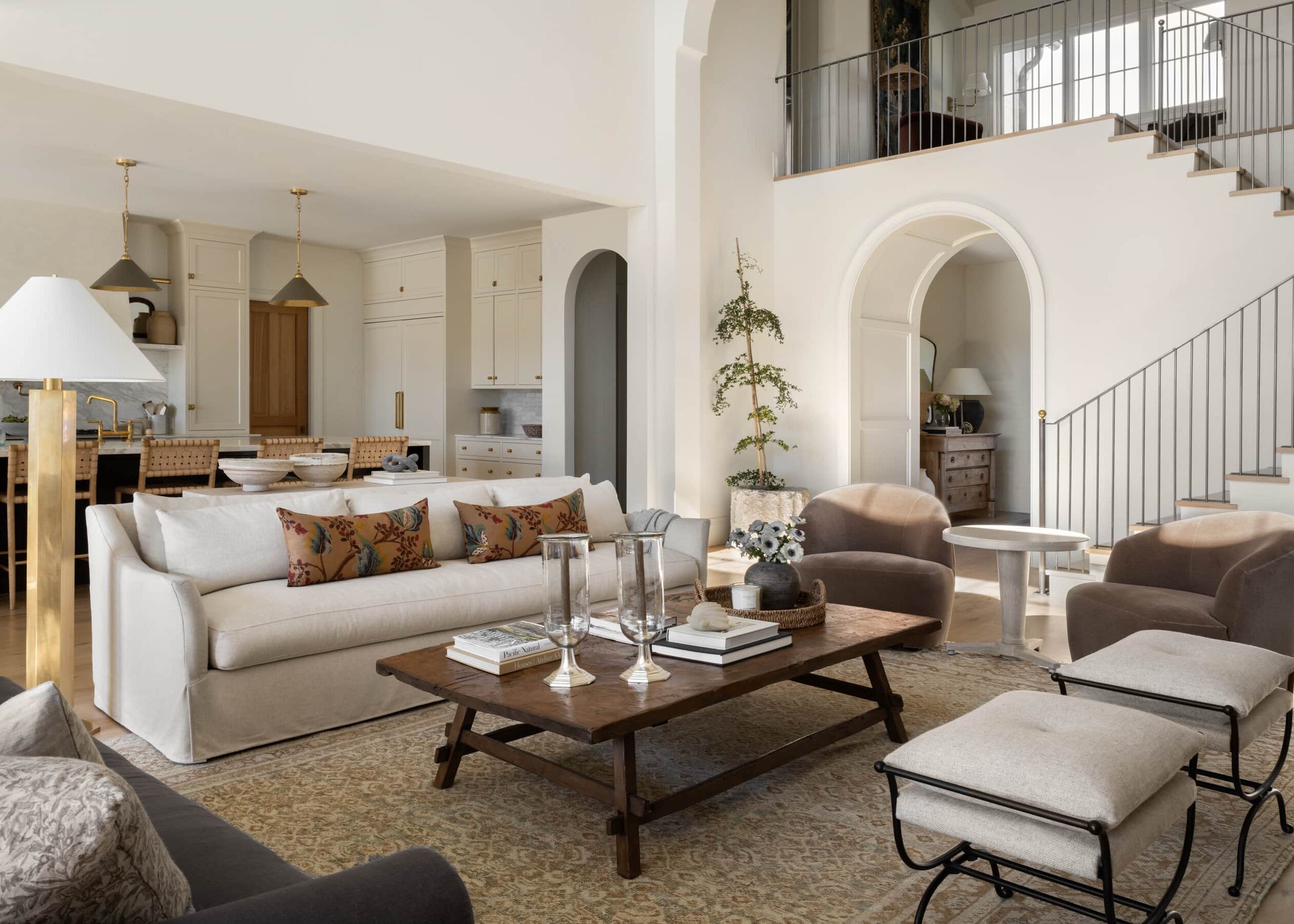
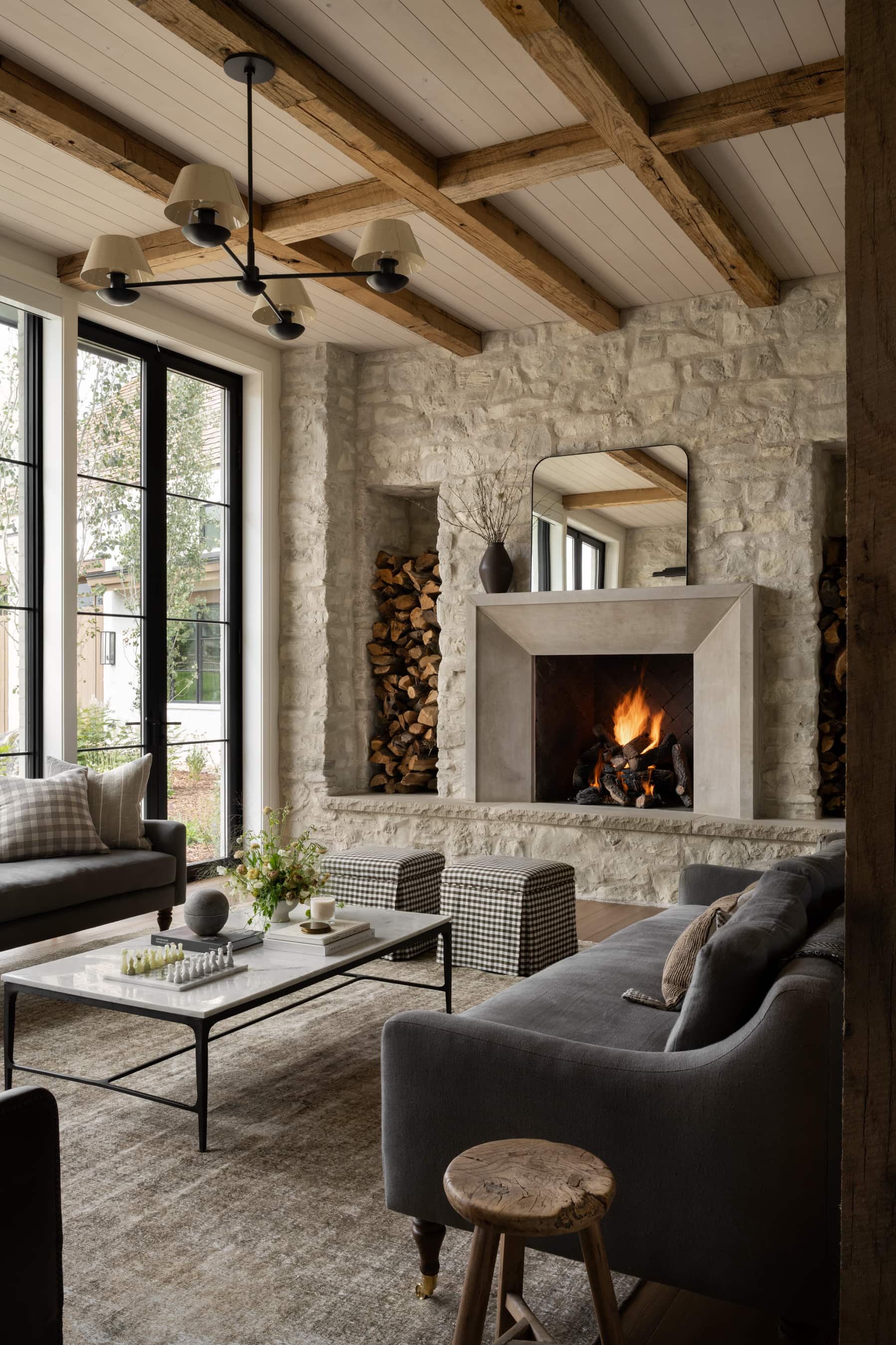
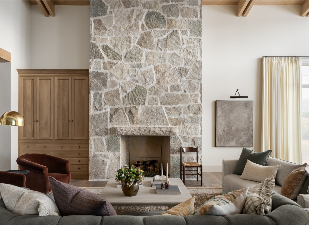
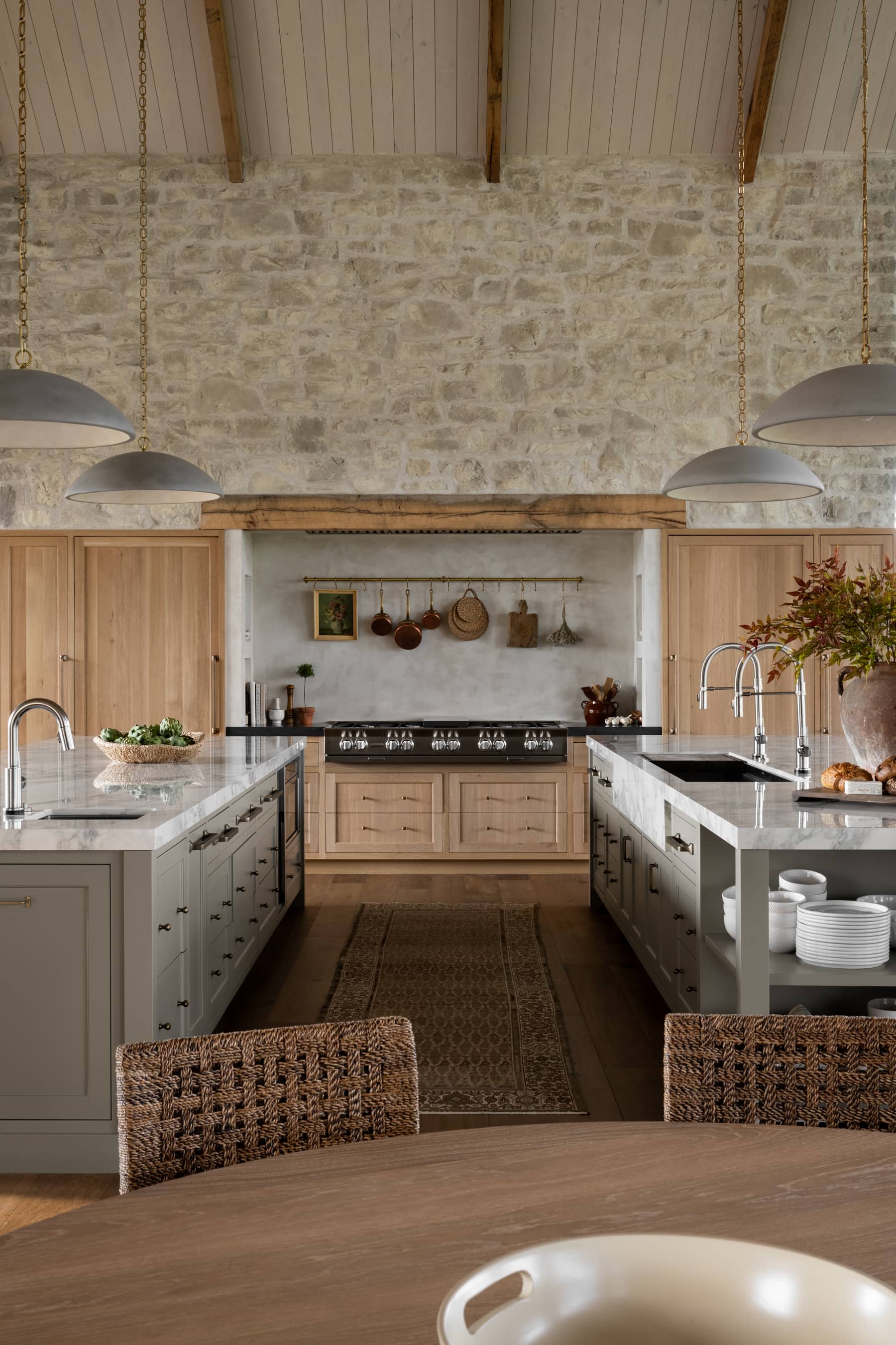
We loved the design of the exterior. It’s modern, clean and captured the natural surroundings of the area. The stone work on the exterior is something we wanted to bring inside.
I’ve said it a few times before, but stone has a bad rep! It’s a beautiful material when it’s well executed. We juxtaposed the texture of the store with clean, white walls and natural wood beams


The artwork is by Ethan Cook. We’re attracted to his contemporary use of shapes and scale in this simple, yet interesting way. Handwoven on canvas, his medium is equally as compelling and the final piece.

Streamlined doesn’t mean boring. We kept the space uncluttered and unfussy without making it feel empty with large statements and substantial pieces. Carrying black throughout the entry tied in the statement black windows and finishes throughout the home.

Minimal & Sculptural
This console called for a contemporary table lamp that would be interesting to look at, but wouldn’t take over the surface space.


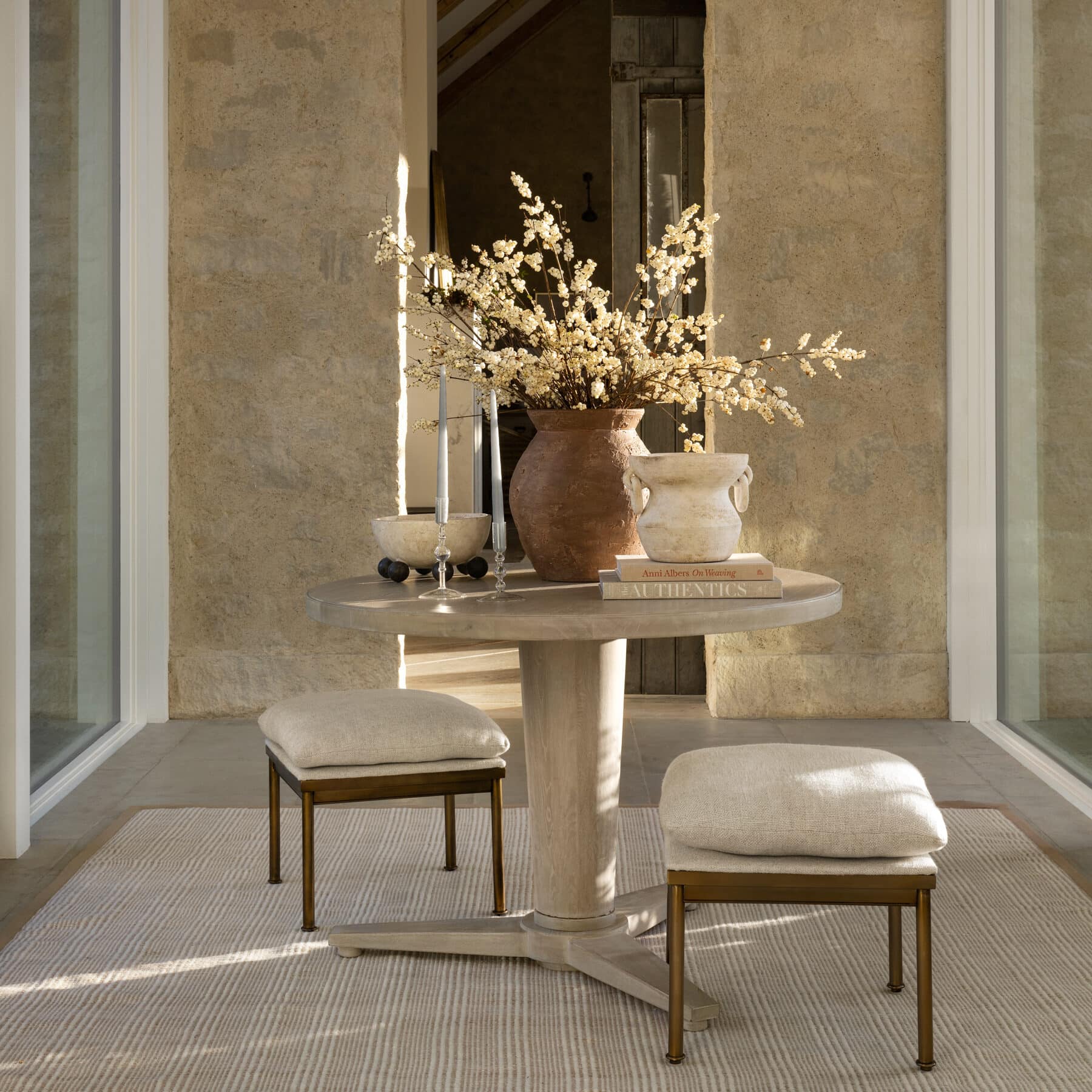
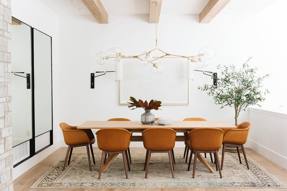
We filled the dining room with natural textures, modern statements, and a restrained color palette. The vintage rug’s subtle pattern perfectly anchored the long wood table and leather bucket chairs.
We wanted to make sure we put a cool plant in the corner, complete with a textural basket to host it. We love our Faux Olive Tree, because you can’t kill it!

The space was open and opposite of the entry way’s artwork. We wanted it to feel different, but still connected. We did a tonal art piece with wall sconces to make a statement without overwhelming the airy, sculptural statement chandelier. We love how linear it felt and filled the space.

Mirrors in the dining
We wanted to reflect light and do something different than more artwork, since we had a statement piece on the adjacent wall. Because we wanted the extra dining seating, we didn’t have room for a console, so we hung floor mirrors!! They are typically heavier, but we love the length and the effect they had in the space.

Stay tuned for more photo tours and webisodes of this gorgeous lake house!

You May Also Like