


Real Simple Magazine: Brooklyn Penthouse Reveal
See the Master Bed and Bath we designed for Real Simple!
10 October 2018 -
Our collaboration with Real Simple brought us to New York City!
We were so excited to be a part of the first ever Real Simple Home. We, along with other talented designers, each designed our own space in the penthouse. The team consisted of Nate Berkus and Jeremiah Brent, Donna Garlough, Neat Method, Robin Henry Studio, Sabrina Soto, Jessica McCarthy, Ariel Okin, Stephanie Sisco and Jenny Komenda.
Pick up your copy of Real Simple October 2018 to see all the spaces! Or tour the whole space here. Styling by Beth Flatly.


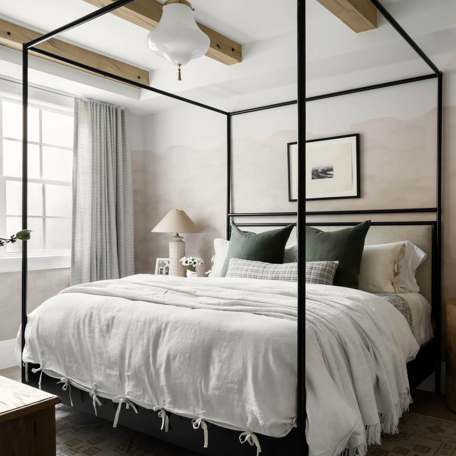
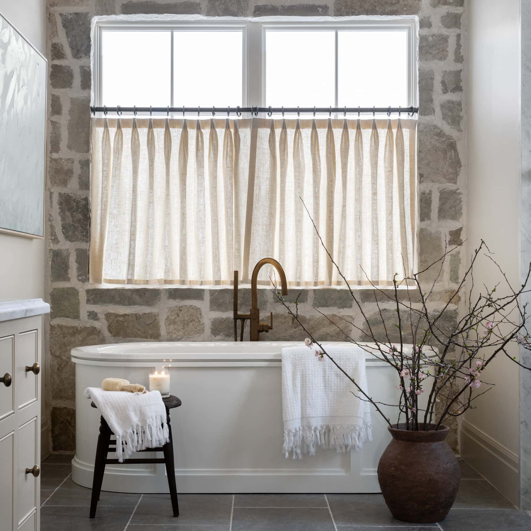
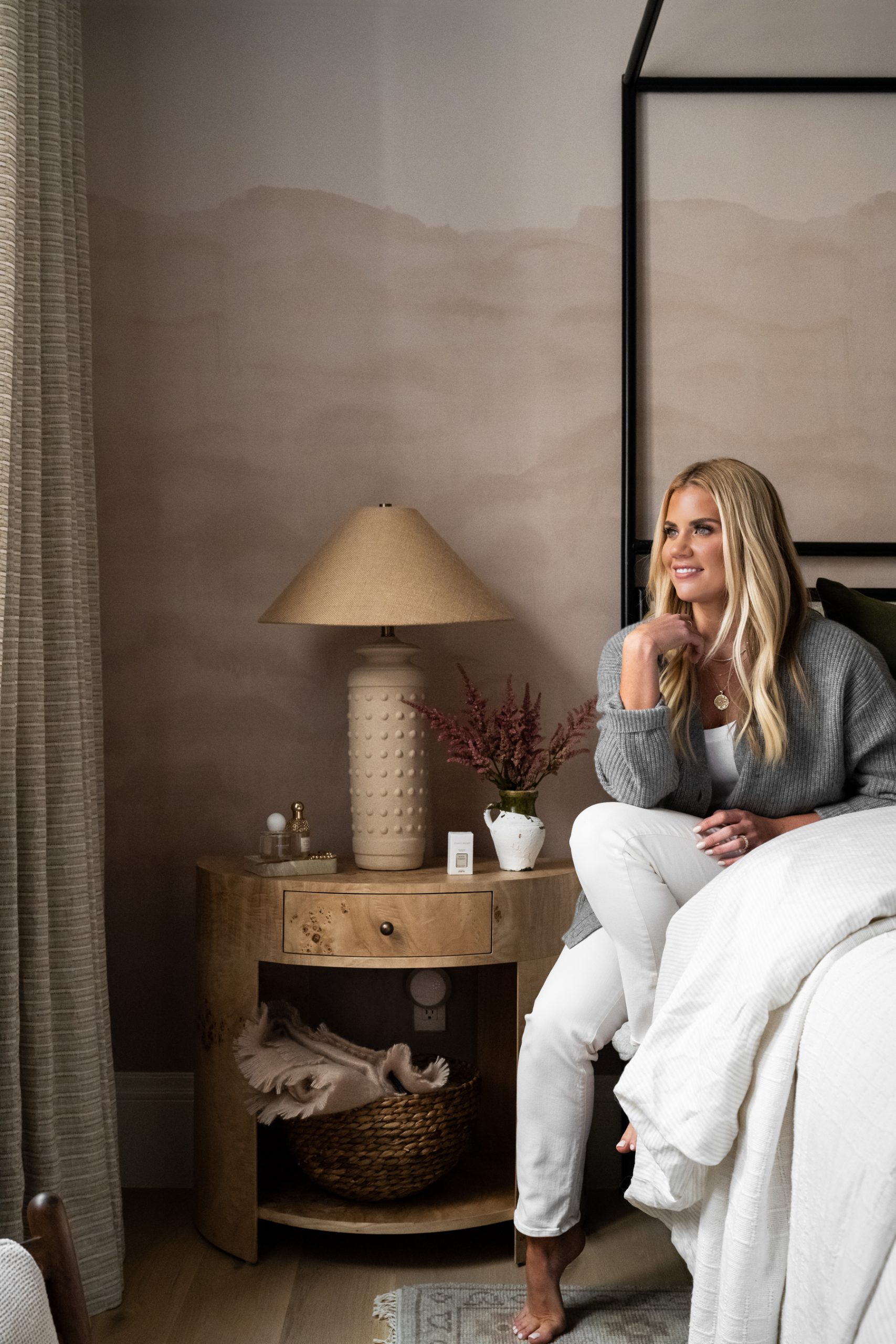
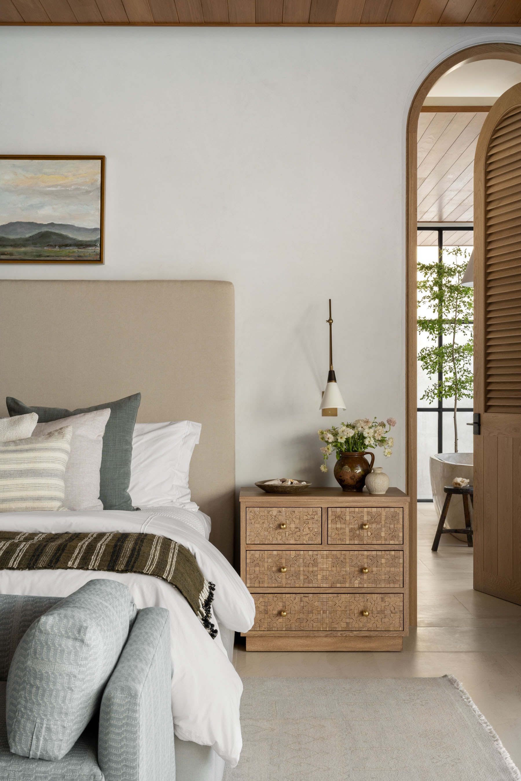
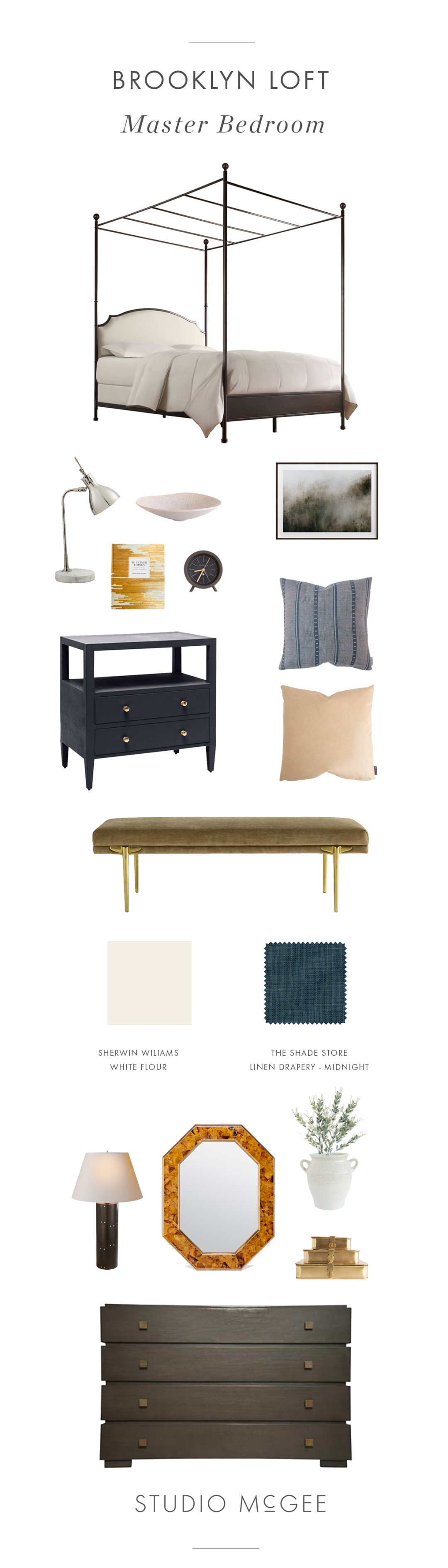
A four-poster bed works best in spaces that have nine-foot ceilings or higher. This keeps the space from feeling cramped! The drapes in this space are from The Shade Store. The Midnight Linen is so bold and pretty, and we love the privacy lining we were able to add!! The paint color is Sherwin Williams White Flour, a go-to white paint of ours.


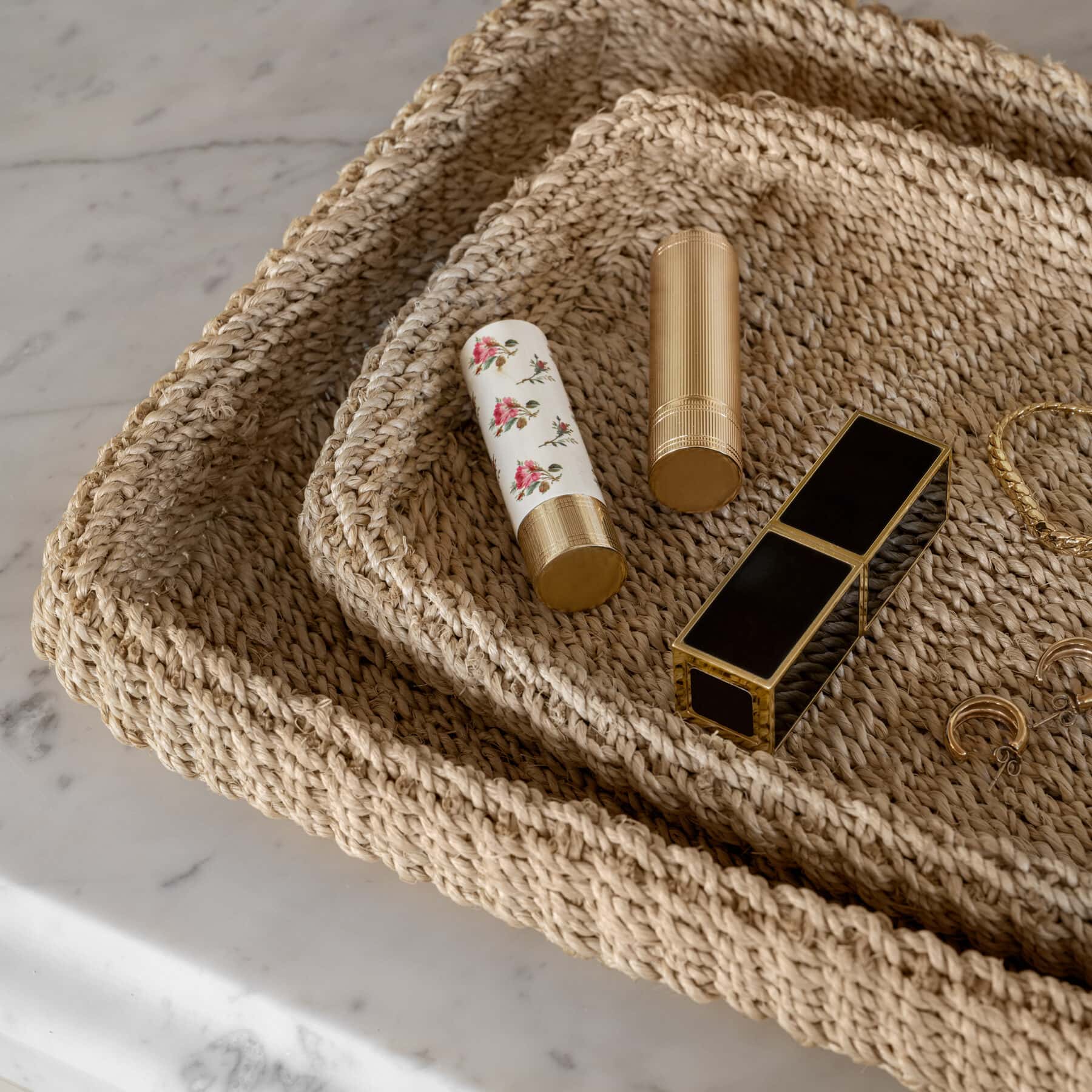
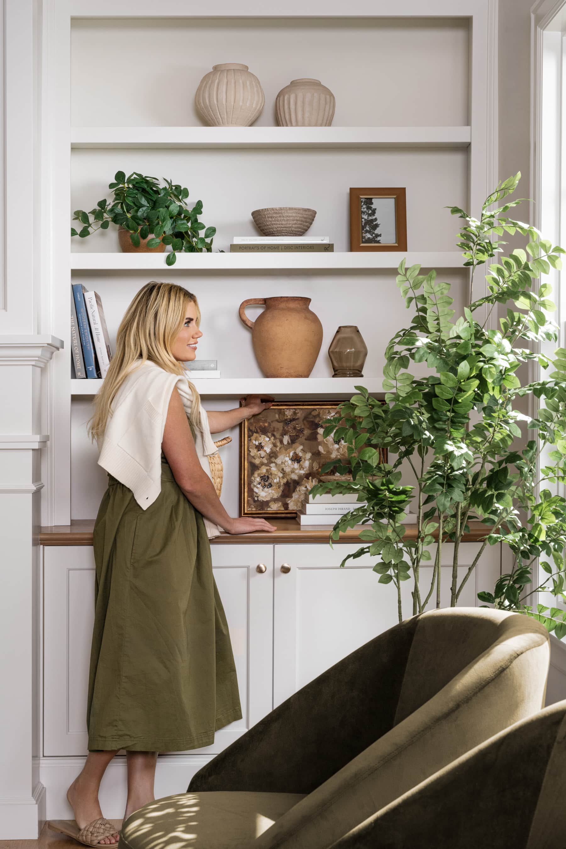
We always love a nightstand that has an extra space for styling. Not only does it look great, but it provides a home to store knick-knacks, journals, pens, headphones, etc. We love filled the space with a low profile bowl to use as a catchall and it add organic shape into mix.

We love mixing metals—it helps the design shy away from going too cold or too glam. The nightstand had these great brass knobs, so we used nickel to add balance. The mirror adds a statement pattern that brings the space to life. We loved the shape and small gold detail on it!


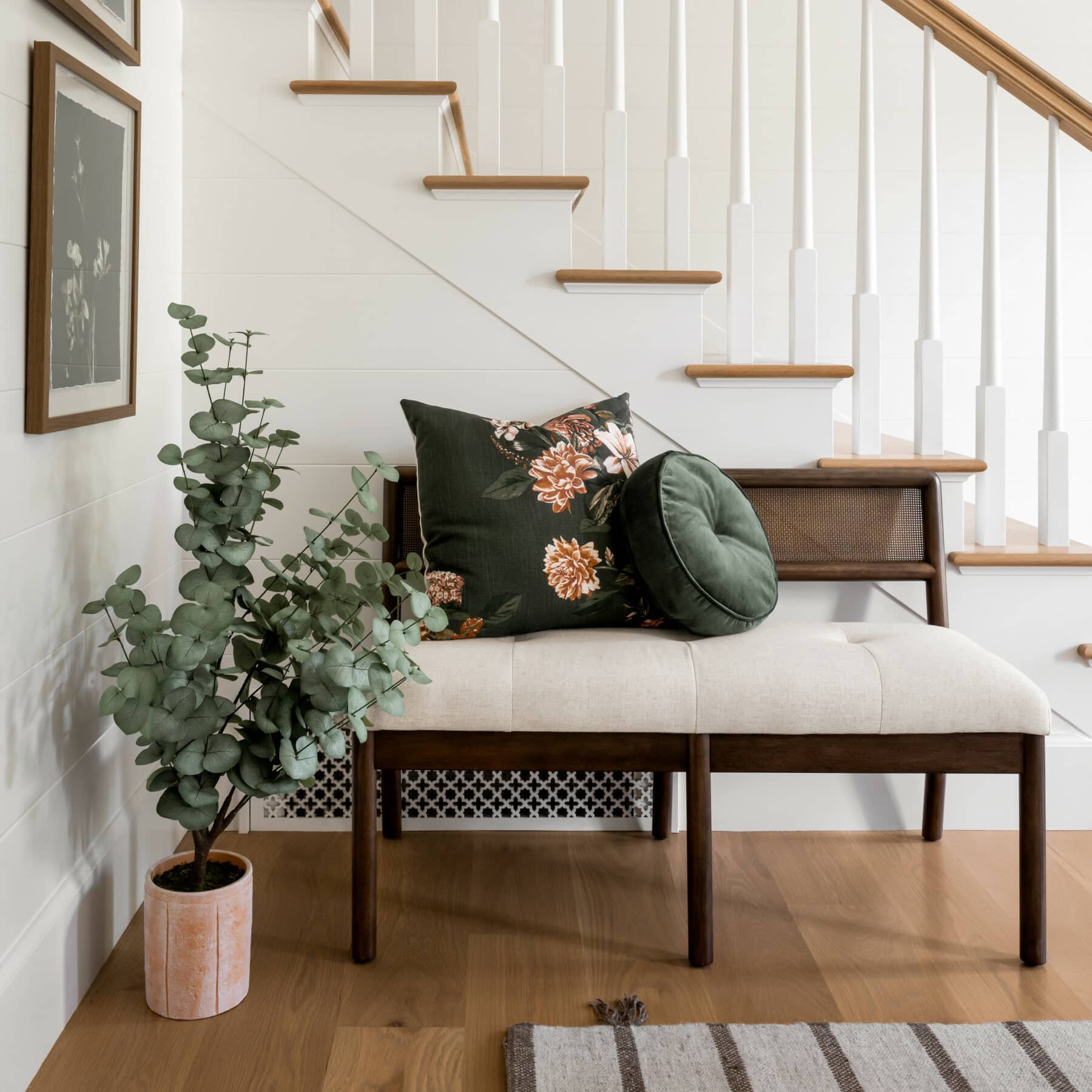
Incorporating natural elements like natural wood are essential in a city loft. With less exposure to the outdoors, we wanted to bring plenty of it in. It’s also convenient to have a place to set extra soap, towels, or to add a spa-like element like greenery or candles. We love the dimension and visual interest in the Addison Side Table. It’s so interesting to look at!
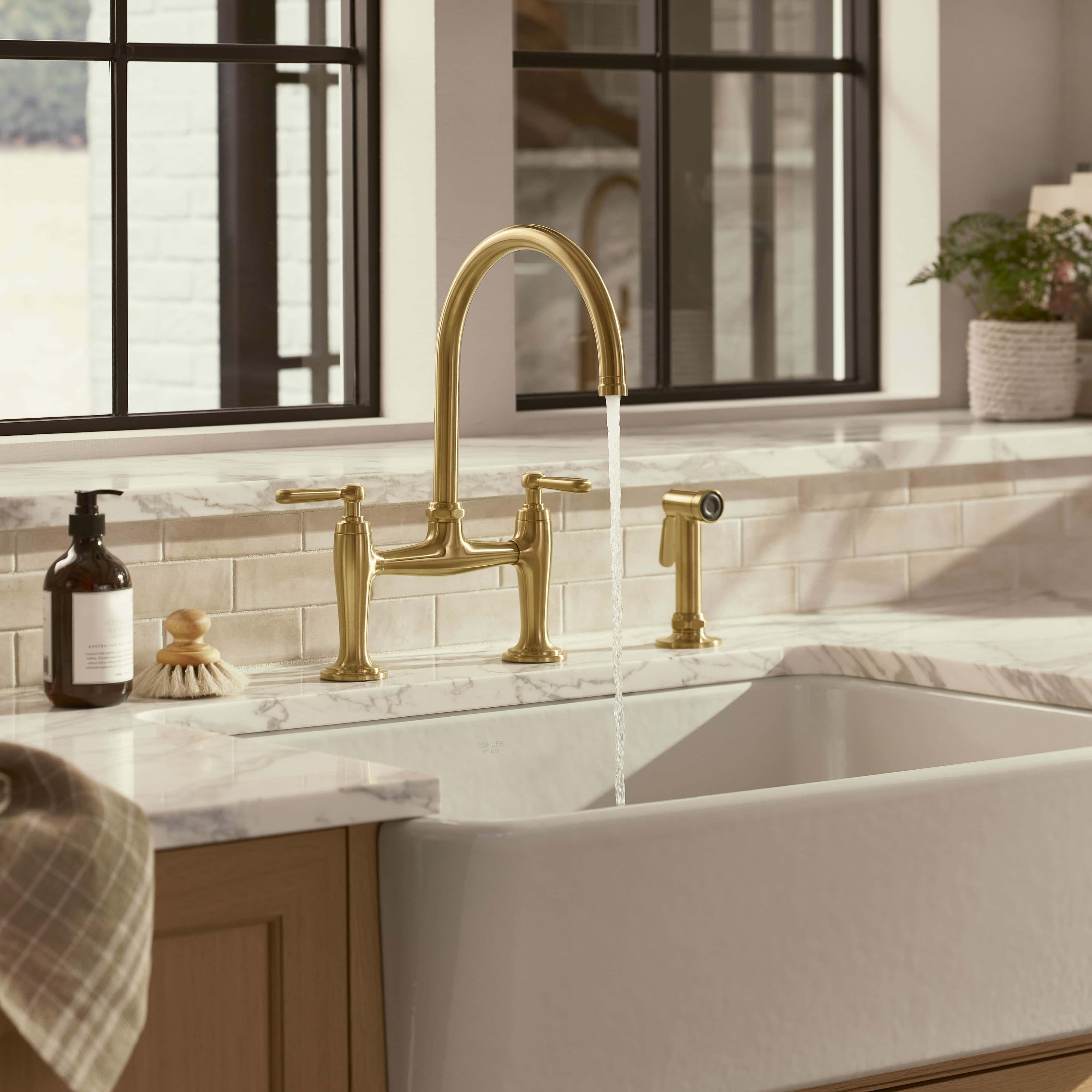
In this space we lined the walls with tile, creating a contrasted wall that makes a bold statement. Then we softened the walls with oatmeal shades.


You May Also Like