


Unconventional Design Solutions
A few ways to think outside of the box
11 February 2021 -
Design is hardly ever a one-size-fits-all approach.
When we’re working on any project, whether it’s a remodel or a new build, we’re always thinking of unique ways to make the most of each space.
Finding solutions to allow for more function or form is a crucial part of the design process. In this post, we’re excited to share a few “unconventional” approaches to creating a space that reaches its full potential.
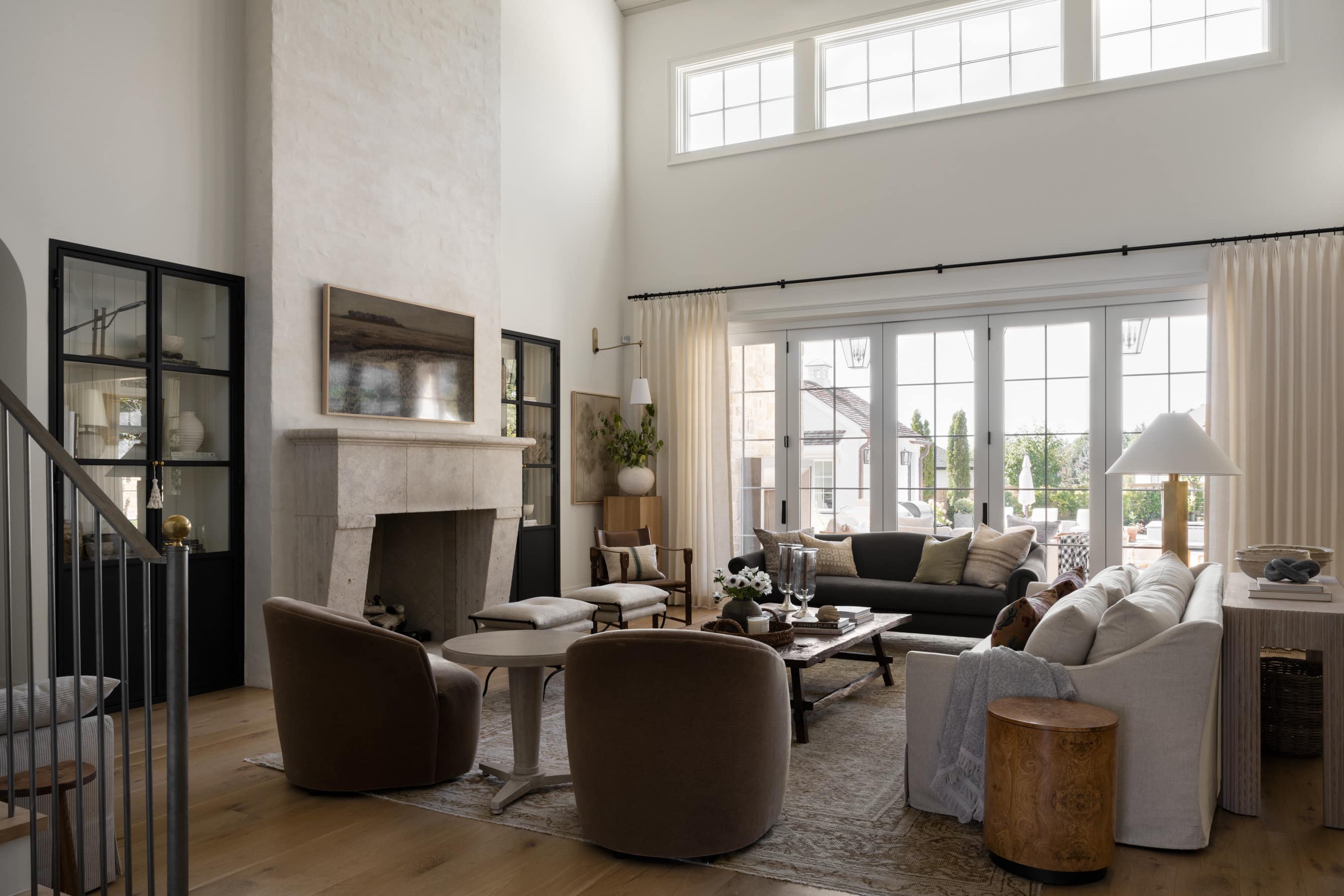
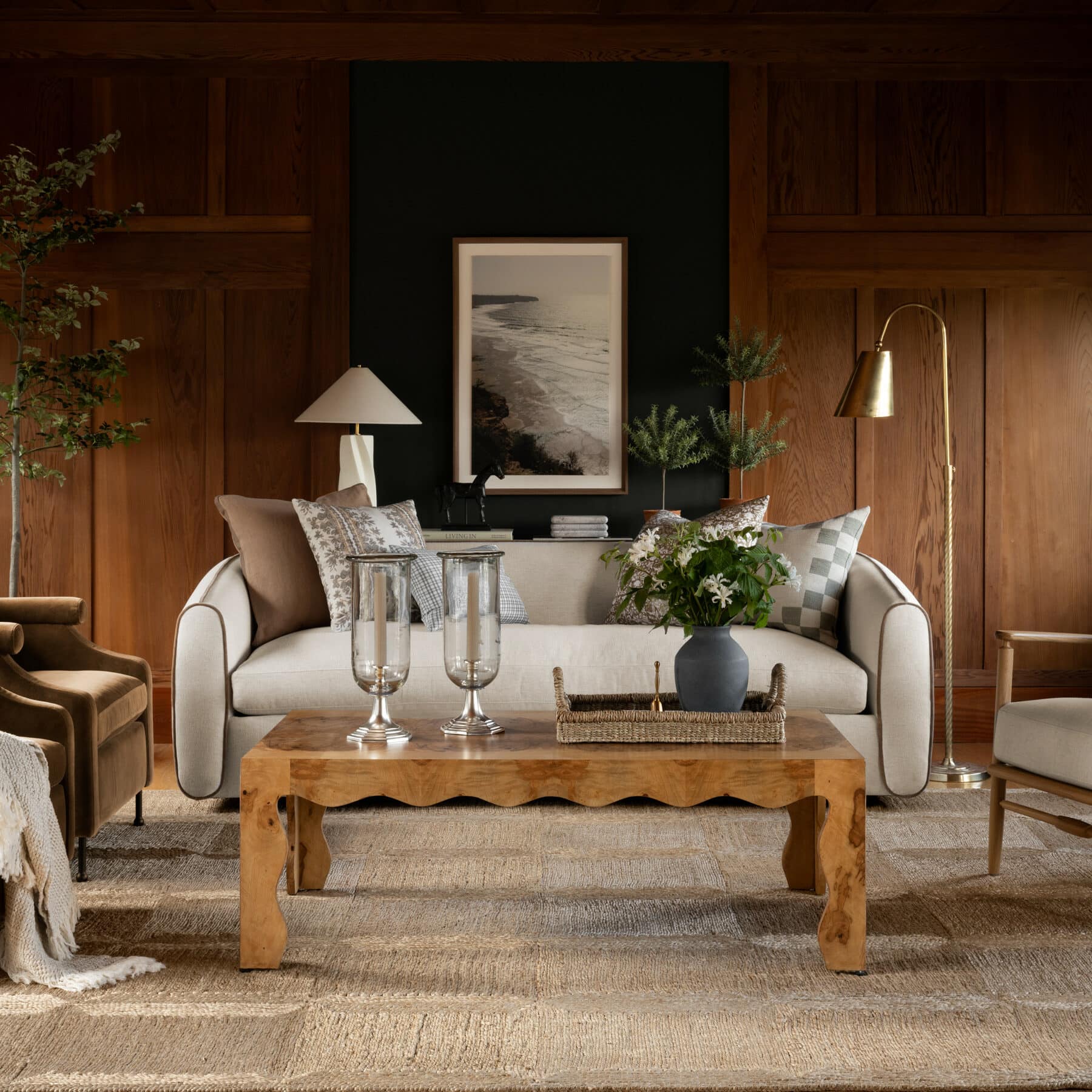
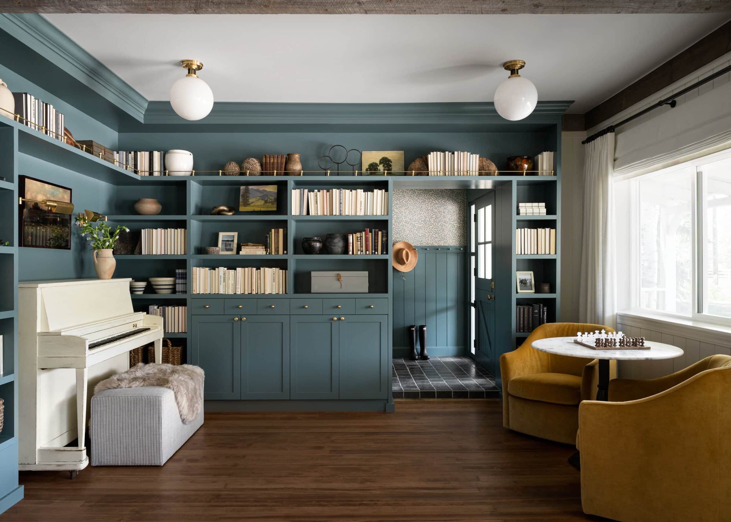
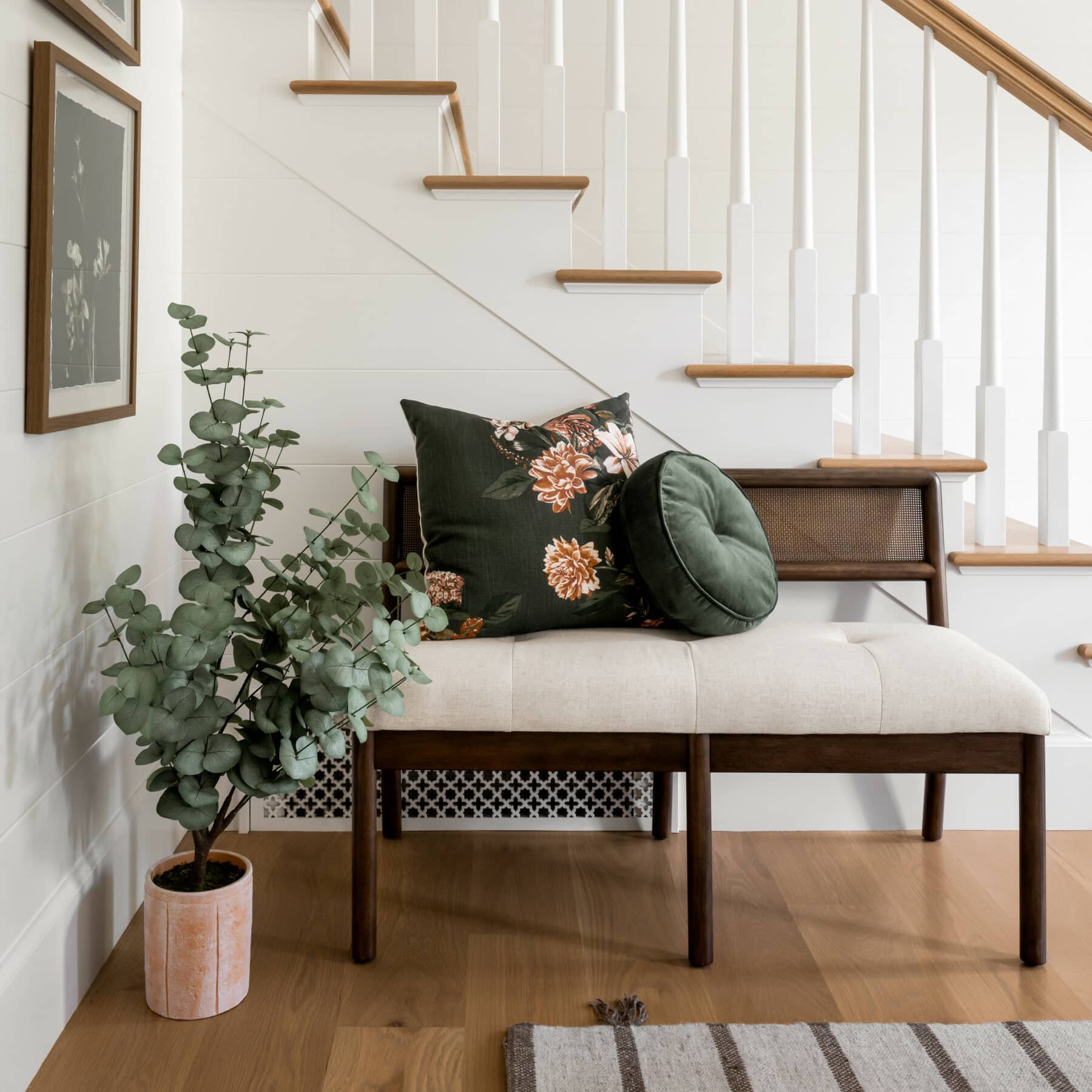
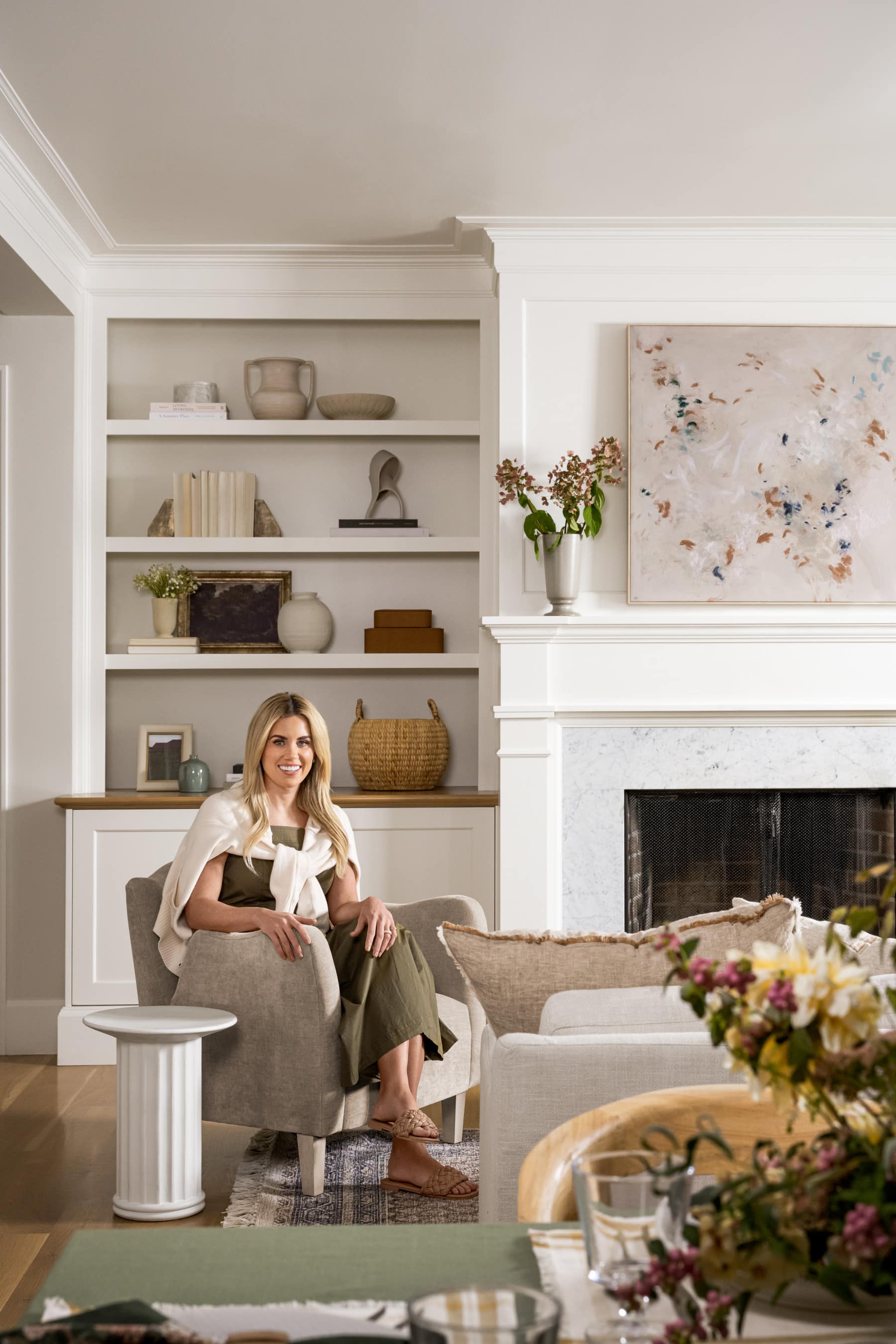
No. 1: Moving the couch away from the wall.
Although it may seem counter-intuitive, sometimes moving your couch to the center of the room can actually make your space look larger. Plus, moving your sofa away from the wall can actually create more functional space for a console table with storage, a separate seating area, or even a desk.

"One of the mistakes people make is that they pull all of their furniture to their walls because they're trying to create extra space in the room, but it can make the room feel less cozy and intimate."
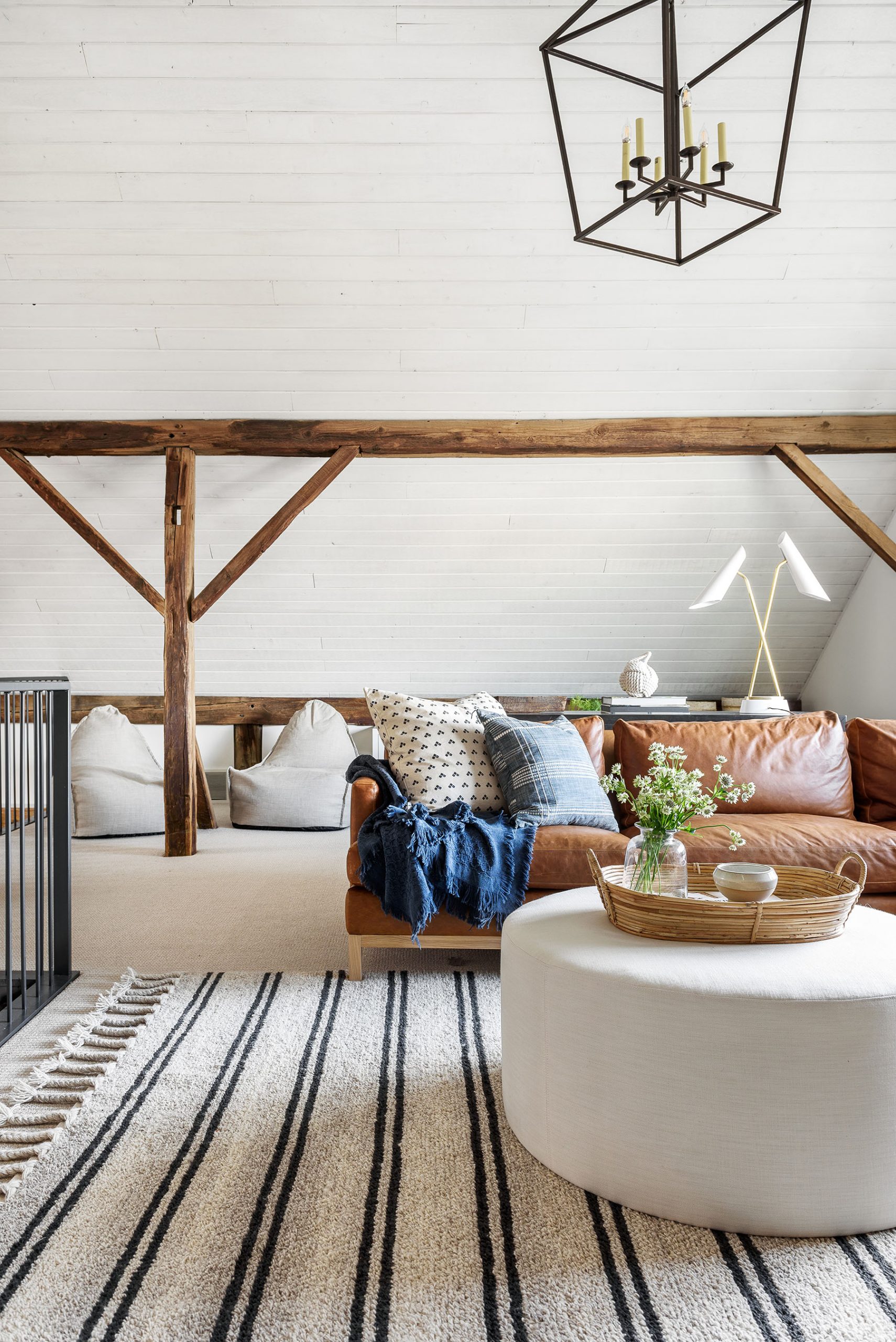
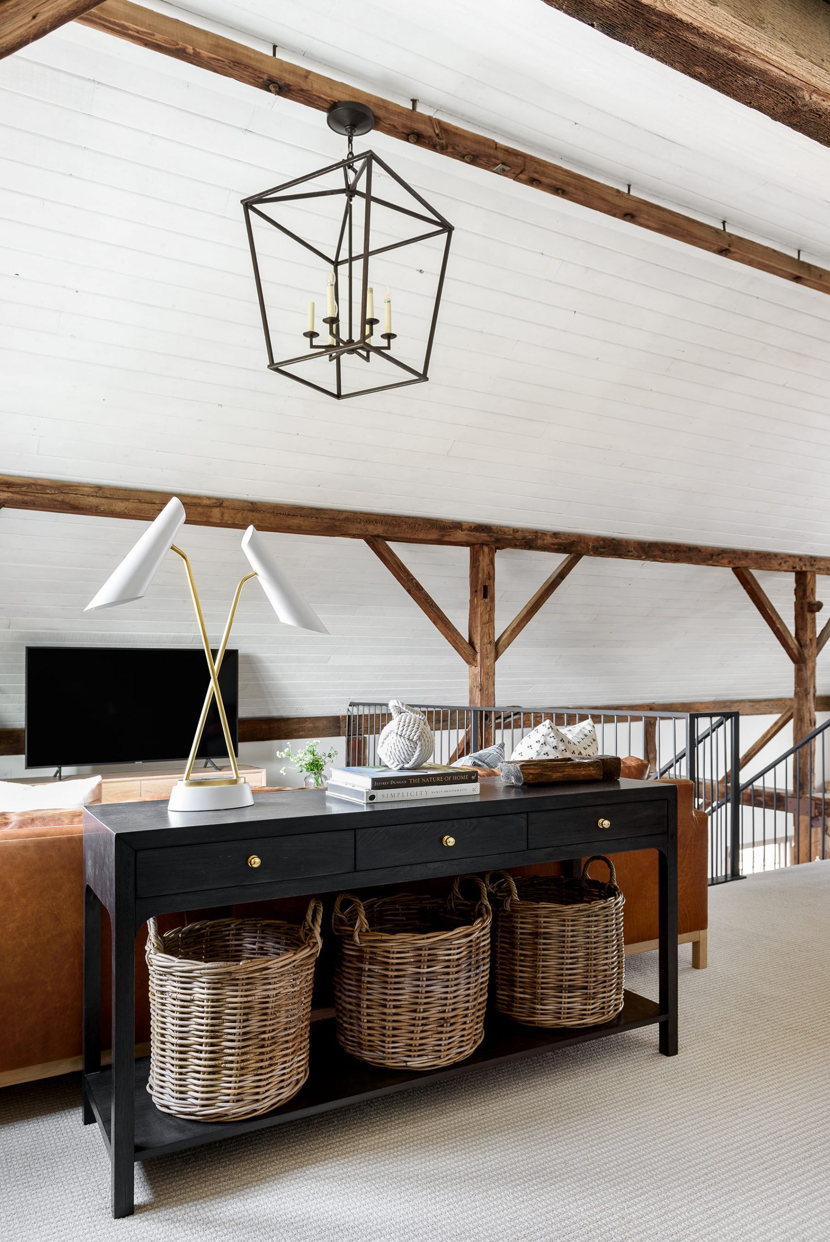
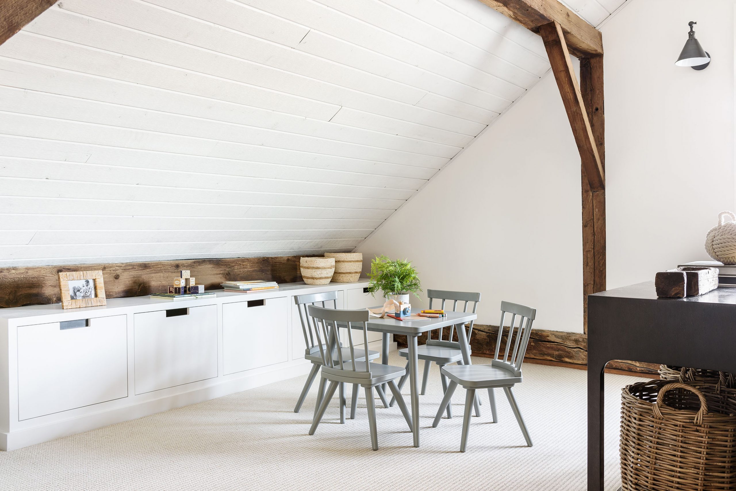
In our Historic Netflix Loft Remodel, we could maximize functionality by placing a sofa near the center of the room and creating a play area for the kids behind the couch.
Separating these pieces with a console also created a barrier that made them feel distinct. We love that our clients now have a multi-purpose space for playing and relaxing.
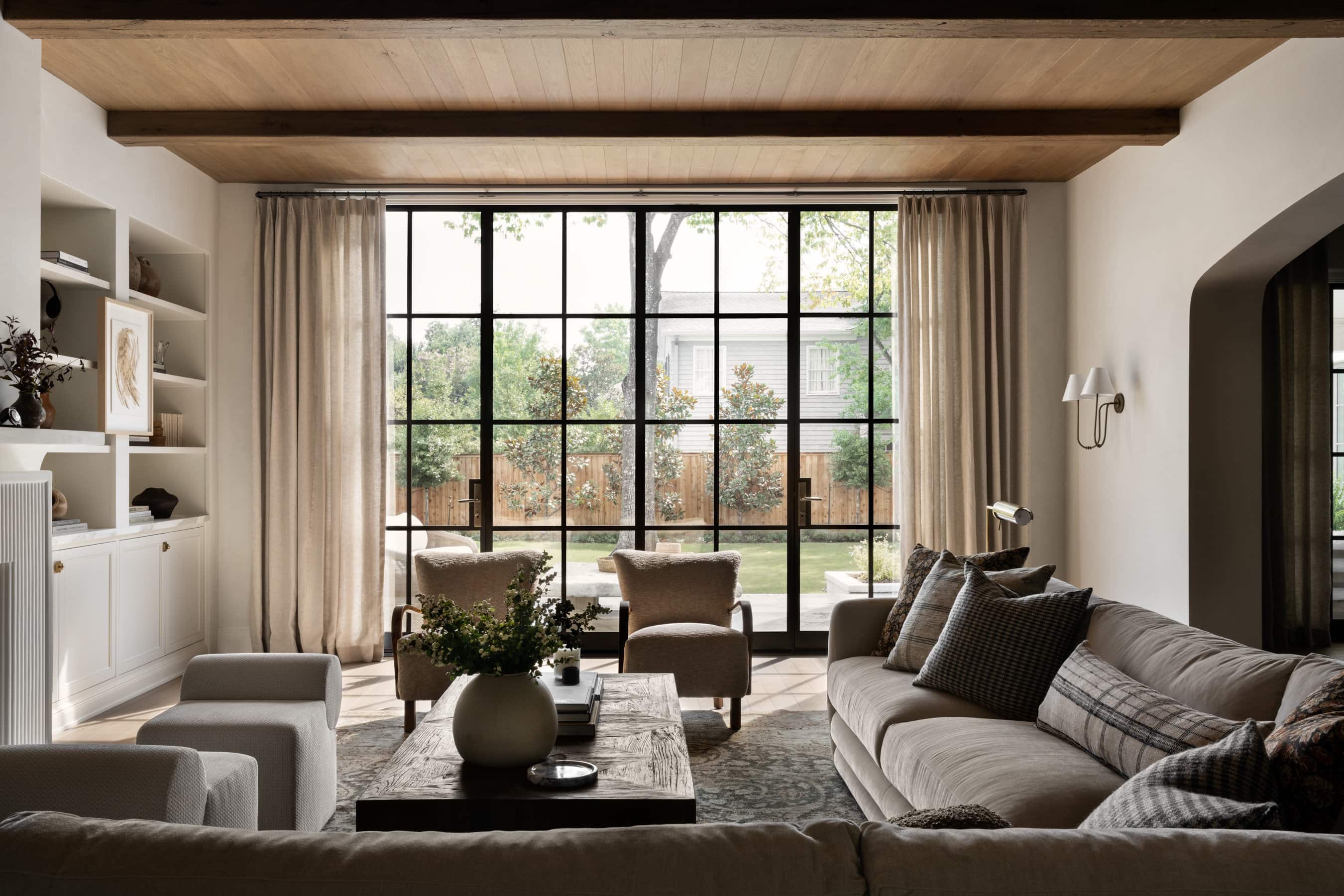
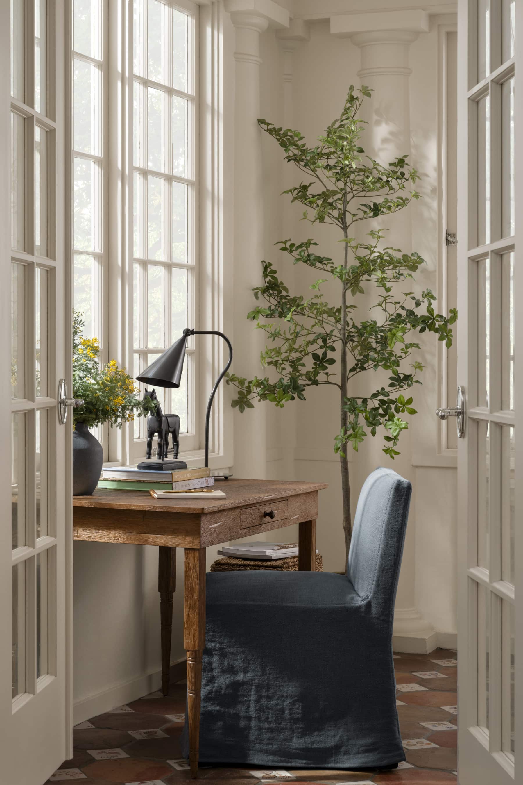
No. 2: Embracing asymmetry
Whether you want to balance an asymmetrical element or you want to bring more interest by intentionally creating some imbalance, embracing asymmetry can take a design to a whole new level.
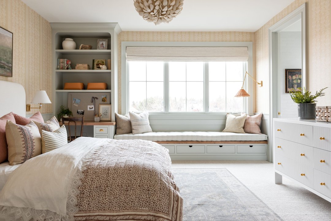
In Wren’s room from The McGee Home, the design didn’t allow for her window to be centered. We wanted to bring some balance back into this space, so we added a window seat and built-in bookshelves above her desk to set the scene.
Not only did the shelf create balance, but it allowed us to add more color and personality to the look with expressional built-ins and a cool blue-grey hue.

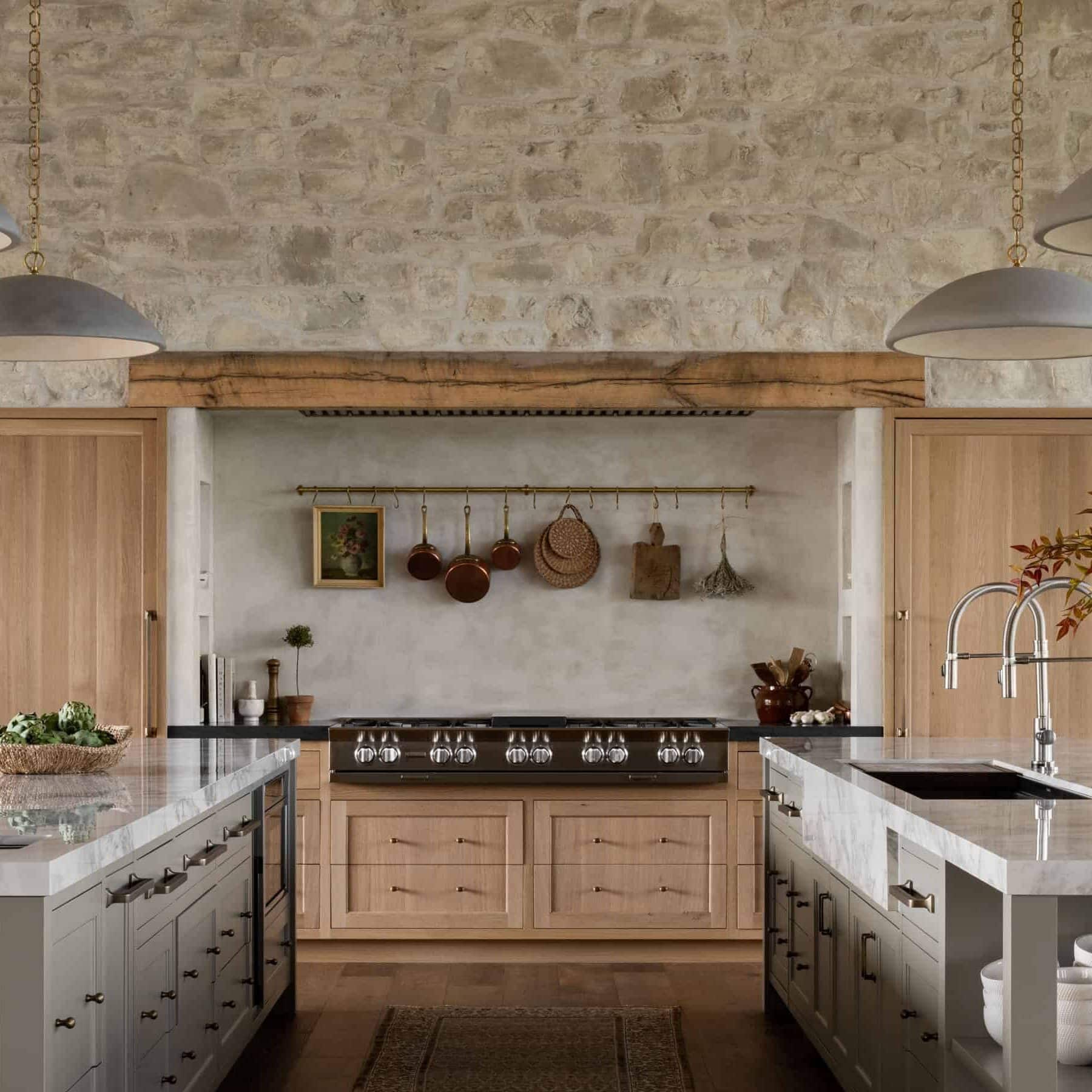
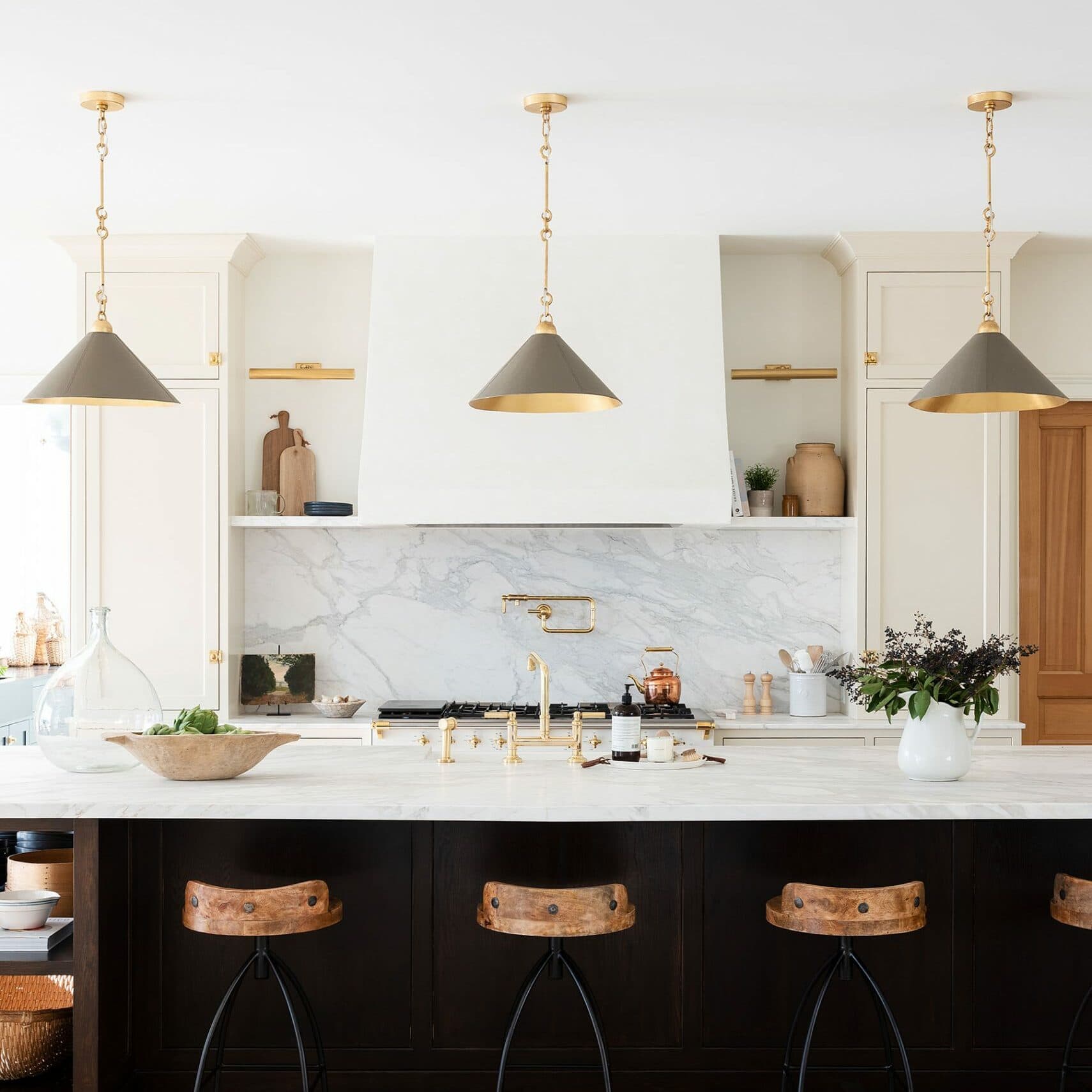
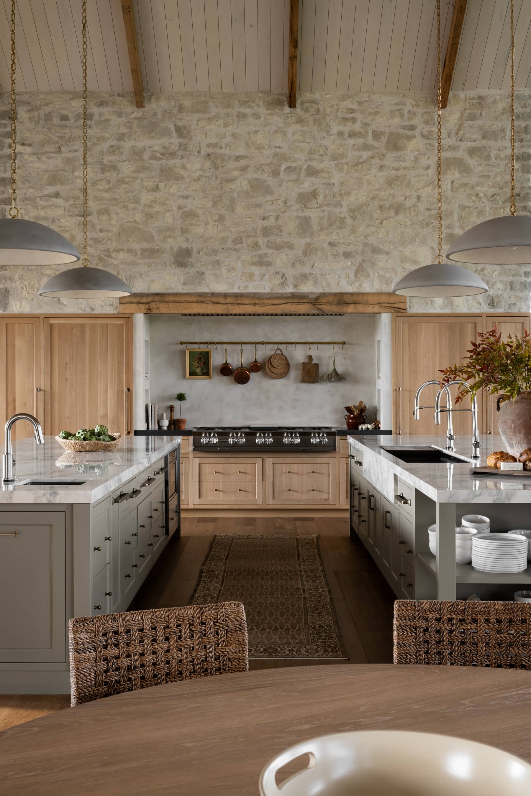
Sometimes (in design and life,) the best results come from pivots, which was definitely the case with our Crestview House kitchen.
In our original plans, we had an extended hood and a more traditional, symmetrical island. However, we shifted at the last minute to consider our client’s love for cooking and added more prep space by eliminating the extended hood and building a butcher block into the island’s end.
We love the asymmetry this creates in their space, and it ended up being our client’s favorite element.

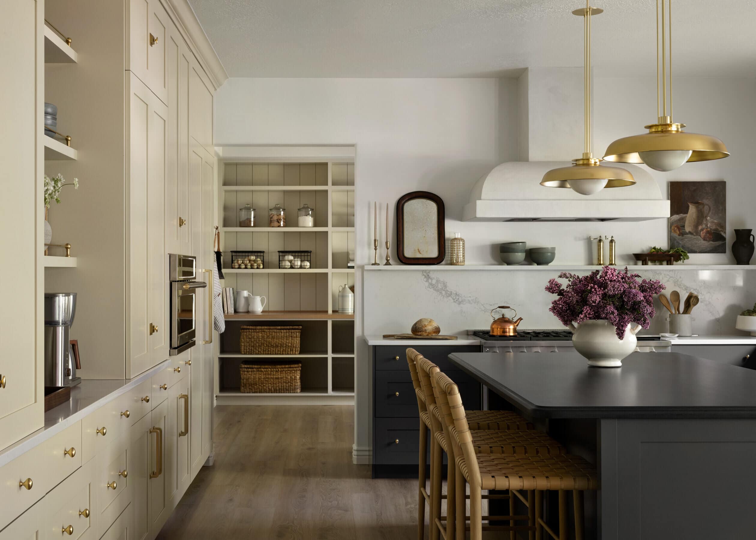
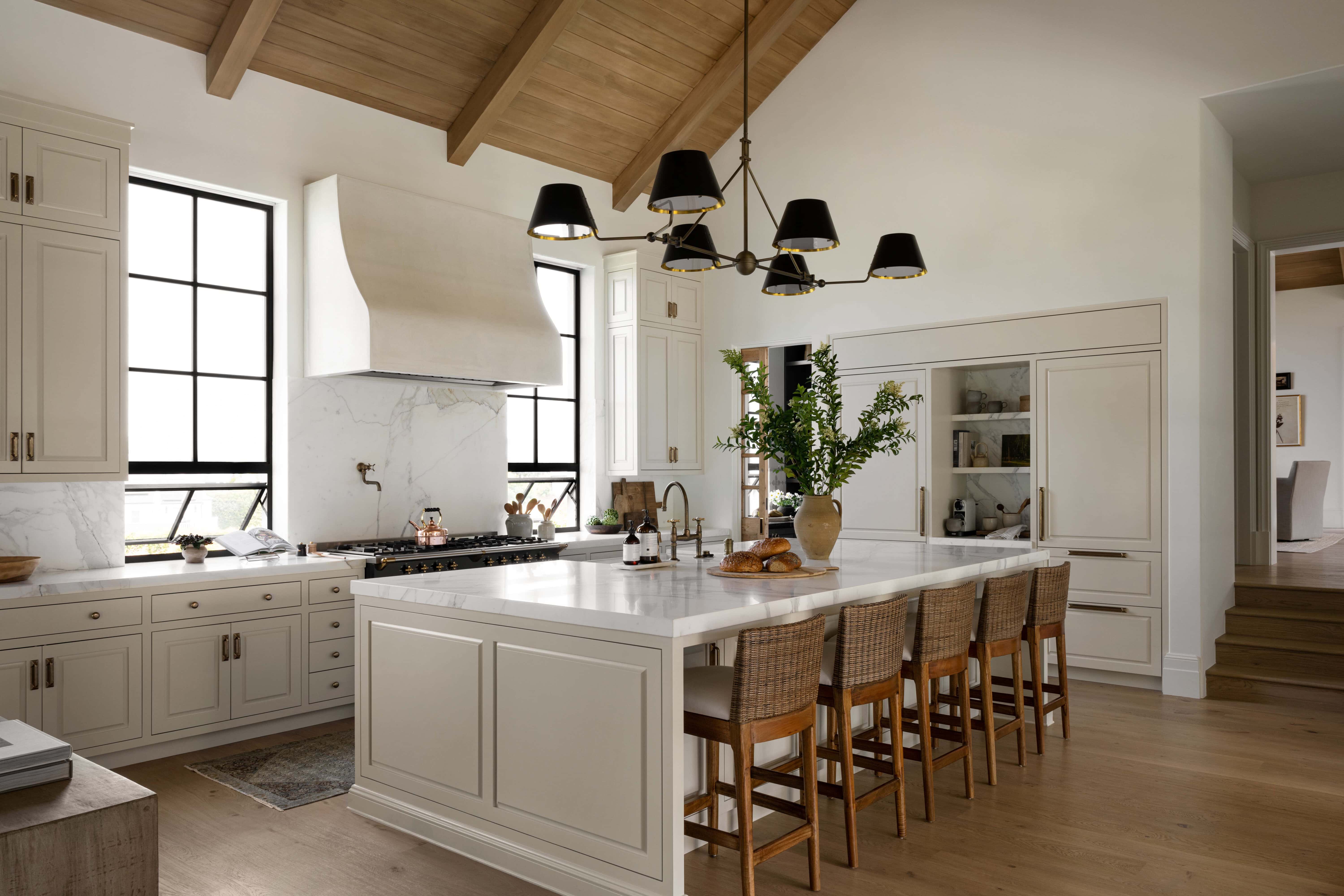
In The McGee Home kitchen, there was a lot of symmetry happening around our island’s focal point, and we felt like we needed to add something to throw it off just a little bit.
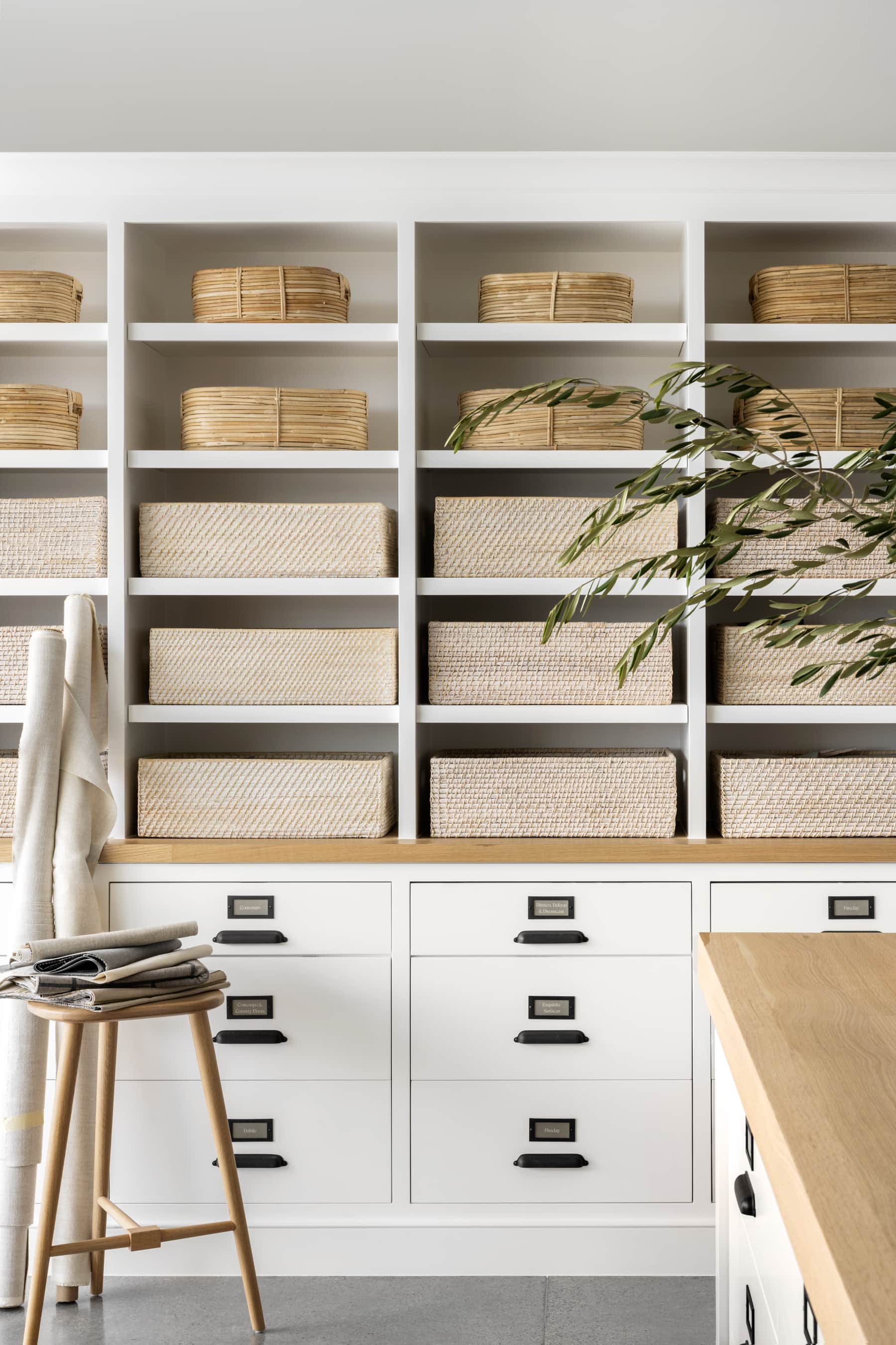
We ended up creating this piece at the end of our island to feel more like a piece of furniture, and it’s open-nature breaks up the closed cabinetry, allowing for more visual interest.
No. 3: Think outside of the walls
One of the challenges of a remodel is seeing the potential outside of the box (and sometimes, the walls). Although re-structuring can be intimidating, making a few changes can completely transform the way you live in your home.


Before we started working on our Cove Remodel, the sitting room had two arches encased in a faux stone that limited the space’s form and function.
Although we usually don’t like to close things up, closing up the smaller opening and creating a french door moment through the entrance made much better use of the space and allowed for less visual distraction.

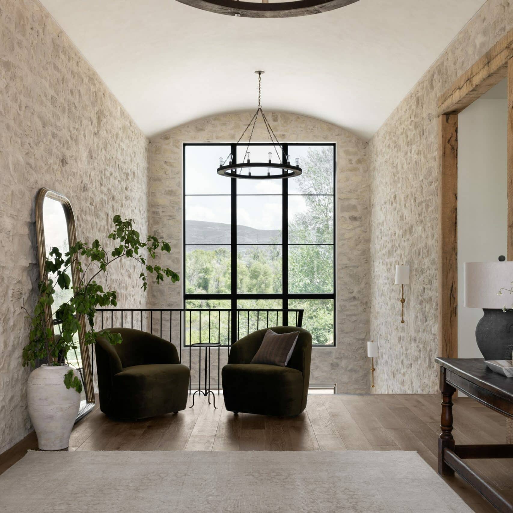
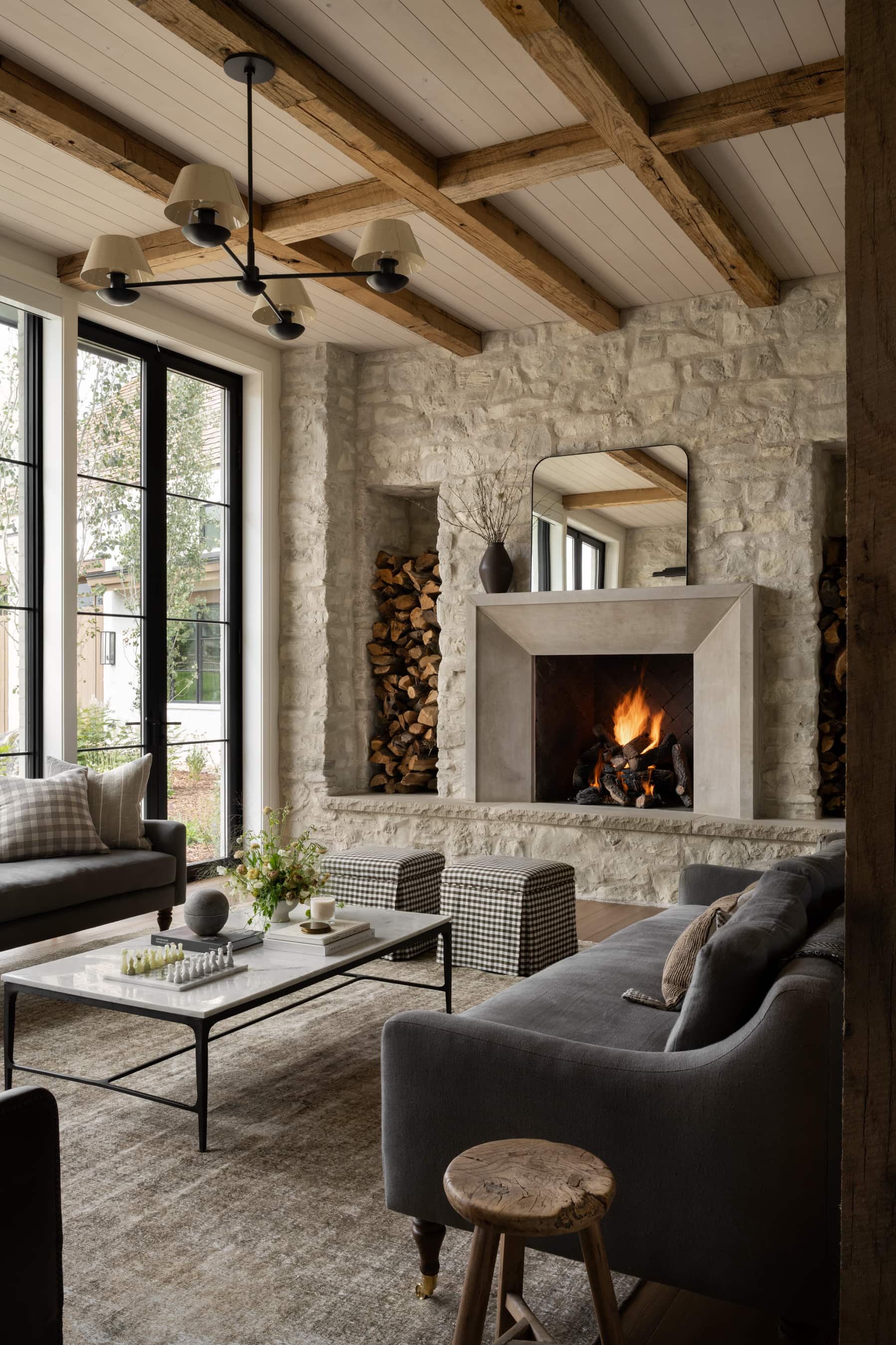
When we walked the site of our Crestview House, and it was just framing, the ceiling details were a little.. funky. So, we decided to create the ceiling details we wanted.
We realized that we had a lot of vaulted space, and so we built as high into it as we could, and we couldn’t be happier about the open feeling it brought.

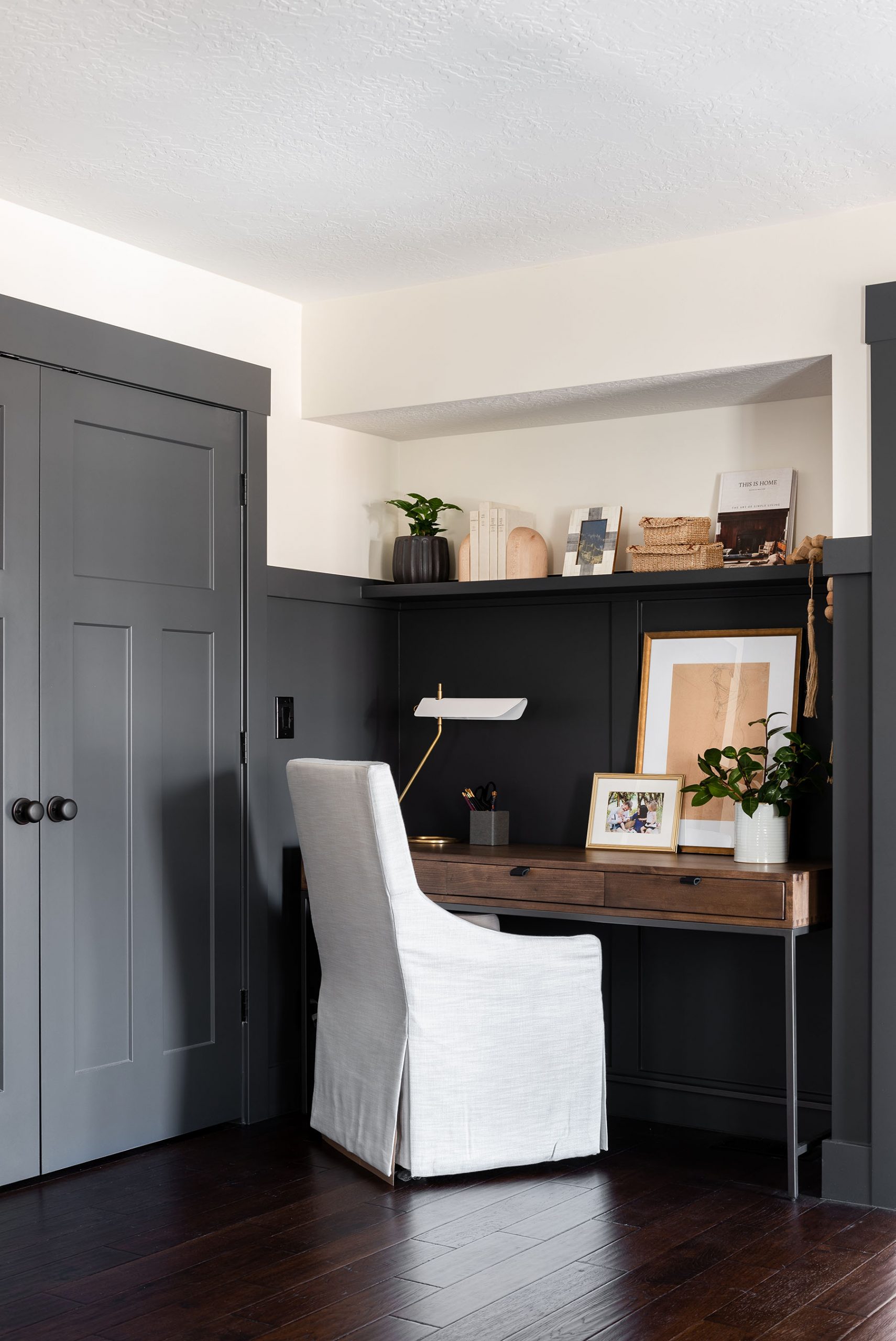
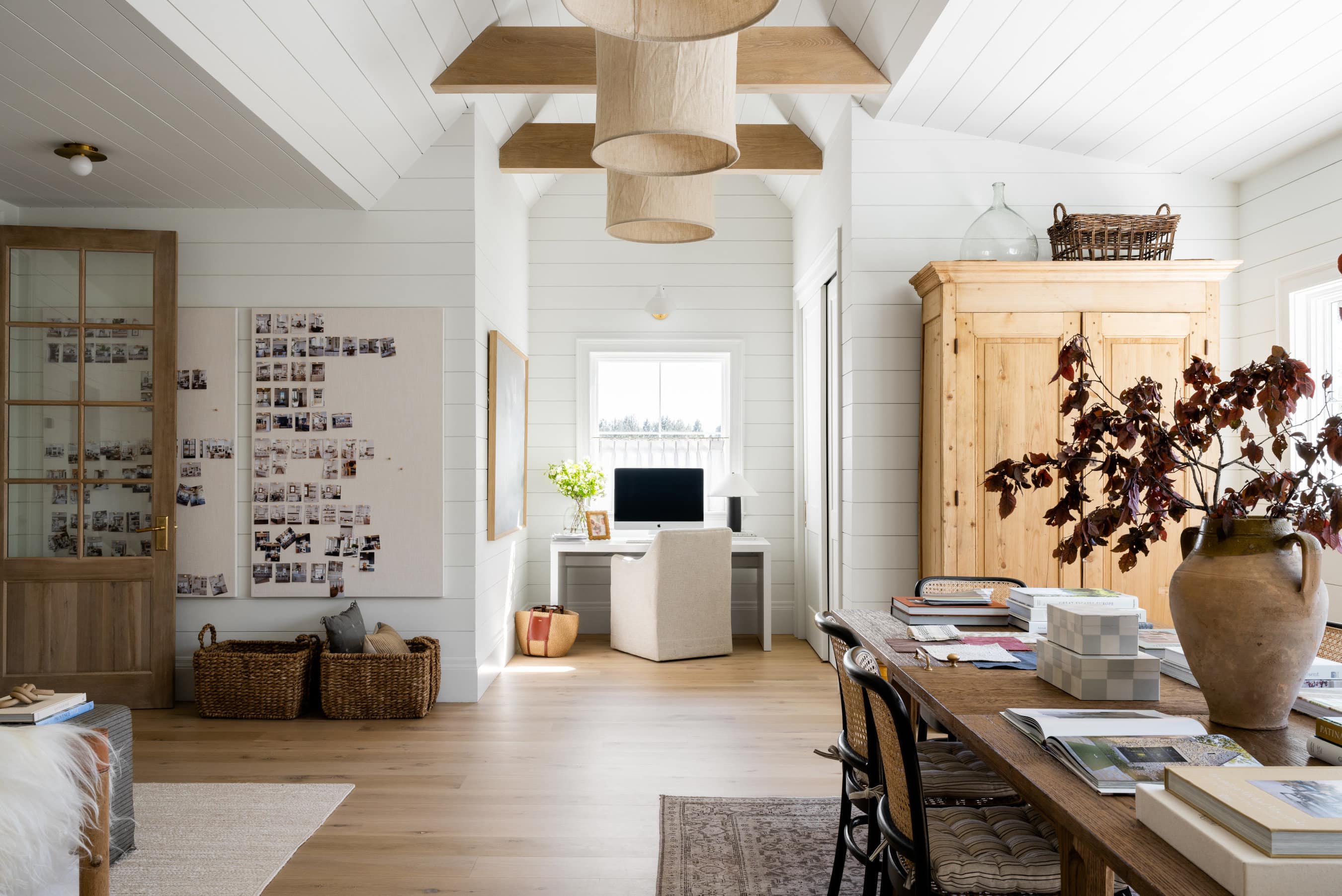
In our Bright & Moody Netflix Project, recently featured on our Netflix show “Dream Home Makeover,” our clients really wanted to include an office nook in their open-concept living space.
While we were a little short on square footage, our clients had a storage closet behind the room that they longer needed, so we decided to knock it out to create a small indented area for a desk and chair. In the end, the overall look and feel of the room are much more open, and we love the function the desk-nook brings.
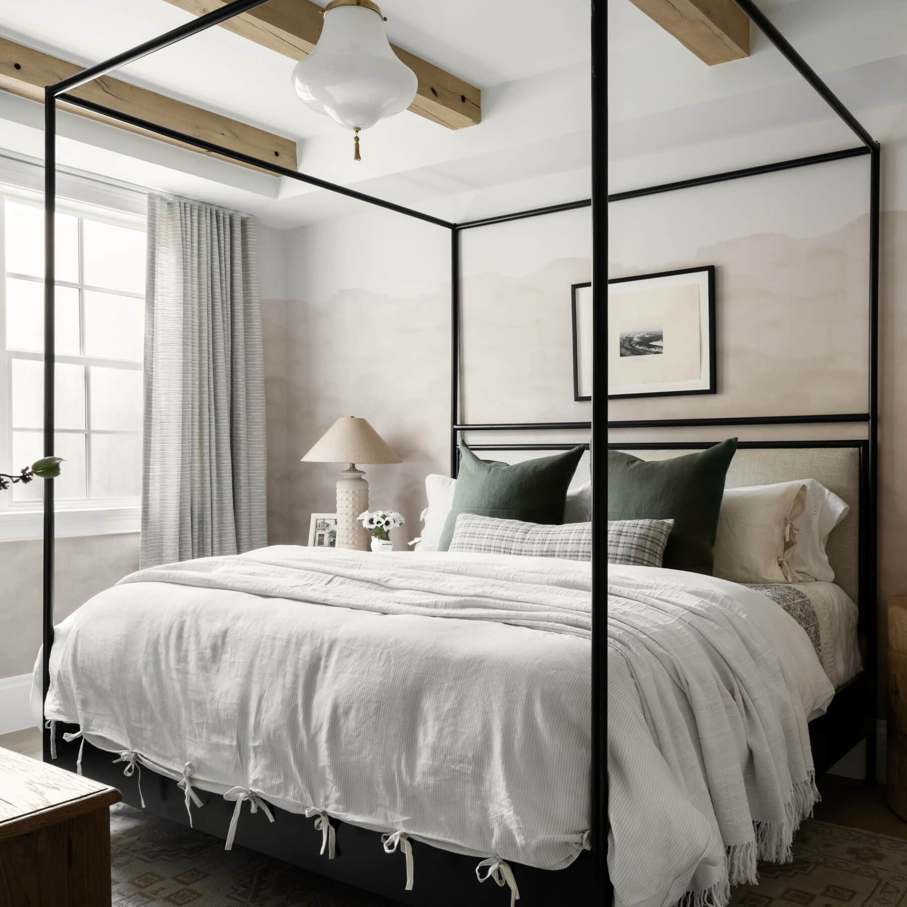
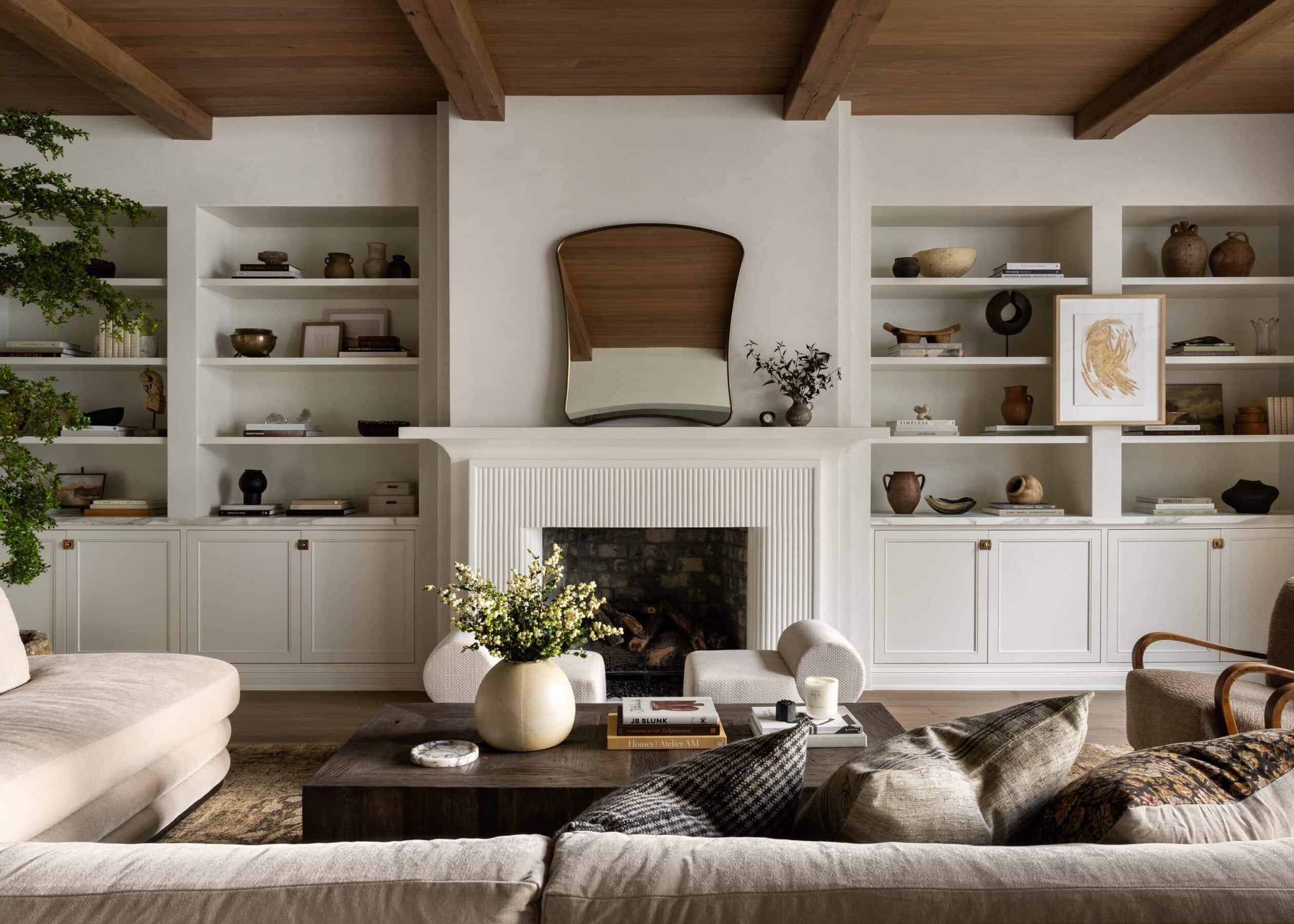
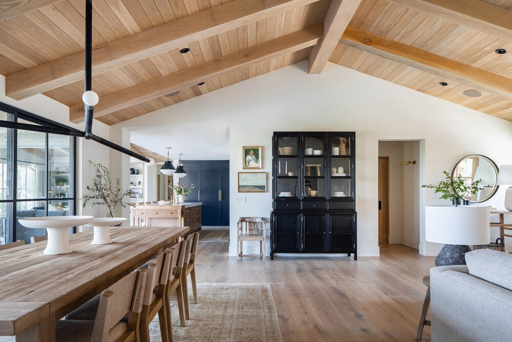
No. 4: Add dimension with ceiling details
Before you treat the ceiling like an afterthought, consider making a statement to add more dimension.
We love adding beams, wall treatments, paint, and even wallpaper to ceilings to bring interest. While you wouldn’t think that a ceiling would make such a big difference in your space, it’s amazing what some texture and tone will do.
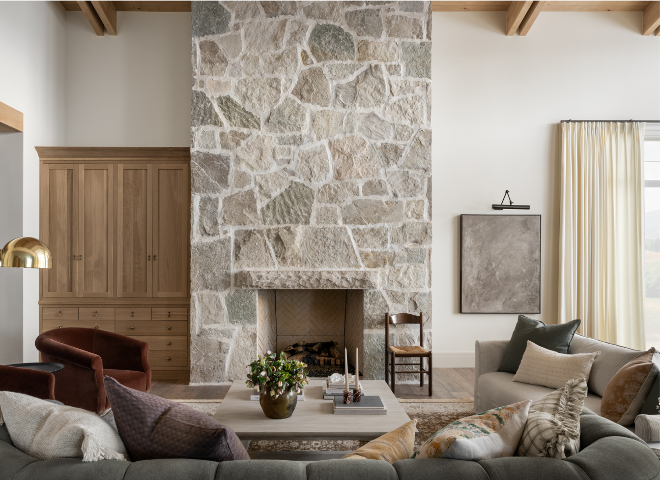
In our Crestview House, incorporating a light oak wood to the ceiling created a feeling of warmth and character that brought the entire design to the next level.

In the girl’s room from our Rye, NY project, we found this amazing vintage wallpaper for the ceiling to draw the eye up and create a whimsical but sophisticated feeling that makes us want to move right in.

Rather than painting the ceiling white in The McGee Home Office, we decided to carry through the deep-hued paint on the walls up to the top. This is an easy way to create a statement on your ceiling because it feels simple and streamlined but still adds interest.
You May Also Like