


Personalizing Your Space with Pattern
16 August 2022 -
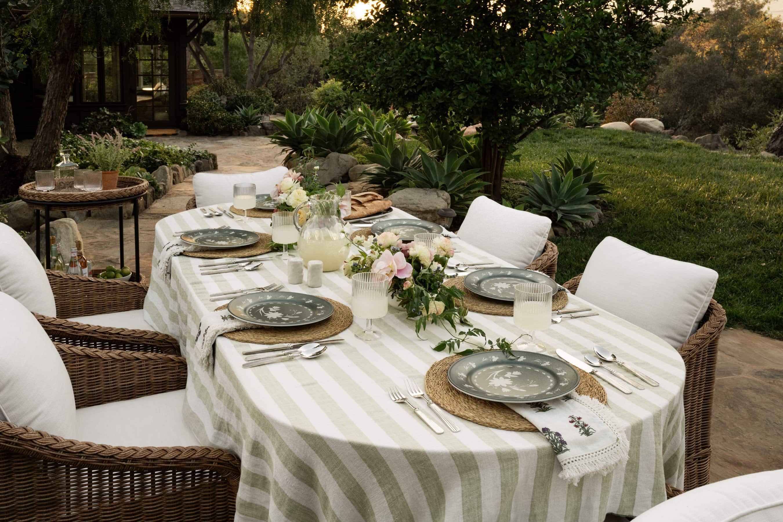
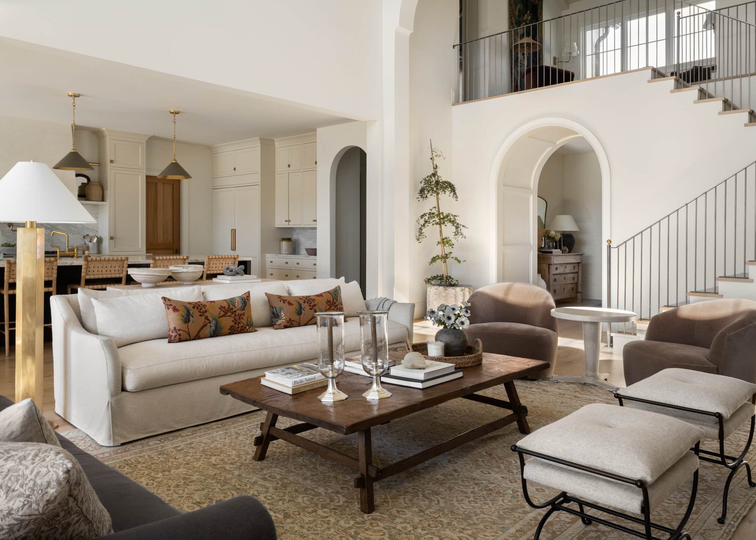
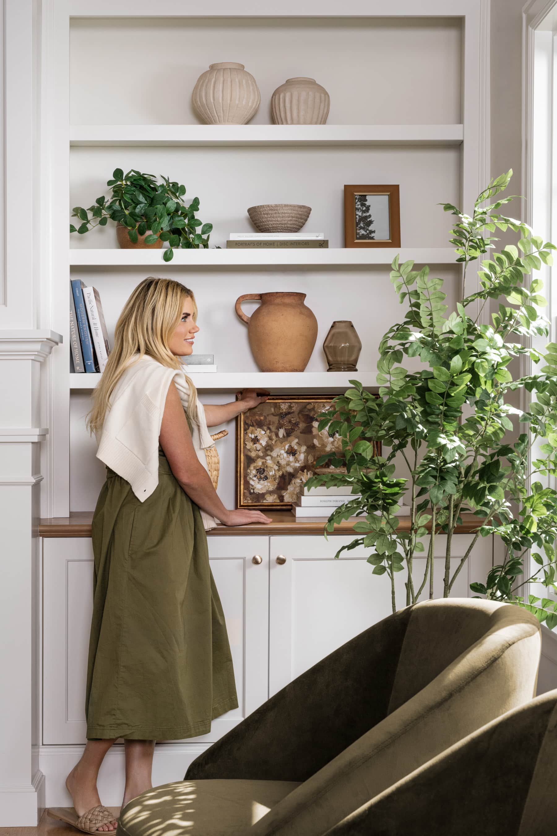
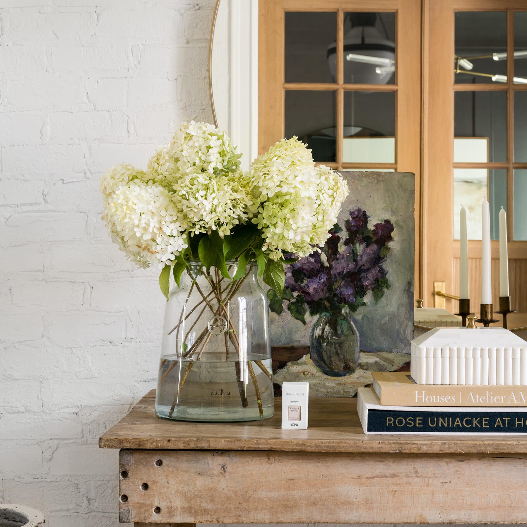
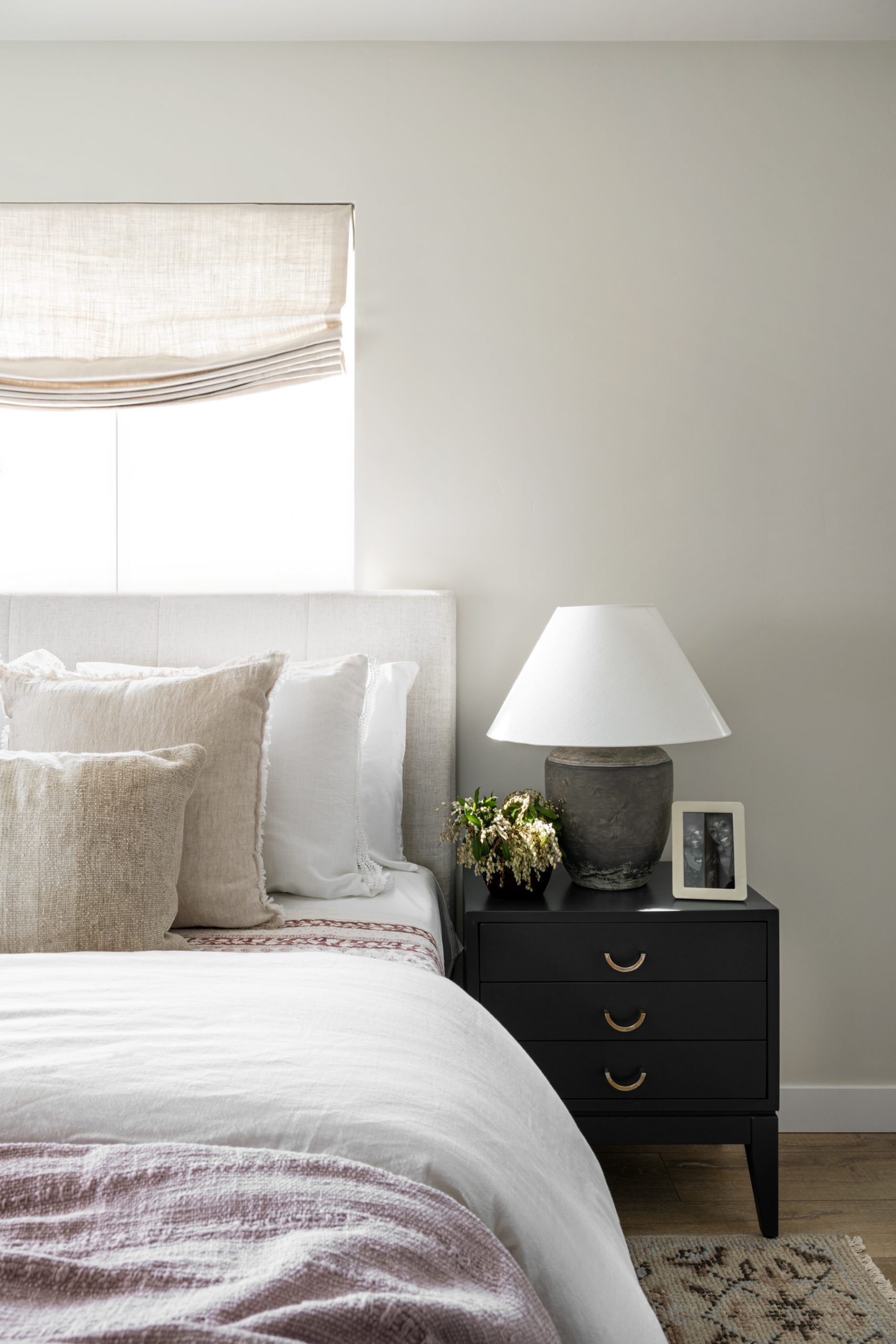
You don’t need vibrant colors to make a space stand out.
In fact, we kept things light and neutral in Mary’s home renovation, leaning on patterns to give it a cozy charm. Episode two of Season 3 provides so many practical ideas for designing your space, which Shea goes into detail in this webisode. Here, we’re highlighting the element of pattern for three simple ways you can add visual interest in tonal palettes. Let’s take a look!
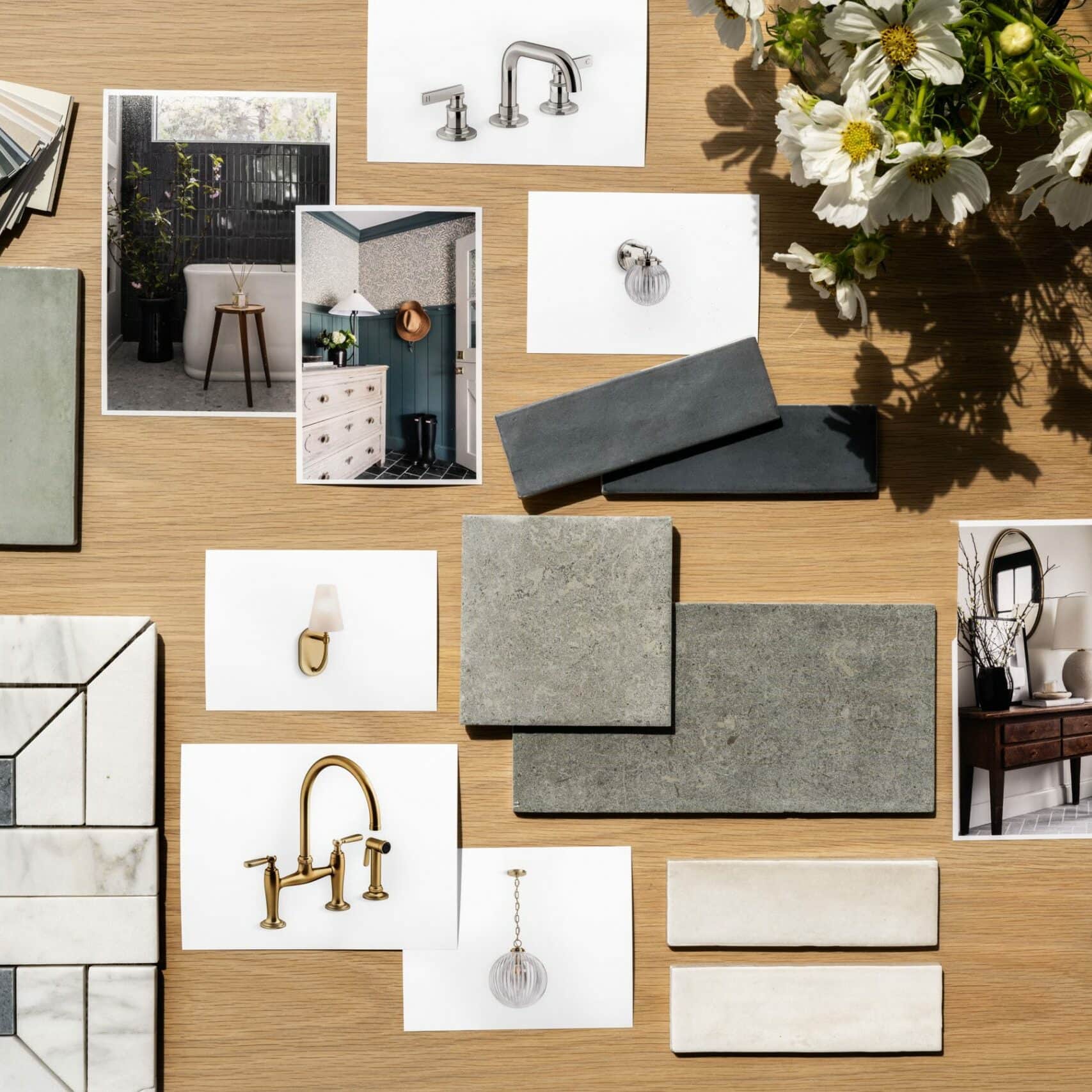
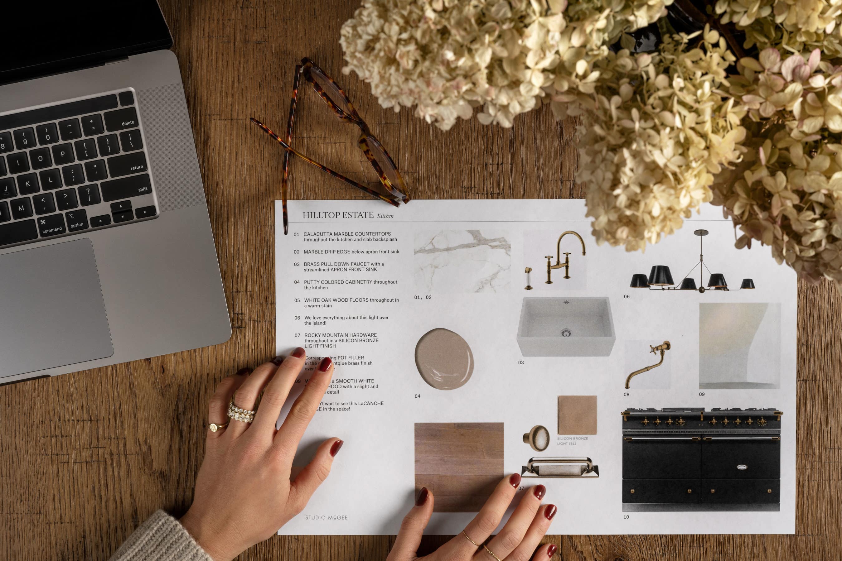
Source List from our Partners:
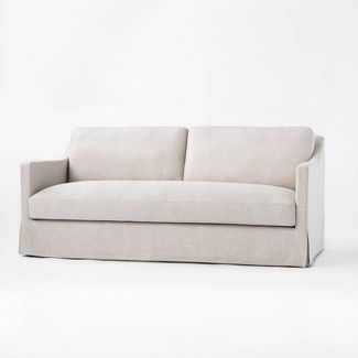
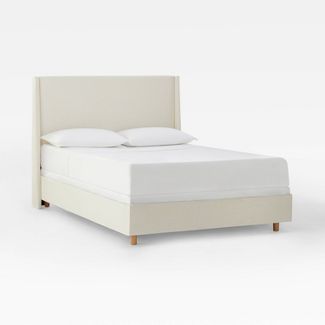
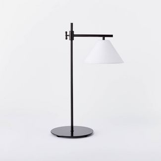
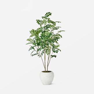
Studio McGee Decor Items: Target, Window Treatments: The Shade Store, Fireplace: Dreamcast Design, Frames: Framebridge, Baseboards / T&G: Metrie
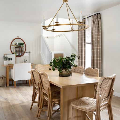

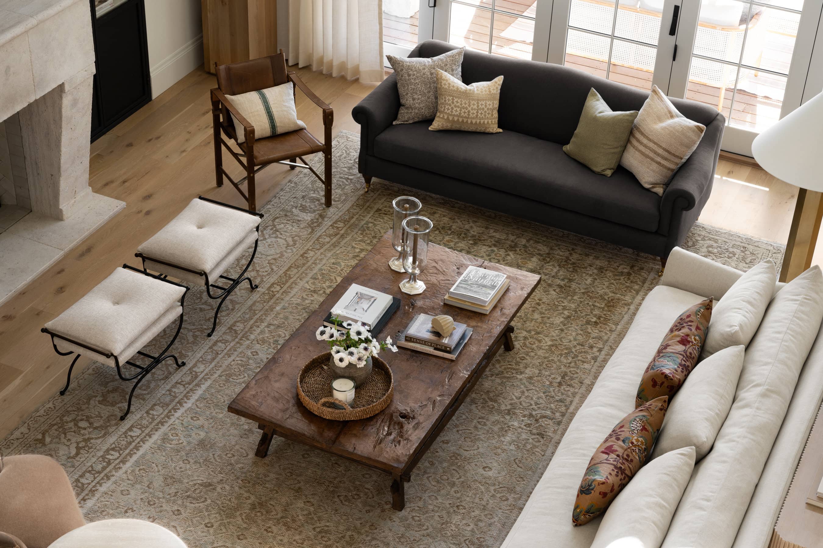
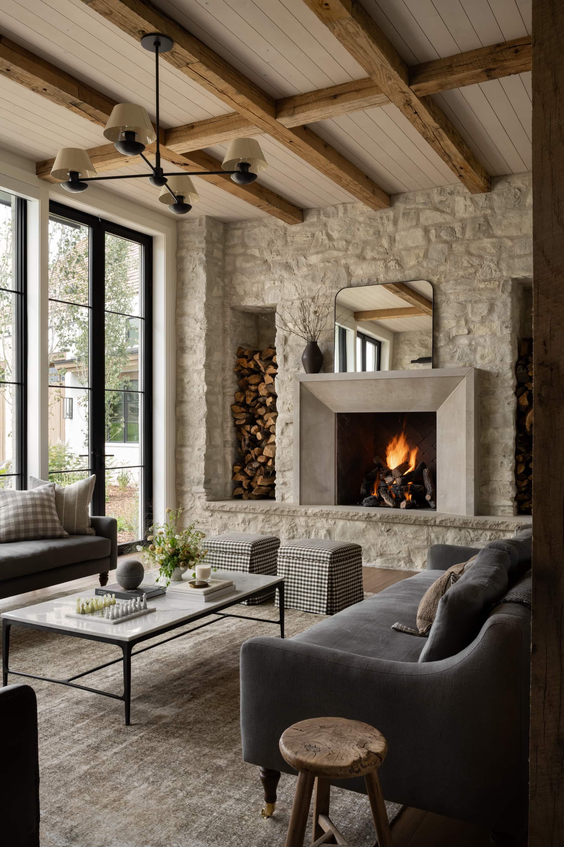
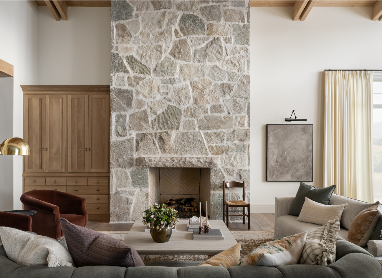
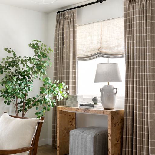
No. 1: Draw the gaze upward
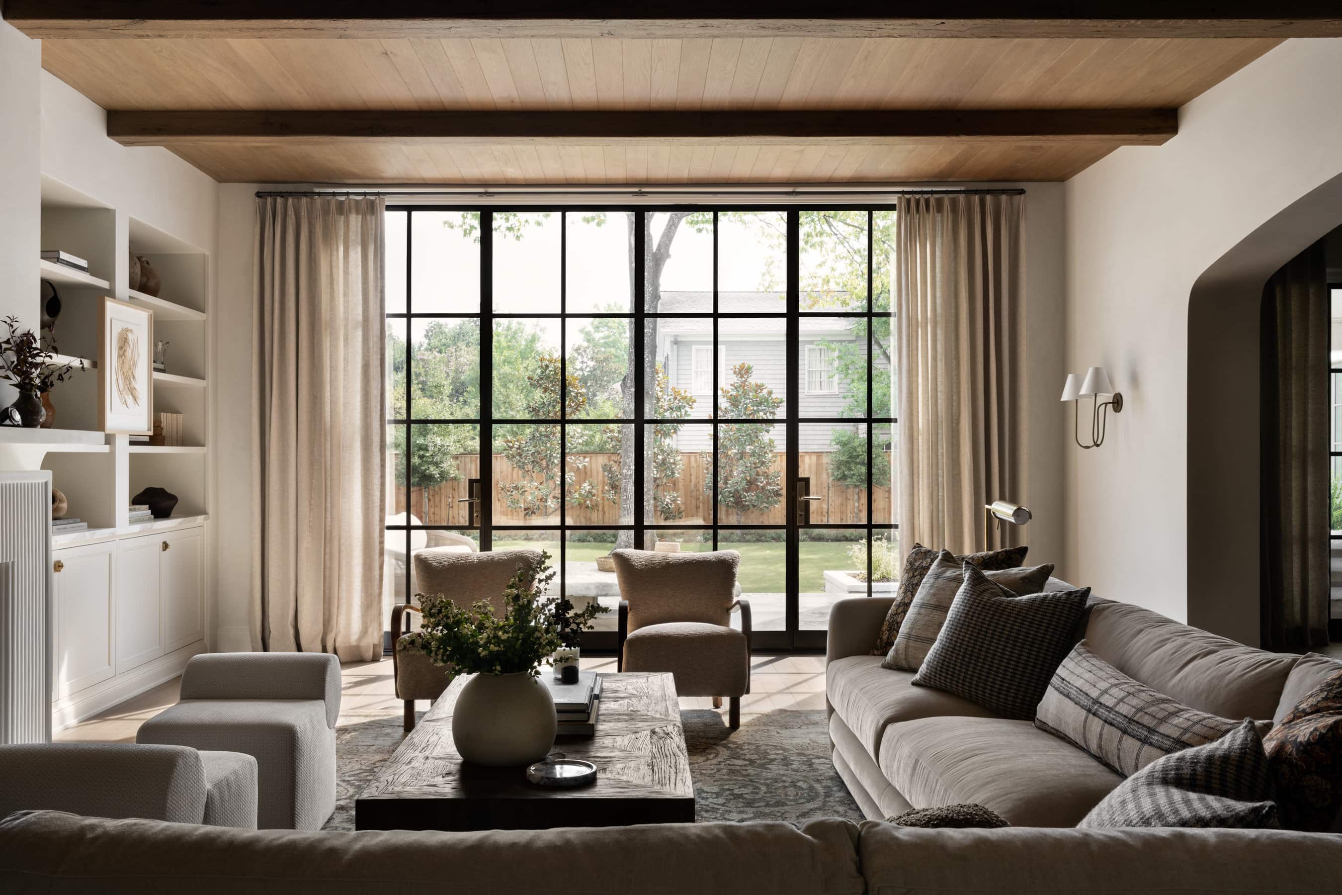
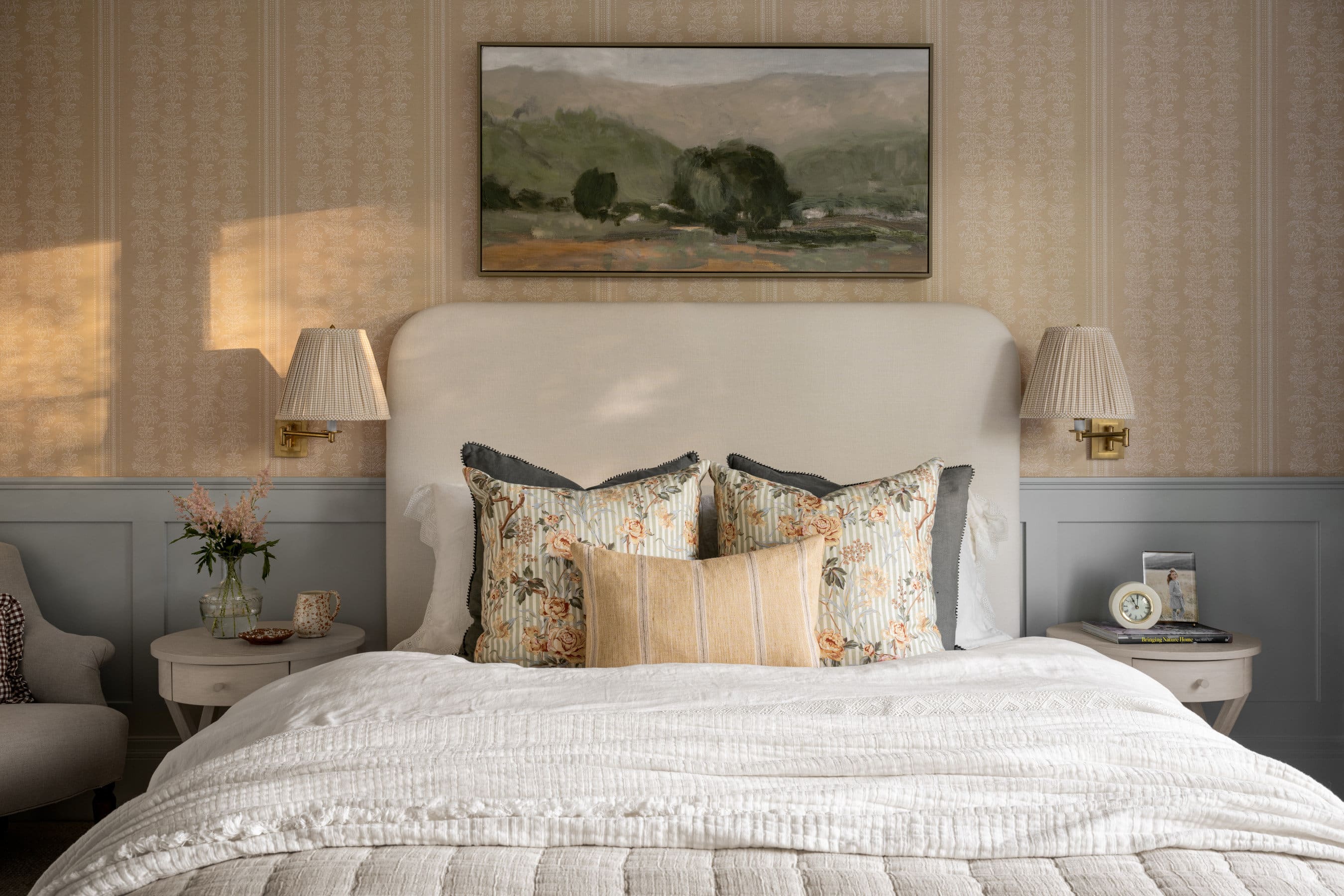
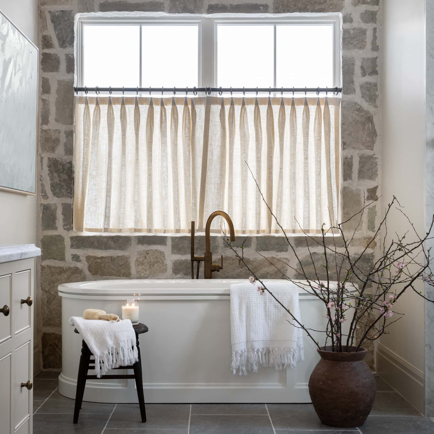
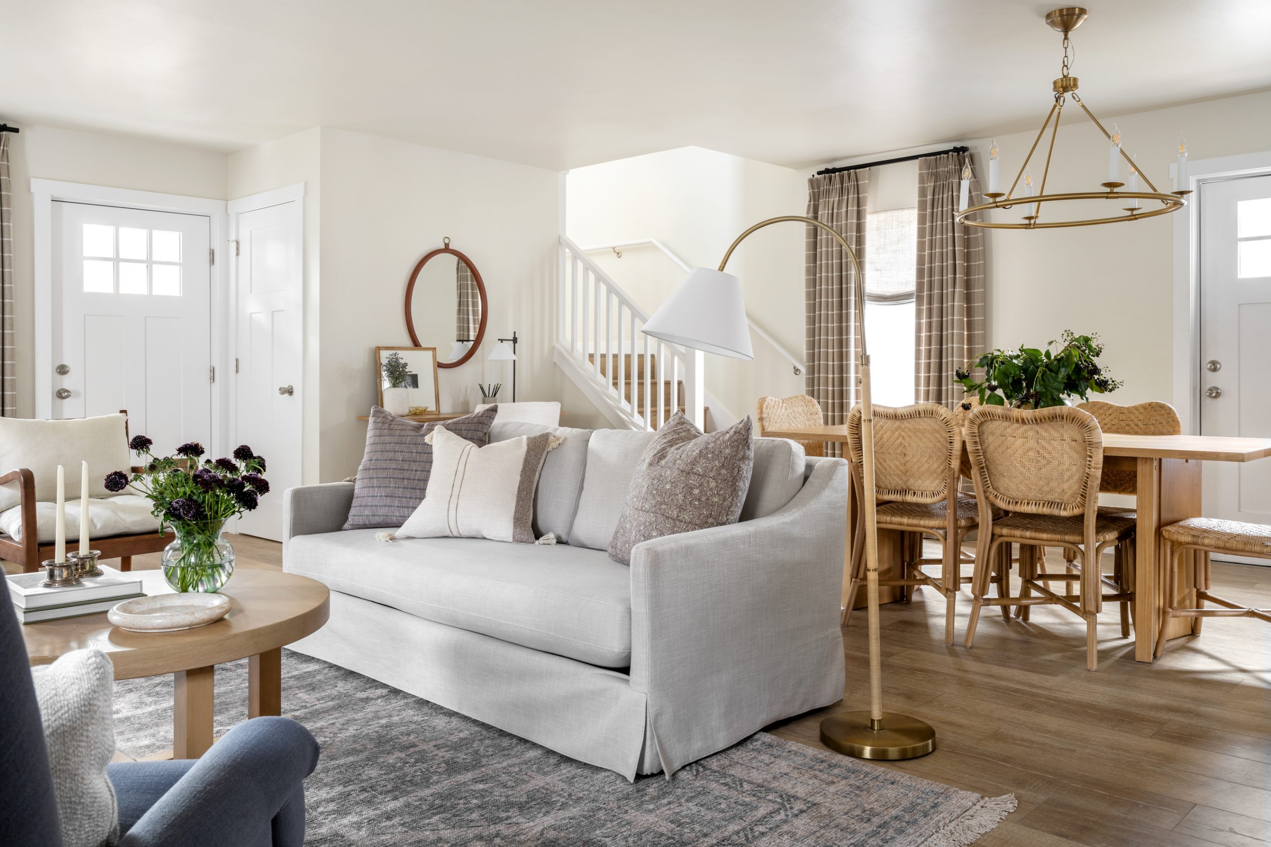
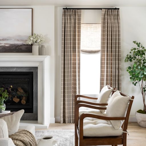
So often, the default choice for window treatments is a solid color — and with good reason! But in an otherwise neutral space, opting for a pattern on the drapes (as shown here with this cozy window pane print) brings visual balance and draws the eye upward toward the ceiling.
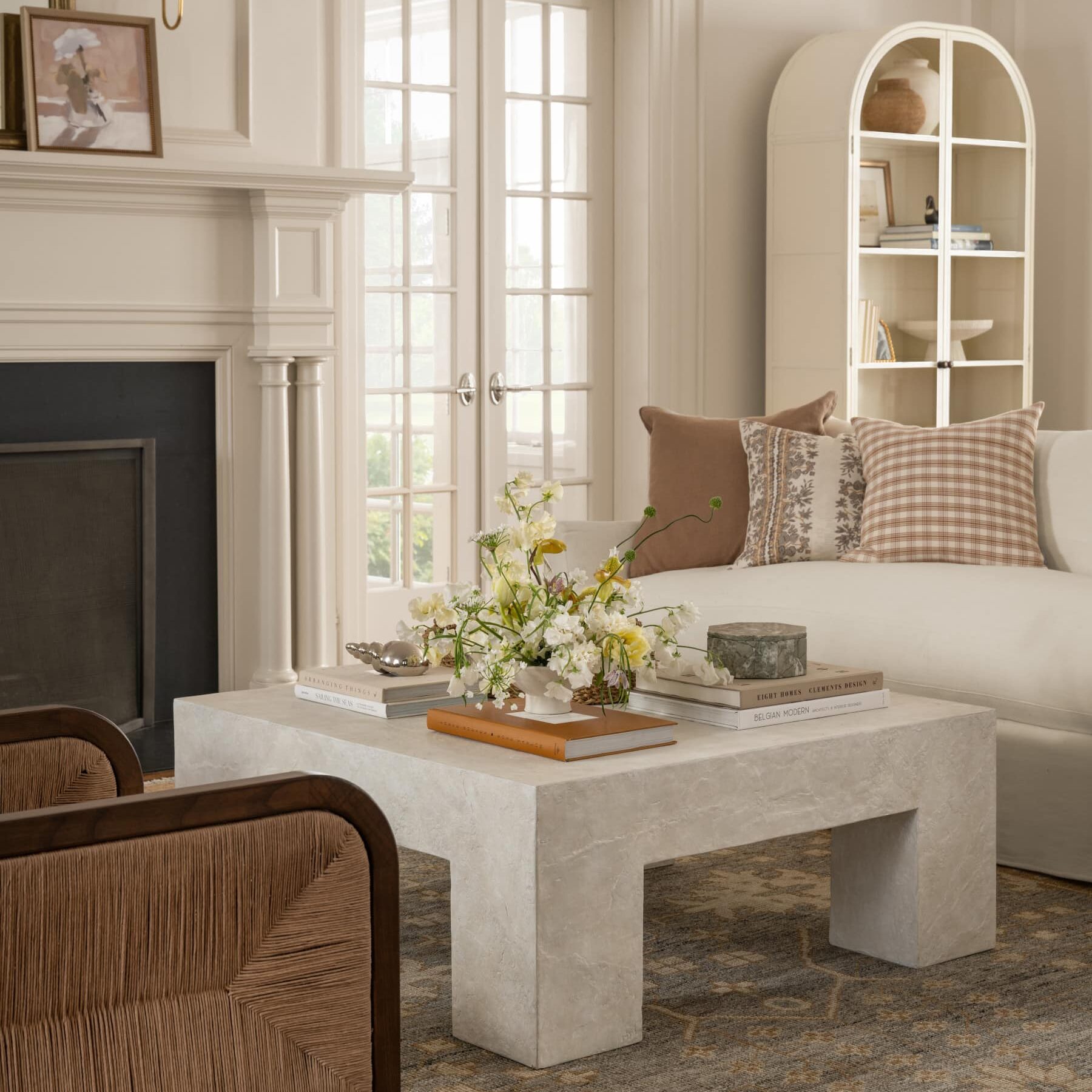
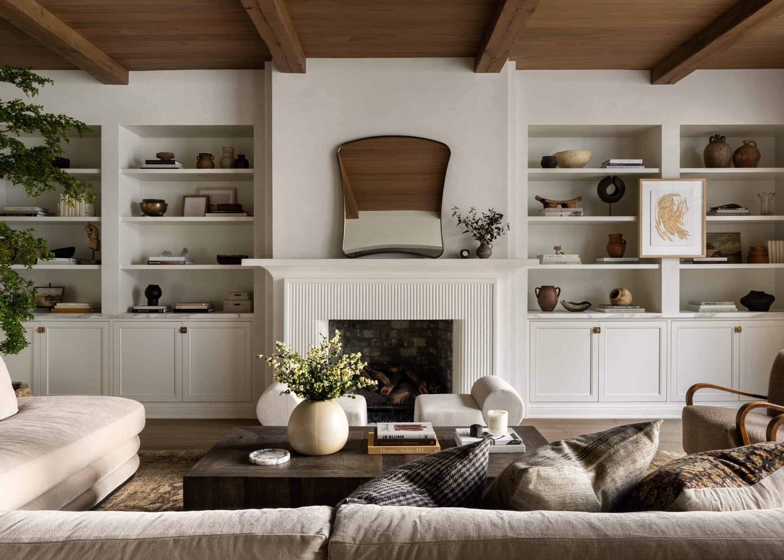
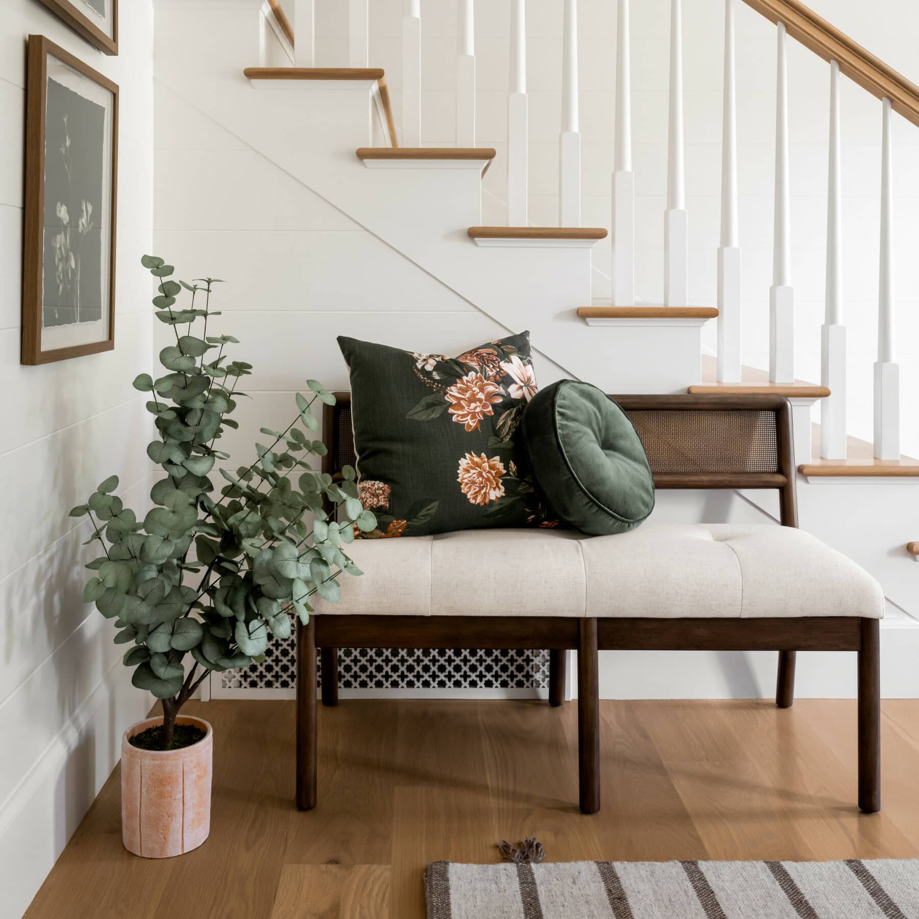
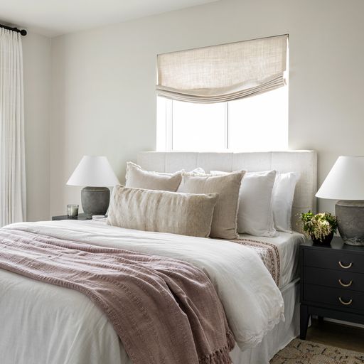
No. 2: Add texture to tonal palettes
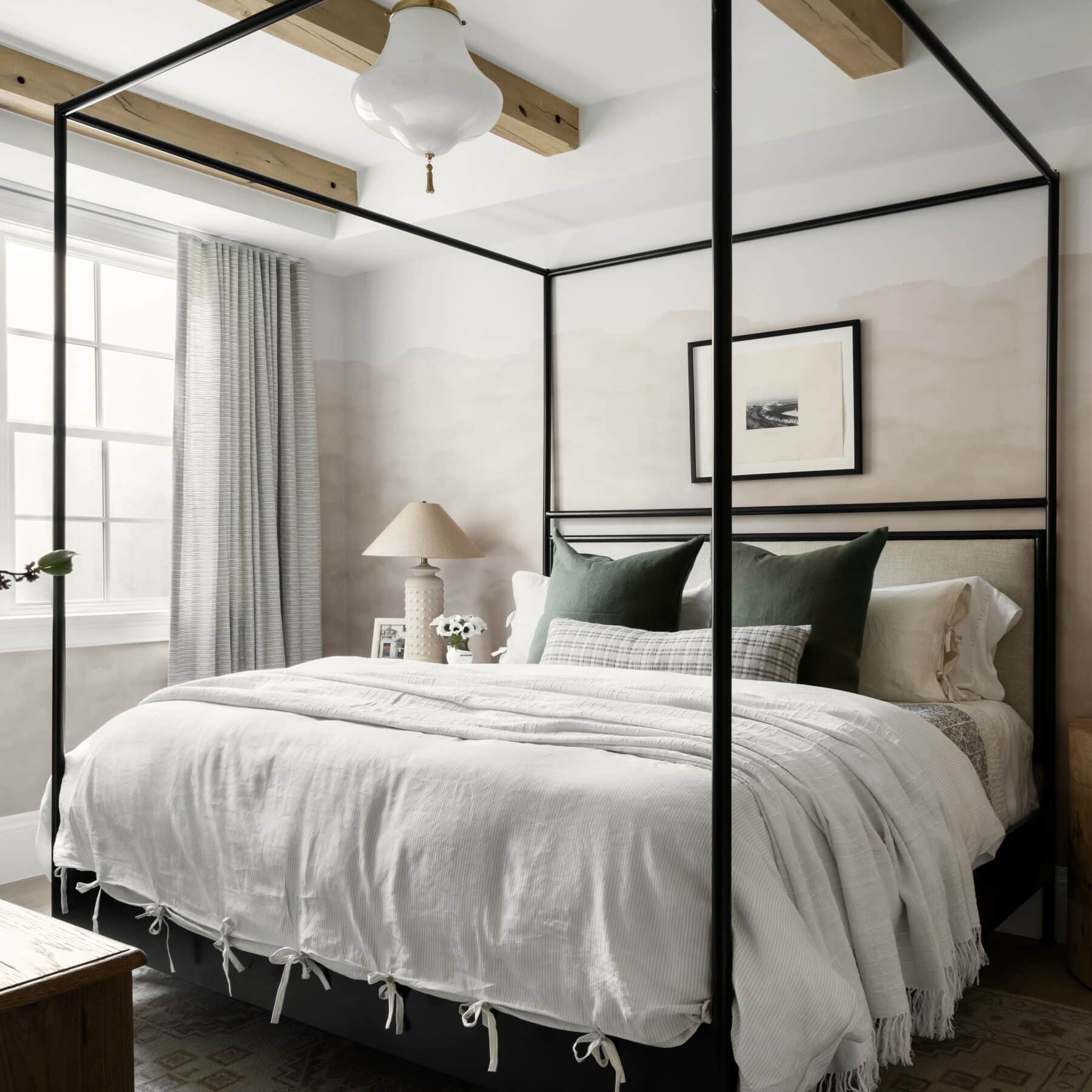
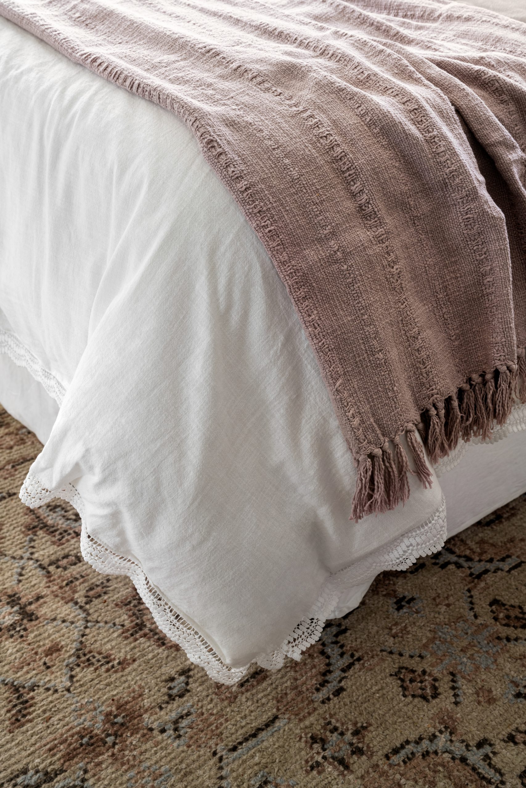
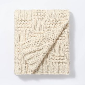
If you’re going for a singular-hued color scheme, try incorporating patterned pieces within the palette to give it dimension. Staying narrow on the range of colors affords you even more room to play with texture for interest.
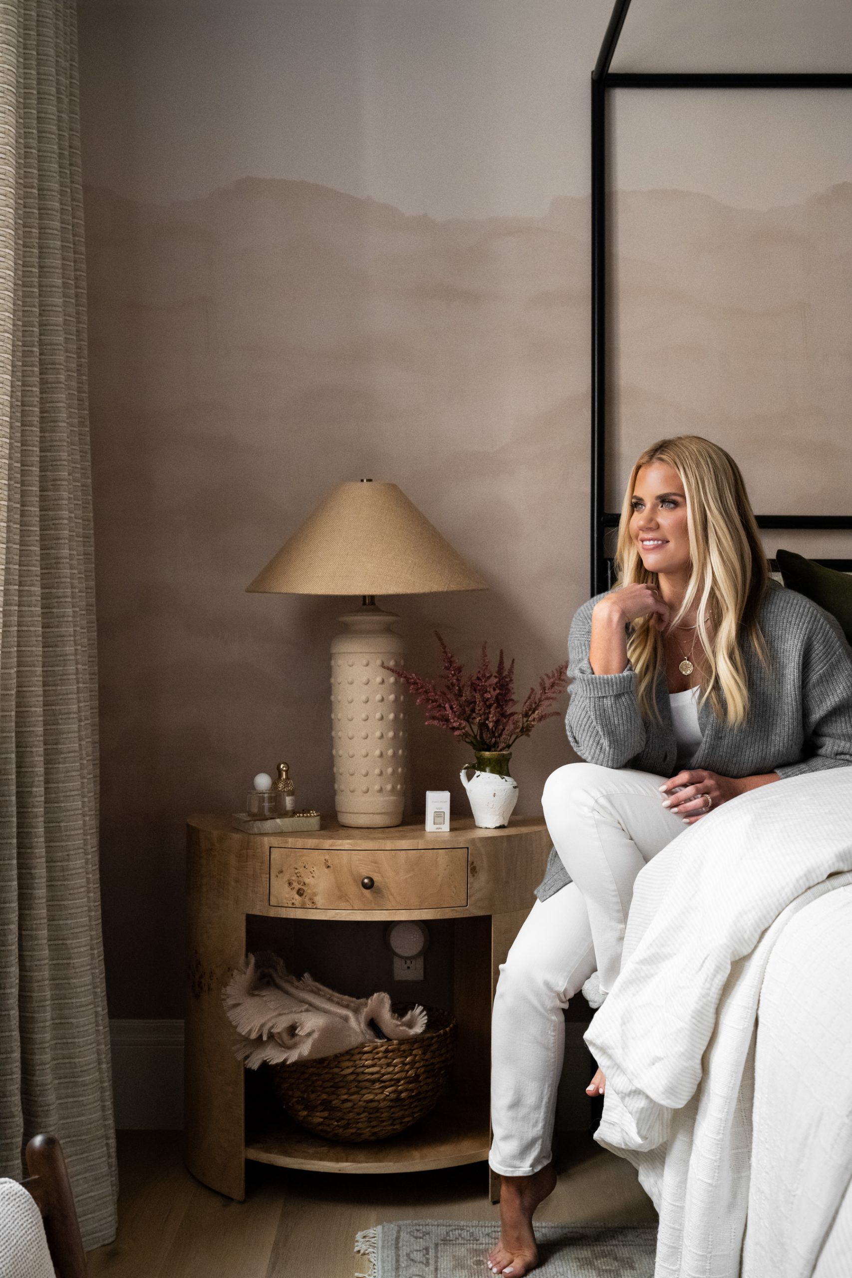
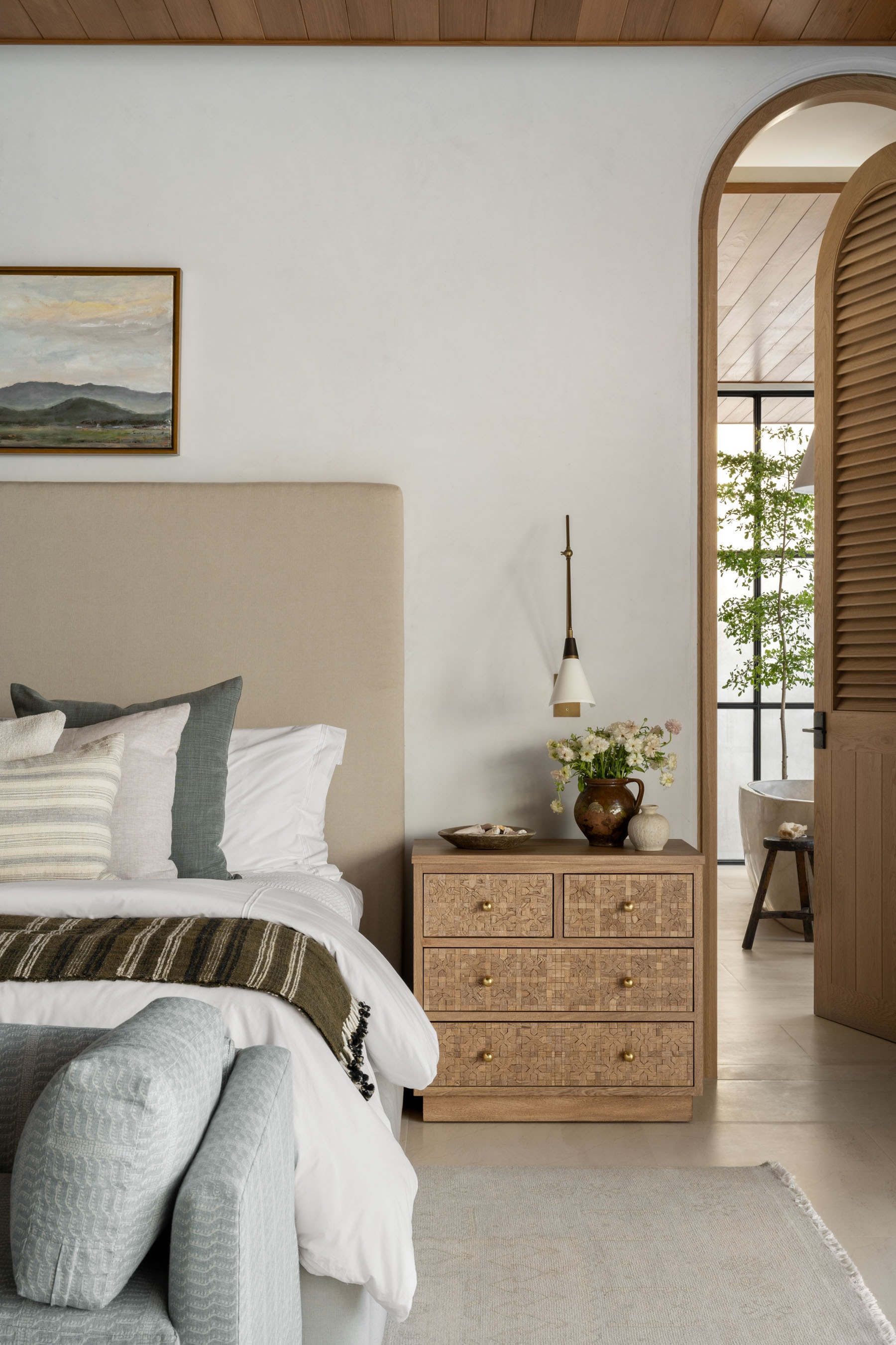
“In Mary’s bedroom, we decided to dress the bed with layered linens, a little bit of pattern mixing on the textiles, and adding that quilt into the space… it made all of the difference.”
Personalizing Your Space with Pattern
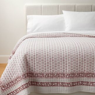
Decorative Border Cotton Slub Wood Block Print Quilt
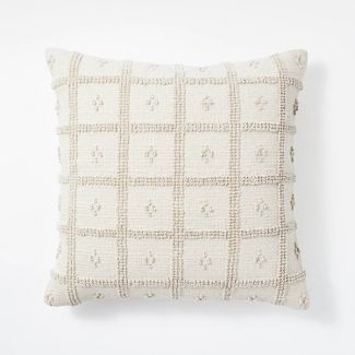
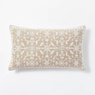
Woven Cotton Tufted Square Throw Pillow
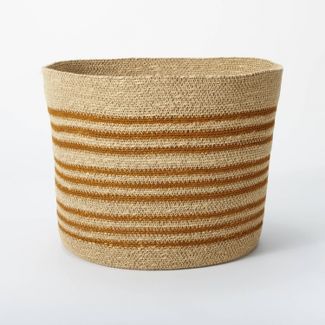
Small Soft Striped Basket
Oversized Cotton Slub Woven Jacquard Lumbar Throw Pillow

Lace Border Cotton Slub Comforter & Sham Set
Cotton Velvet with Lace Trim Reversible Throw Pillow
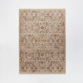
No. 3: Build the look from the ground up
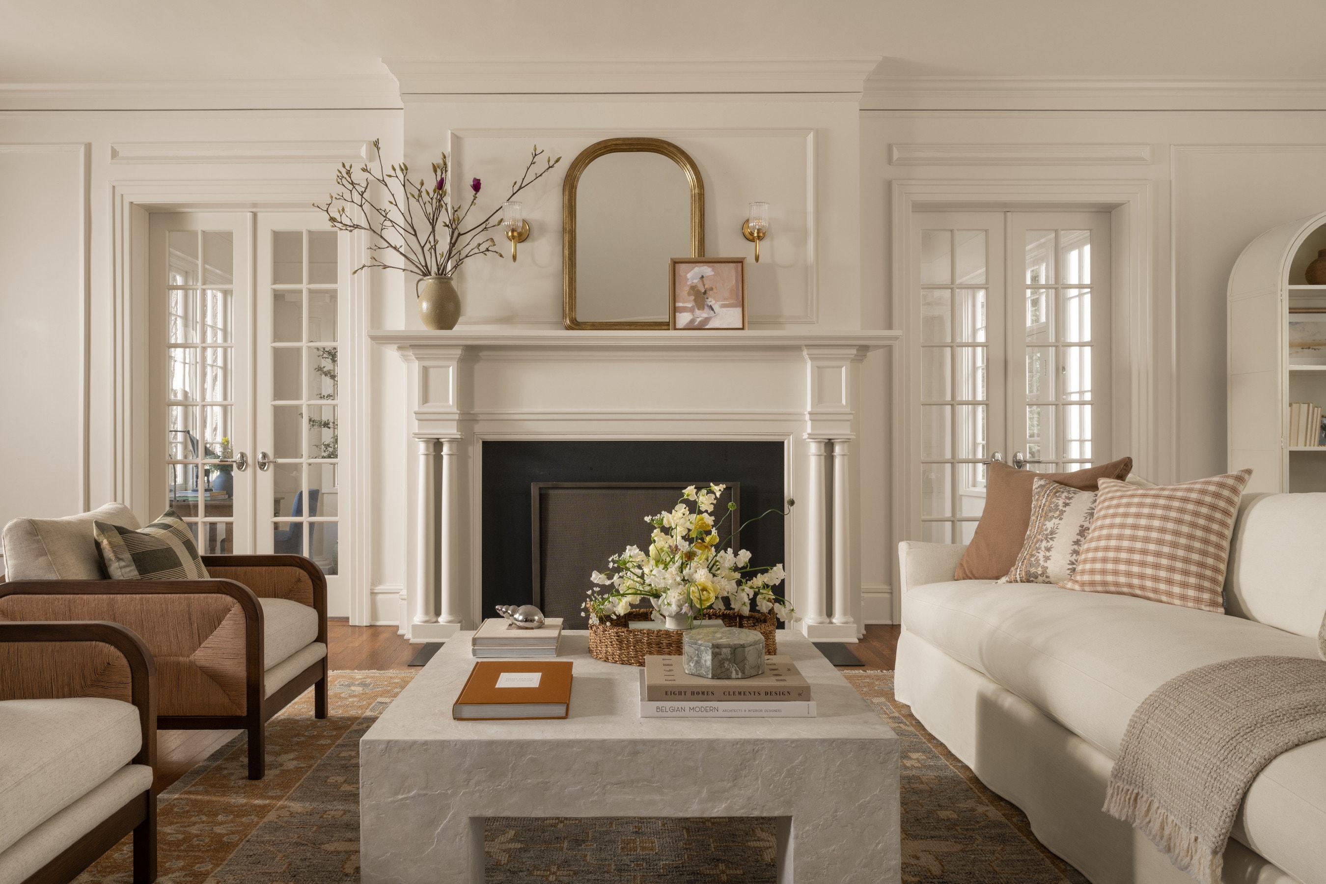
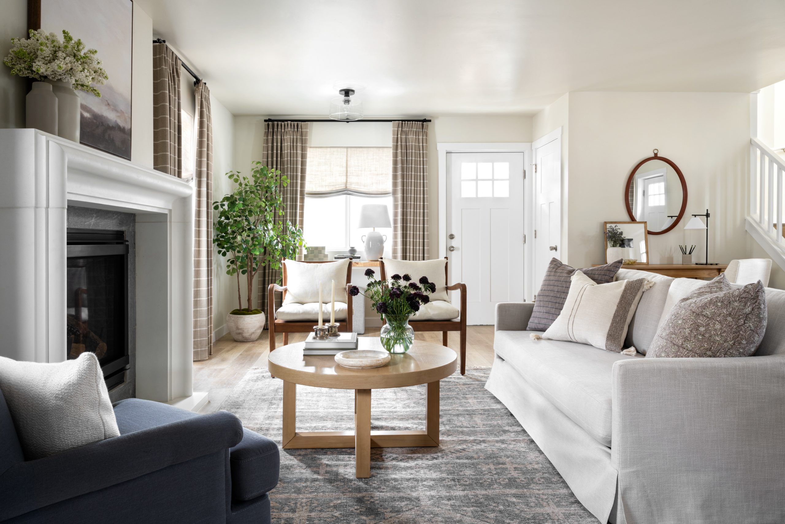
Sometimes it helps to start with the rug or pattern you have in mind, and ground the scene in that statement piece. When the rug carries so much appeal, your furniture can play a more neutral, supporting role.

Each week, we’re bringing you more insider tips from this season of Dream Home Makeover. Give these a try in your space, and have some fun with pattern!

You May Also Like