
Open & Airy Netflix Kitchen Remodel
Details + tips from Episode 6!
09 November 2020 -
Layton, UT
If we had to choose a favorite space to remodel, it would probably be the kitchen.
Not only are kitchens the heart of the home, but a good kitchen design significantly impacts the everyday through both form and function.
Today, we’re sharing a kitchen remodel that is near and dear to our hearts. Featured in Episode 6, “Grand Kitchen Deployment,” of our Netflix show “Dream Home Makeover,” the transformation of this space highlights so much of what we love about residential design.
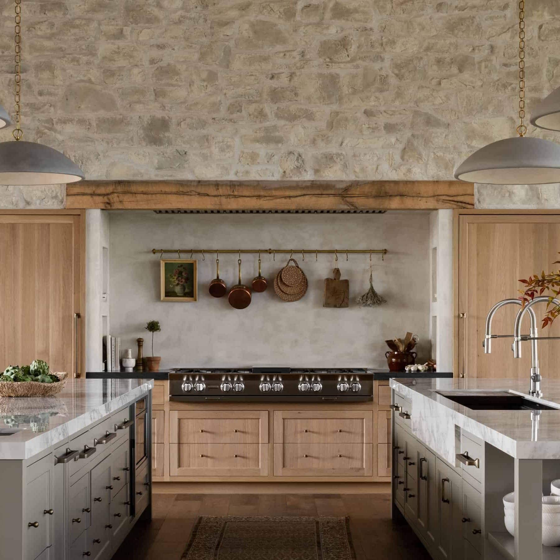
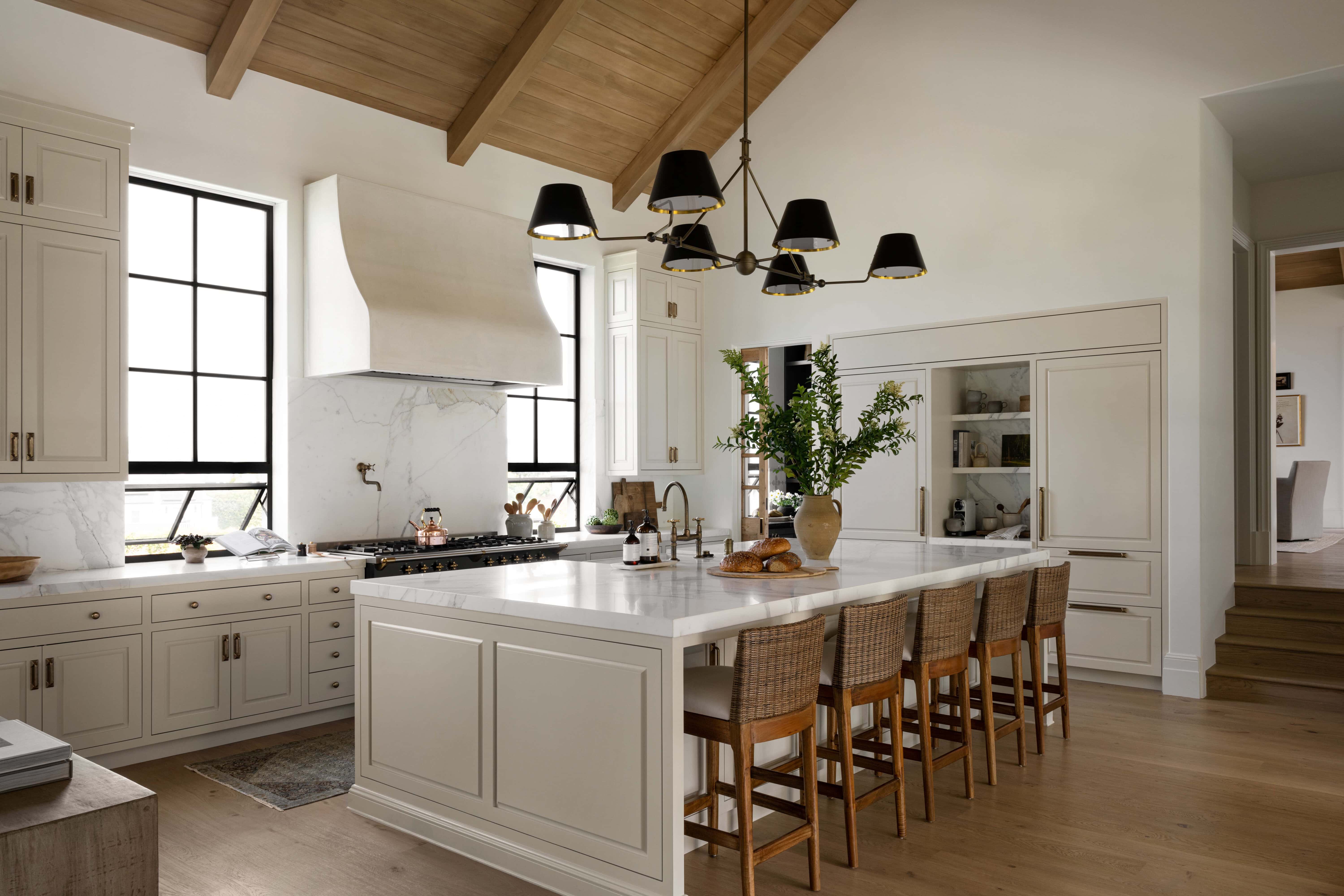
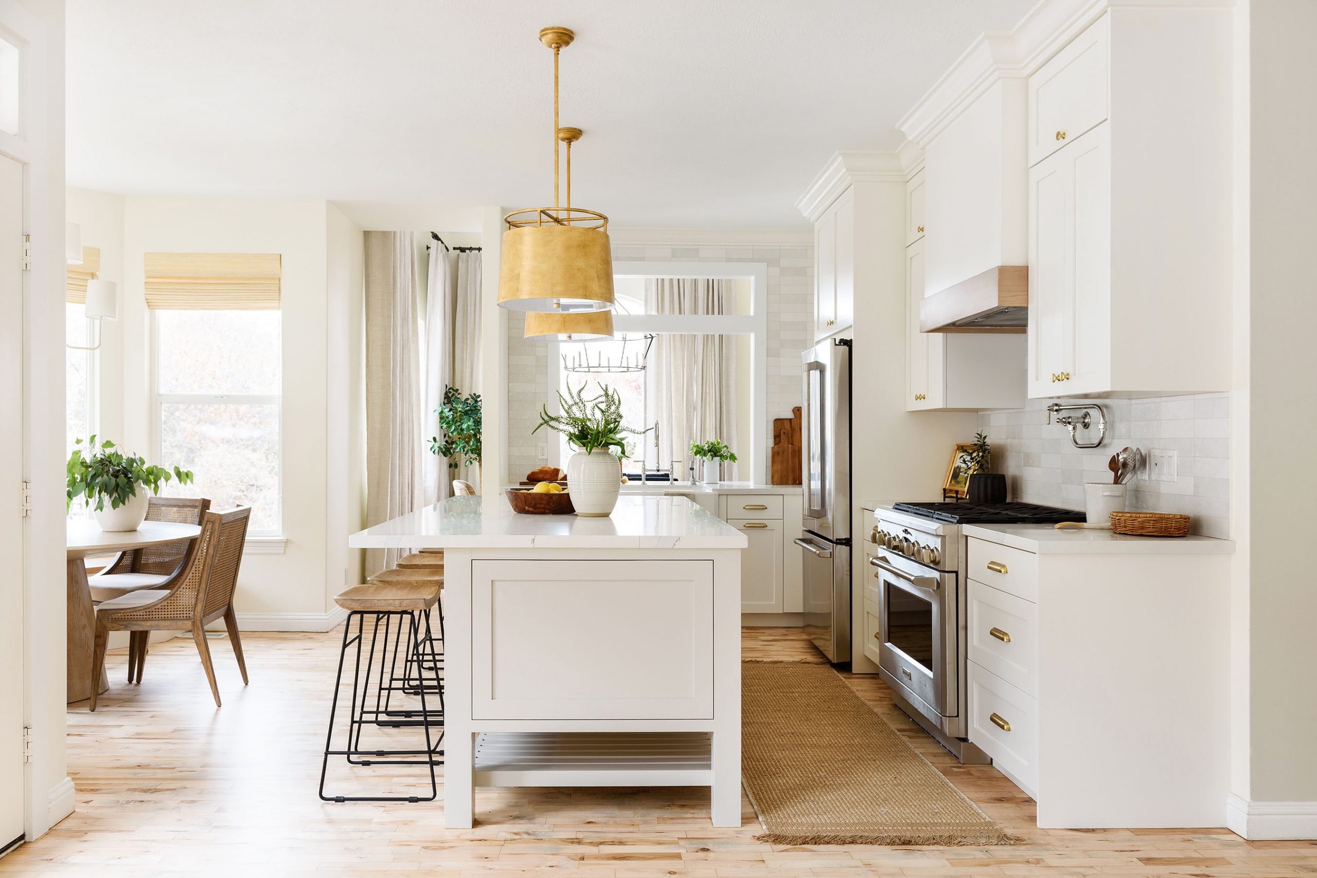
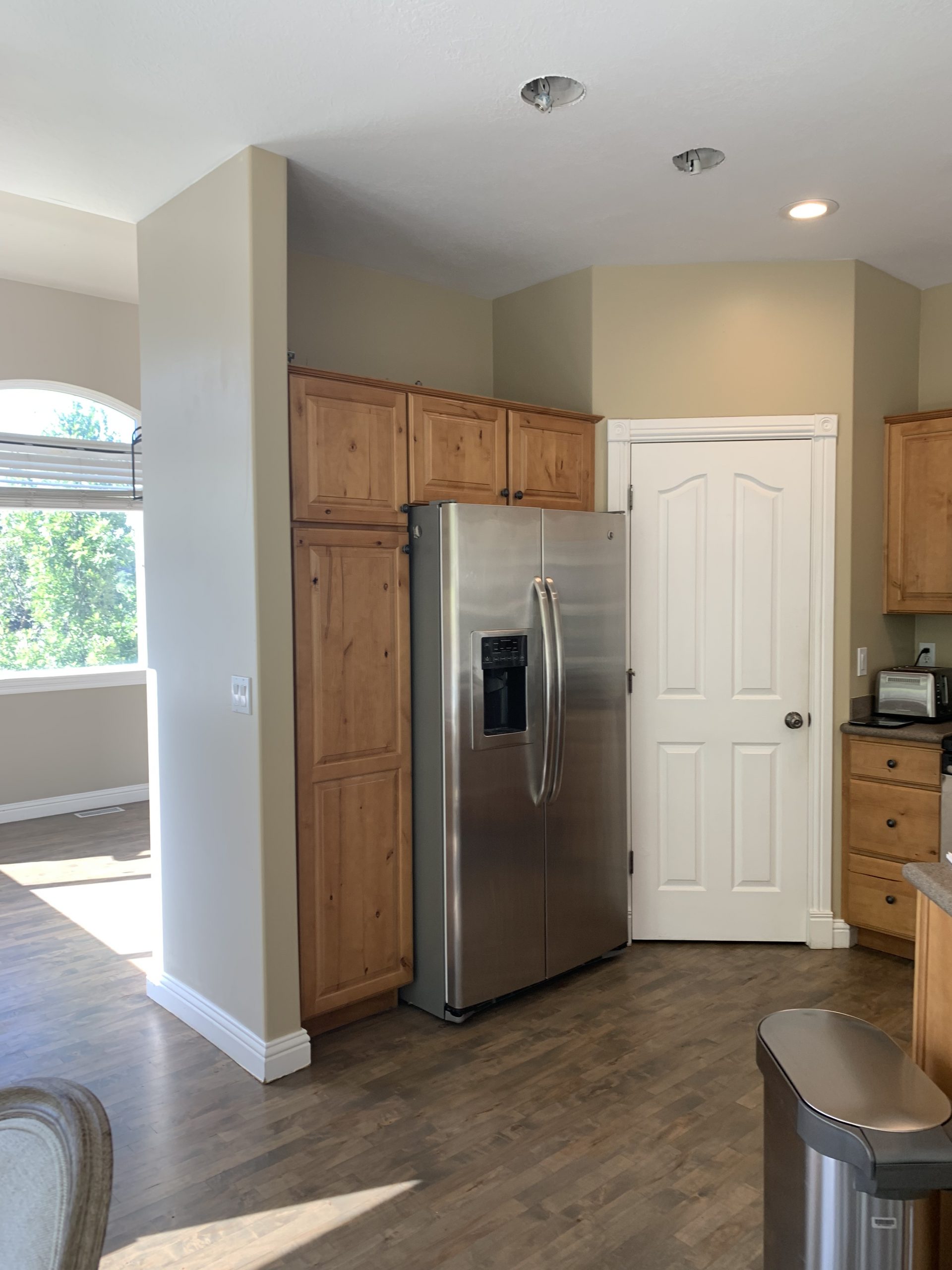
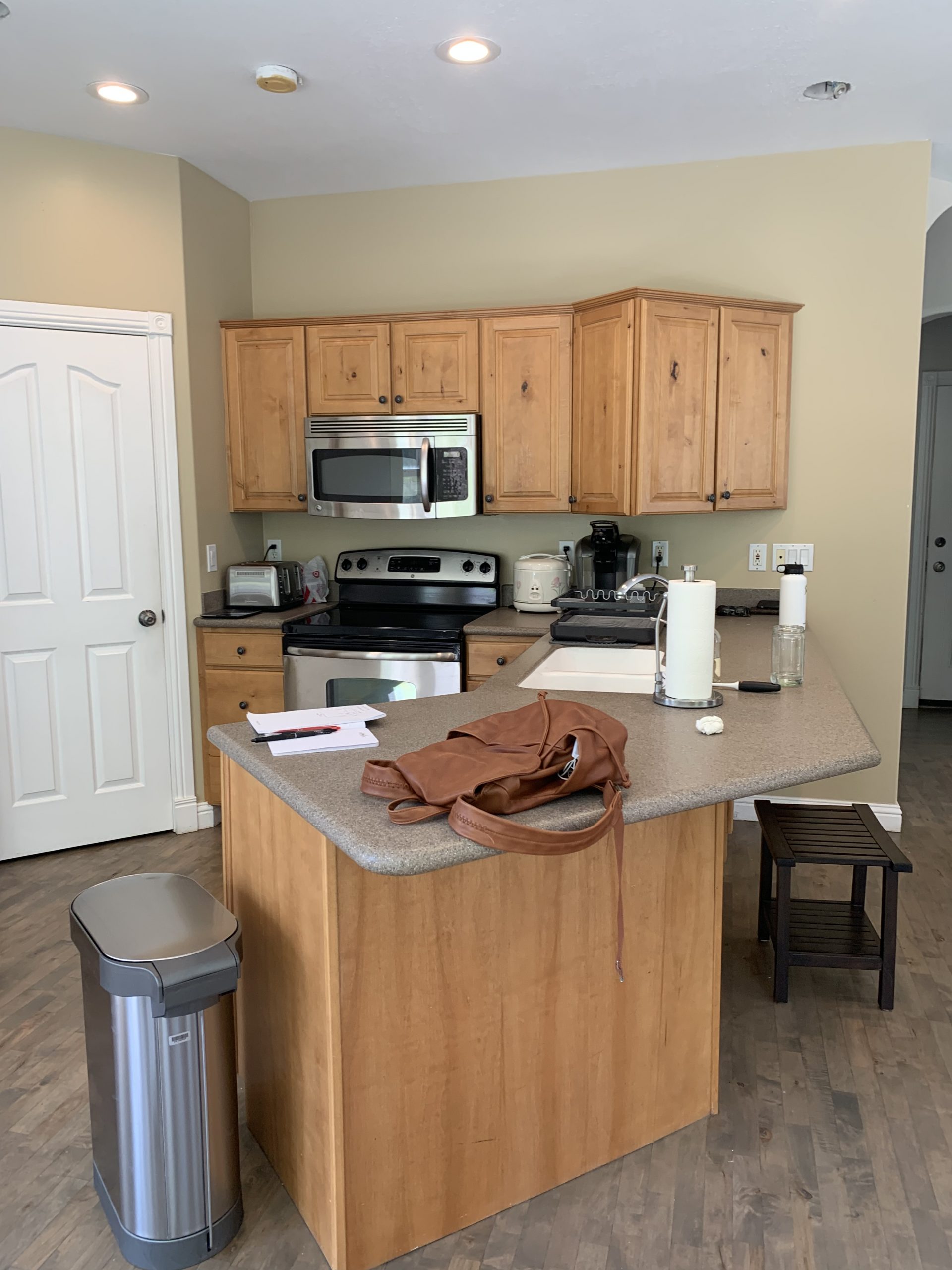
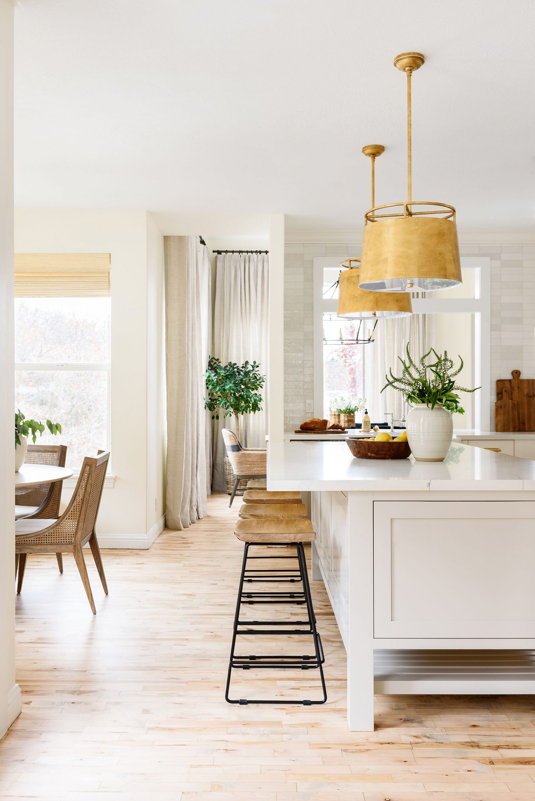
With closed off angles, dark tones, and limited counter space, the kitchen in our client’s home wasn’t working for them functionally or visually. Eager to complete their space before being apart during deployment, our clients dreamed of a light, bright, and open kitchen where they could cook, entertain, and be together.
After getting a clear idea of their vision, we couldn’t wait to help them create a space that would allow them to make more memories as a family before being apart.

Here are a few things we focused on to bring their remodel to life:
Adding and subtracting intentionally
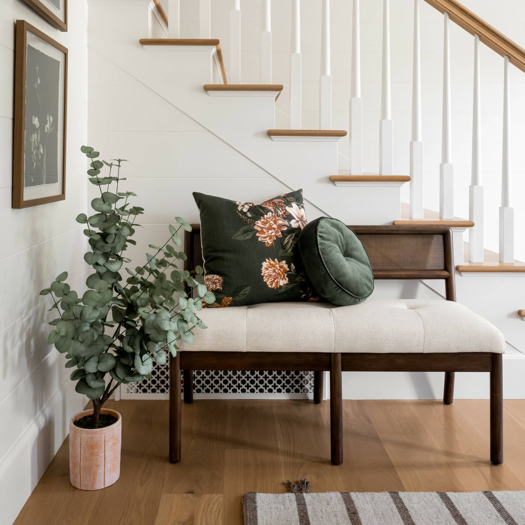
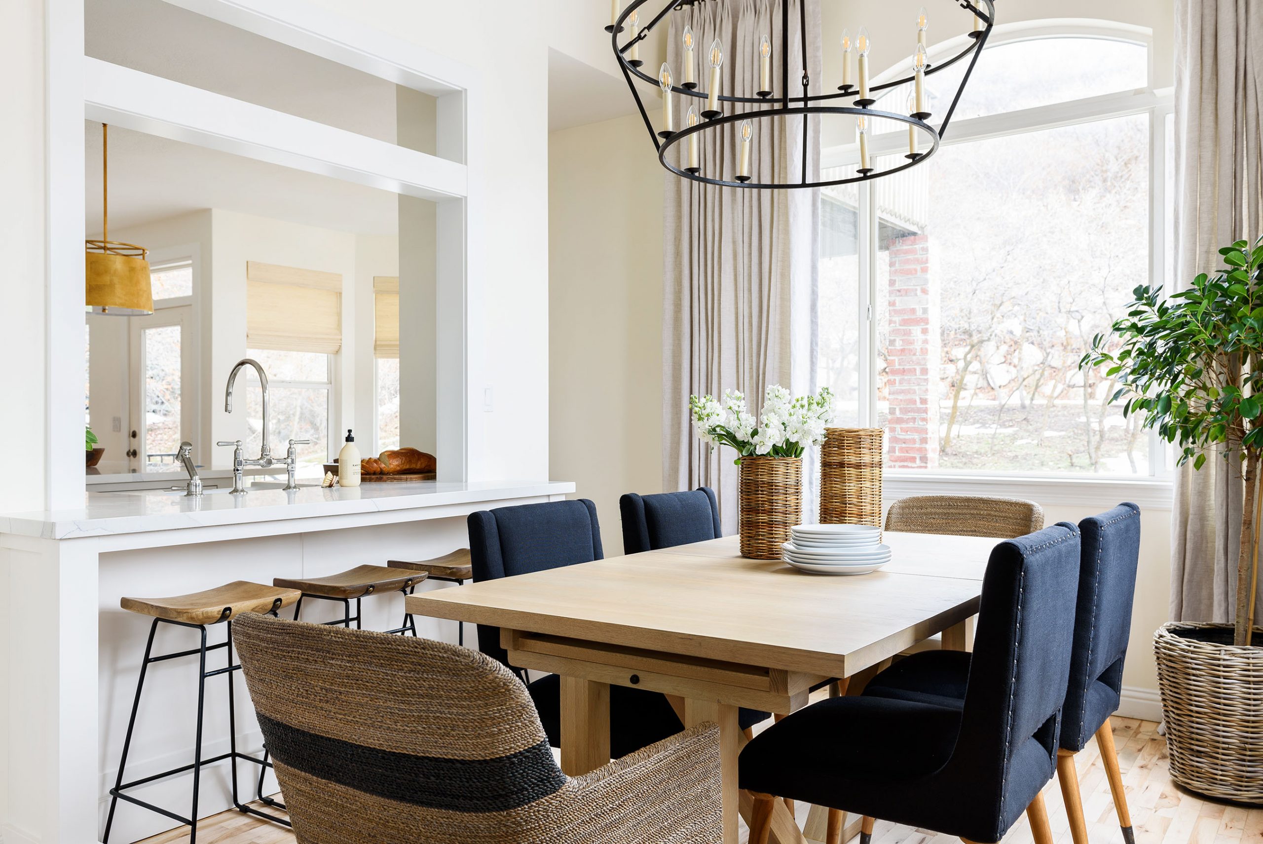
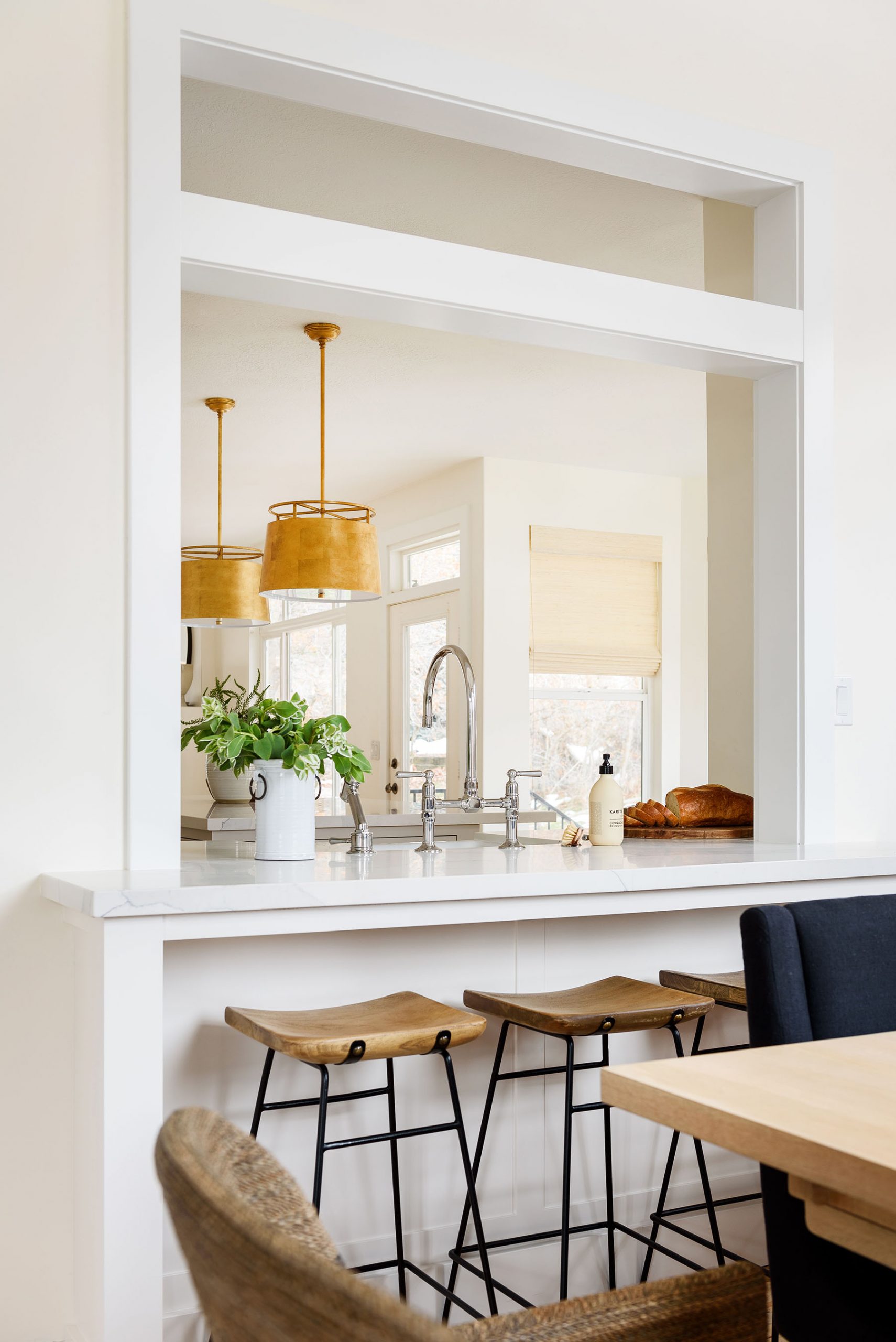
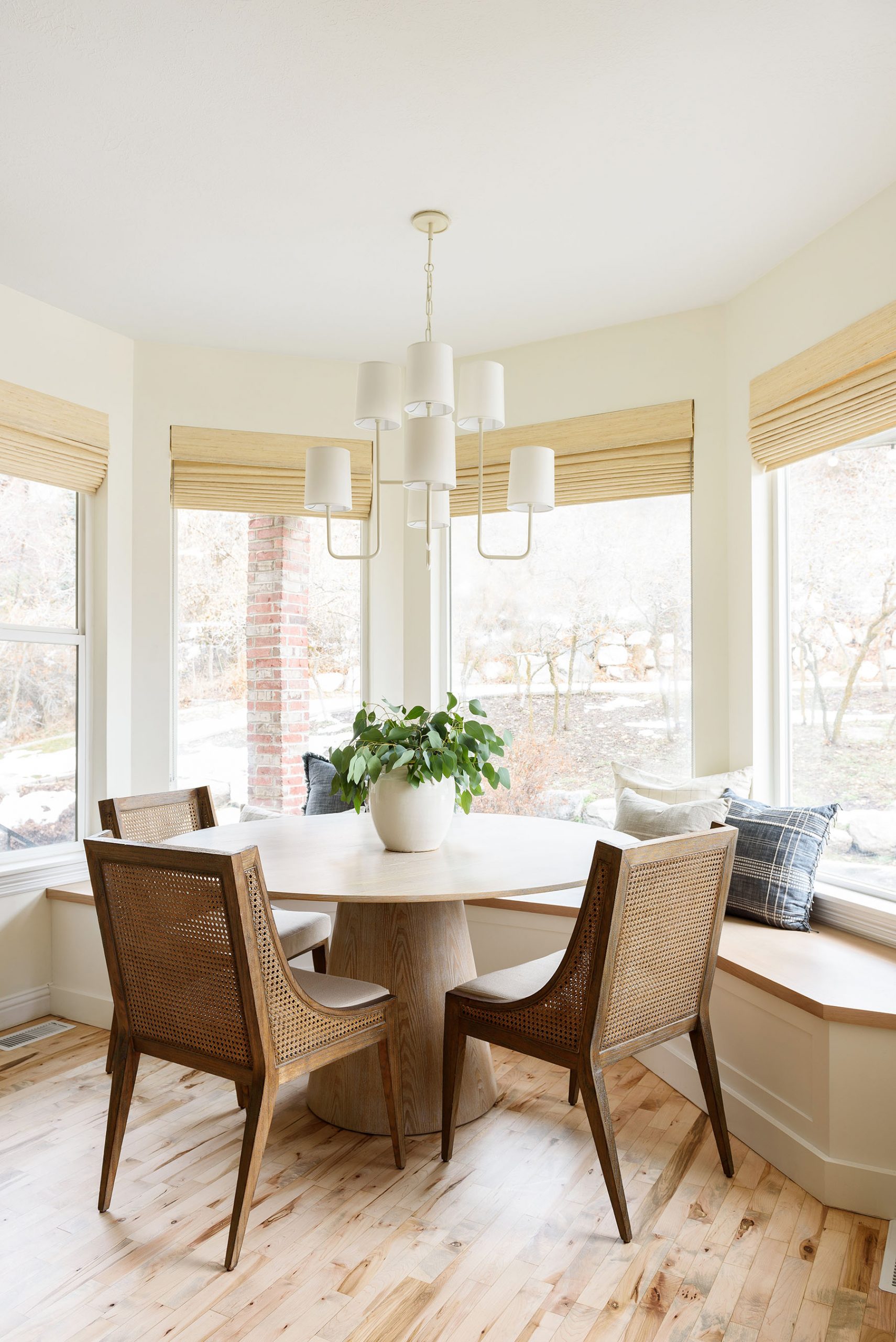
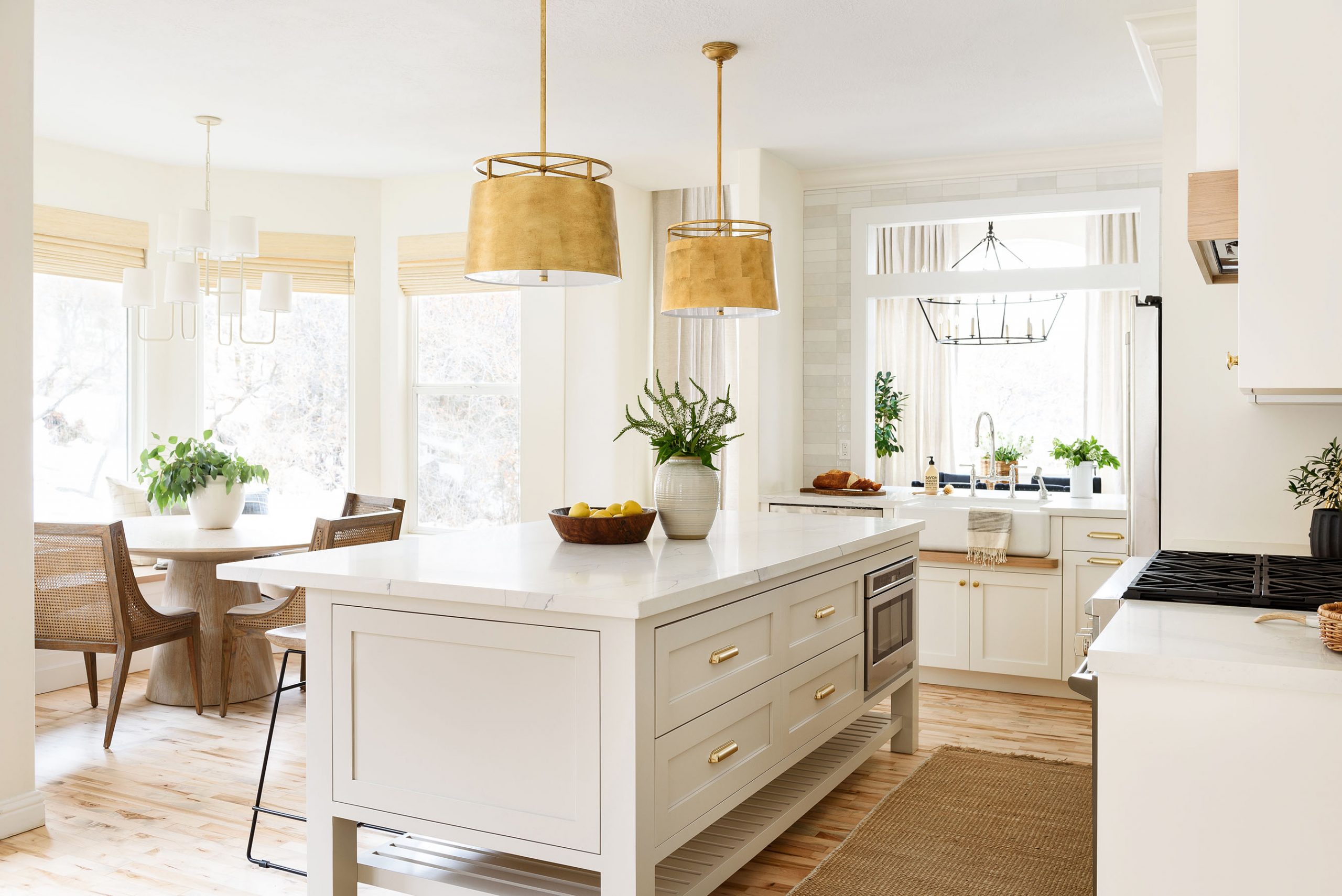
One of the first things our clients mentioned to us when we started this project was that they wanted the space to feel more open. Their dining space, which they often used when they had family over, was separated from the kitchen with a wall in-between. We knew that knocking it down would reduce storage space, but we knew that creating a “window” between the kitchen and dining space would bring so much more light into the room, opening it up.

Read our tips on mixing stools and dining chairs here.
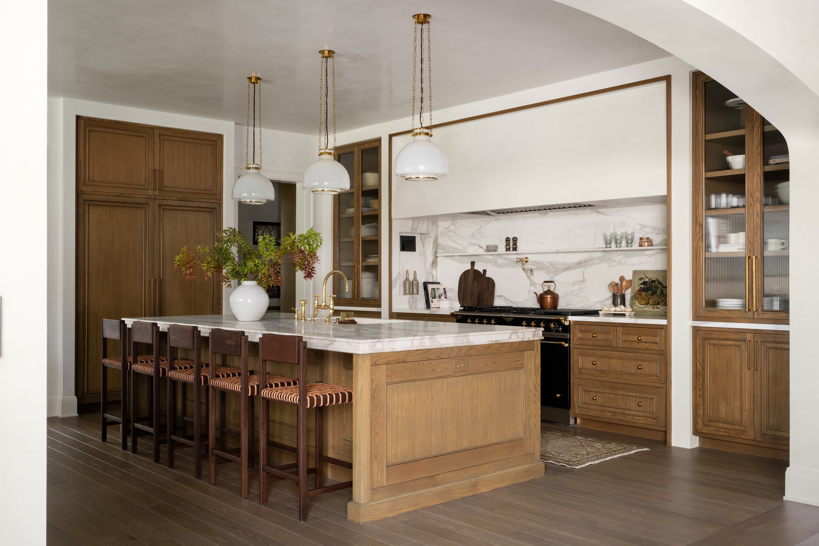
To create an open and spacious look that was still functional, we decided to remove everything that disrupted the flow from the angled cabinetry to the oddly placed appliances and install new cabinets and a giant island in the middle with more storage space.
In doing this, we were able to open up their space and bring in more seating through counter stools and a little corner dining nook with a built-in window seat.
"Good design is about adding and subtracting and being smart where you're choosing to do so. Even if you add more things to a space, by creating real uses for each area, you can make it feel larger."
Open & Airy Netflix Kitchen Remodel

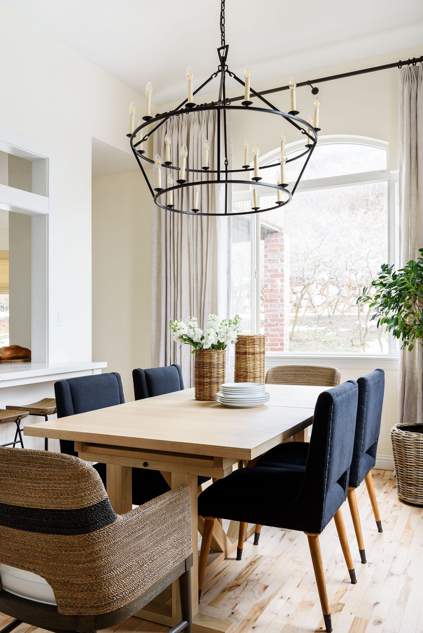
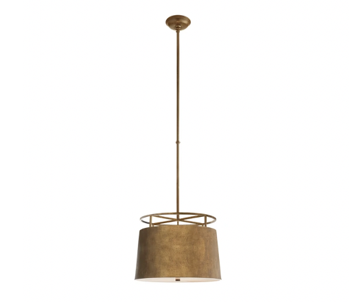
Darlana Two-Tiered Ring Chandelier
Incorporating materials with longevity
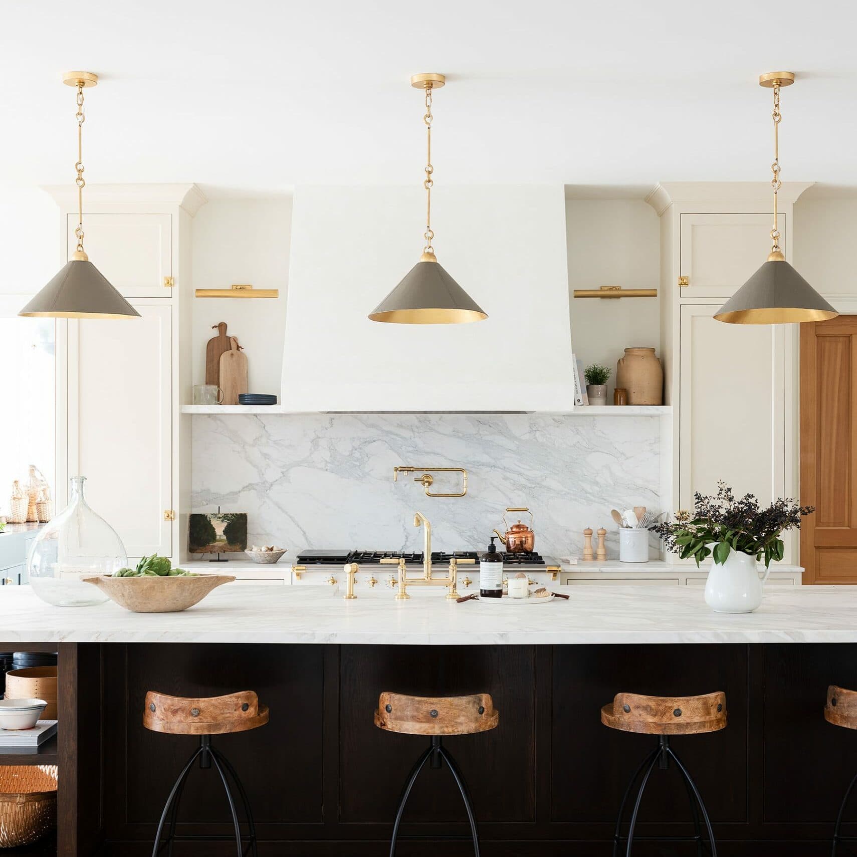
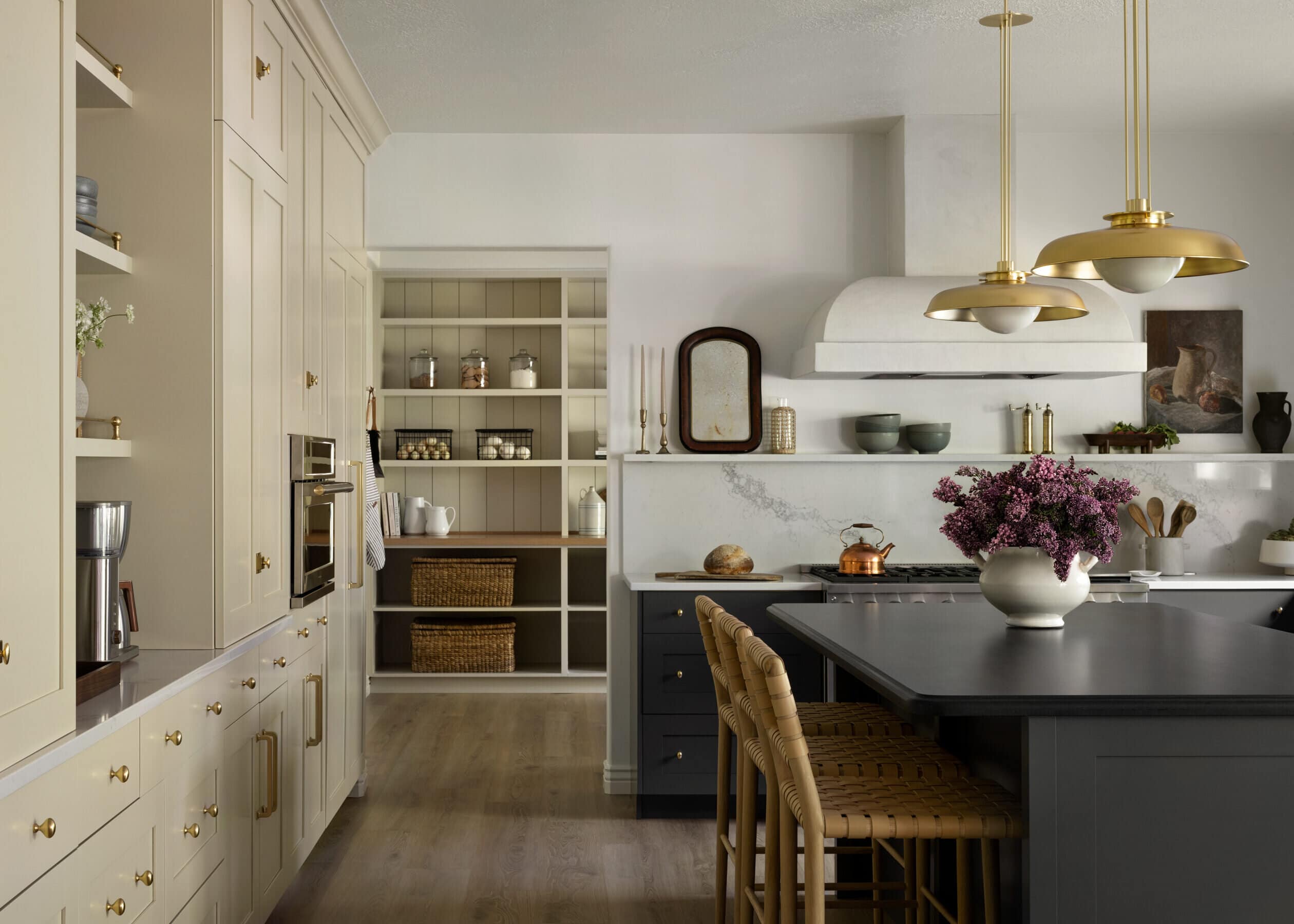
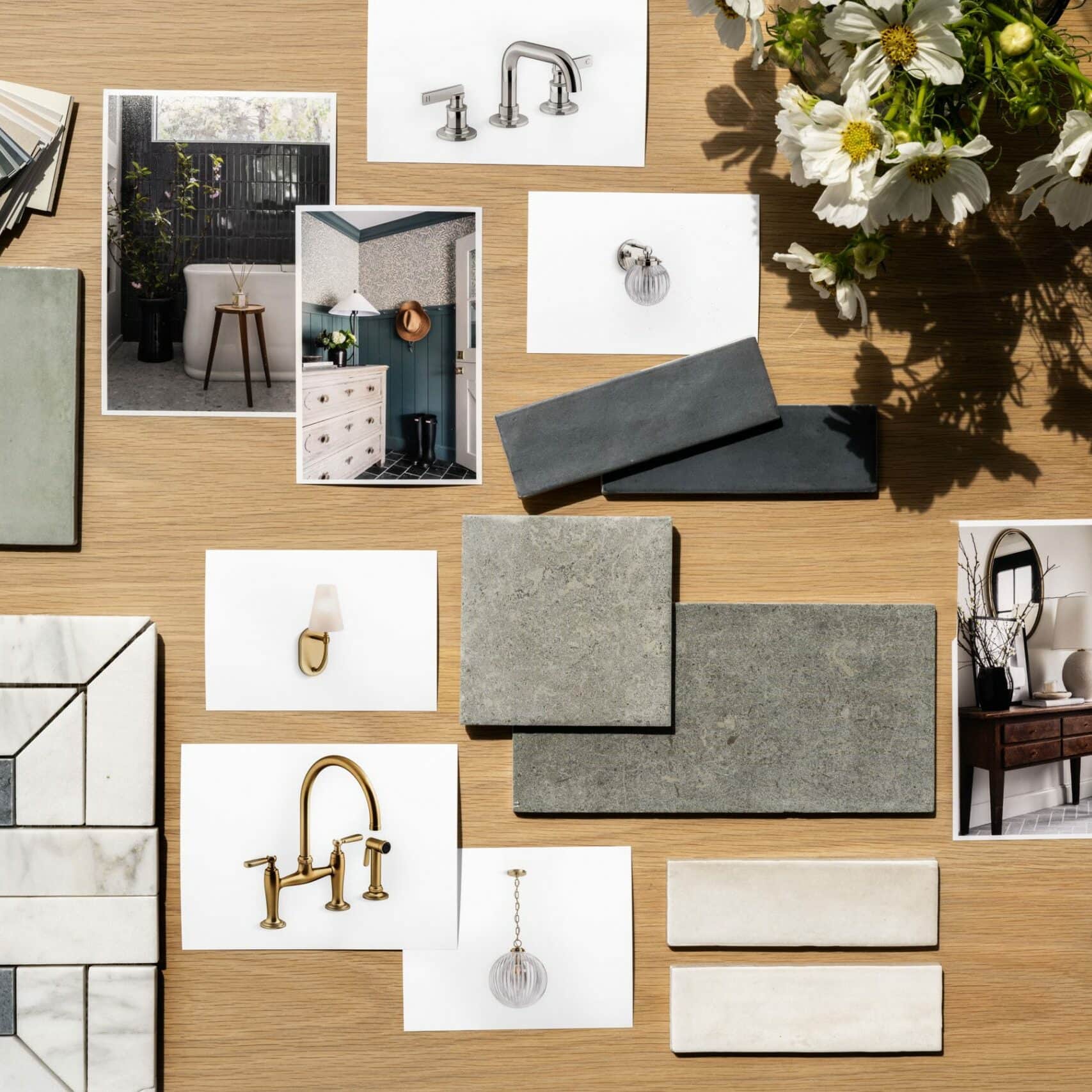
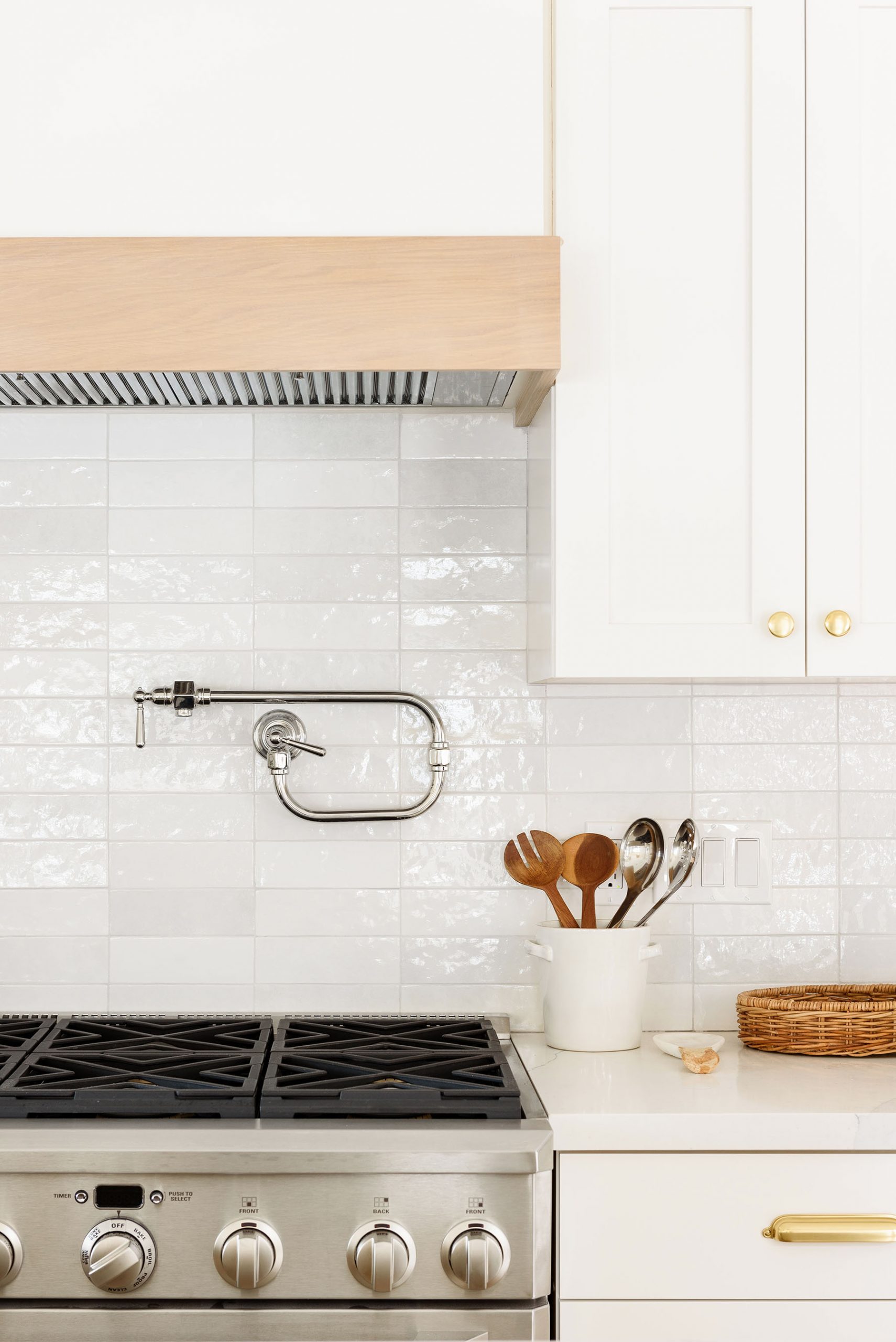
It was important for our clients to incorporate durable materials in styles that felt classic and held longevity. They loved the look of white, bright kitchen spaces, so we stuck to a palette of whites and light grey tones.
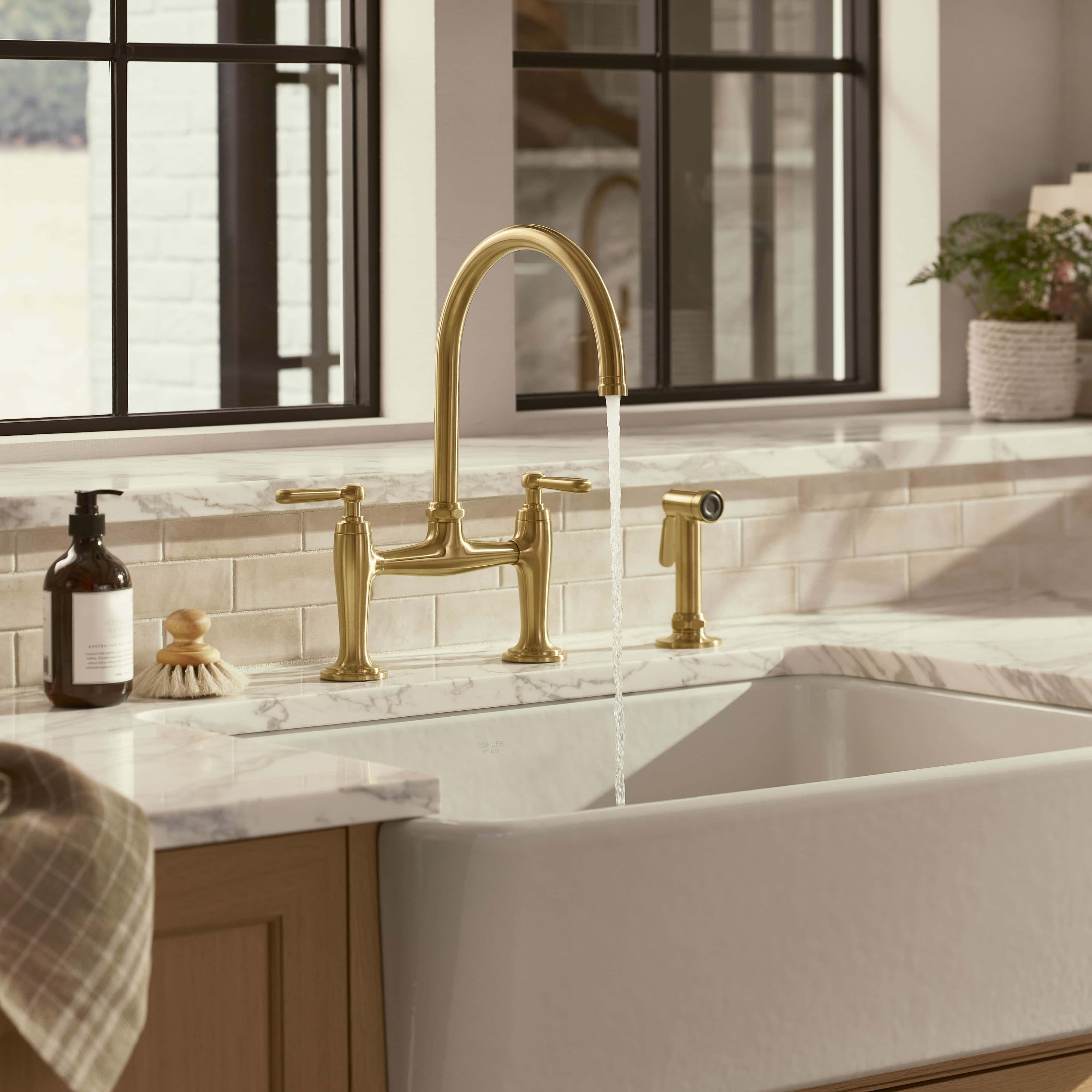
On the cabinets, we used one of our favorite, go-to shades, “Simply White,” by Benjamin Moore.” We love how it feels fresh, clean, and works in nearly every space to bring in some brightness. Then, to add a slight contrast but keep the feeling light, we did a Quartz countertop from Bedrosians and a custom light grey stain on the island.
See more of our favorite white paint colors by clicking here.
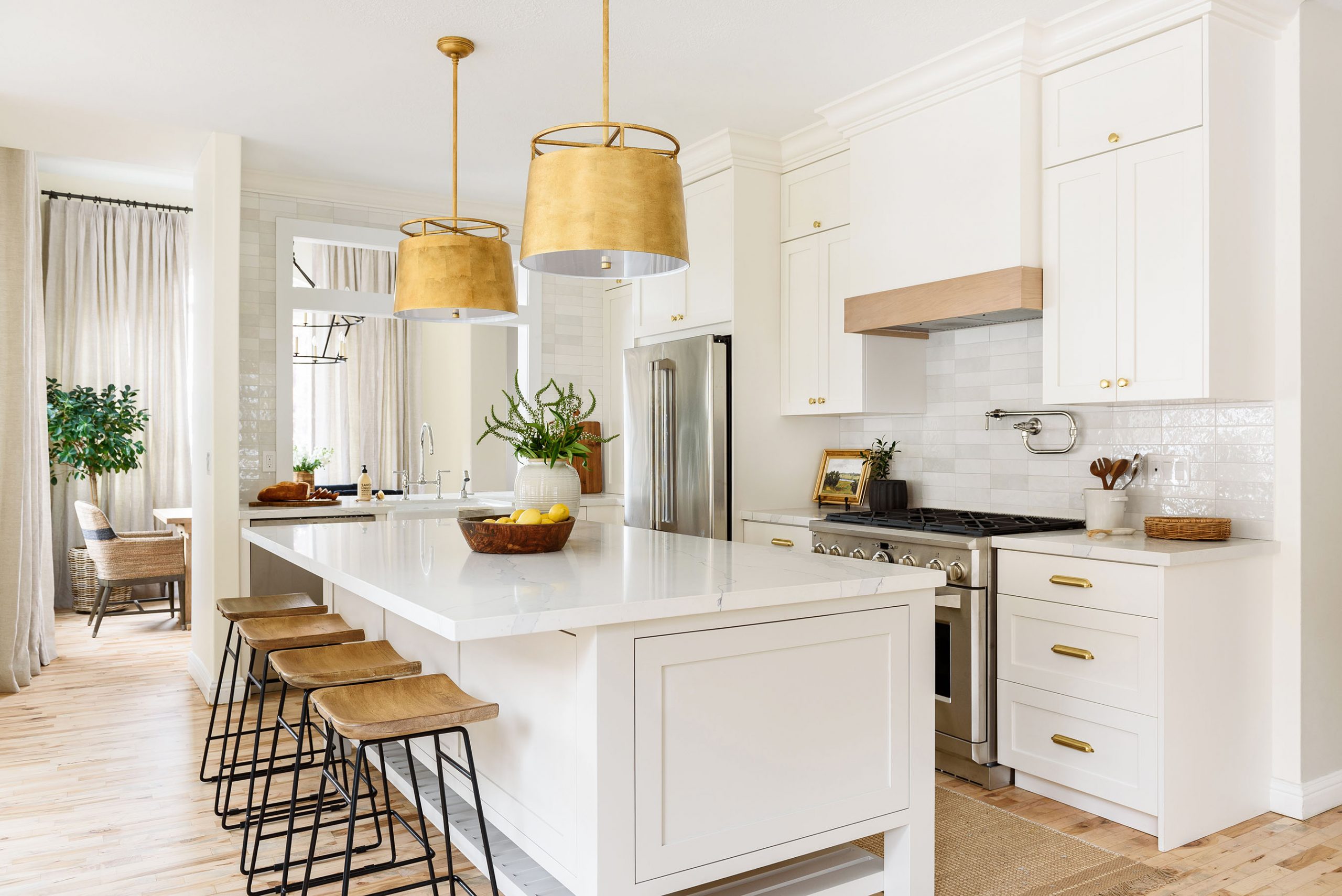
We added a little bit of extra texture with a tonal white and grey tile from Bedrosians on the backsplash that tied all of the tones together and reflected the new light flowing into their kitchen and accented the look with silver and brass fixtures.
Read tips on hanging lights here.
"Some of my most cherished memories come from moments in the kitchen. Growing up, I made a dessert with my mom every Sunday, and we've carried that tradition in our own home. Labor and love truly intersect in the kitchen, and when you're re-creating your kitchen, you're not just creating a new space; you're creating new memories."
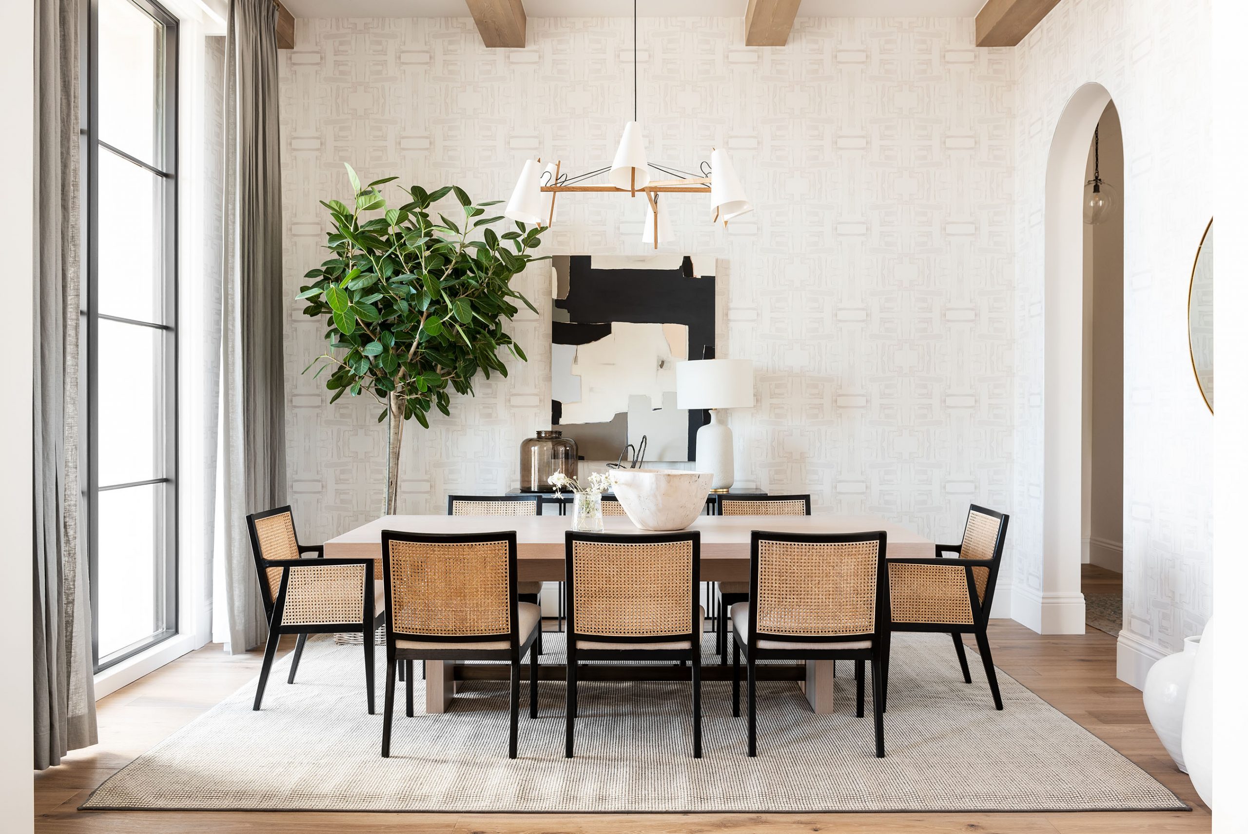
Open & Airy Netflix Kitchen Remodel
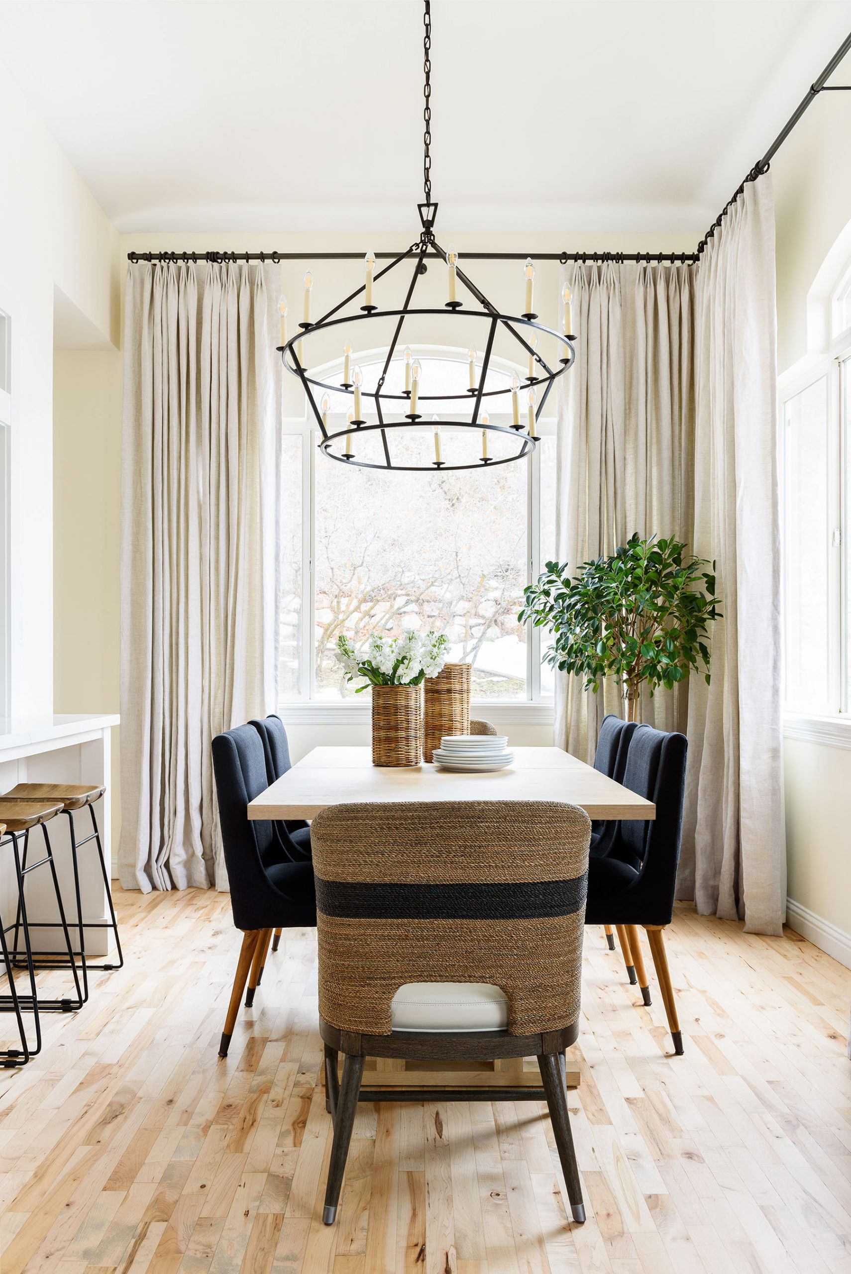
Jaime Chair
Go Lightly Medium Chandelier
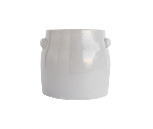
Rue Vase
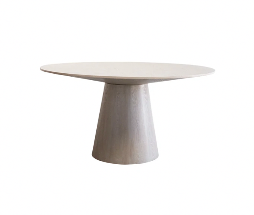
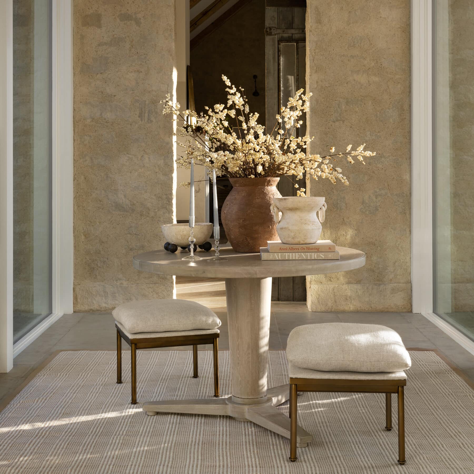
Preston Round Dining Table
Mixing Tones & Textures
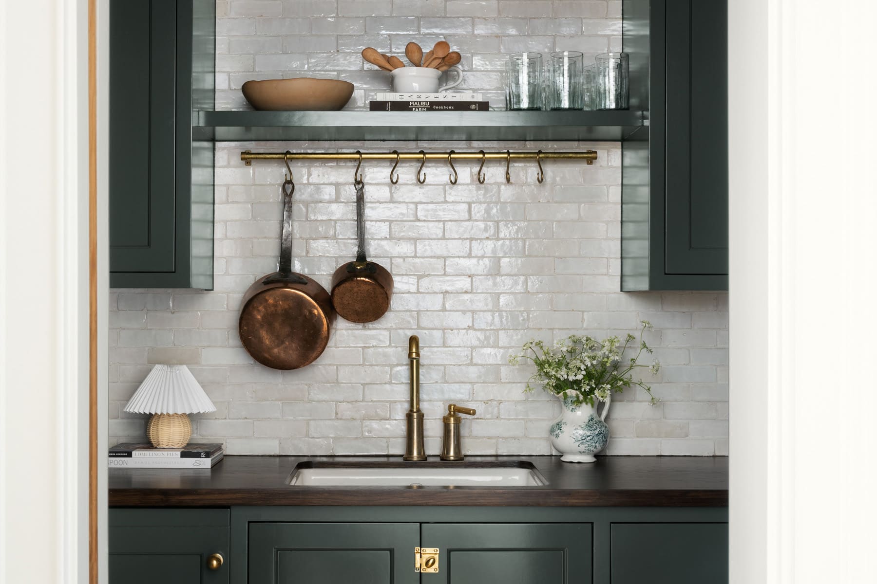
When it comes to kitchen finishes, sometimes we match them, and sometimes we mix them. It really depends on the space, but one of our rules of thumb is that if there is one finish throughout a home, we try to incorporate it in the kitchen.
Our clients wanted to incorporate brass tones in the kitchen, but they also already had silver elements in the home, so we mixed them in this space to create a cohesive look. We used a silver, polished nickel faucet and then created contrast with matte, brass knobs. Often, when mixing finishes, we’ll use shiny and matte elements to get more balance and dimension.

Find more tips for mixing finishes here.

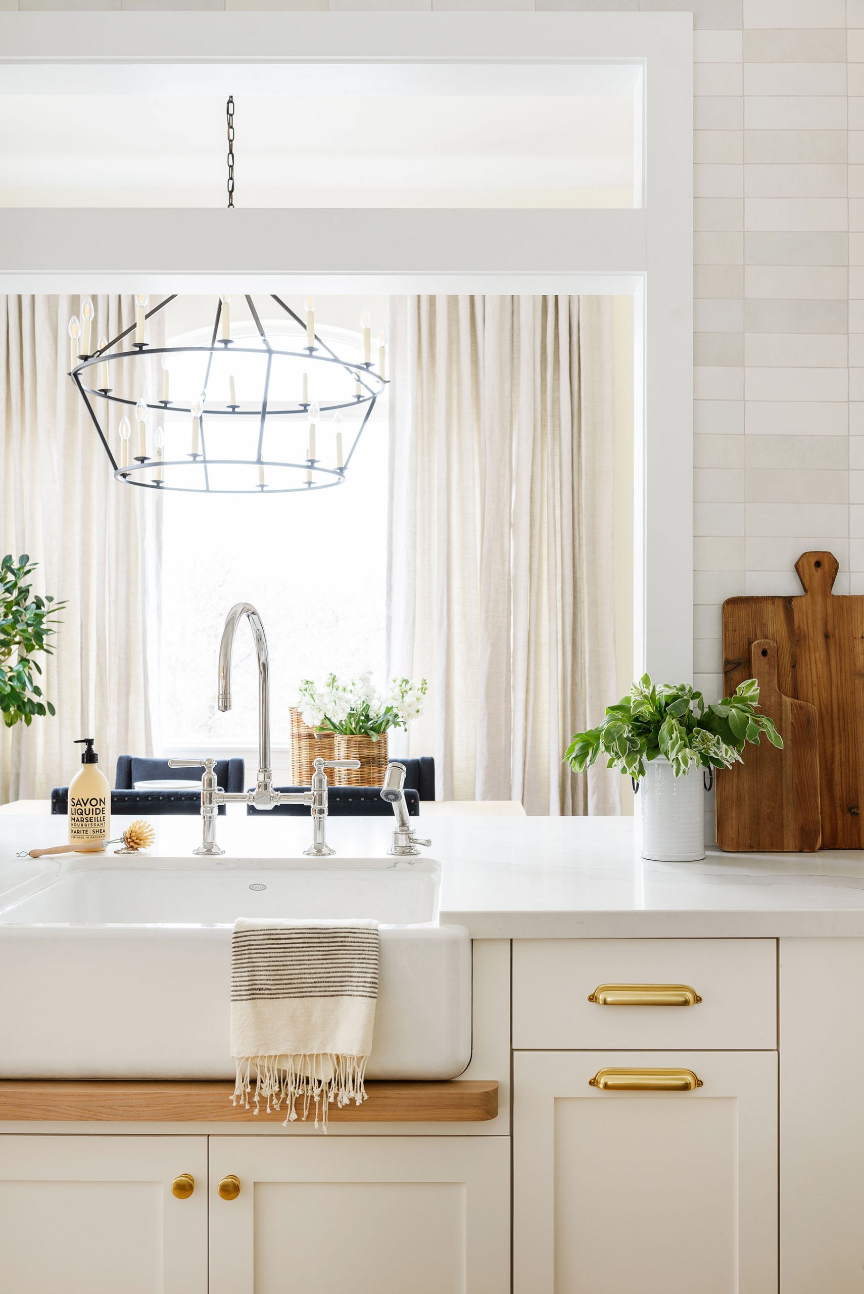
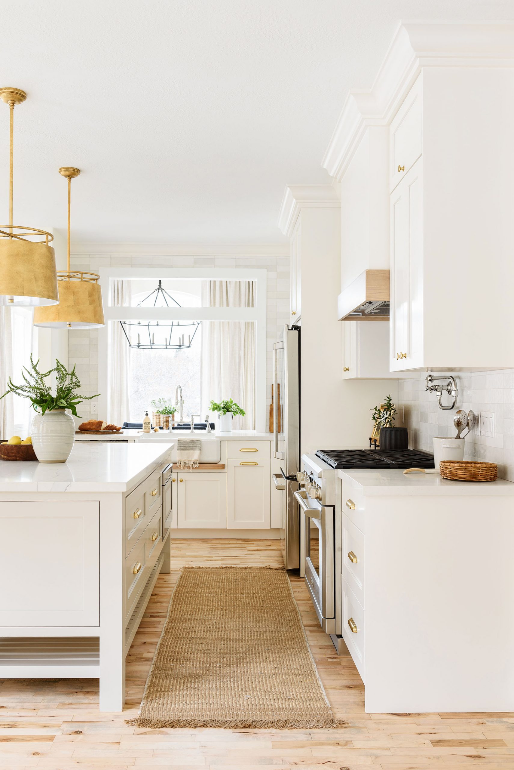
Another way we love to mix tones is through pieces and textiles. In white kitchens, we love to layer wood and brass tones through stools, lighting, and decor to add depth.
The warm textural accents in this kitchen, like the gold pendants, rug, and decor, bring an element of curation without sacrificing simplicity.
Open & Airy Netflix Kitchen Remodel
Bryden Medium Round Pendant

Williamsen Counter Stool
Rounded Edge Easel
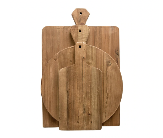
Cutting Boards (Set of 3)
We’d like to thank our partners Killowen Construction, Dreamcast Design and Production, Bedrosians Tile, Benjamin Moore, Lemco Design, Metrie, Target, and The Shade Store for making this project a success.
You May Also Like