
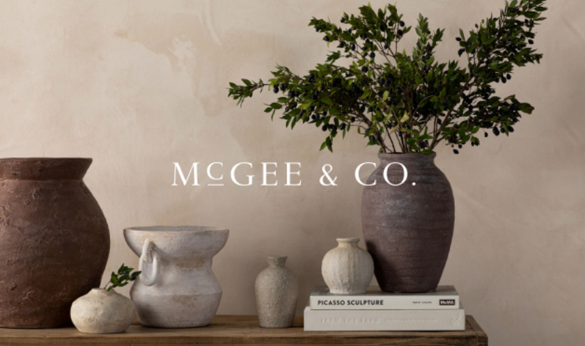
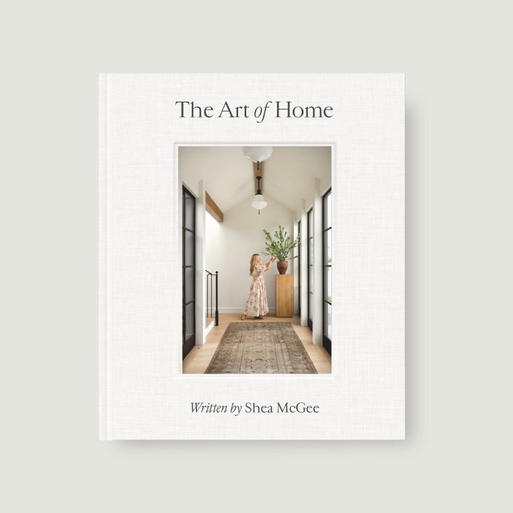


Inside the Catalogue | Marigold Color Story
The hue you see in nature. Here, all the ways to incorporate it into your own home.
01 May 2023 -
The color of the sun—
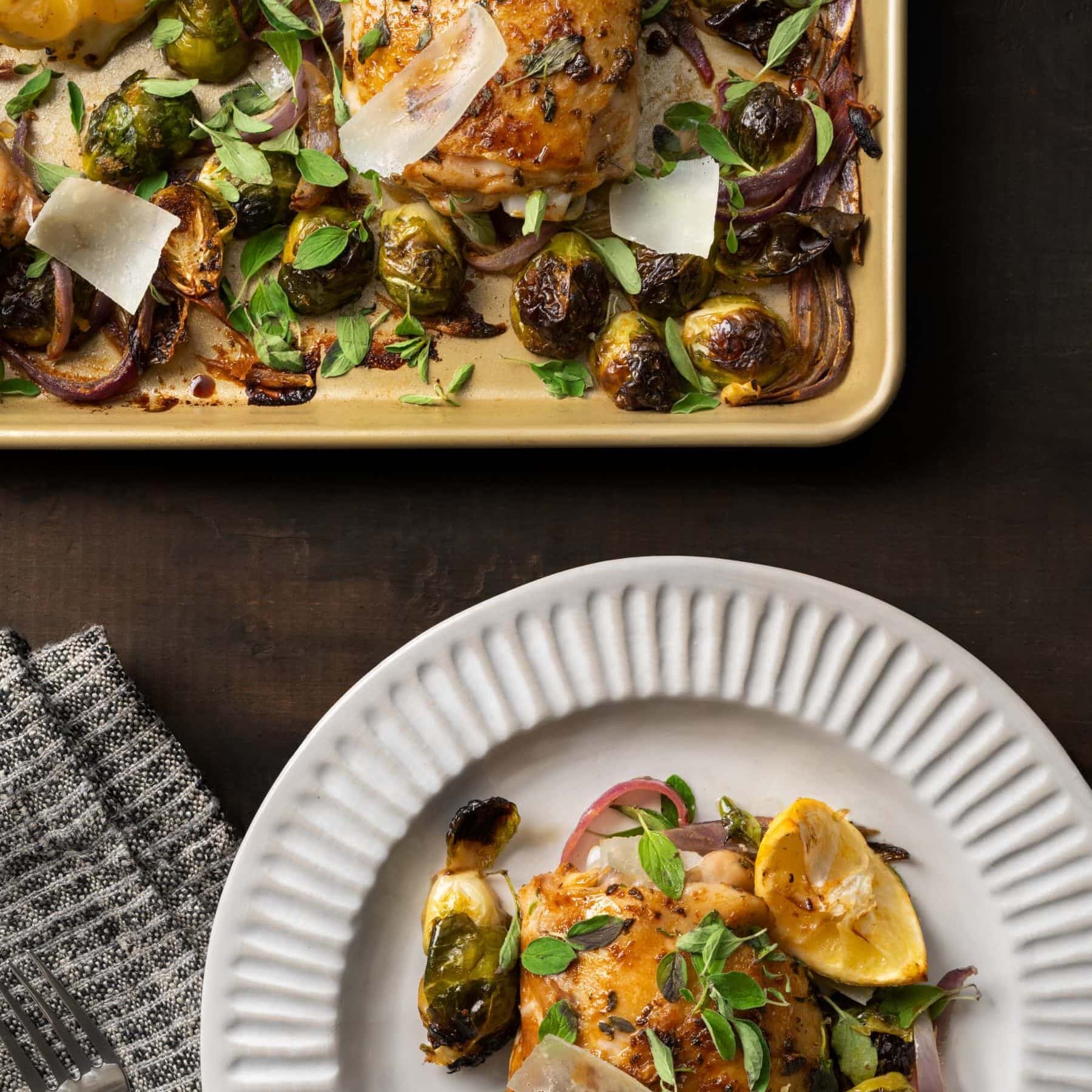
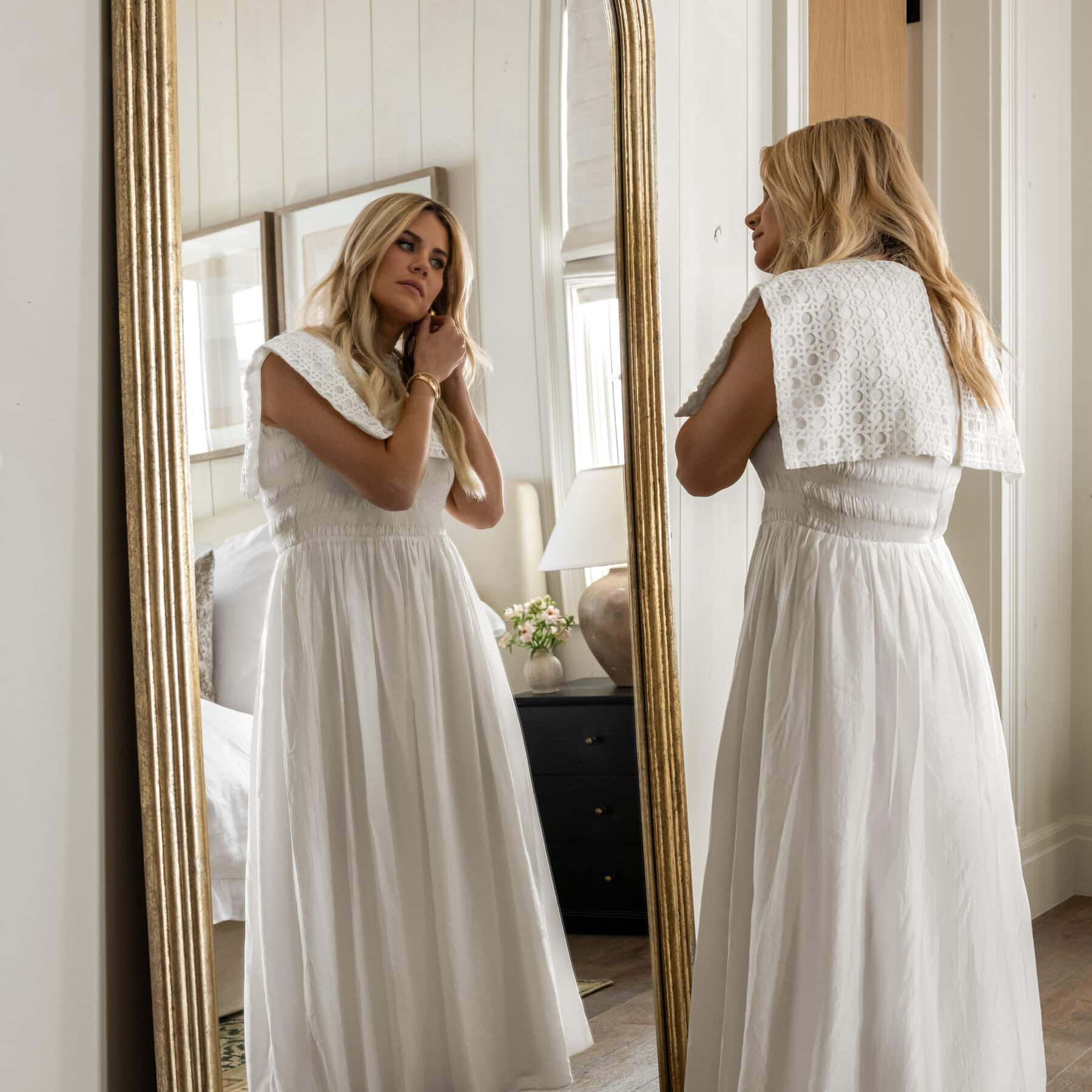
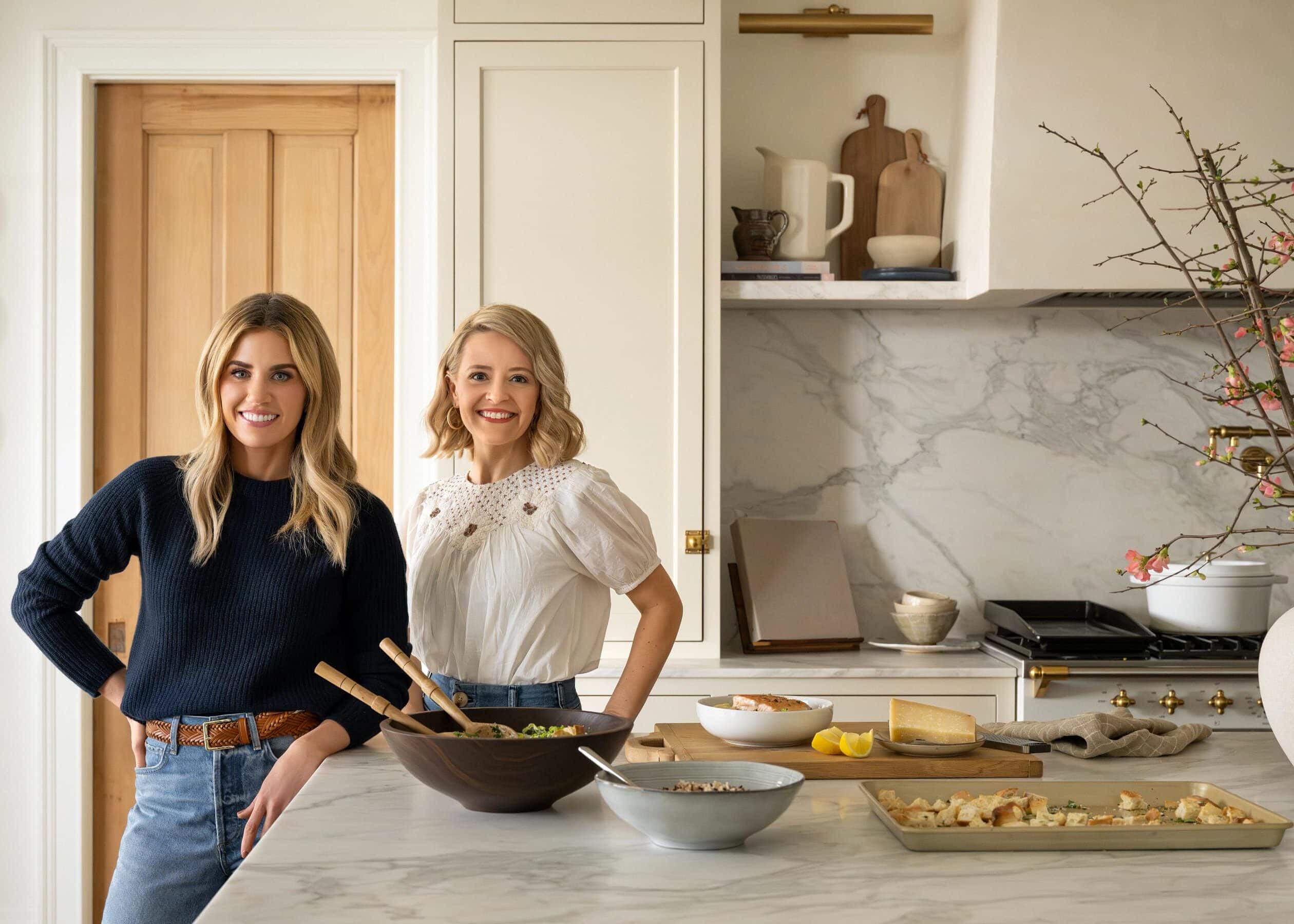
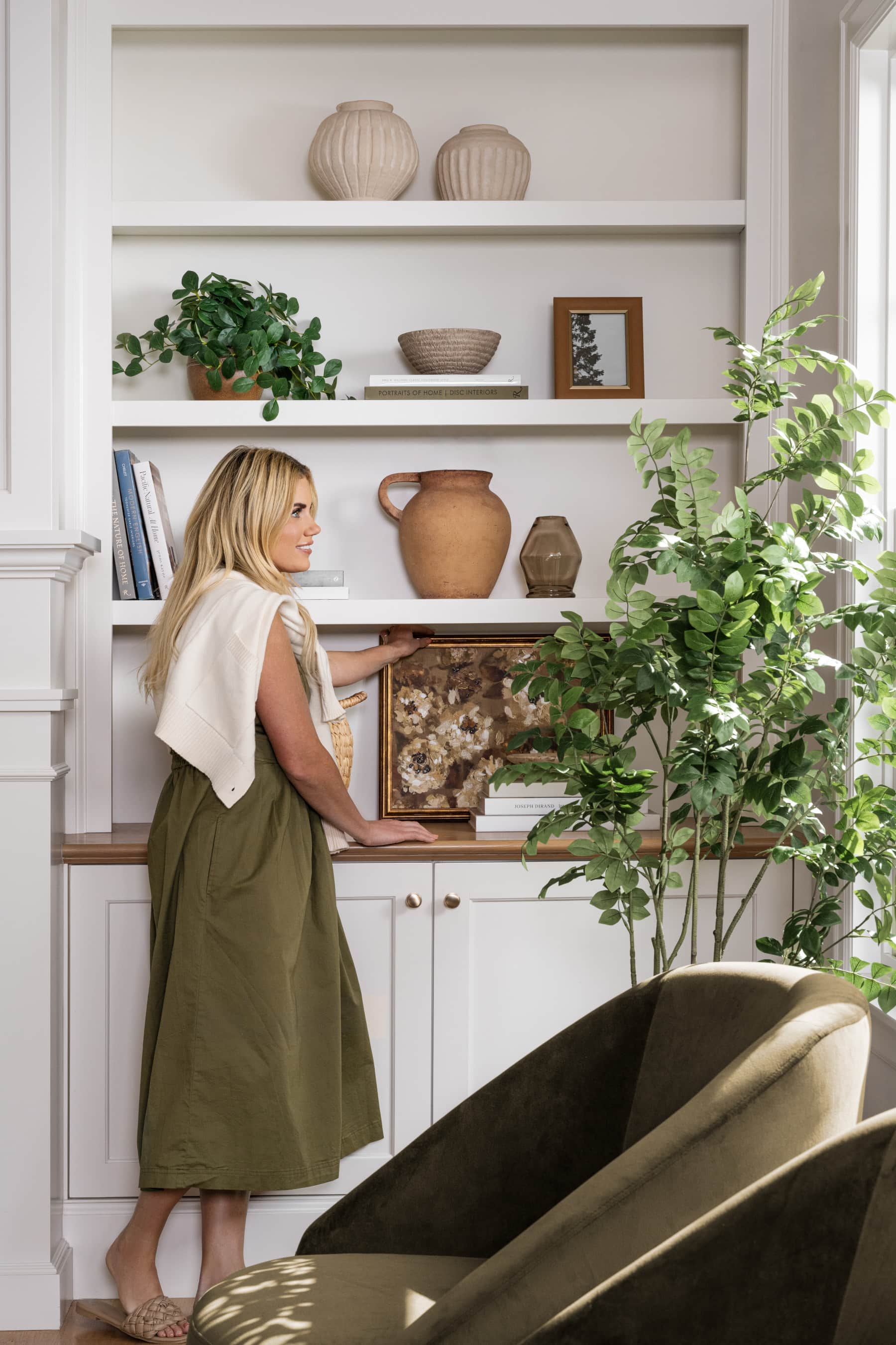
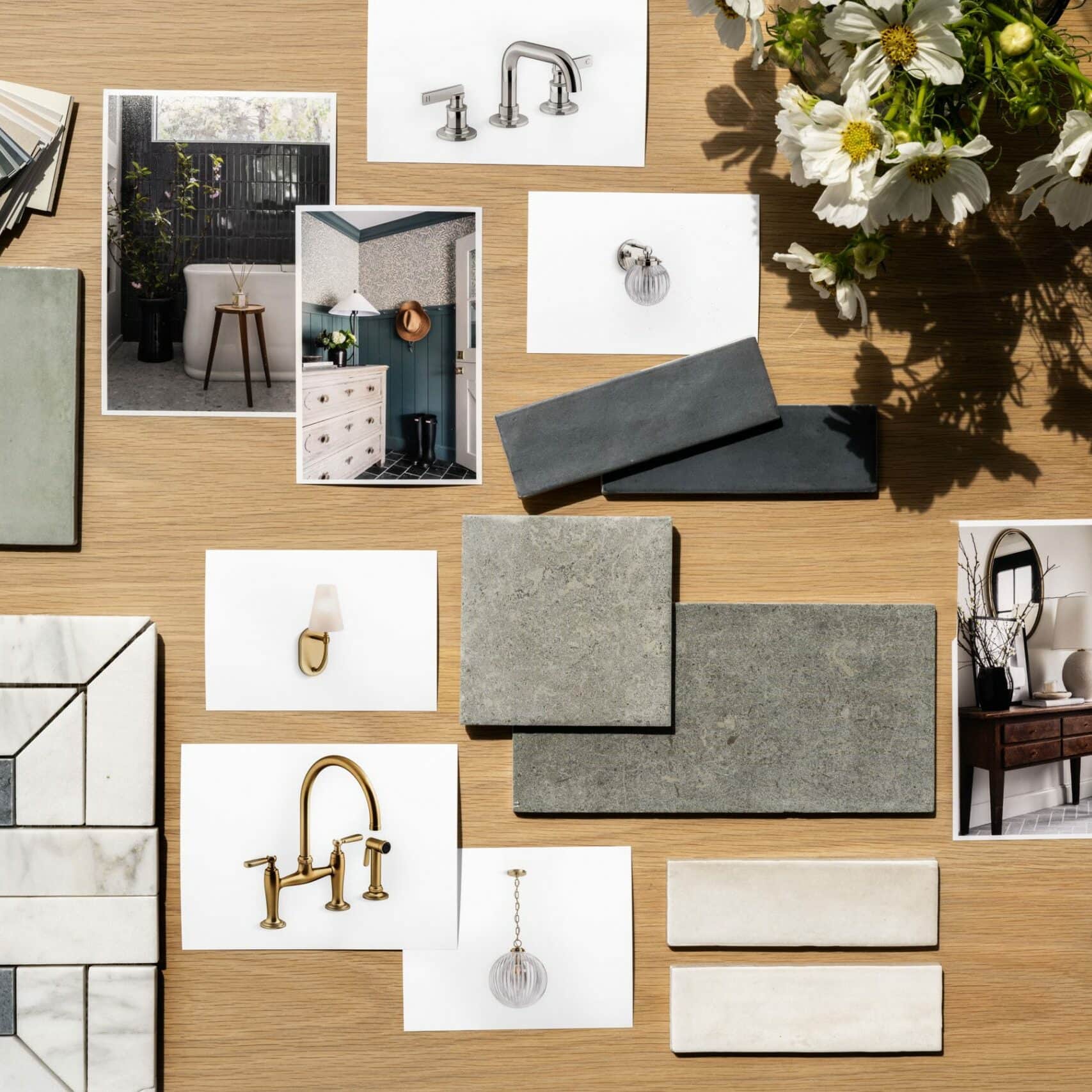
—is a surefire way to bring a sense of freshness and life into your home. In our McGee & Co. summer catalogue (browse the digital version of it below) we chose the hue to complement our newest summer collection, a pairing meant to elicit warmth and vitality. Below, we’ve dug deep into the marigold color trend with inspiration for how to incorporate it onto your walls (Shea’s favorite paint colors!), into your closet (including the dress Shea wore for the catalogue shoot), and tips for where to start.
Tip No. 02 | Embrace the Energy

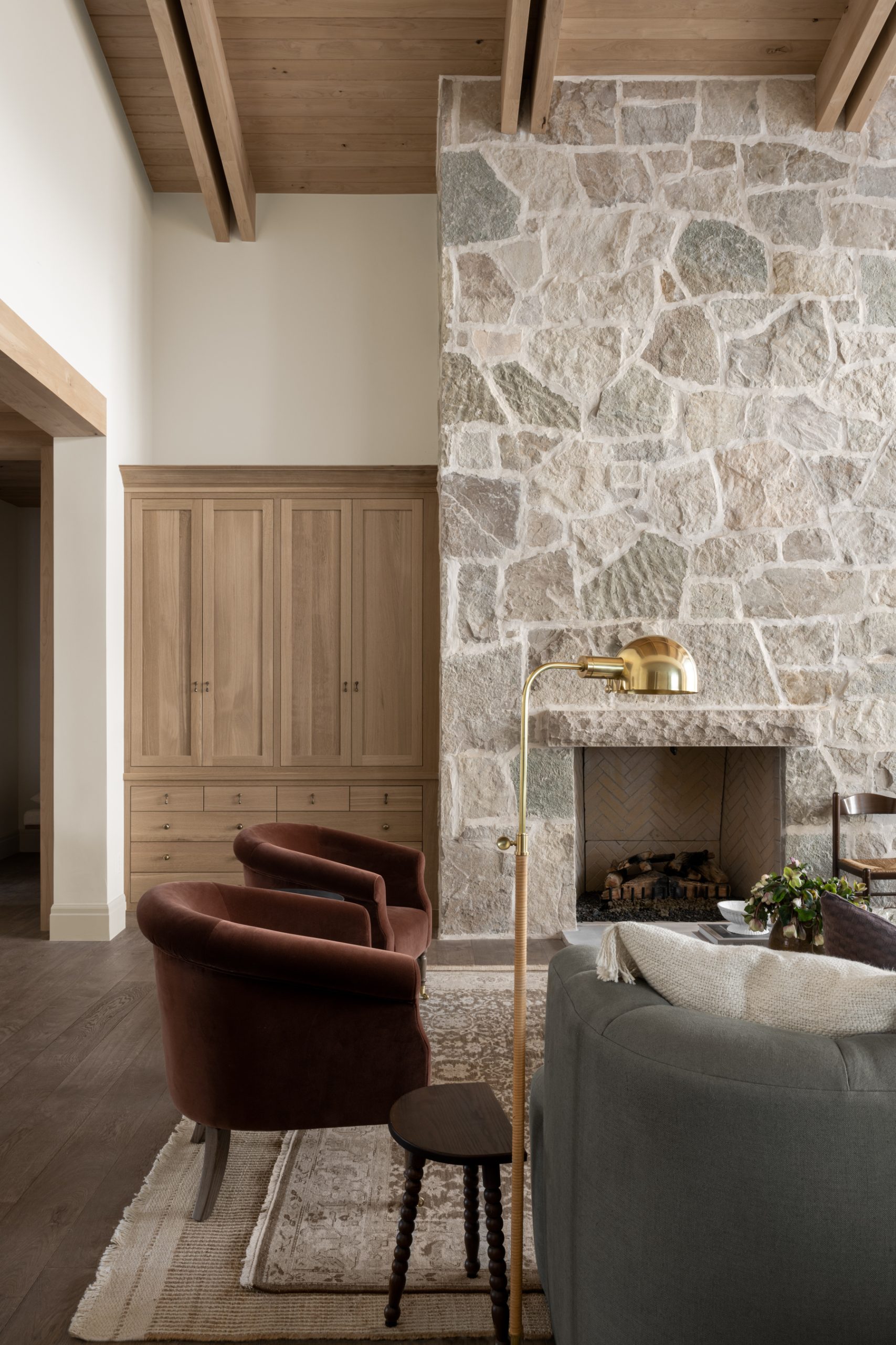
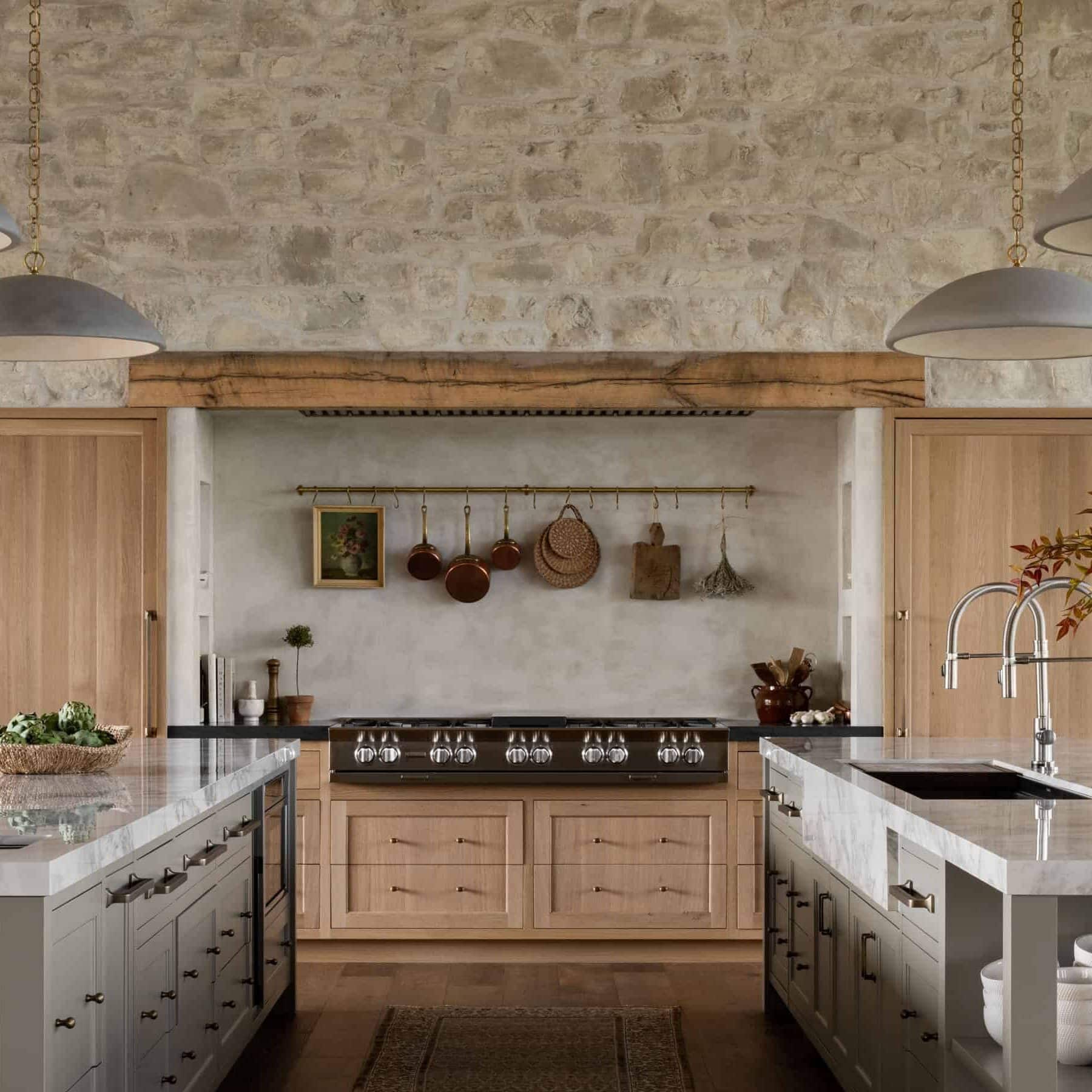
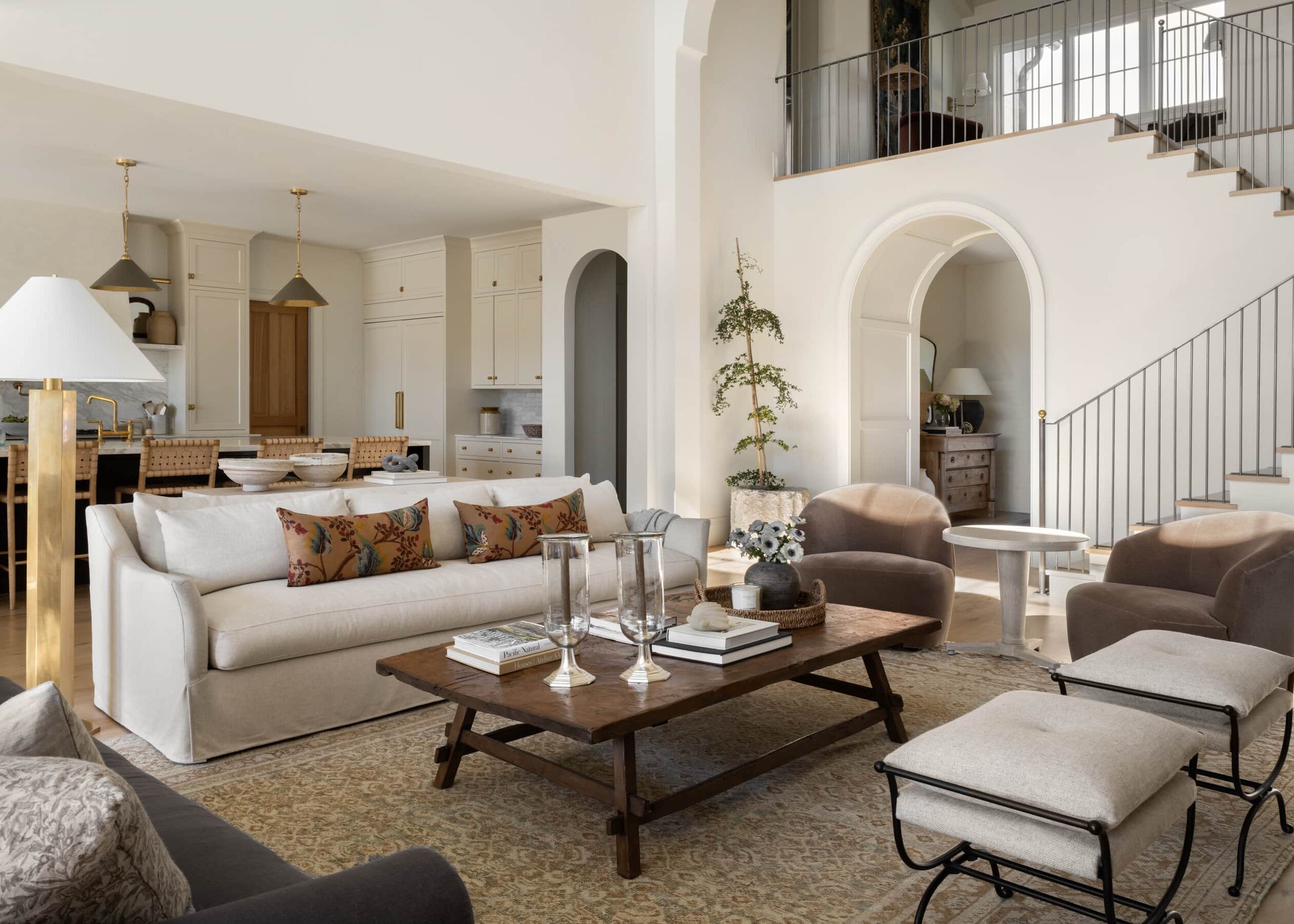
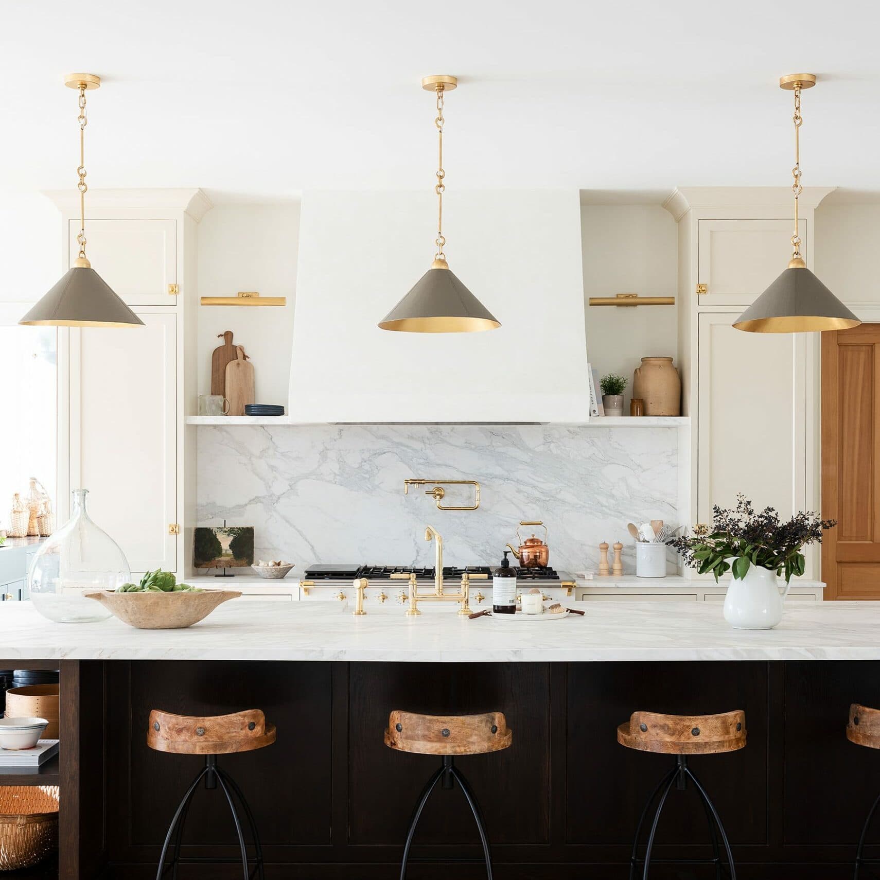
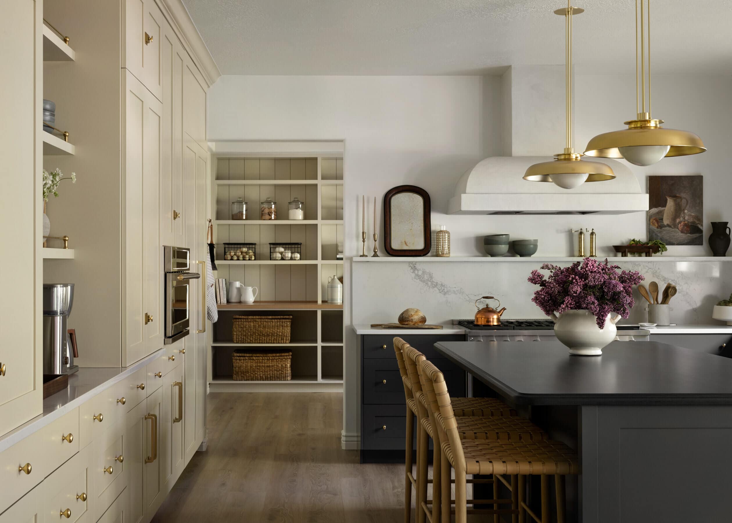
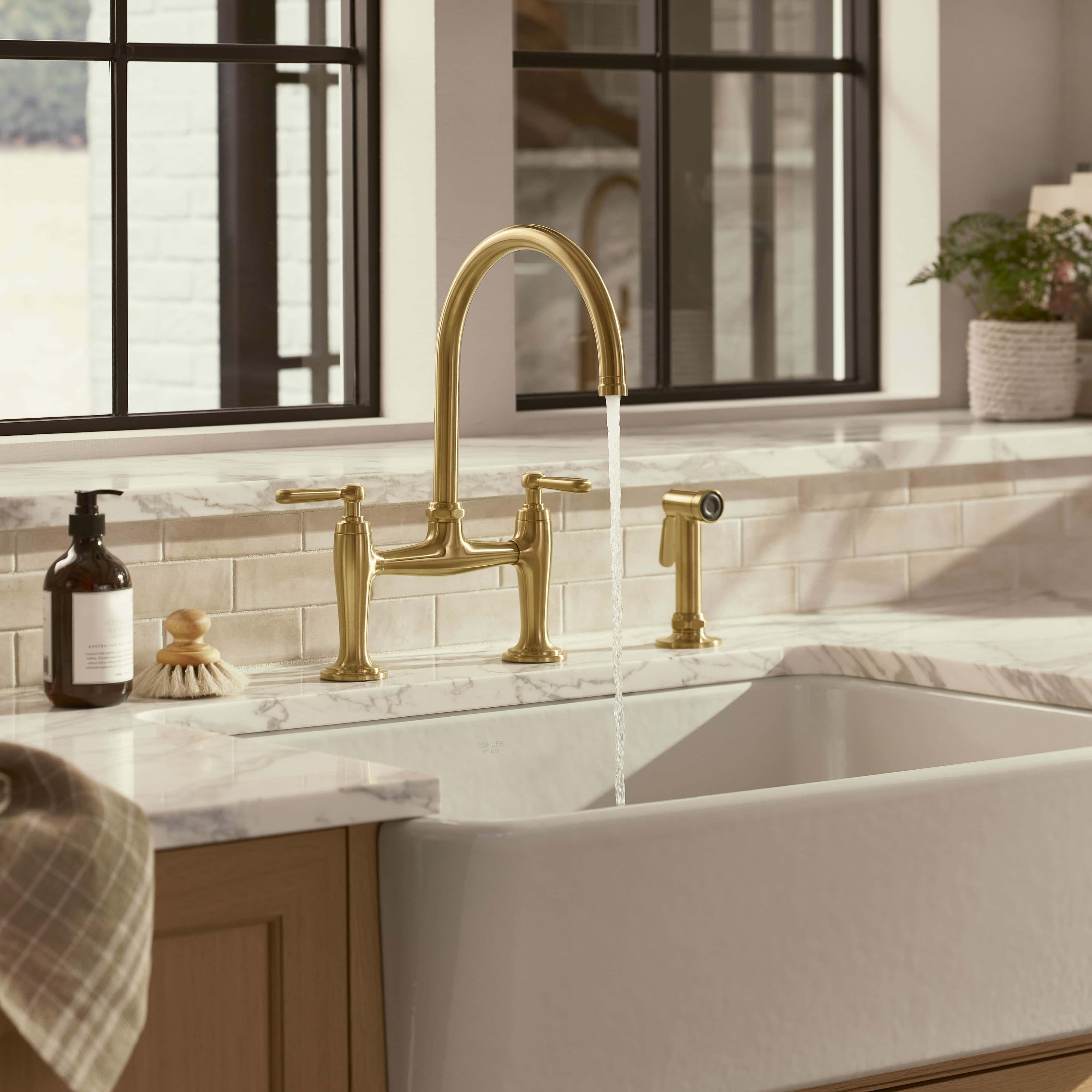
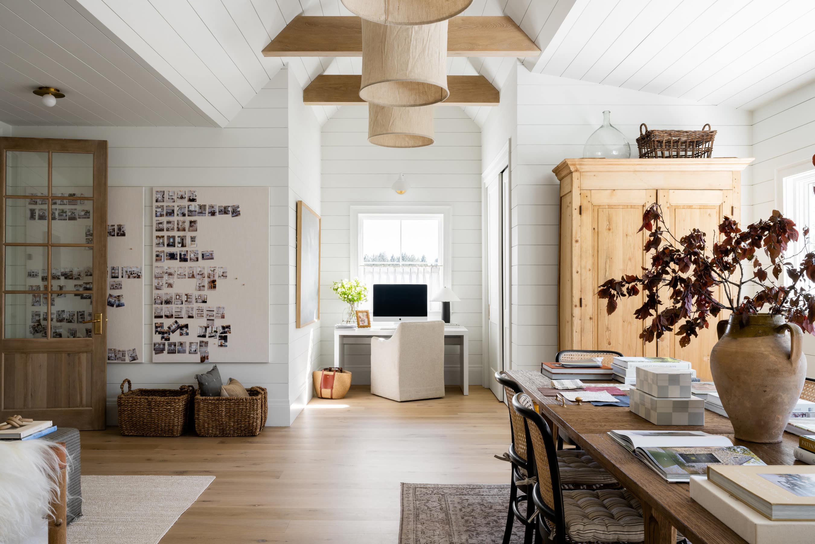
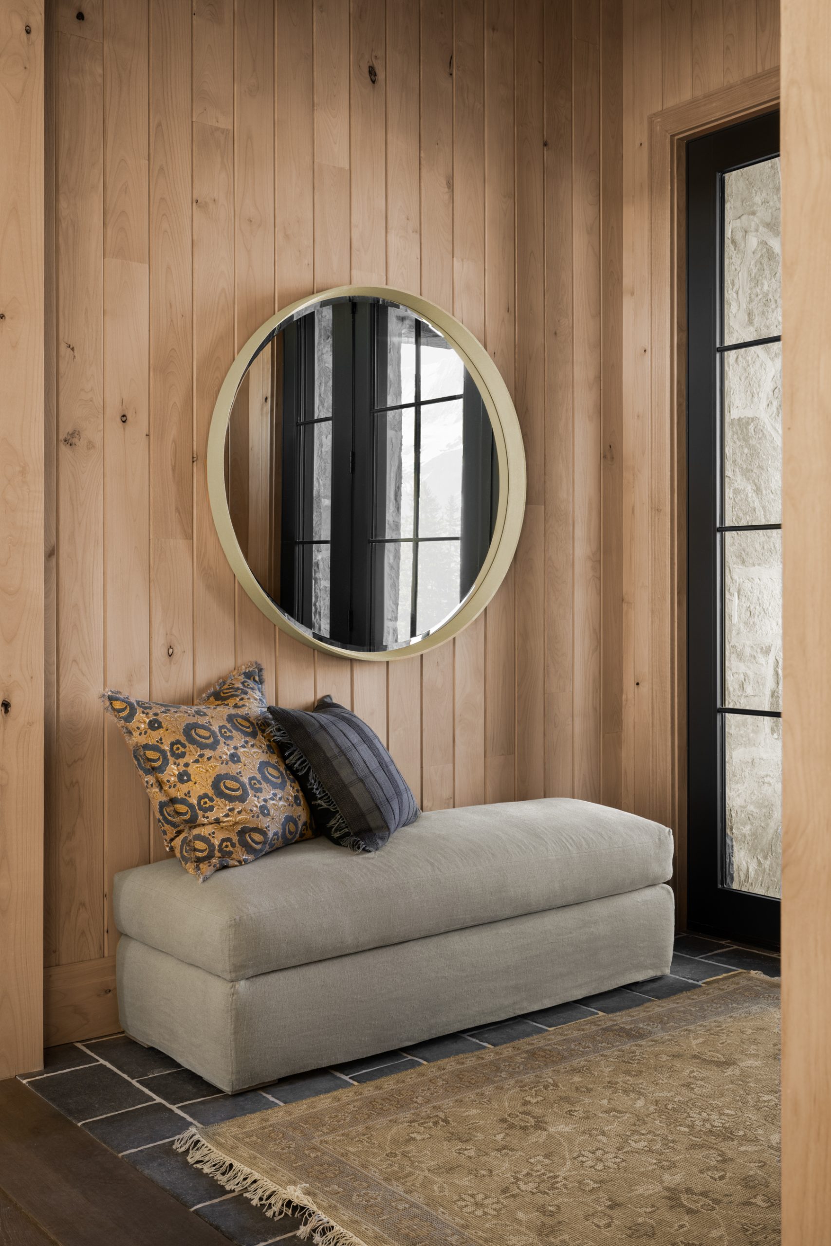
Tip No. 01 | Play Off Brass
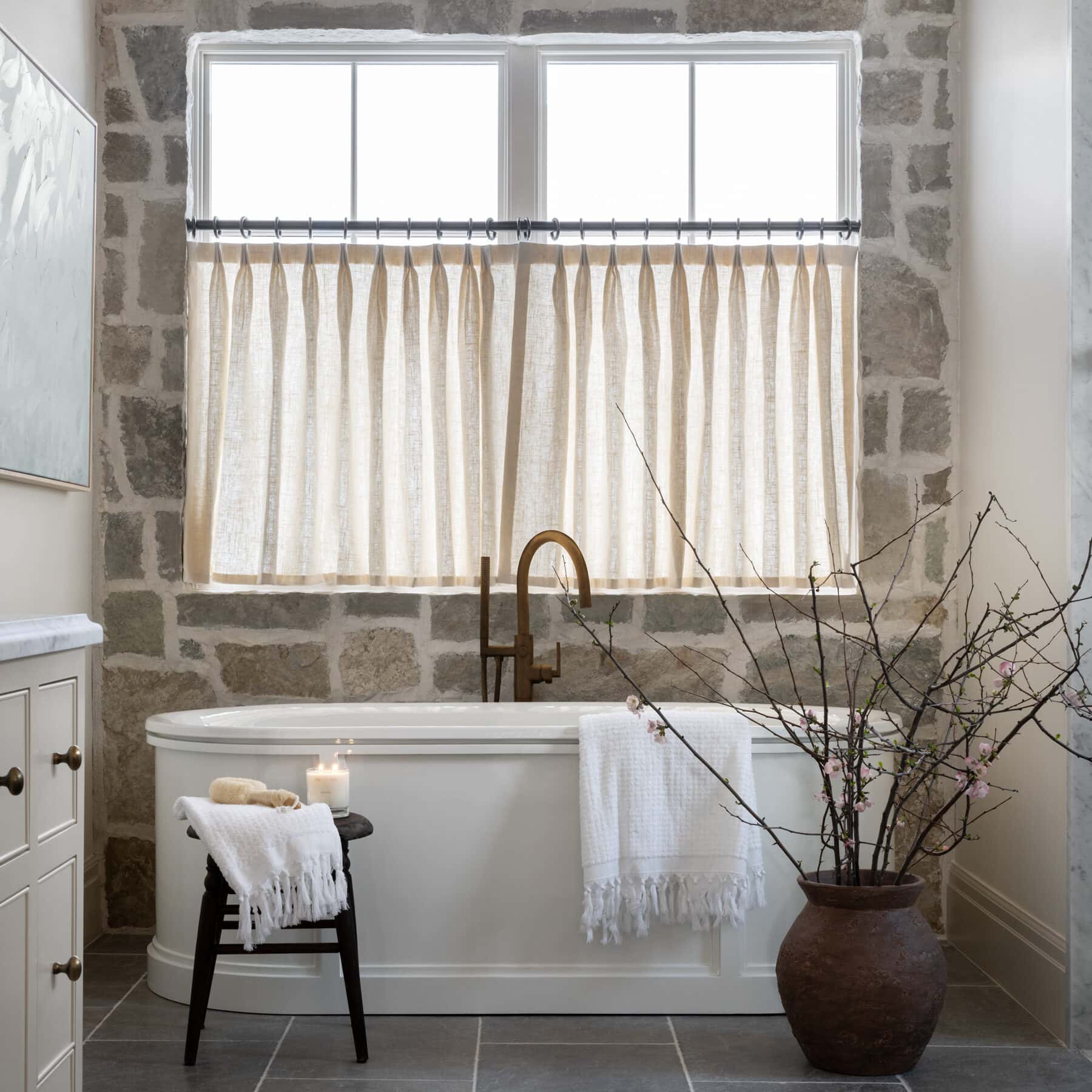
A great way to start incorporating marigold colors into your space is to look around at the hardware. A room with brass hardware provides an easy jumping off point. Use the brass as a complementary hue and work out from there, perhaps bringing in an accent wall, a few furniture pieces, or toss pillows to tie in marigold moments elsewhere in the space.

“I prefer to use marigold paints that have a strong tan undertone which allows us to use color in a way that seamlessly flows with more neutral spaces—we are painting a mudroom in Park City one of these colors as we speak!”

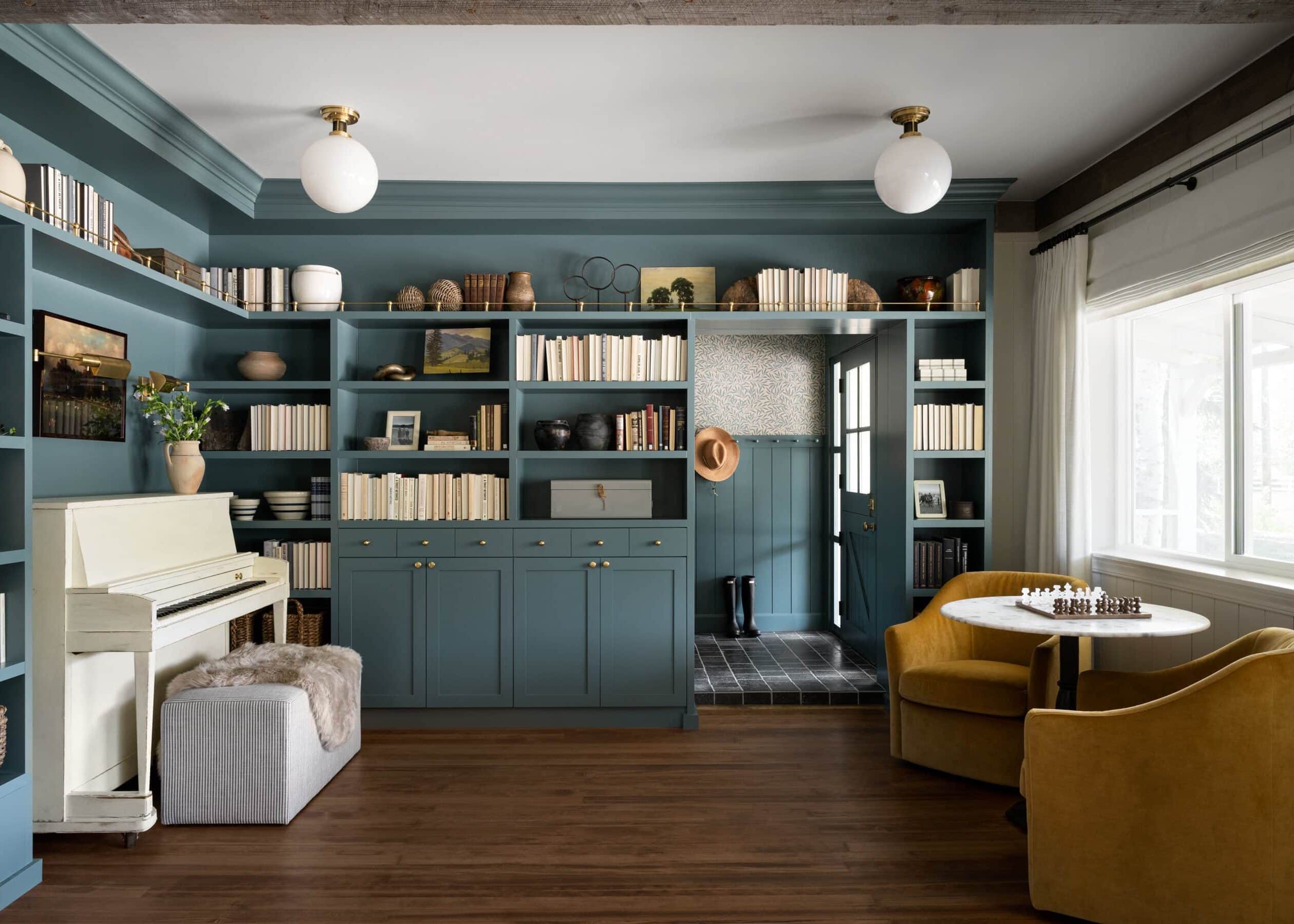
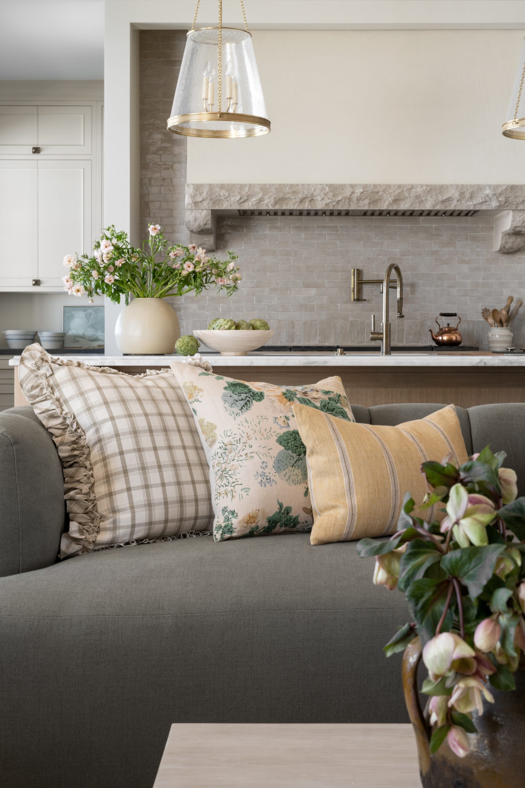
Tip No. 02 | Embrace the Energy
In color theory, marigold with its yellow and orange undertones is all about energy. It has the power to enliven a room. Therefore, choose a space where you want to inject a sense of vitality—a laundry room where you spend hours doing a not-so-loved chore, a sunroom, or a kids room. These are all rooms that would benefit from an infusion of something bold and energetic.
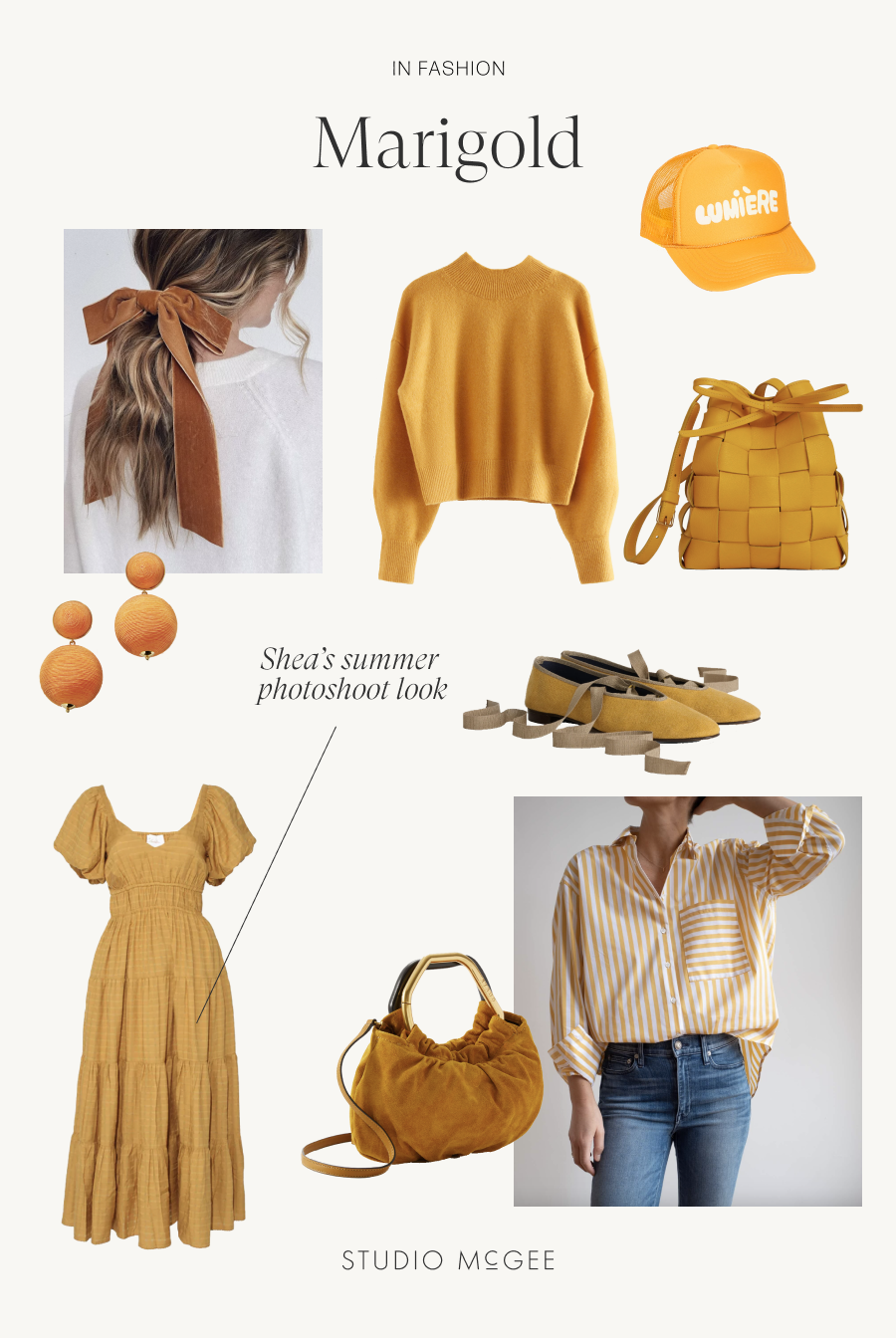
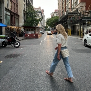
From top left: Kristin Ess Bow Slide from Target, Mock Neck Sweater from & Other Stories, Lumiere Trucker Hat from Clare V., Tangerine Woven Lantern Earrings from Tuckernuck, Upcycled Woven Mini Bucket Bag from Mansur Gavriel, Juliet Italian Flat in Washed Canvas from Alex Mill, Rebecca Blouse and Kali Midi Skirt from Cleobella, Camille Bag from Elyse Walker, and The Deep End Shirt from Ayr.
You May Also Like