

AZ Homestead Project: The Kitchen & Primary Suite
Details from part two of our Homestead Project
31 March 2021 -
Today, we’re taking you on a virtual tour of part two of our Arizona Homestead Project!
If you missed part one, make sure to explore the exterior, entry, and dining room here.
To see more of the kitchen, dining nook, and primary suite, keep scrolling for more details!
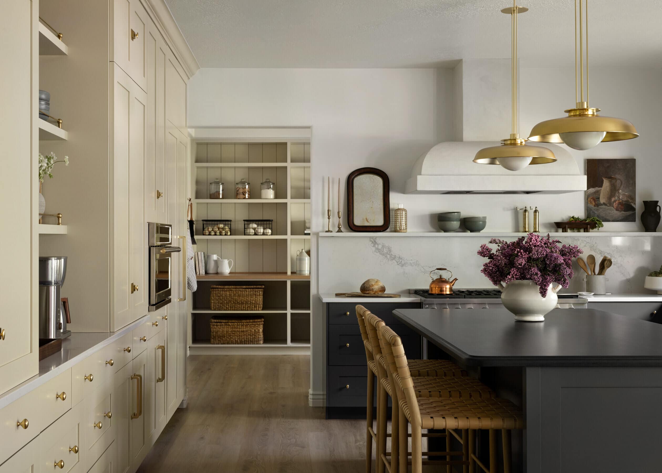
The Kitchen
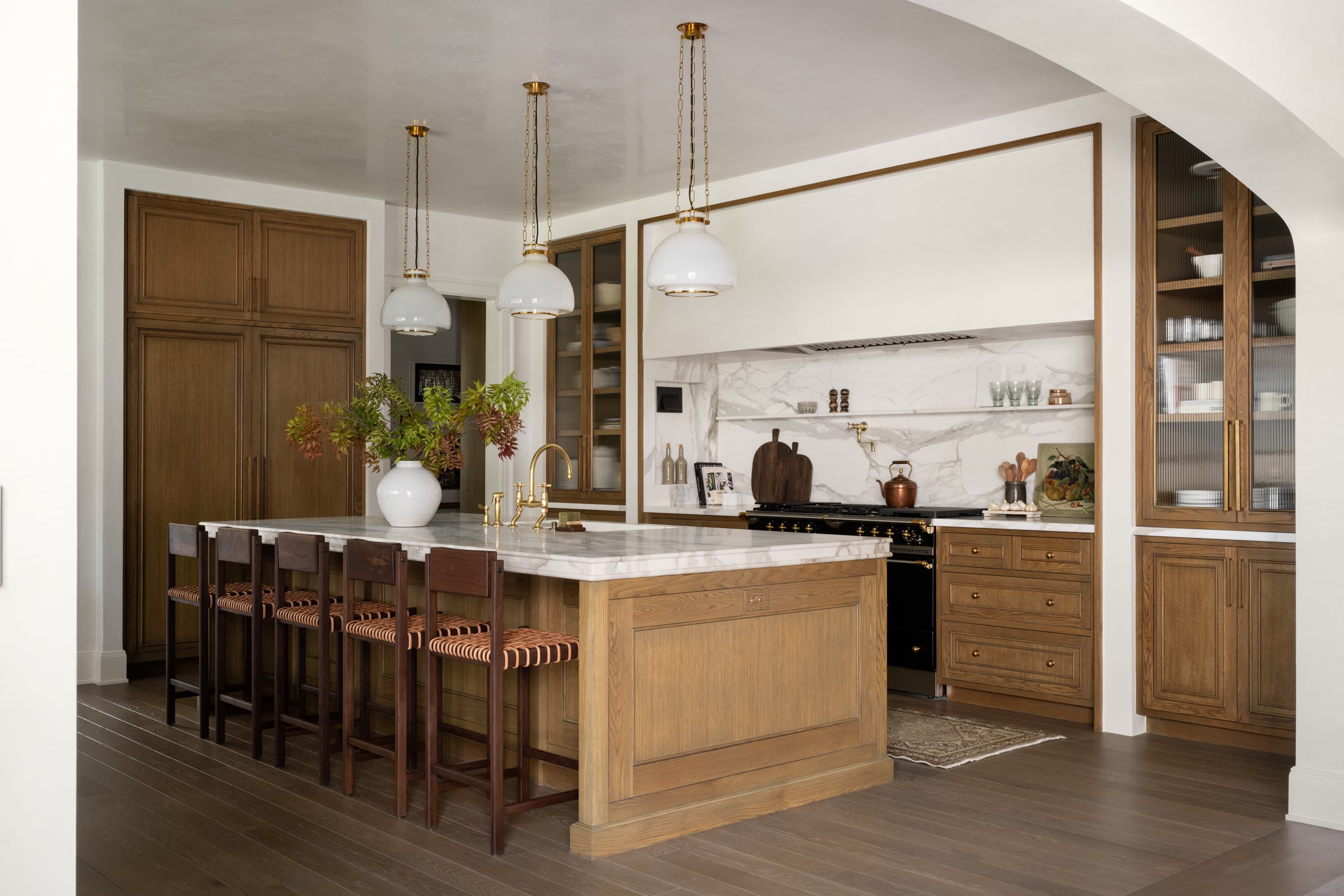
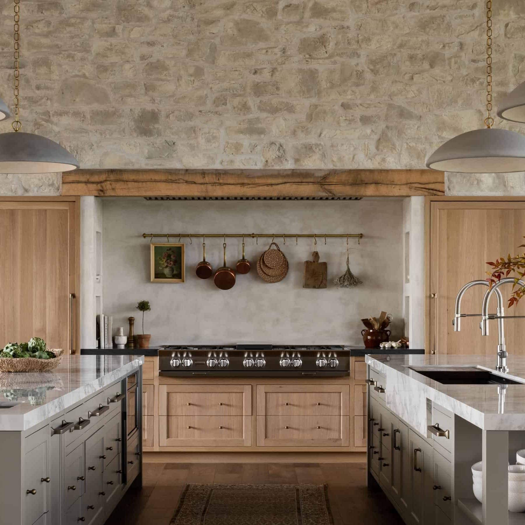
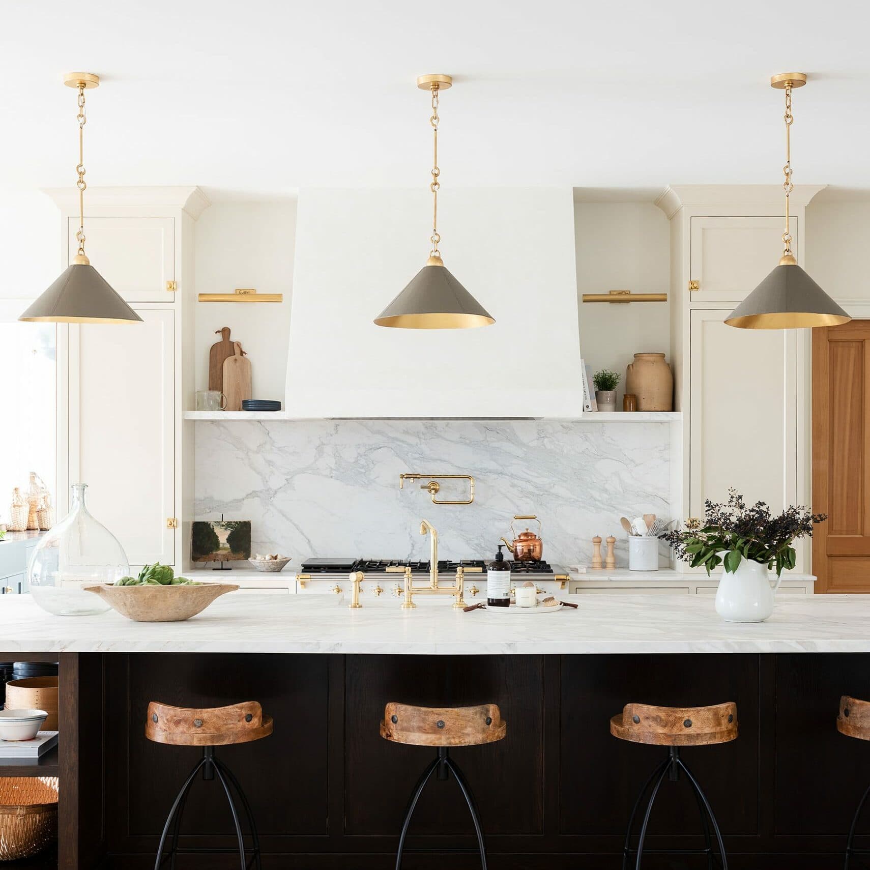
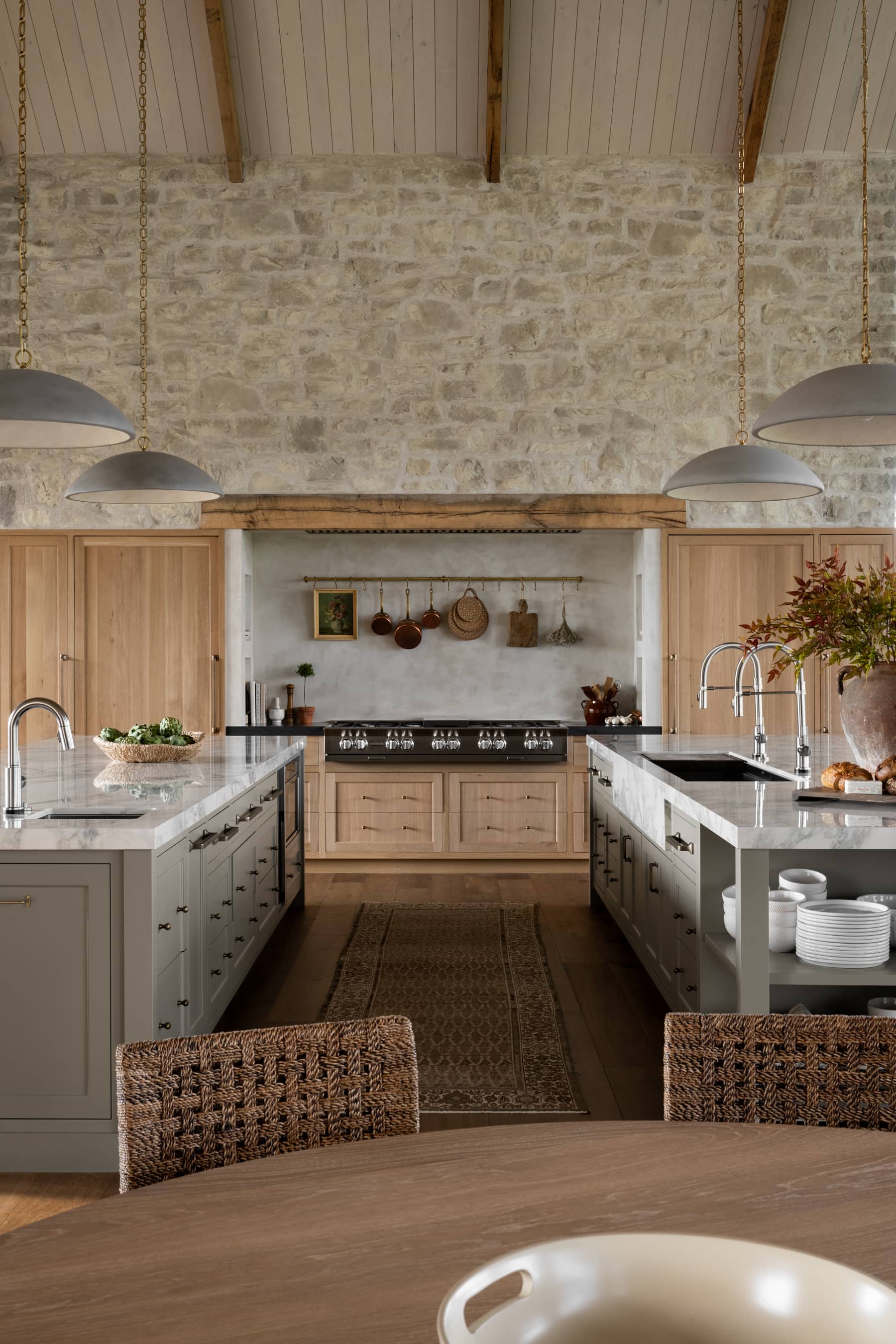
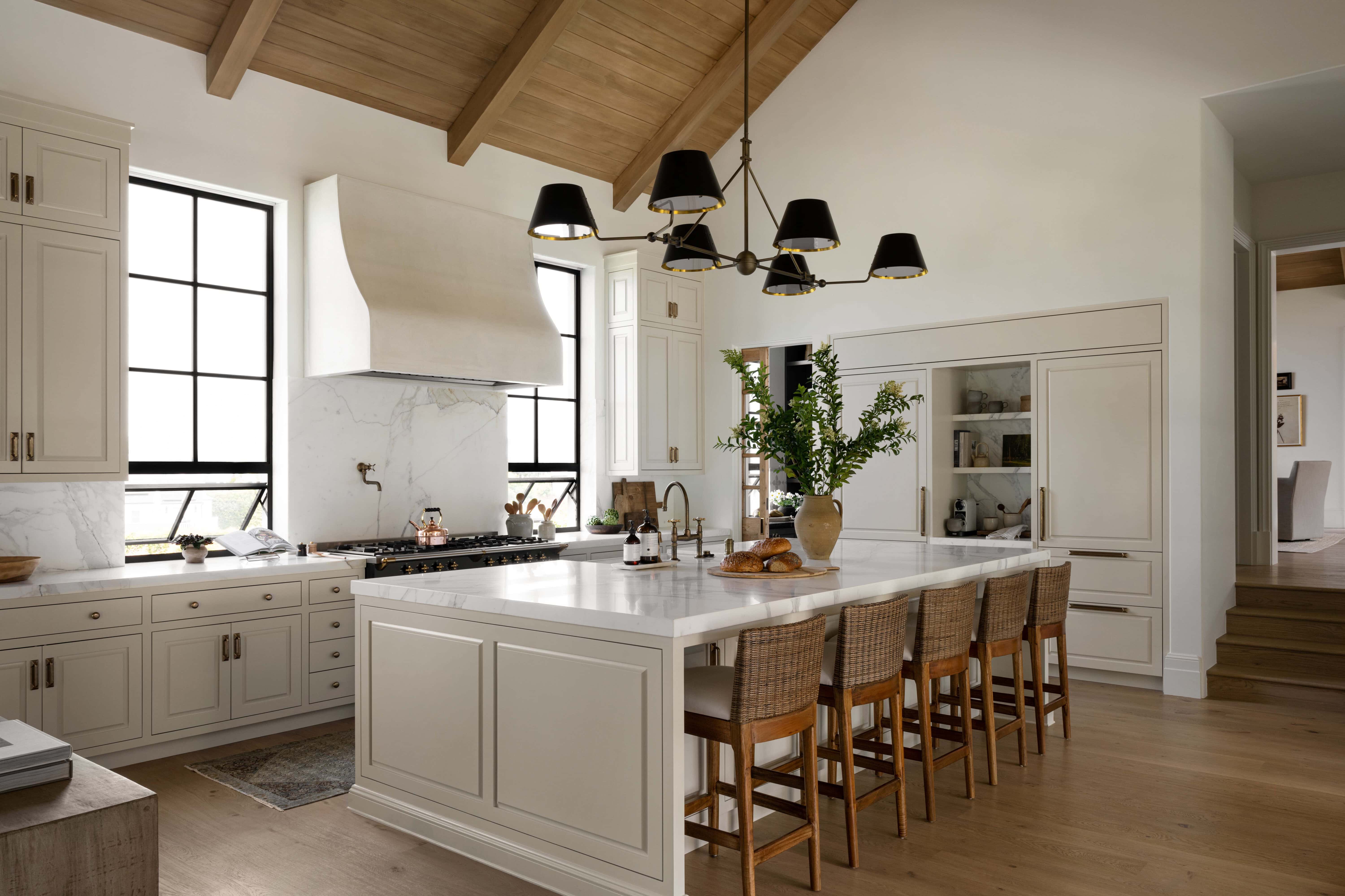
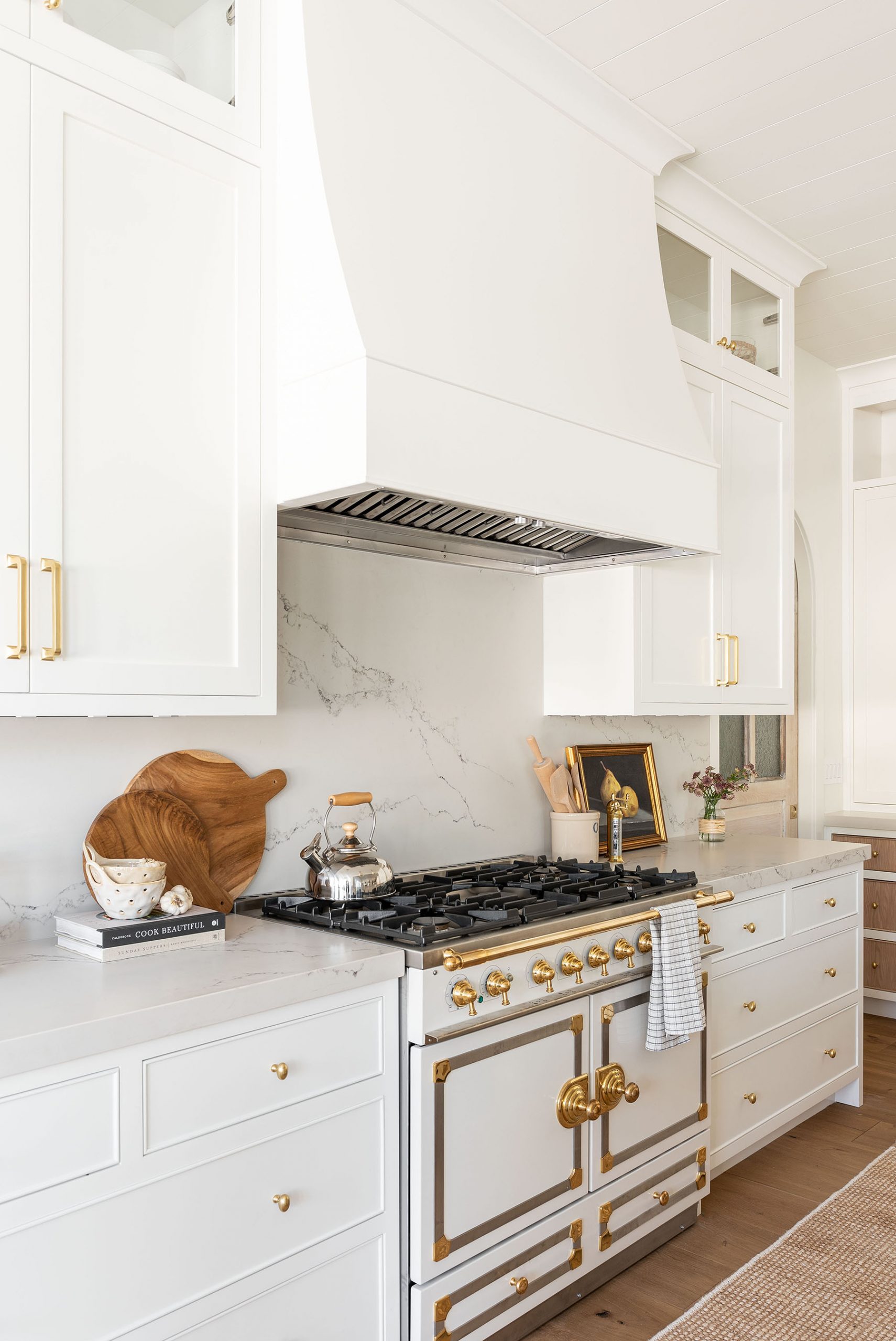
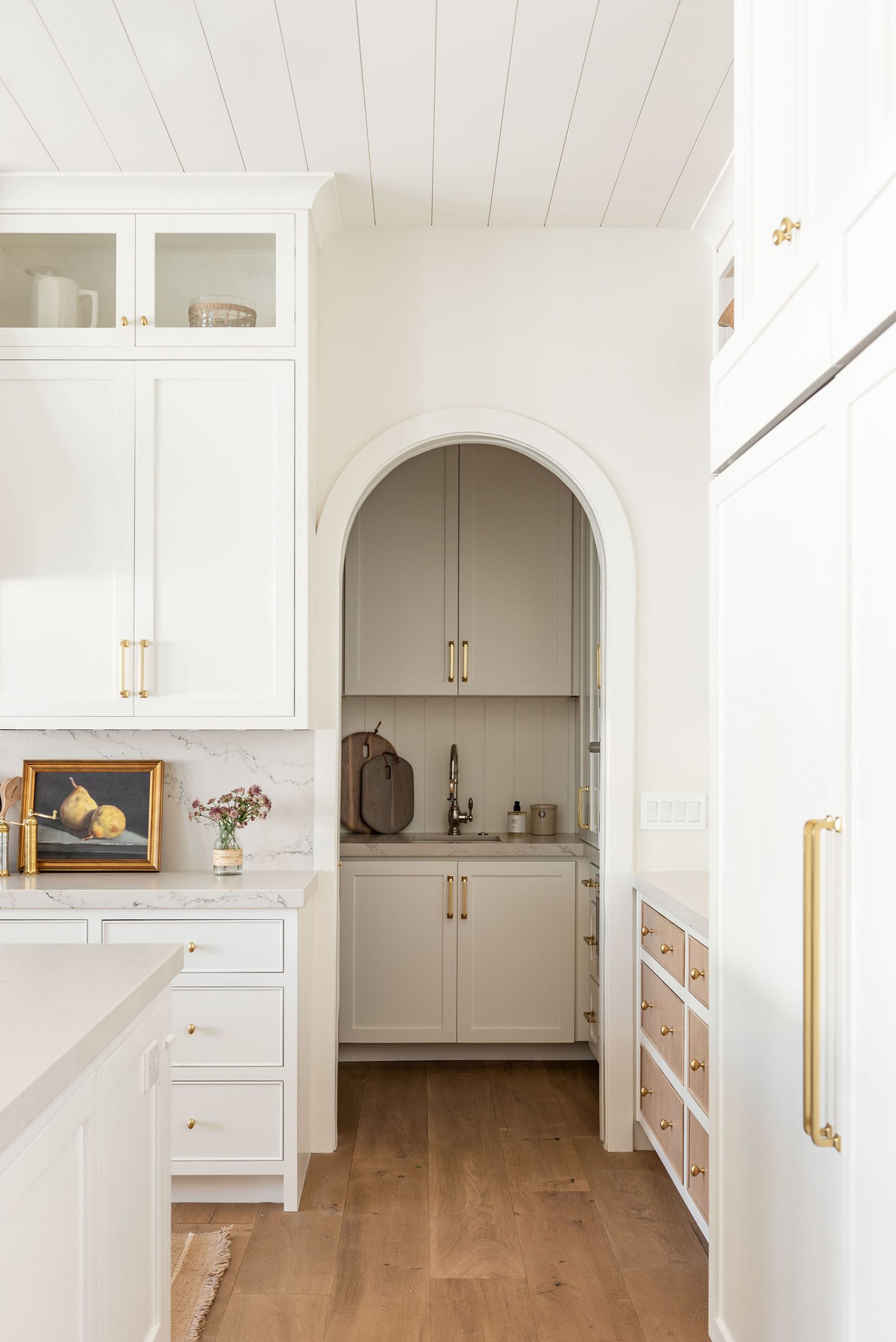
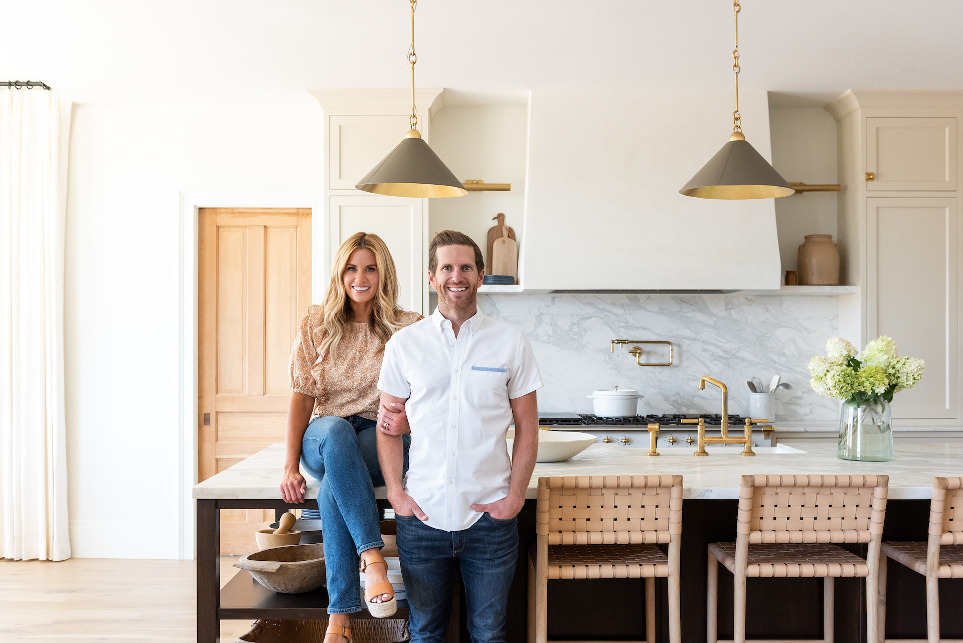
Our clients had their hearts set on a white kitchen from the beginning, and we knew we wanted to play with a few interesting details to bring dimension to the neutral color palette. We started with this beautiful La Cornue range and arched vintage doors that added so much character to the space. Then, we incorporated wood drawer fronts, a textual marble slab backsplash, brass knobs, and drum shape light fixtures to complete the look.


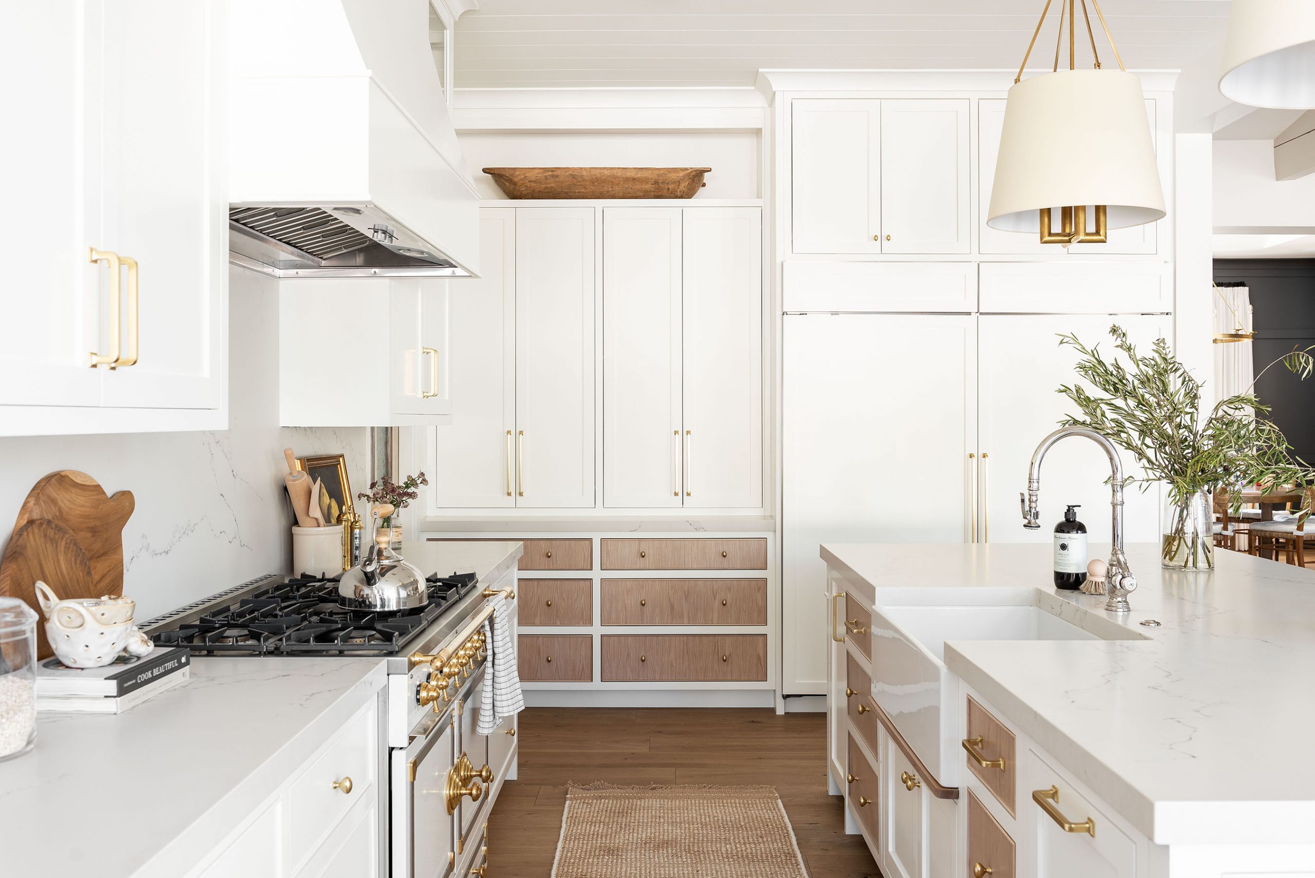

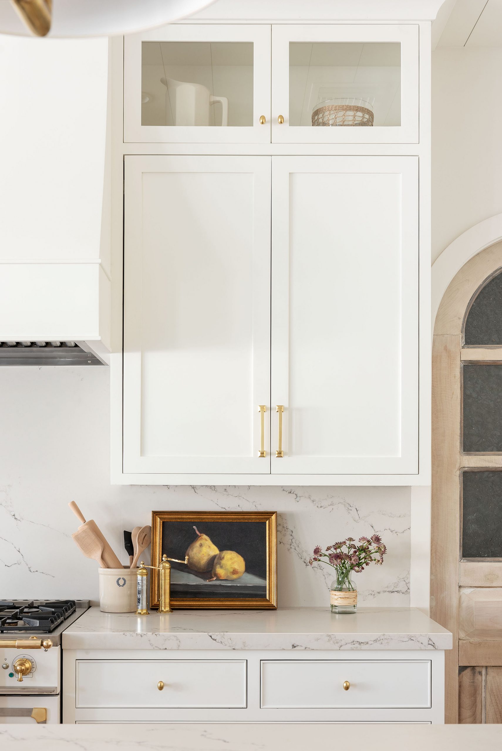
I've said this before, and I'll say it again, but when you do a white kitchen, it's all about making it feel special in interesting details to add more dimension to the space.
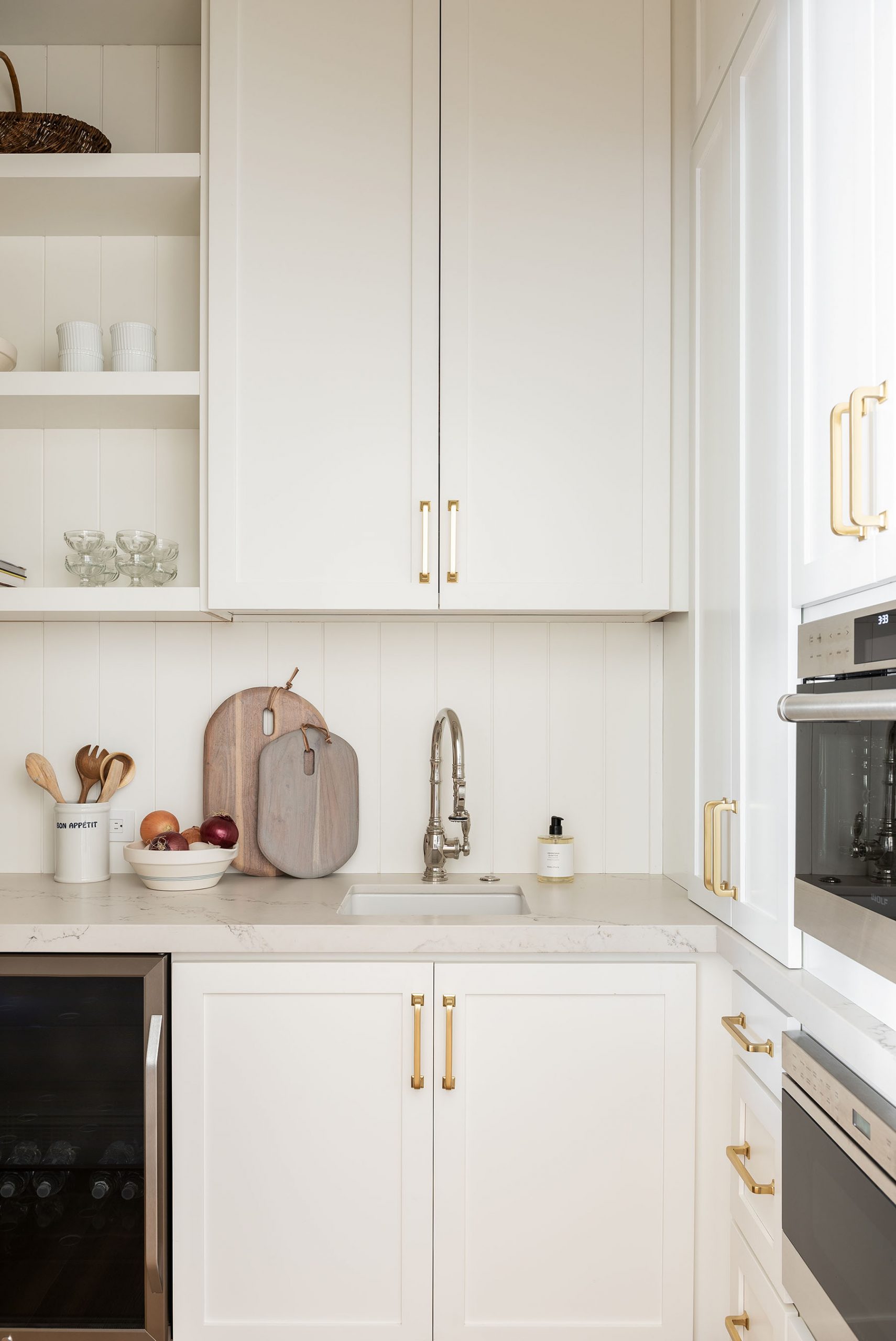
Finish details:
Kitchen range: La Cornue Range
Pantry door: Vintage
Floors: Vicomte Grand Savoy Collection Engineered Floors from Duchateau.
Paint: All Walls, Trim, & Ceilings – Swiss Coffee at 75%
Cabinetry: Custom stain
AZ Homestead Project: The Kitchen & Primary Suite
Williamsen Counter Stool
Still Life with Pears

Girona Rug
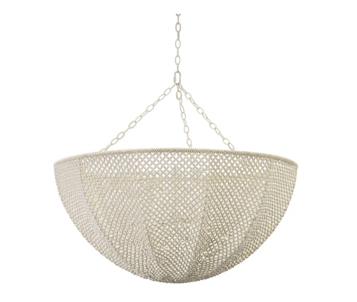
Dalston Hanging Shade
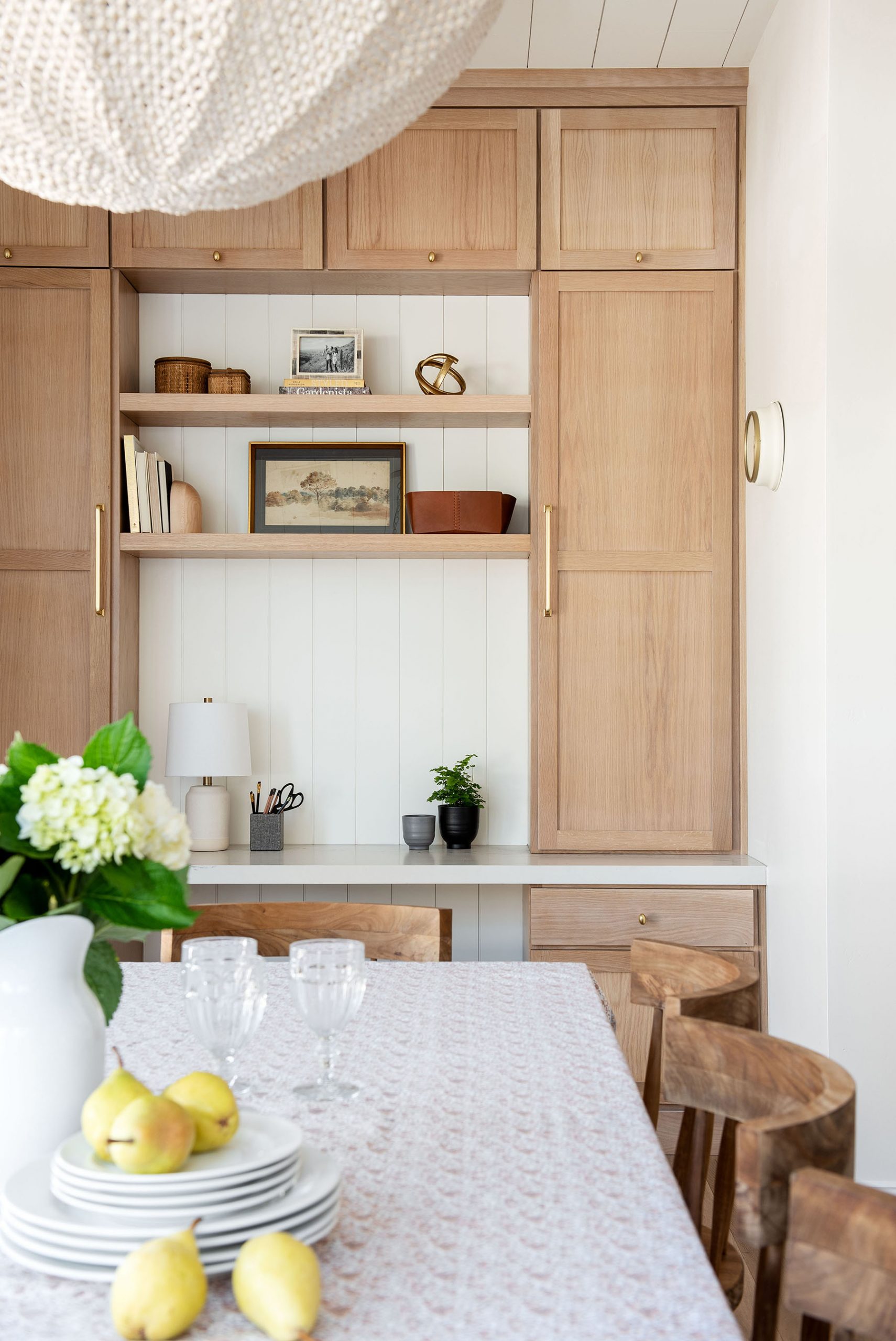
The Dining Nook
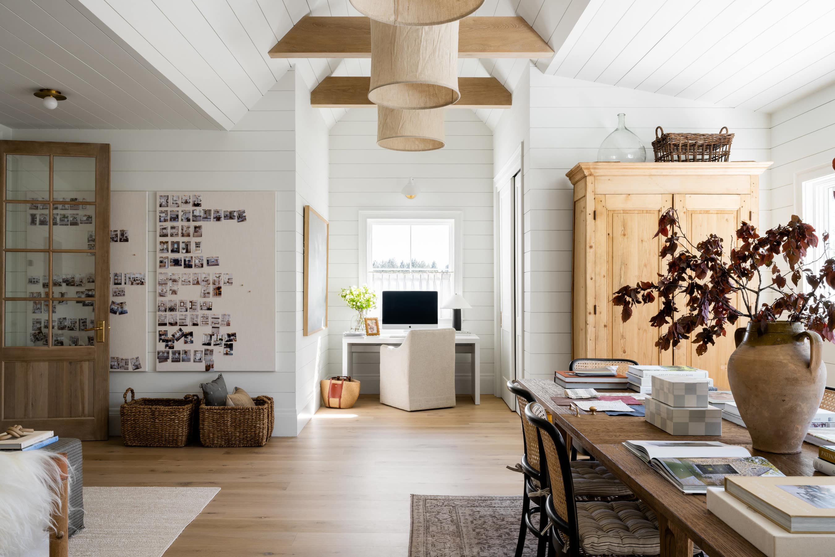
Next to the kitchen, we did a casual, everyday dining nook with a built-in desk. We tied in the built-ins with the wood tone incorporated on the kitchen wood drawer fronts to bring in some contrast and added a long wooden table with spindle-back chairs in a warm wood tone and a textural, canned light.

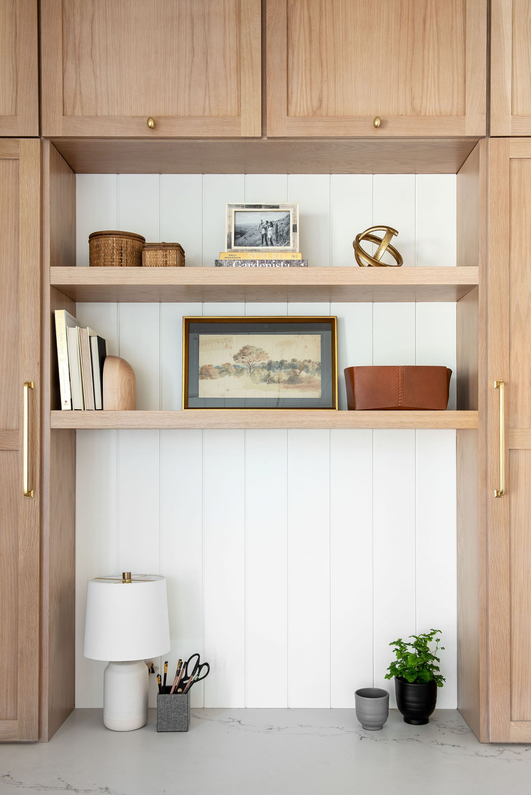

Try this at home: When working with a minimal color palette, try choosing pieces that bring interest in other ways through textural elements, thoughtful details etc.
“I love that the light fixture we incorporated in this space feels light and airy, but the attention to detail keeps it interesting.”

Finish details:
Paint: All Walls, Trim, & Ceilings – Swiss Coffee at 75%
Floors: Vicomte Grand Savoy Collection Engineered Floors from Duchateau.
Cabinetry: Custom stain
AZ Homestead Project: The Kitchen & Primary Suite
Quinn Chandelier
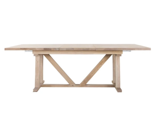
Emory Extension Dining Table

Contemporary Tapered Planters (Set of 2)

Genuine Leather Bin
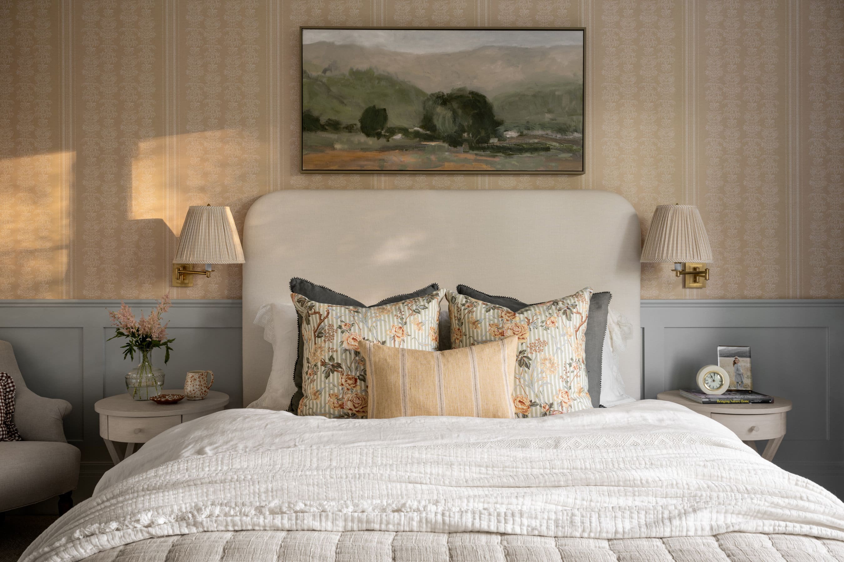
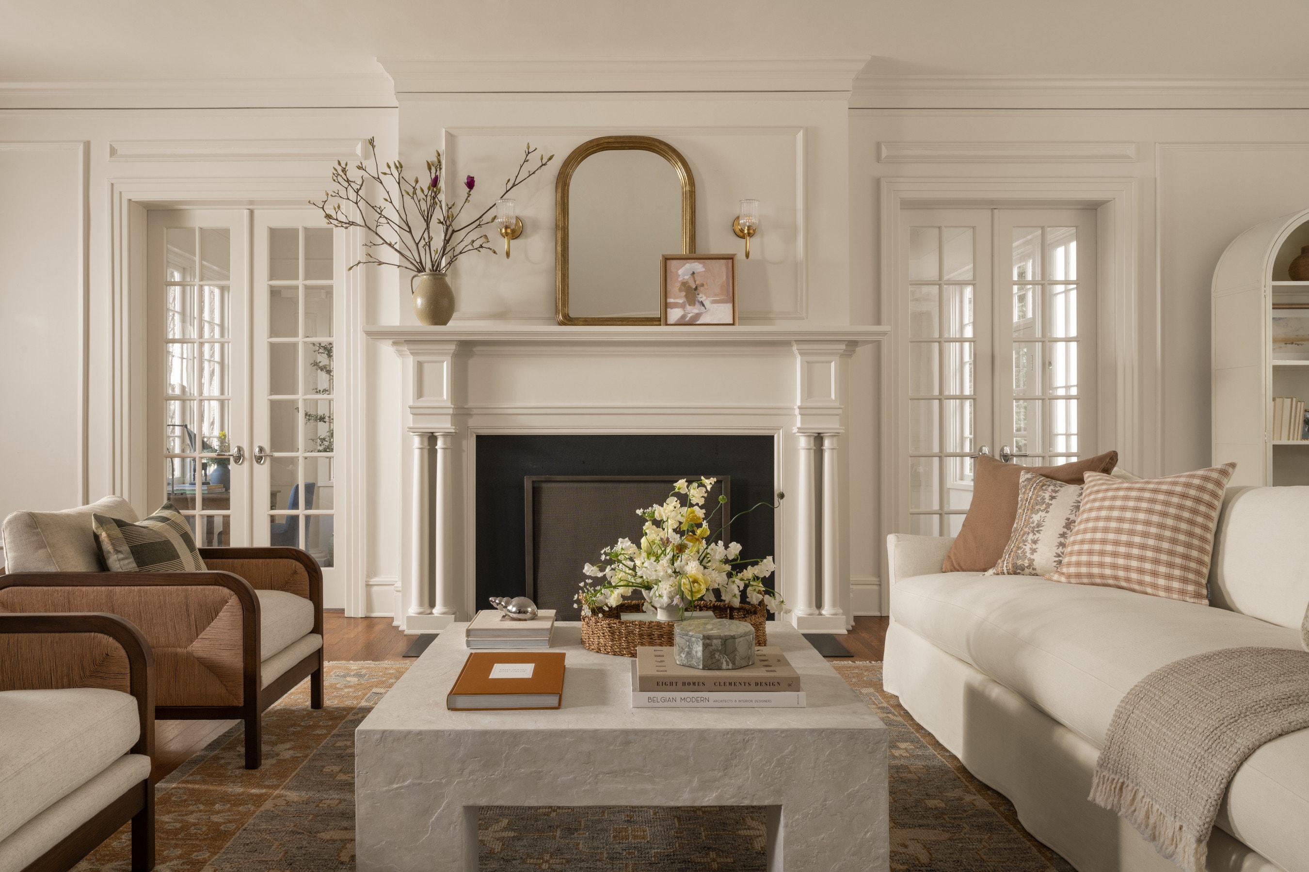
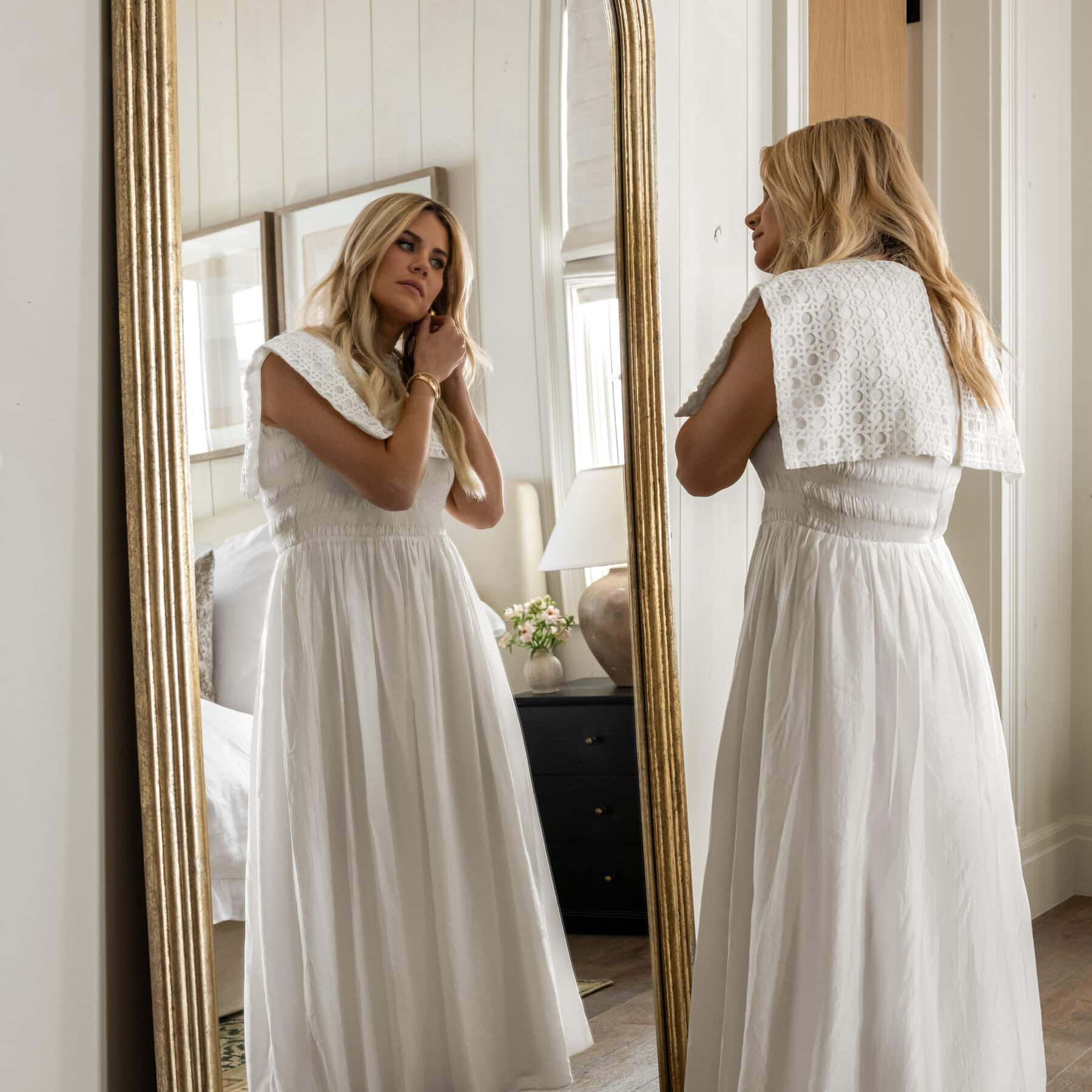
The Primary Suite
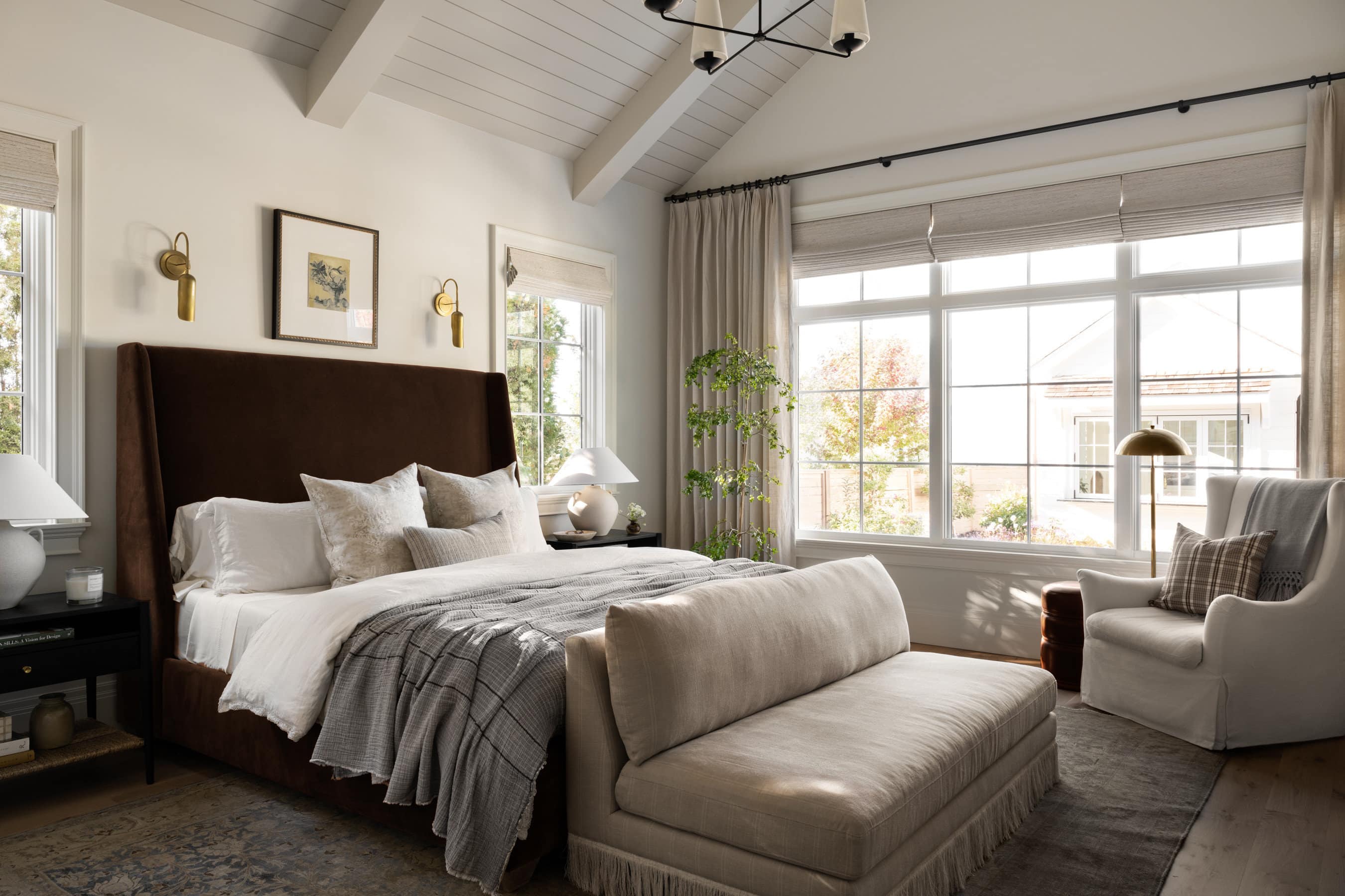
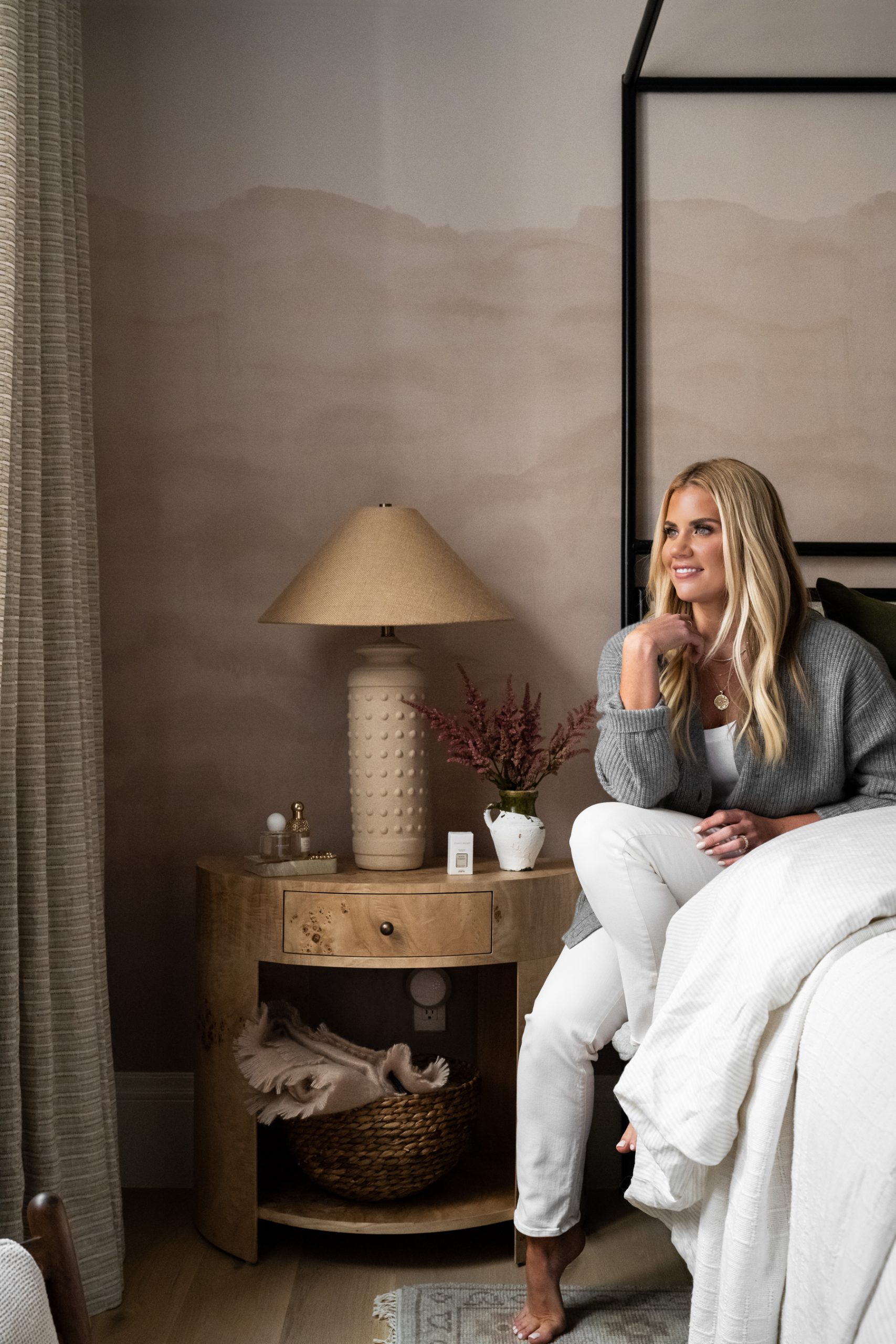
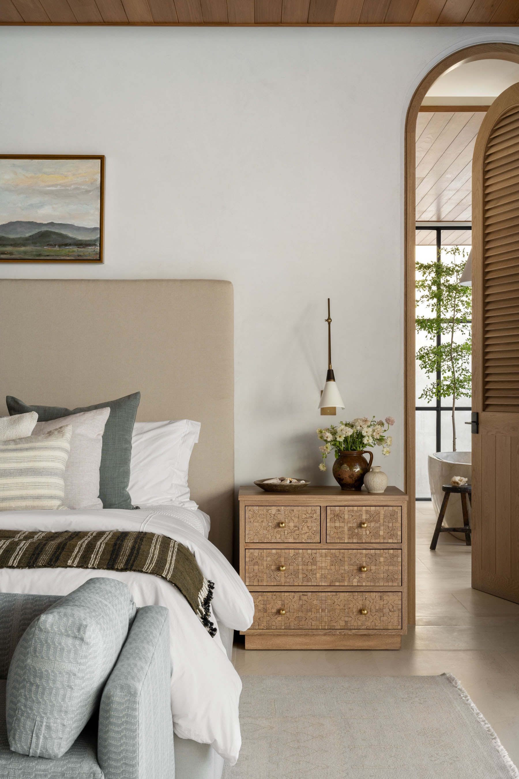
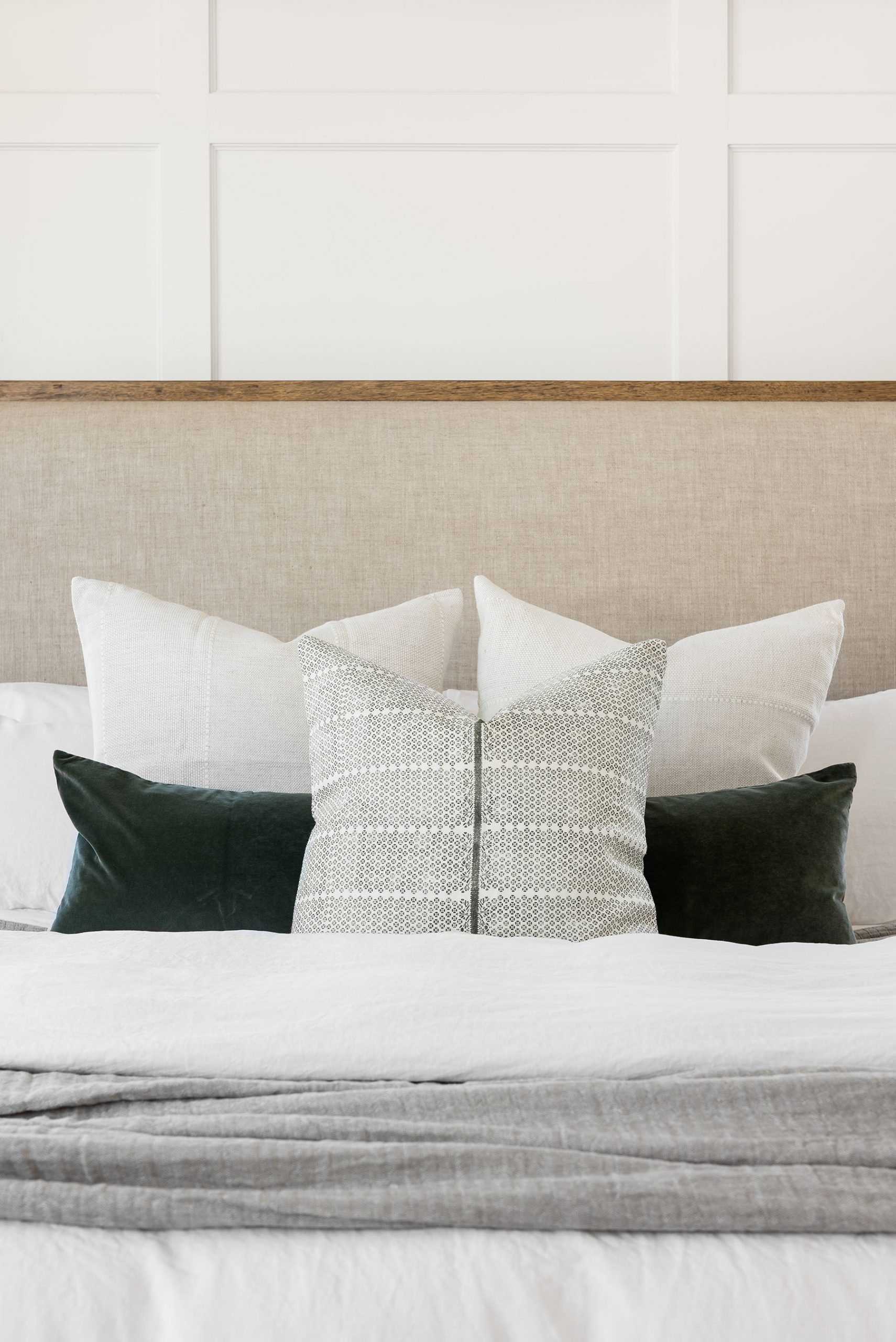
In the primary suite, we expanded a calming, minimal color palette with white paneling on the walls, a warm wood canopy bed, and subtle color accents with a green velvet lumbar and an inky blue linen sofa.
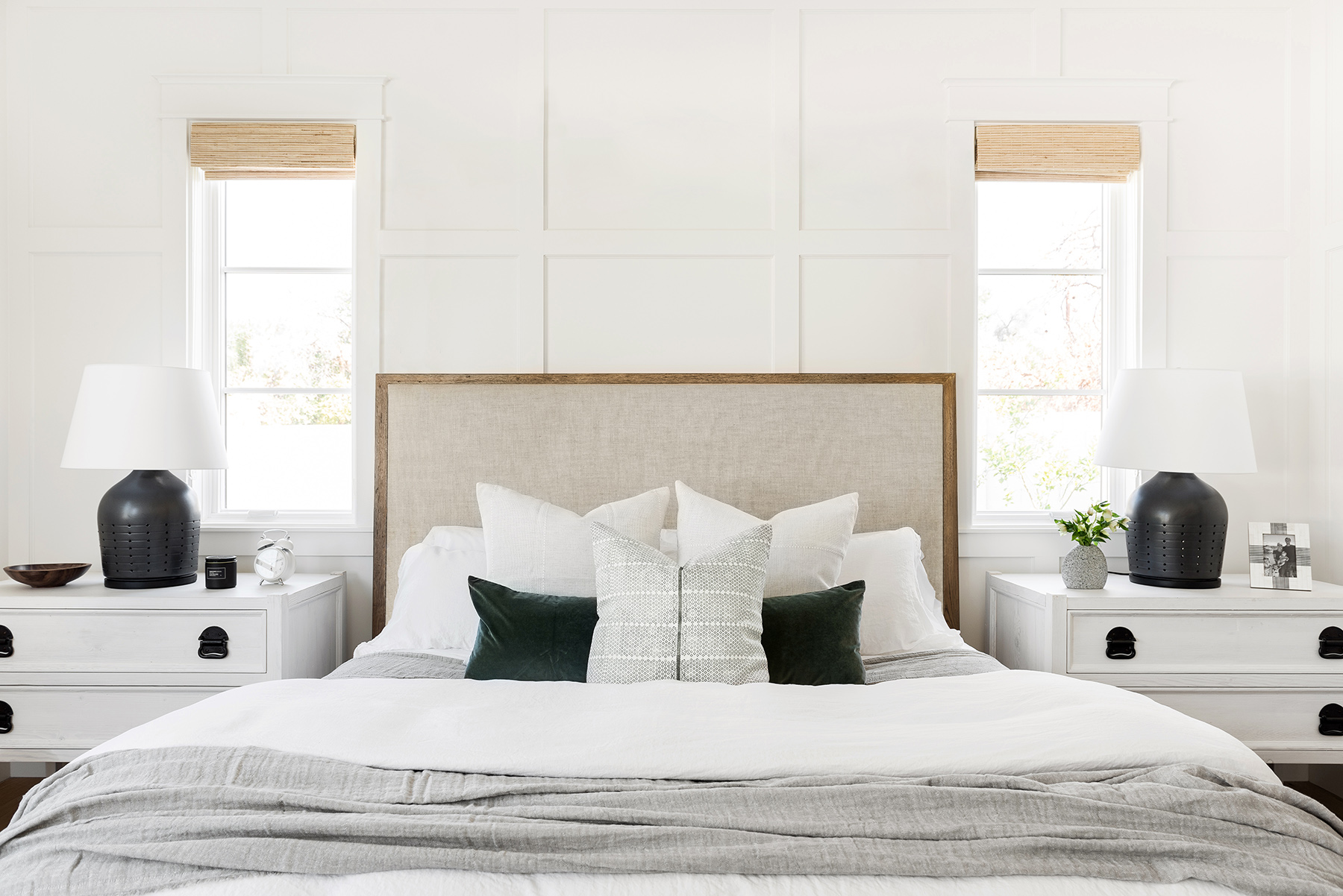

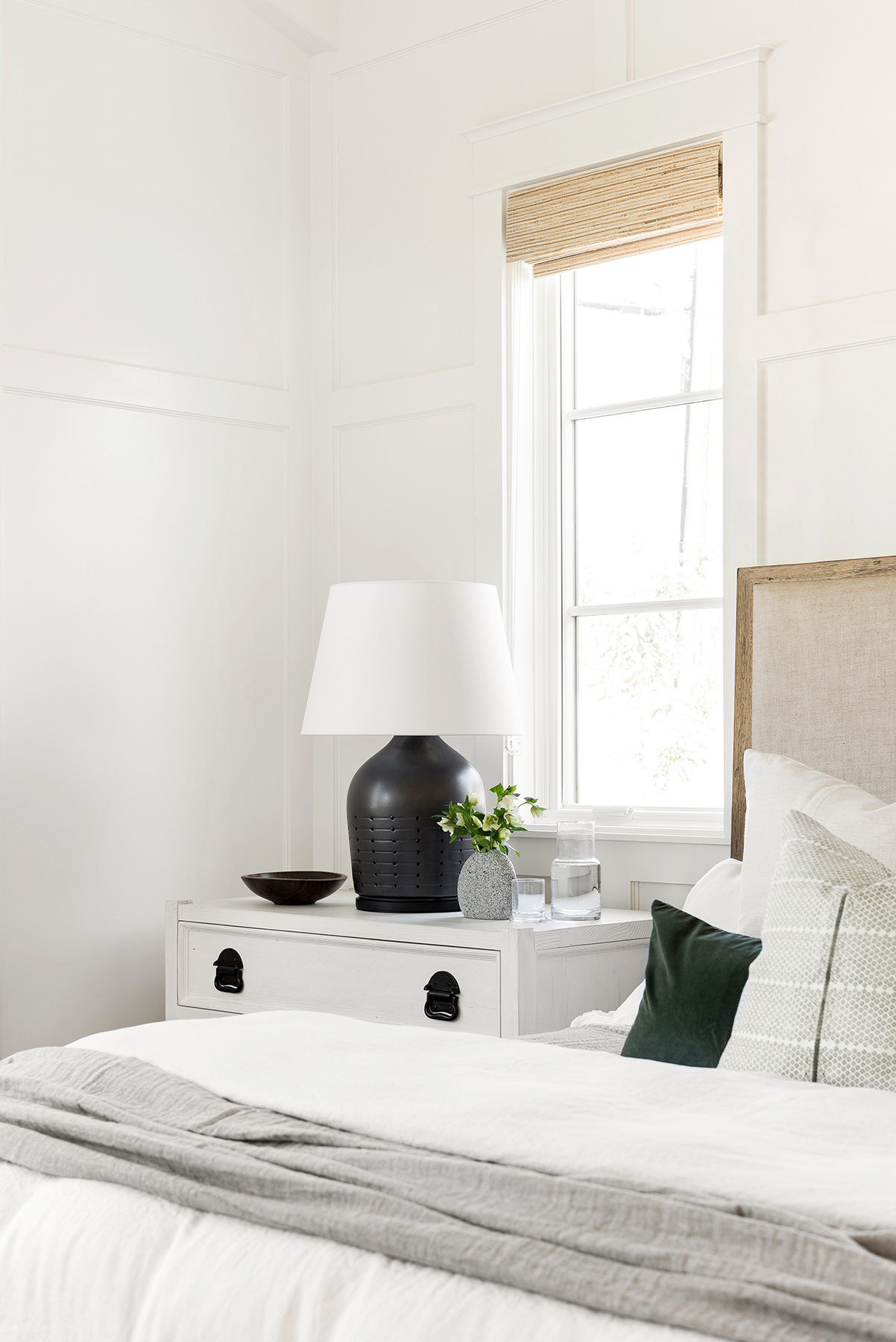
We had enough space to incorporate large, white wood nightstands, and because our client’s didn’t need the storage of a dresser, we were able to add a great seating area across from their bed with layered pillows and artwork.

Finish details:
Paint: All Walls, Trim, & Ceilings – Swiss Coffee at 75%
AZ Homestead Project: The Kitchen & Primary Suite

Evie Hand-Knotted Rug

Nottaway Chandelier
Lidia Side Table
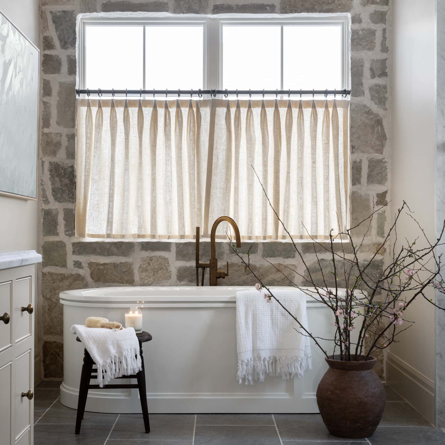
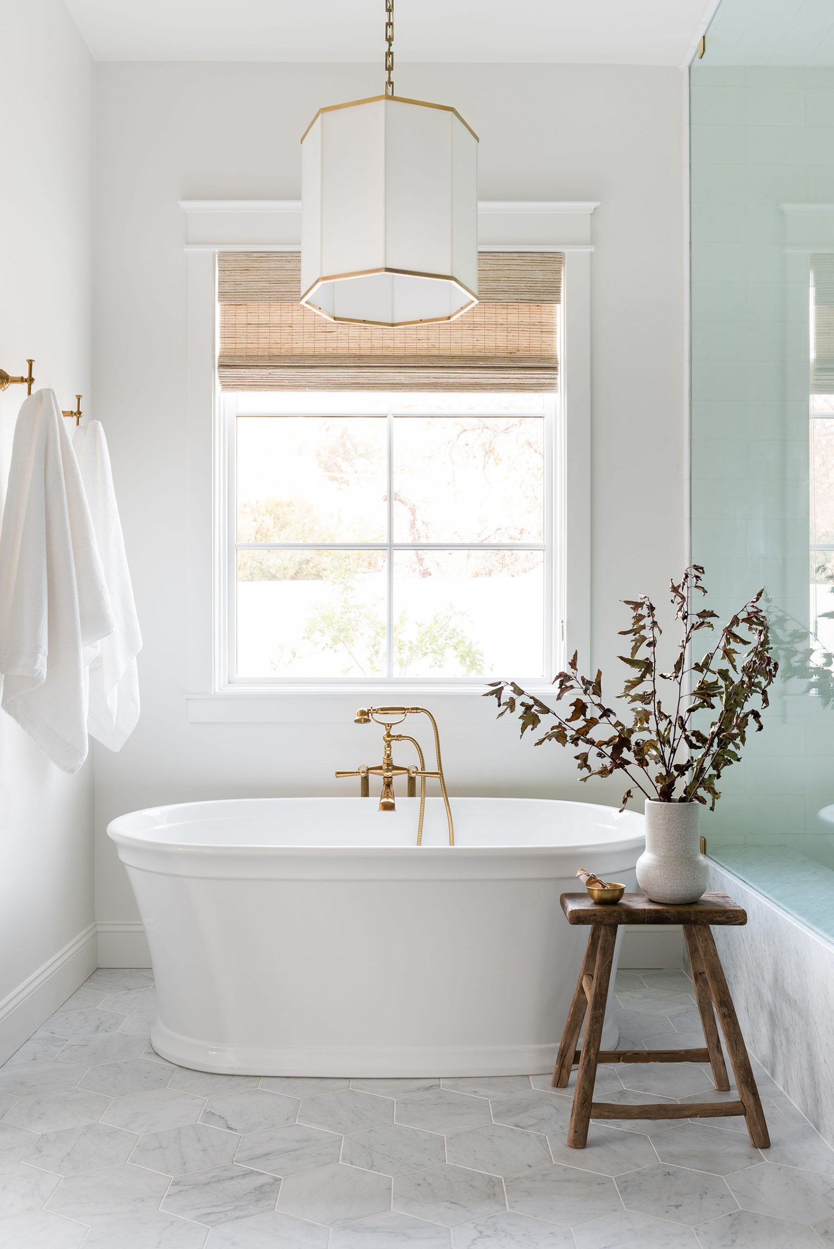
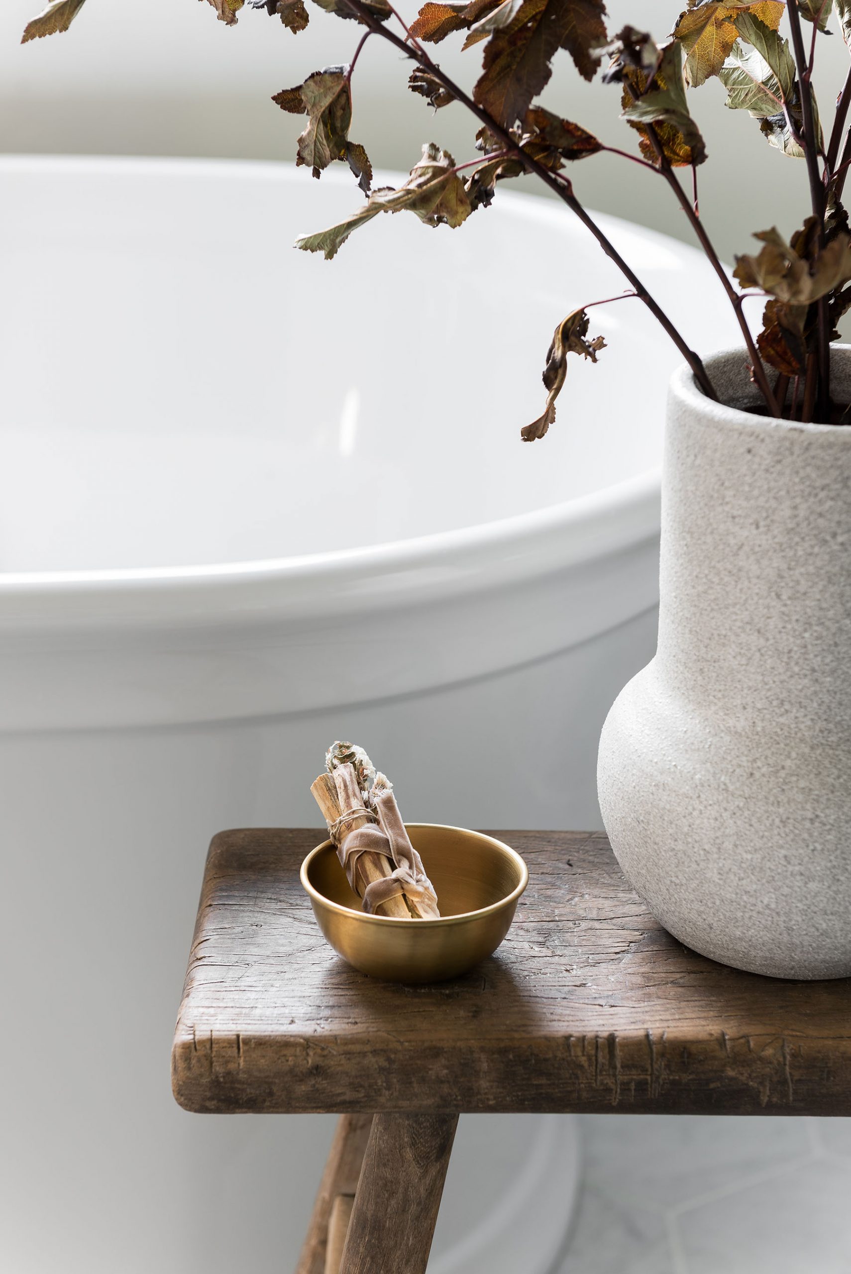
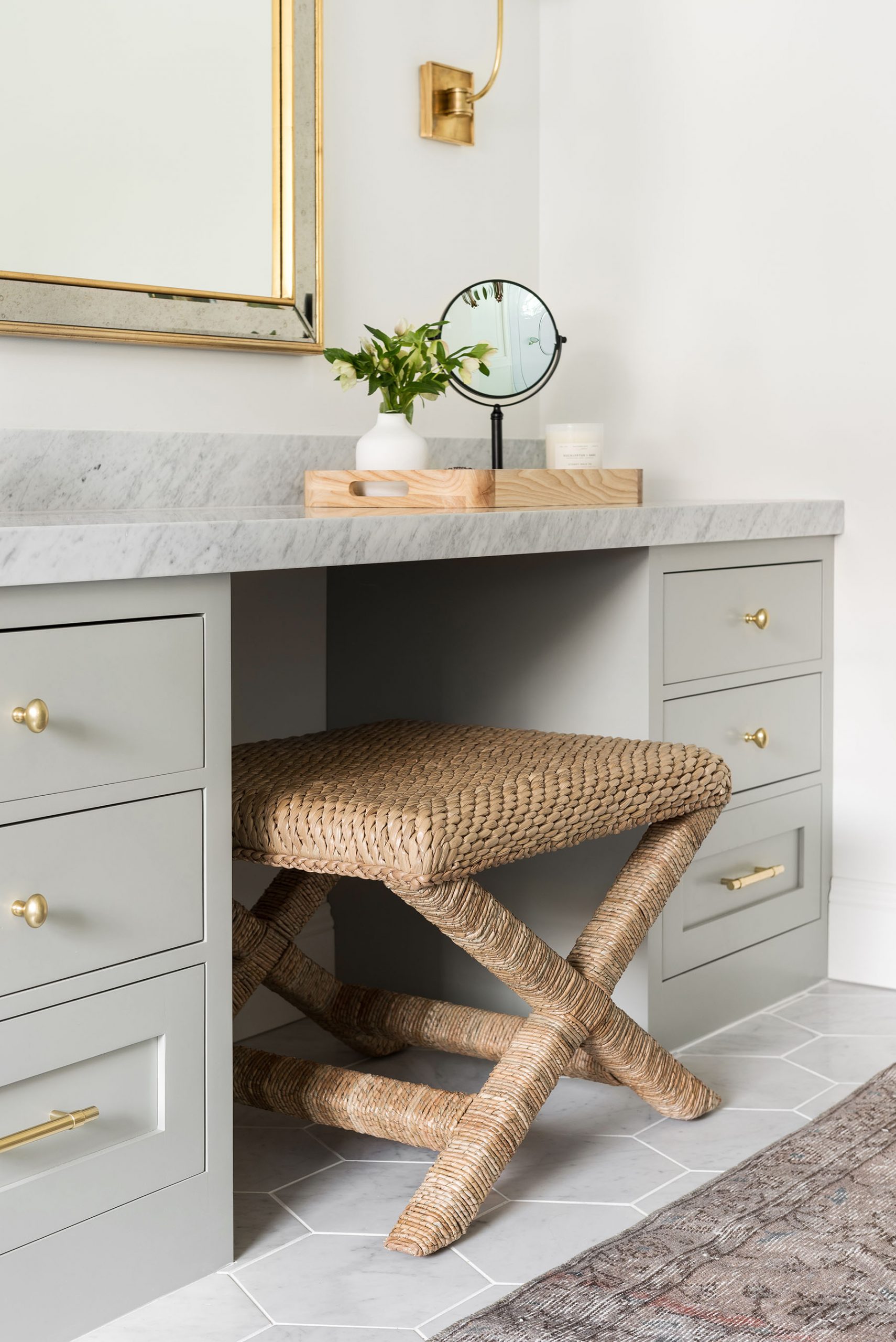
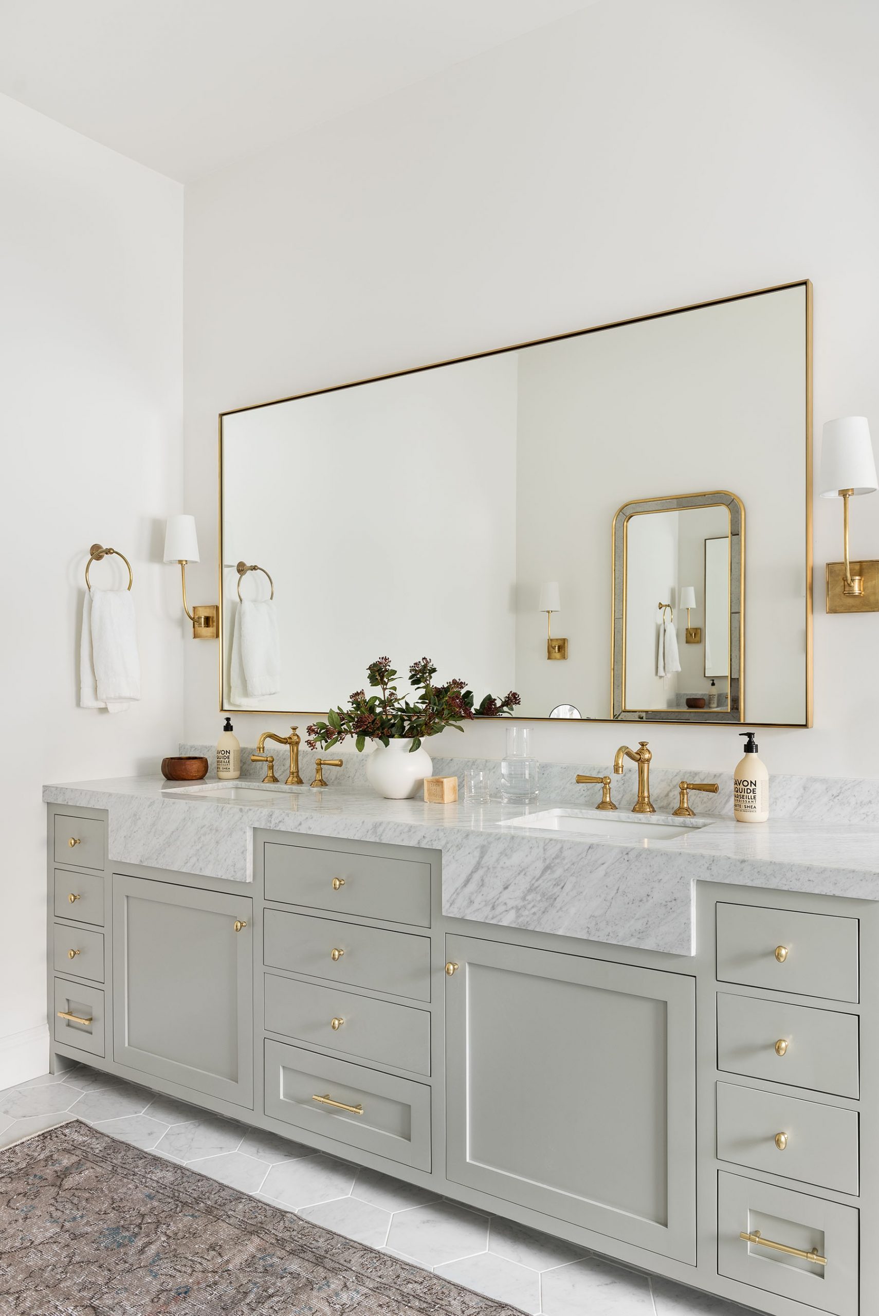
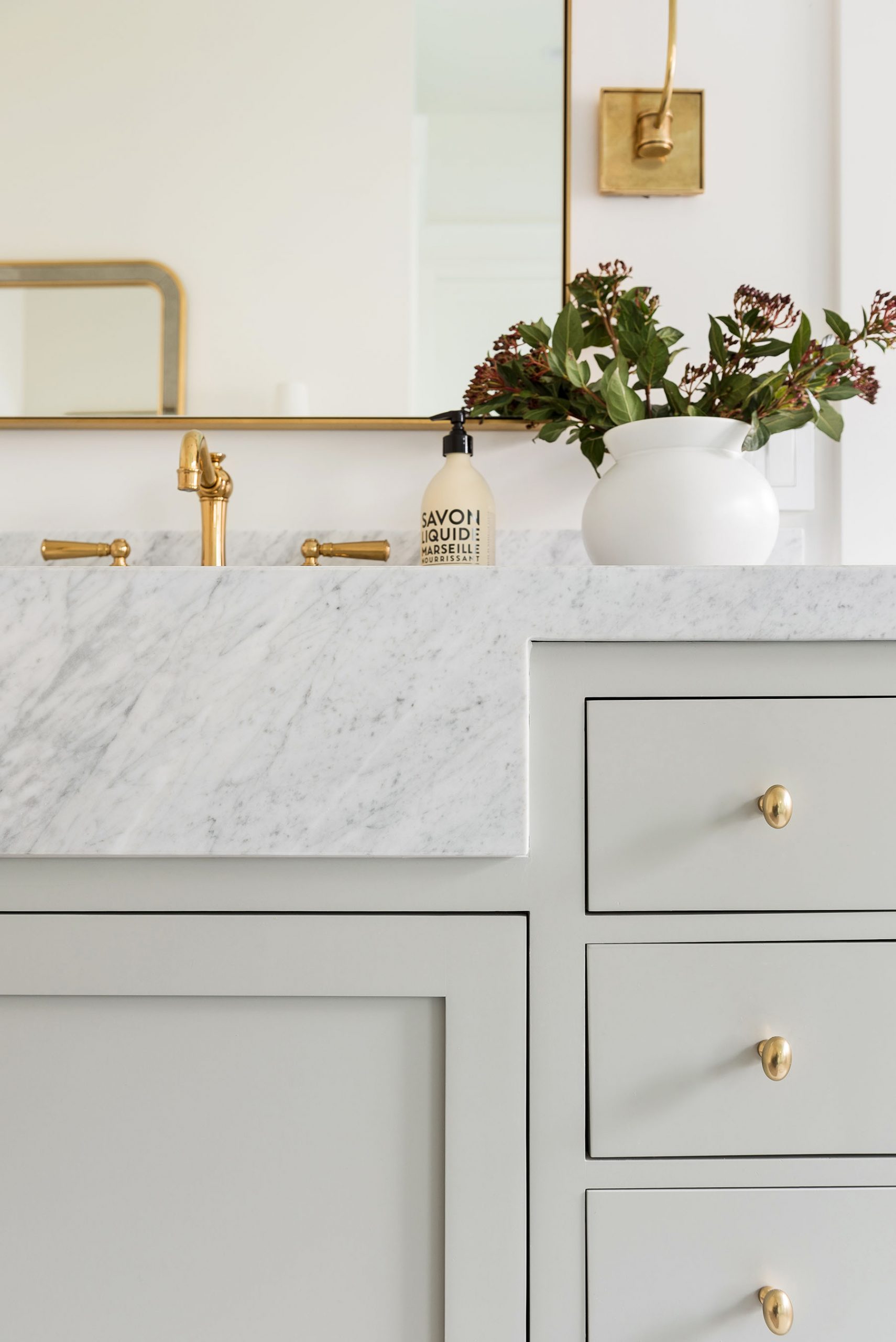
When you walk into the bathroom, you’re welcomed by a subtle green tone with custom stained cabinetry, counter-front sinks, and marble mosaic floors. This space’s real statement, though, is the beautiful free-standing tub and stunning brass tapware. It feels so serene in this master, and we can’t wait for our clients to start their day in this space.


“Incorporating contrasting hardware on the drawers of a vanity is a great way to switch things up and add a fun, unexpected detail.”

“I love that we have some color through the green toned cabinetry, but it feels like a color that can stand the test of time.”
Finish details:
Paint: All Walls, Trim, & Ceilings – Swiss Coffee at 75%
Vanity: Sensible Hue by Sherwin Williams
You May Also Like