


8 Design Tricks We Used in Dream Home Makeover
Some of our go-to tips.
06 November 2020 -
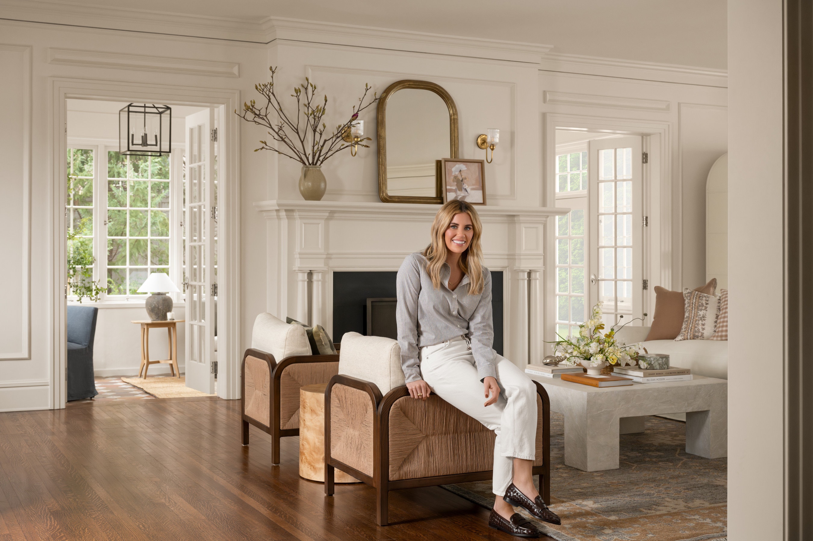
It’s hard to believe that our Netflix show “Dream Home Makeover” has been out in the world for a few weeks now, and we couldn’t be more grateful for all of the love and support we’ve received since its premiere.
We’ve had so much fun sharing more details from the show, and we still have a lot more to go! Today, we’re highlighting some of our favorite tricks that we incorporated throughout our projects on the show.
Even if you’ve already watched all six episodes of Season 1, you might have missed a few of these tips that you can apply in your own space.
Here are 8 of our Favorite go-to design tricks we used in Dream Home Makeover:
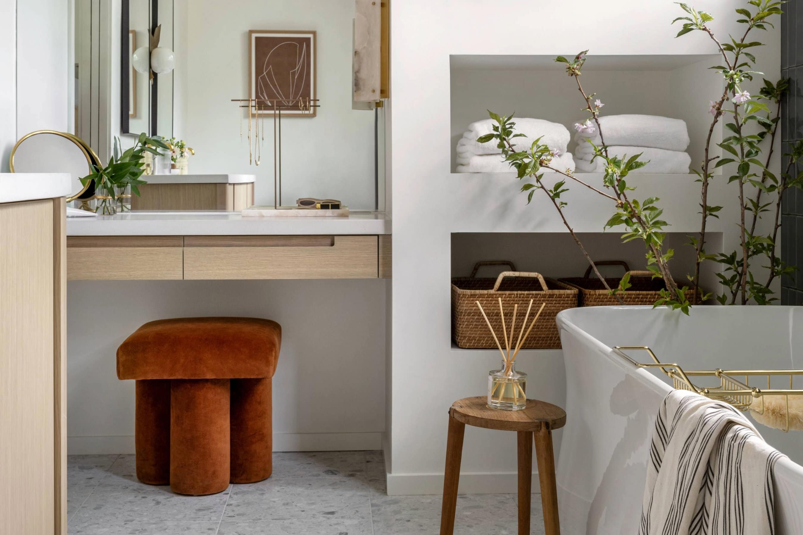
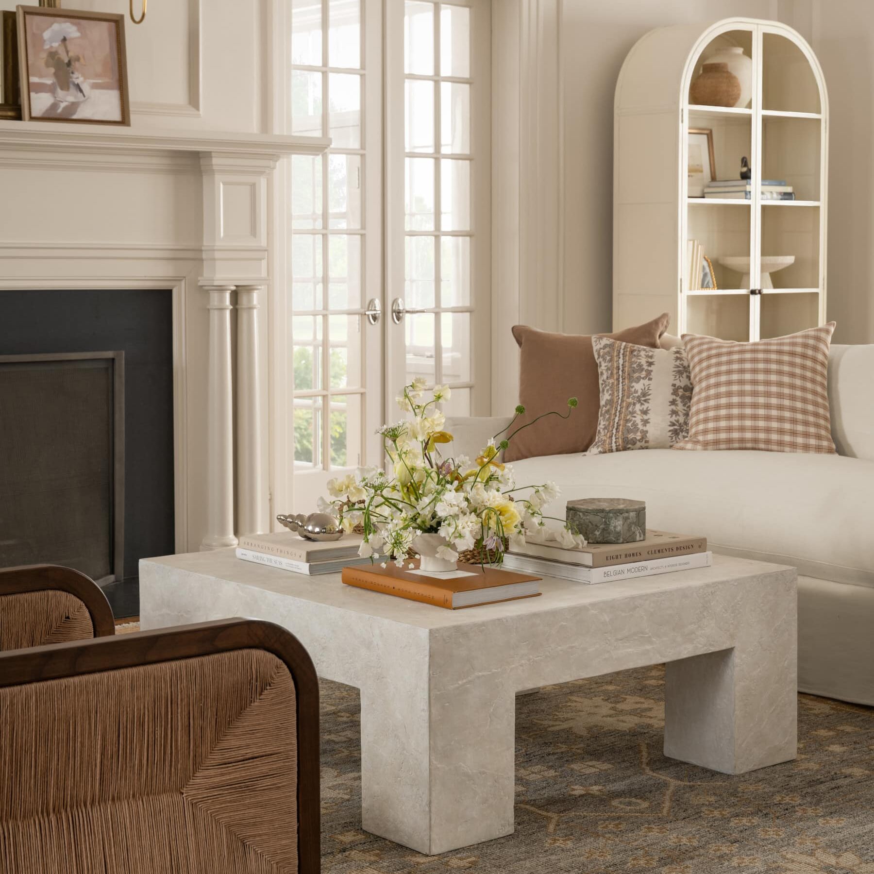
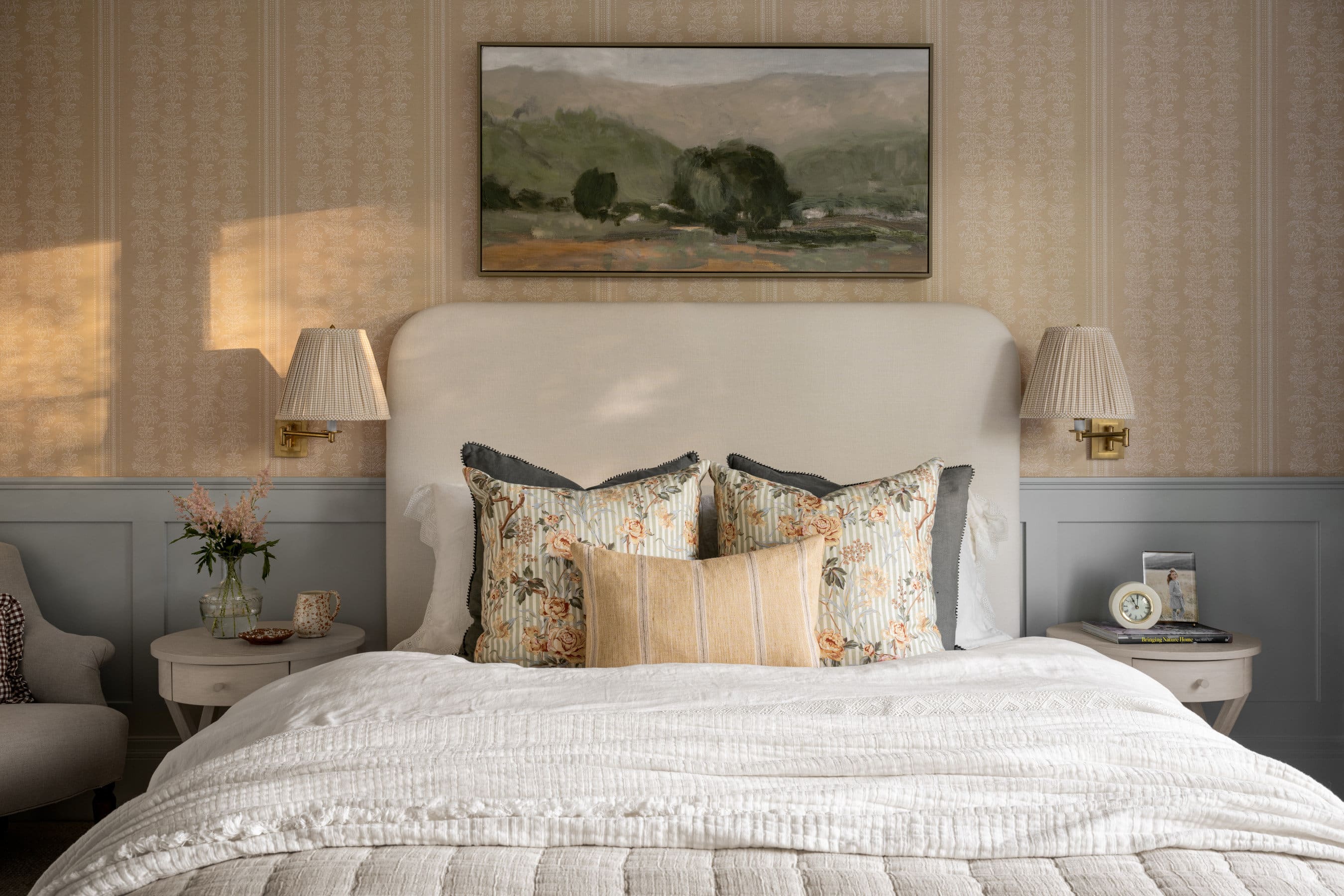
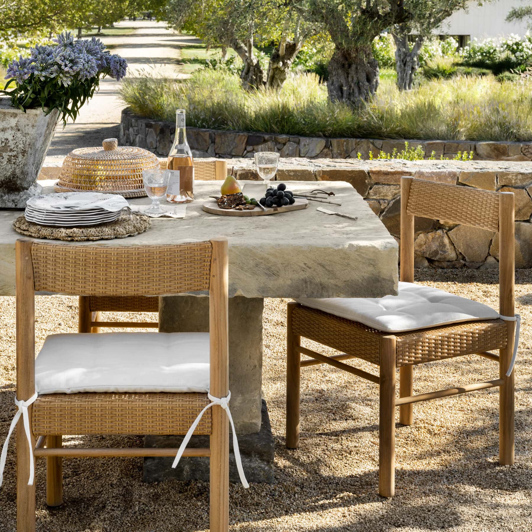
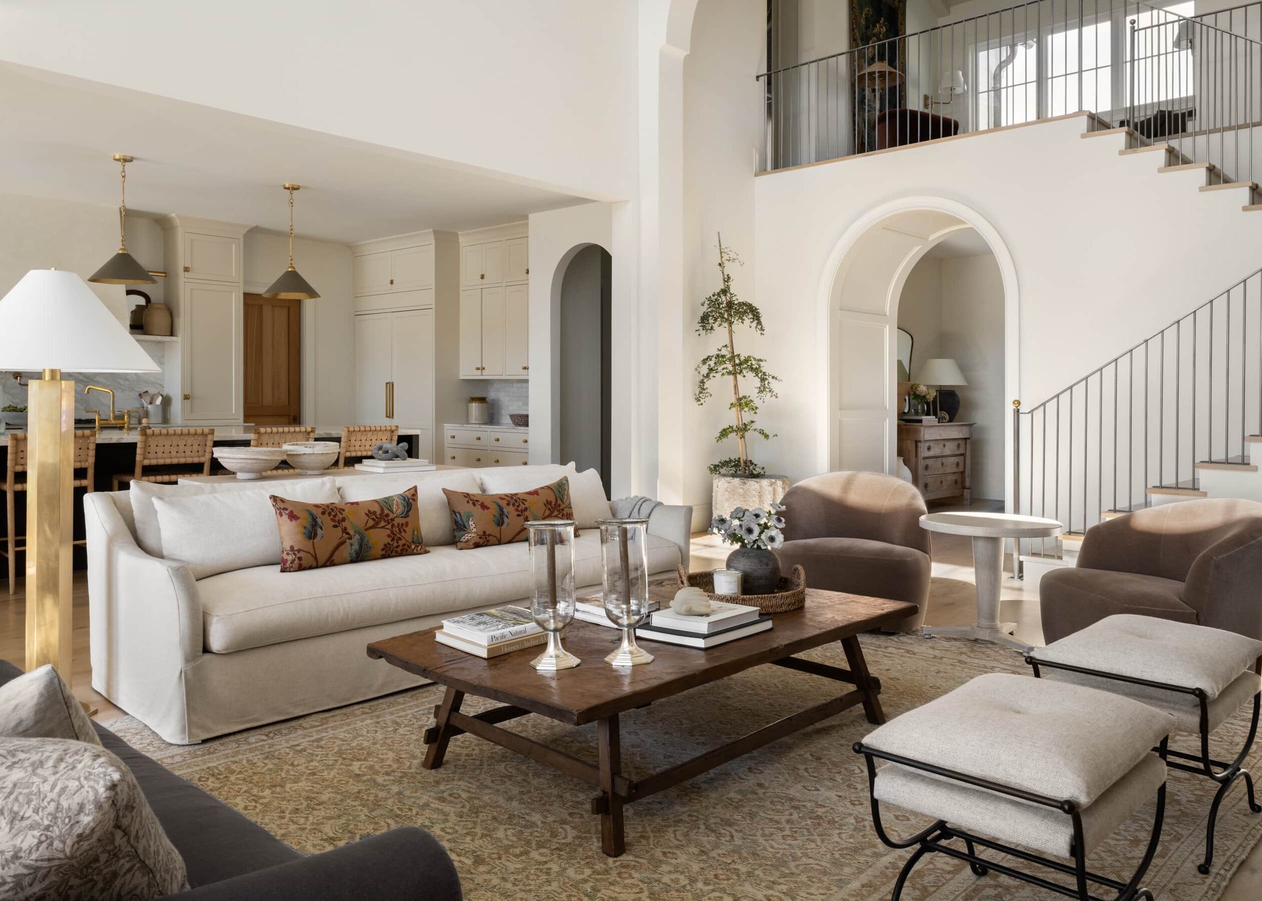
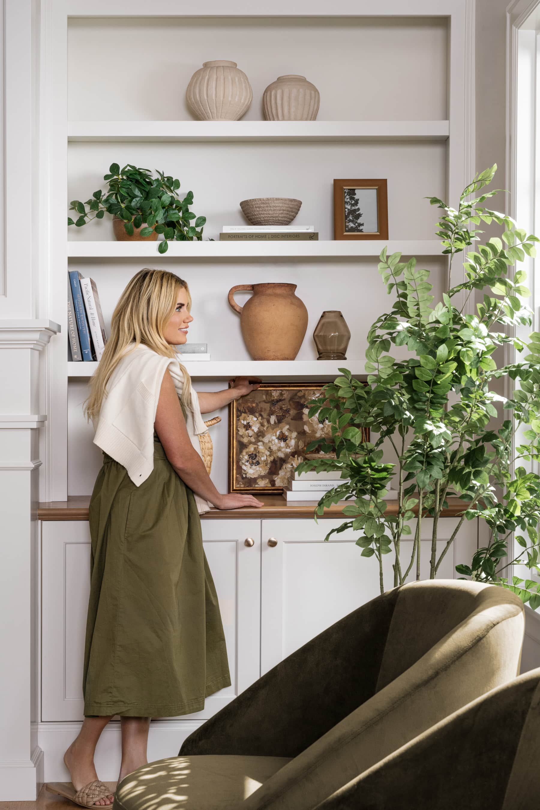
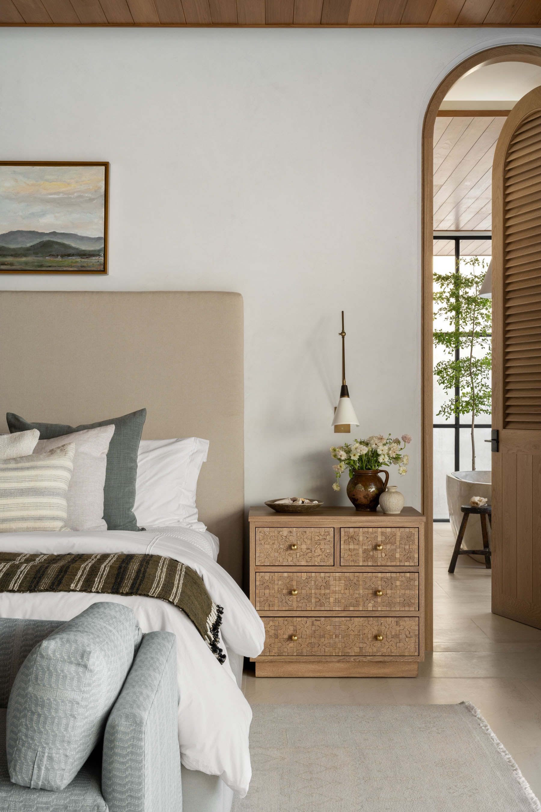
1. Careful space planning in multi-purpose rooms.
While designing one room with multiple purposes can feel daunting, we love the challenge of creating maximum functionality without sacrificing style.
One of our favorite ways to plan small areas effectively is by creating different “zones” within the space that feel separate but cohesive.
We love to set one zone apart from the others by using rugs to section off a seating area, incorporating dividing but storage-saving furniture pieces like consoles or benches, and creating distinct purposes for each area.

From Episode 5, “Historic Home Renovation.”
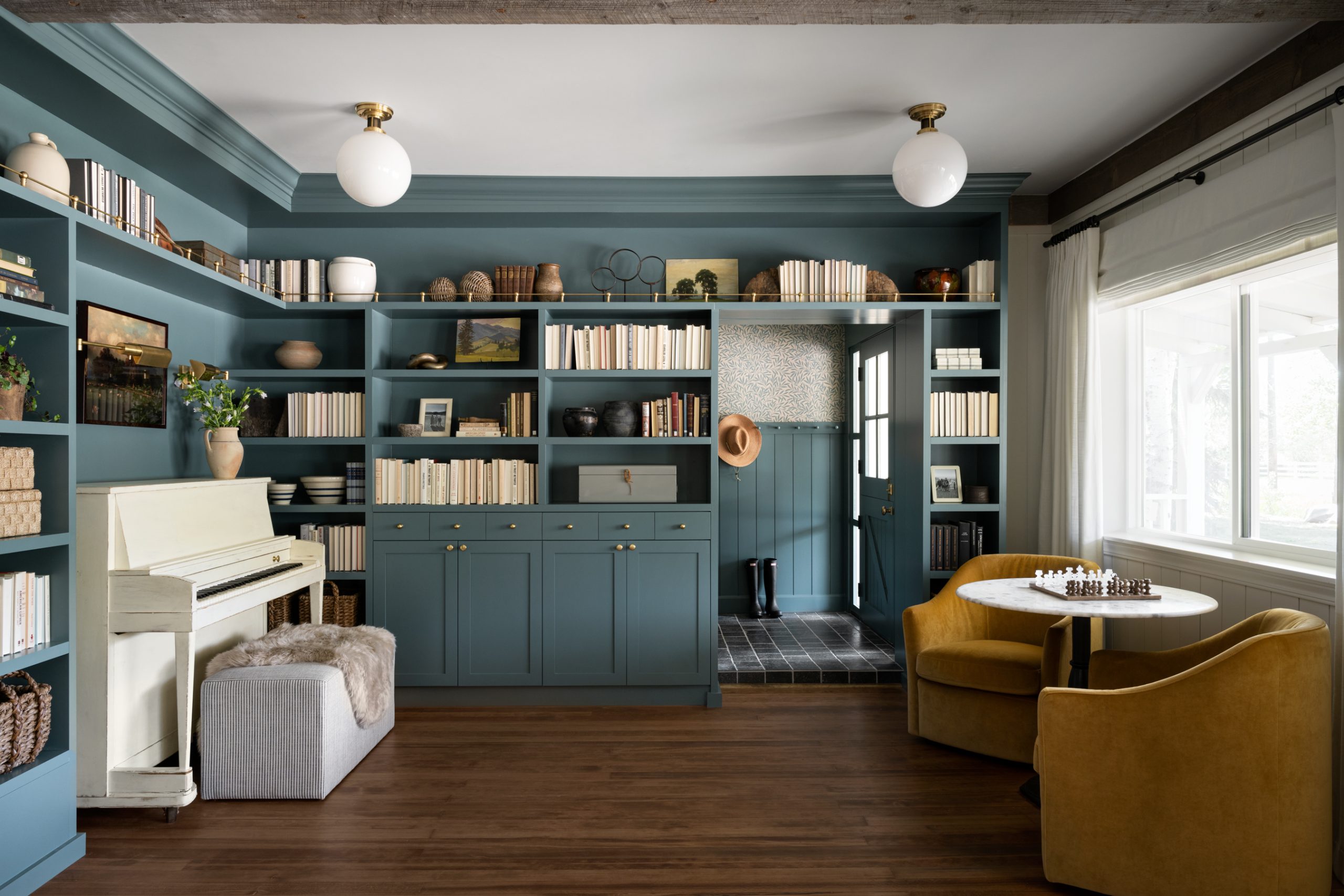
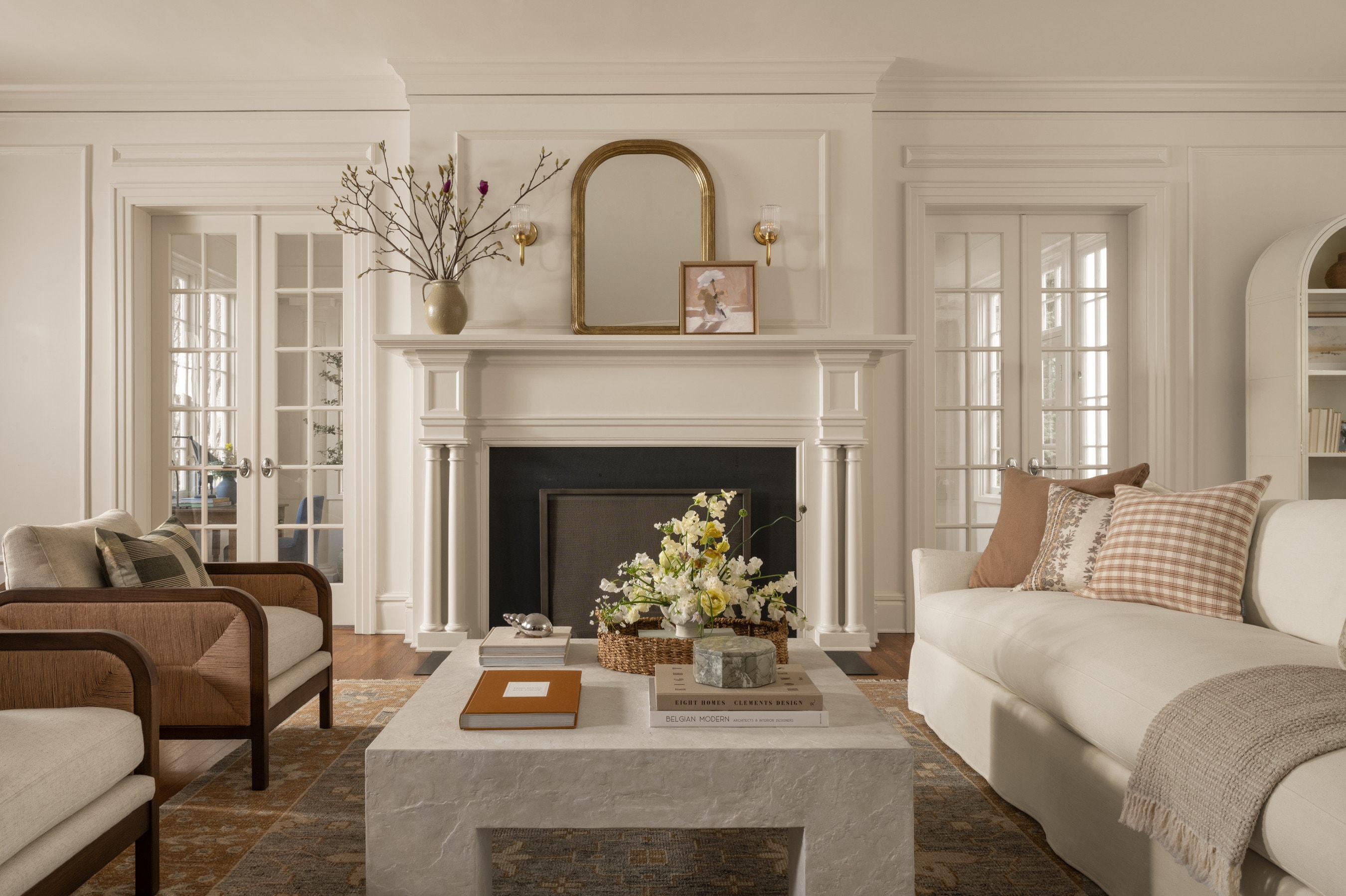
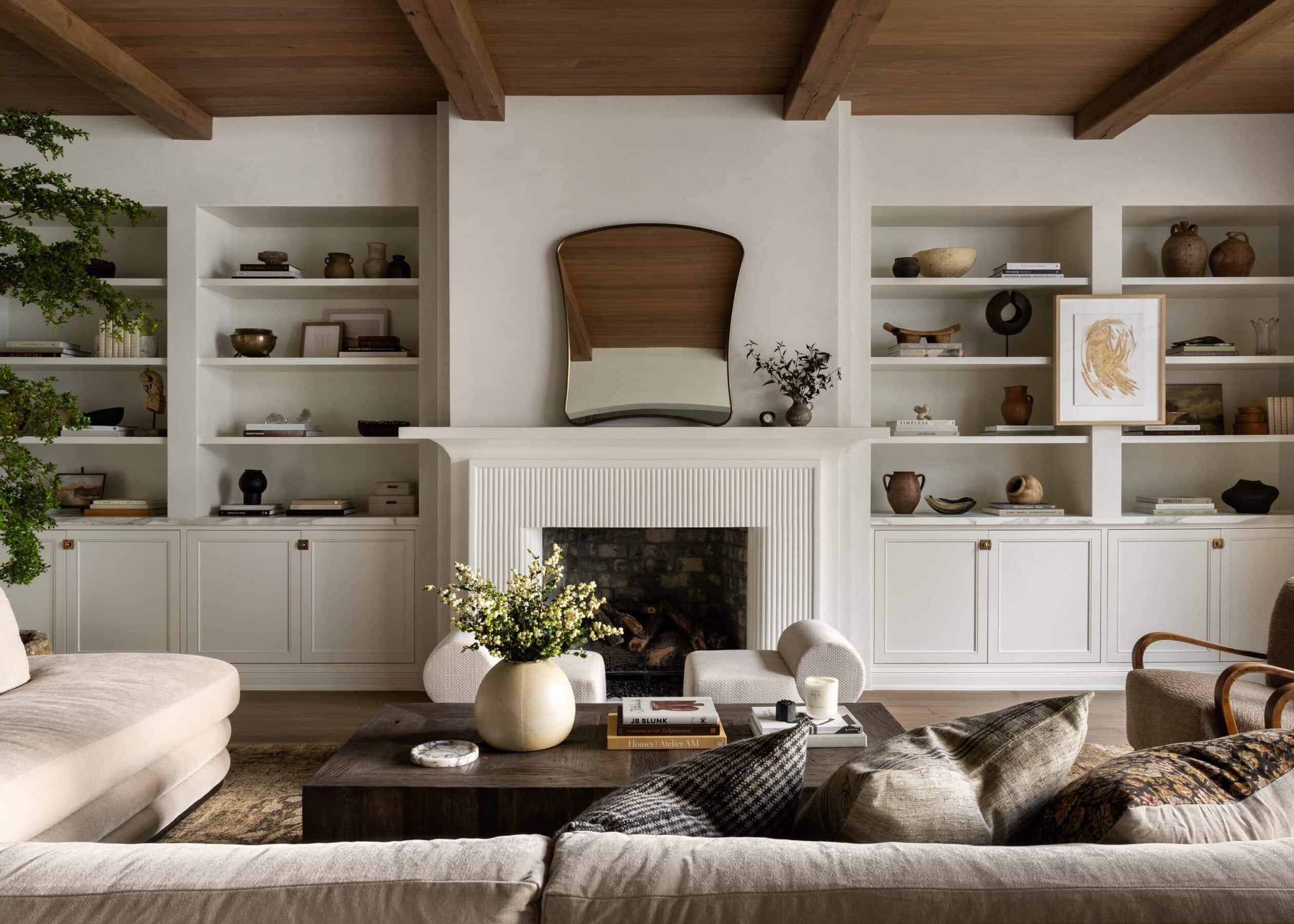
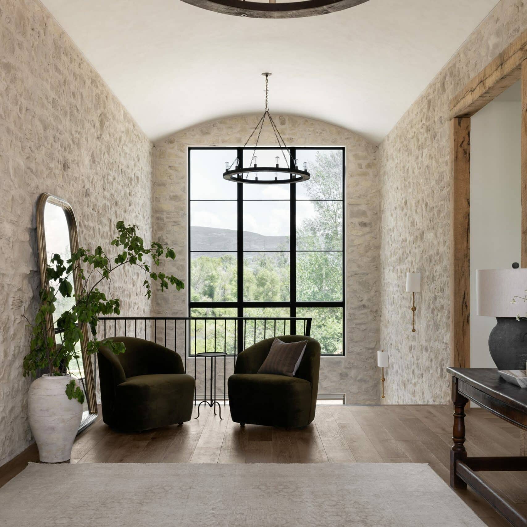
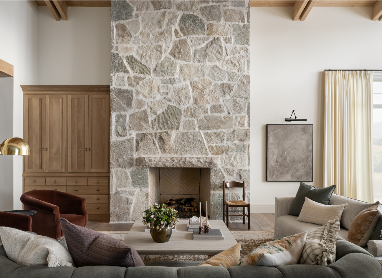
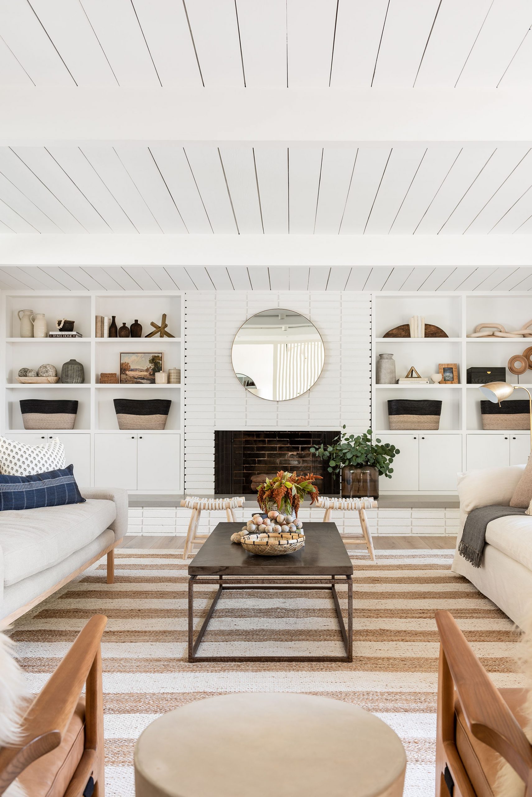
2. Creating a focal point.
We are firm believers that every room needs a focal point. Not only do focal points draw the eye in, but they also give your visual field a place to rest. A focal point can be anything from a fireplace to a large art piece hung on your wall to create balance.

From Episode 3 “Move Room Remake”
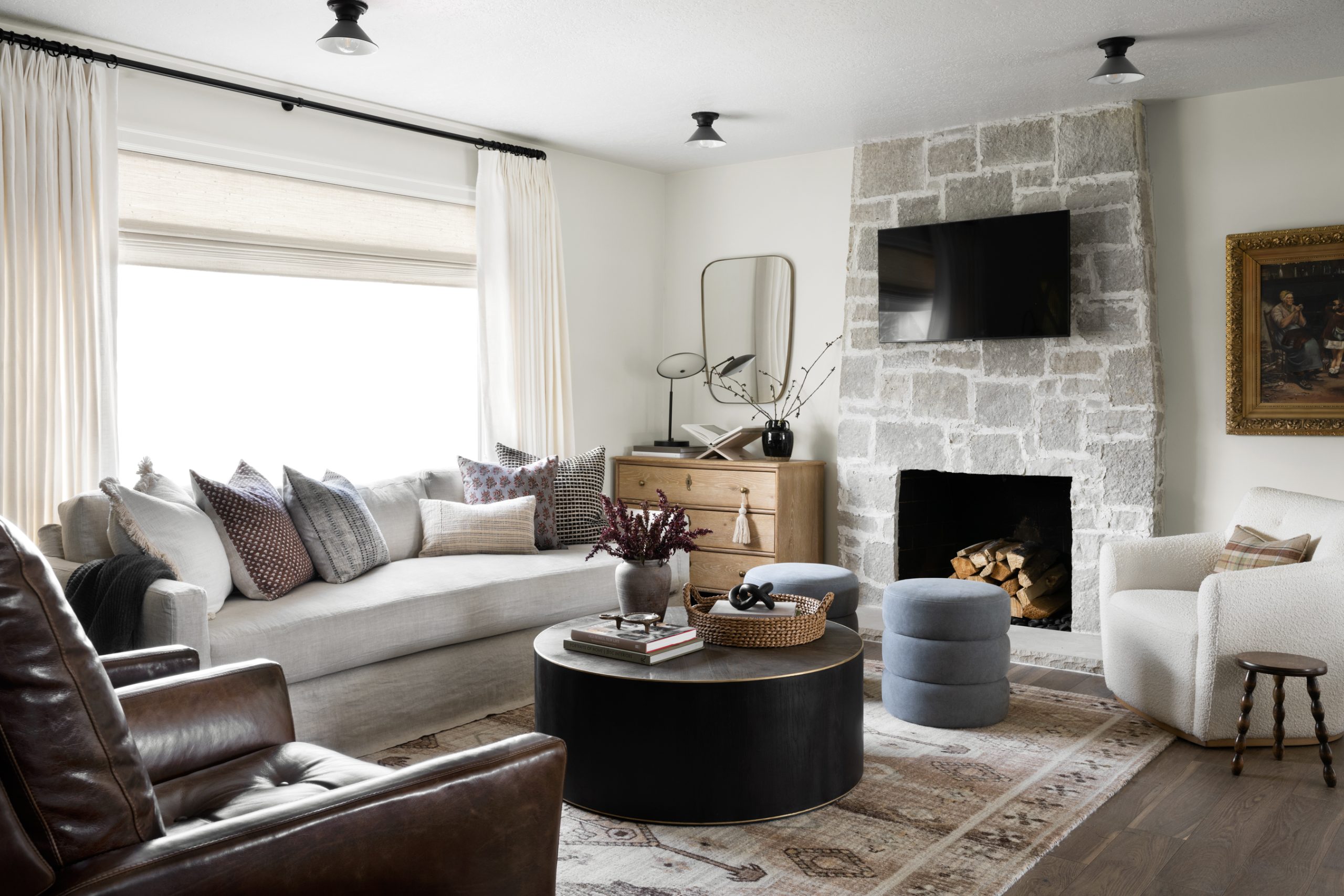
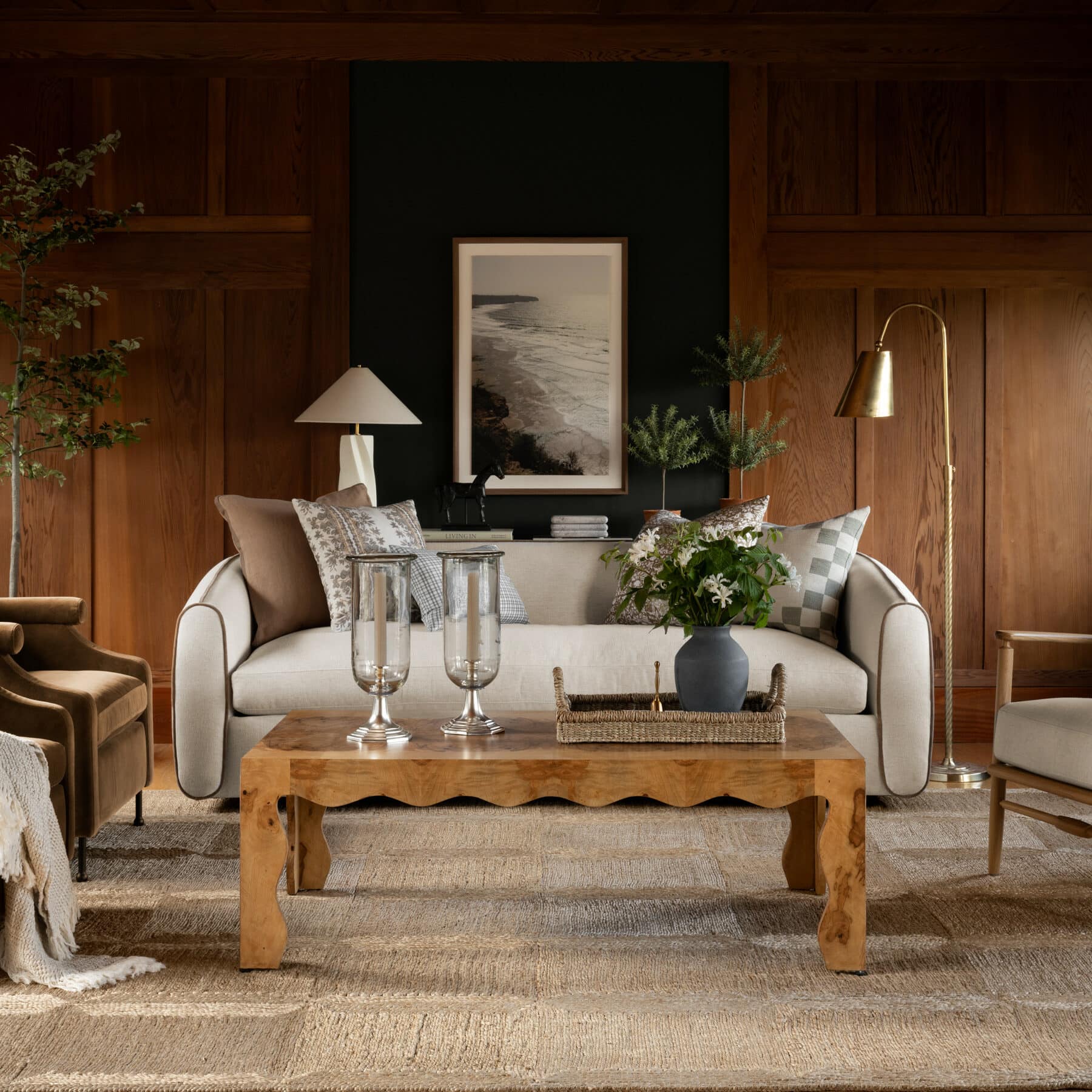
3. Balancing warm & cool tones.
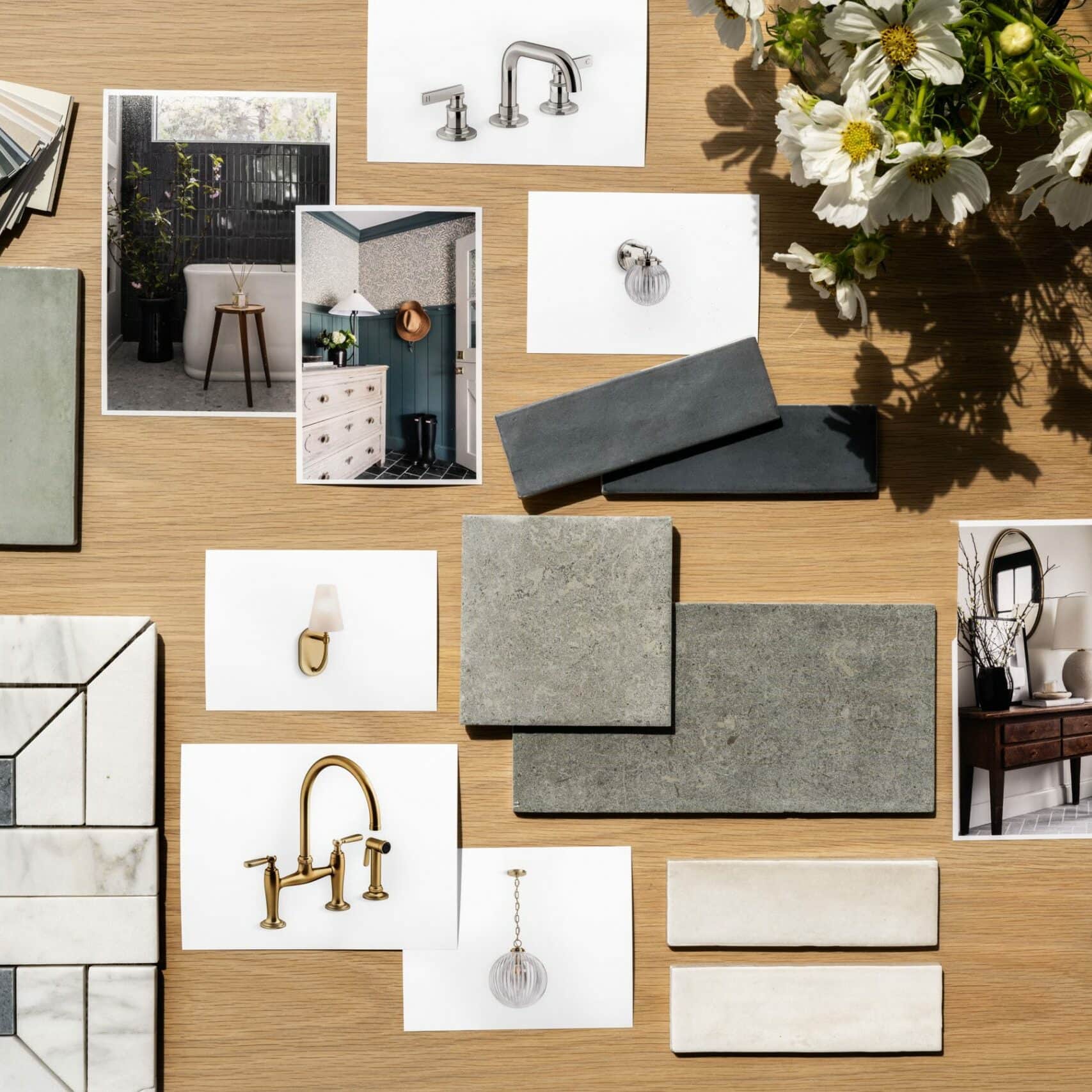
One of the best ways to bring dimension and interest to your home is by blending materials.
In Episode 4, “Los Angeles Hideaway,” our clients were torn between using marble on their kitchen open-shelving to match their island or contrasting it with wood. We encouraged them to go for wood to mix the warm and cool tones, and we love how the blend tied everything together to bring more harmony to the space.
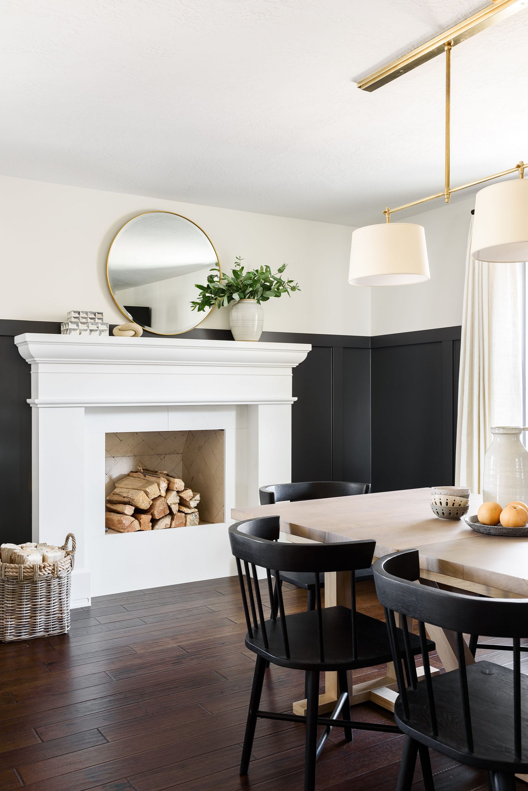
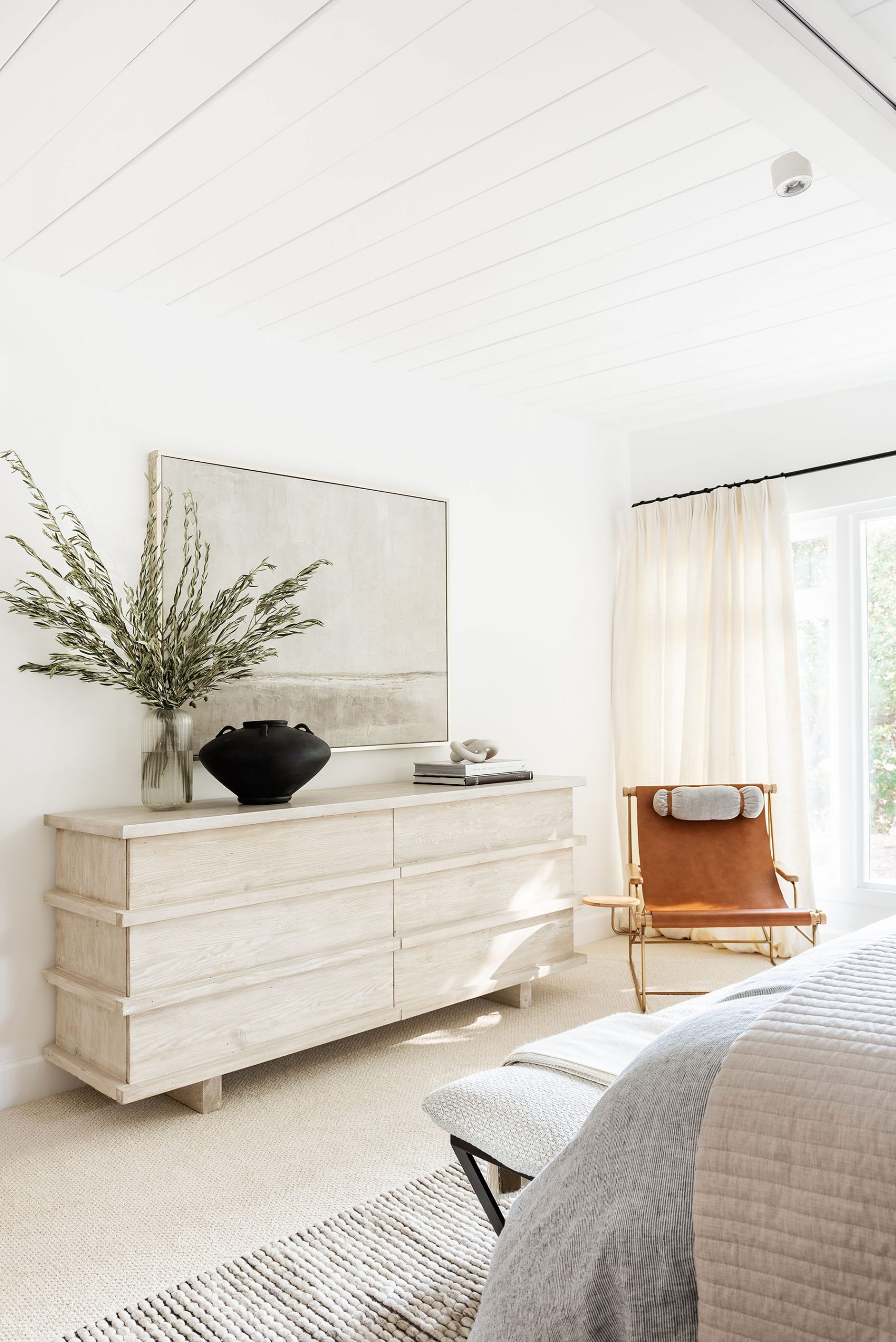
Image left – Episode 1 “Forever Home” Image right – Episode 2 “Manor House Designs”
From Episode 4, “Los Angeles Hideaway”
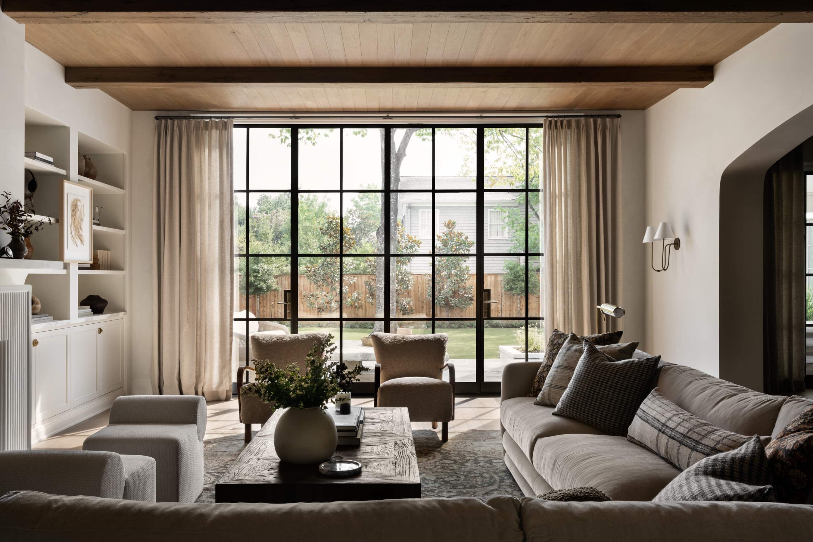
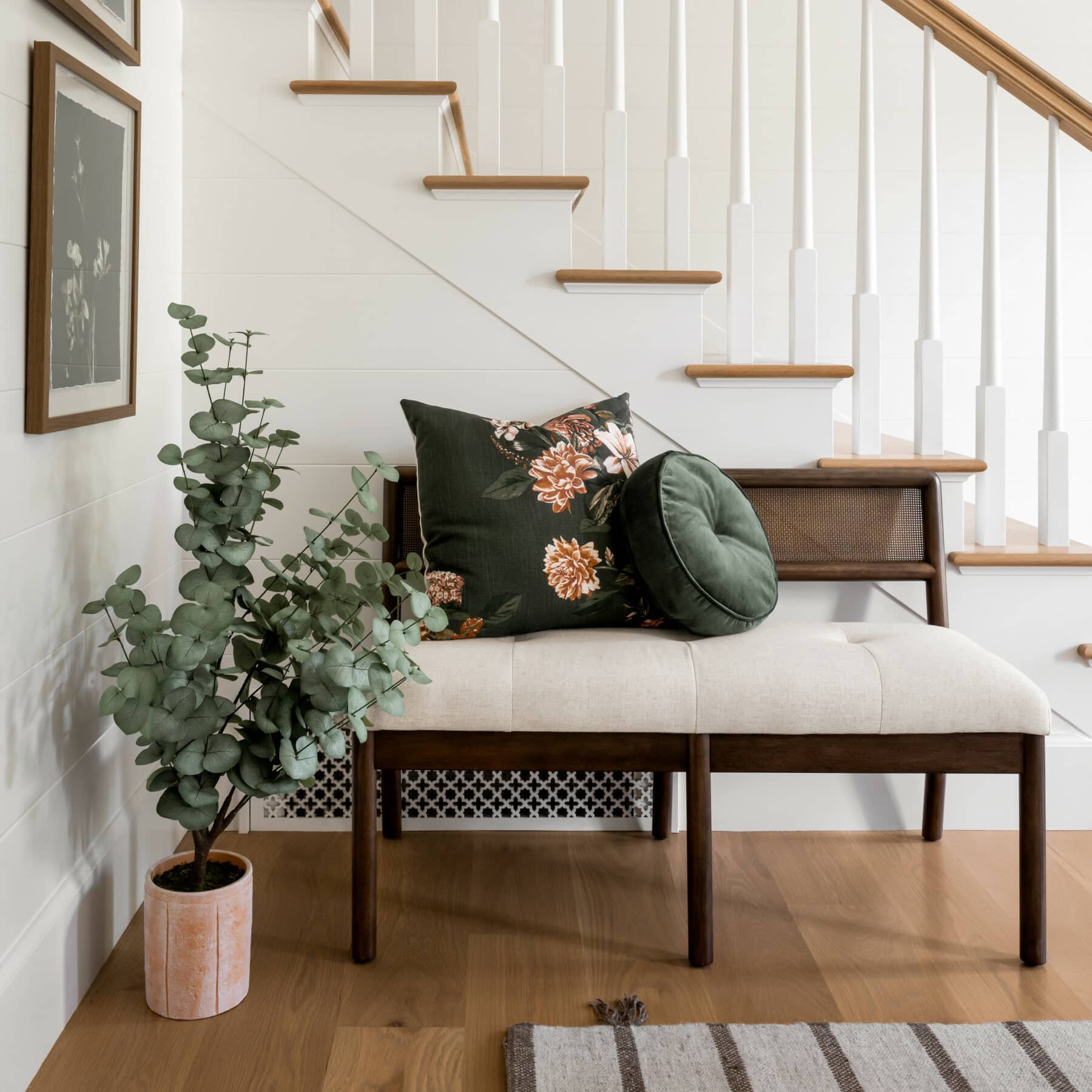
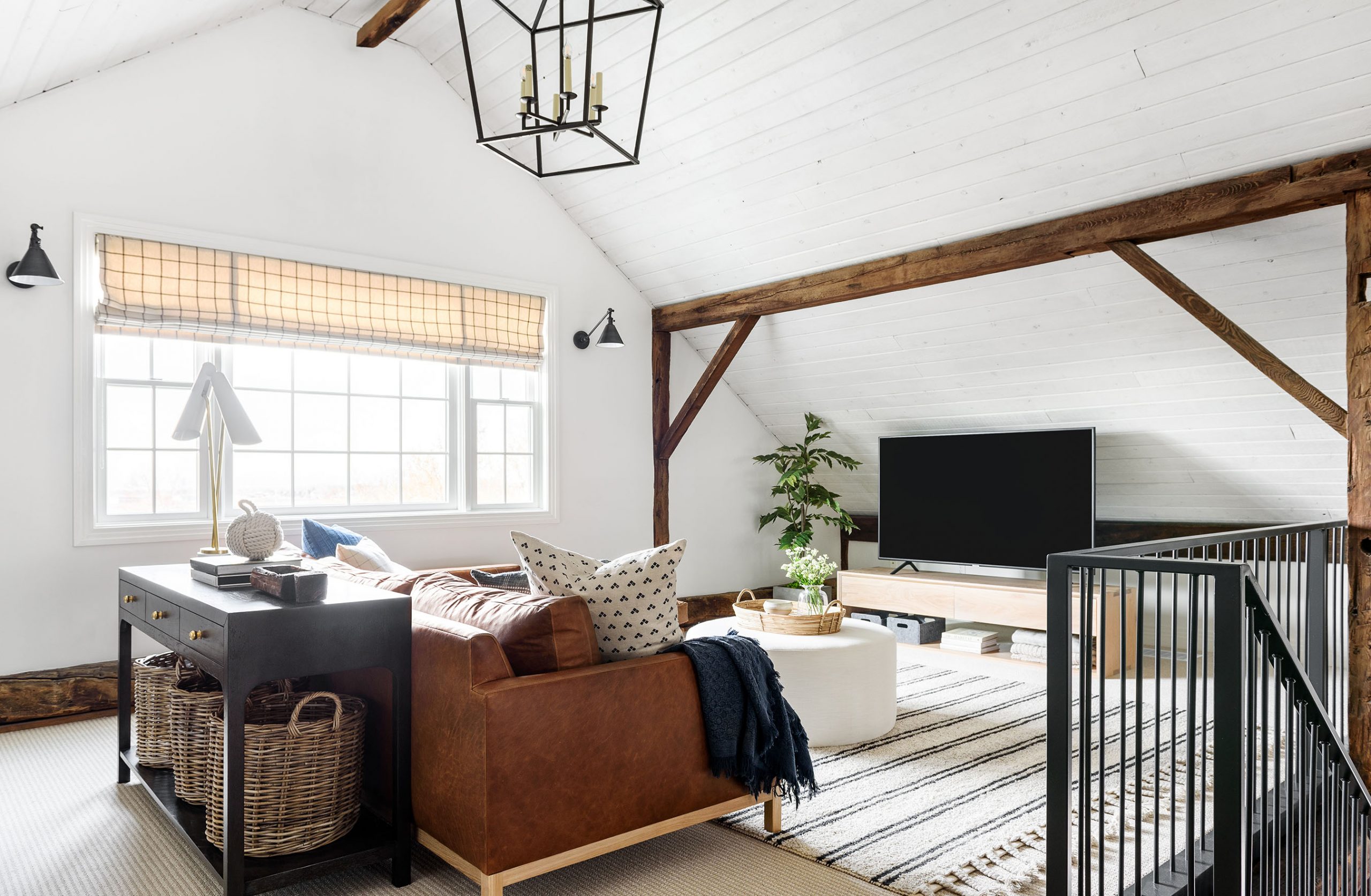
4. Creating pathways in a seating space.
When designing a living area or any area with seating, it’s always important to think about the pathways. We always ask ourselves, “What are the natural ways to enter in and out of this room?” to determine where we place the furniture pieces. It may seem obvious, but we see non-functional pathways all the time, and it really impacts the flow of a room.

From Episode 1 “Forever Home”

From The McGee Home Great Room.
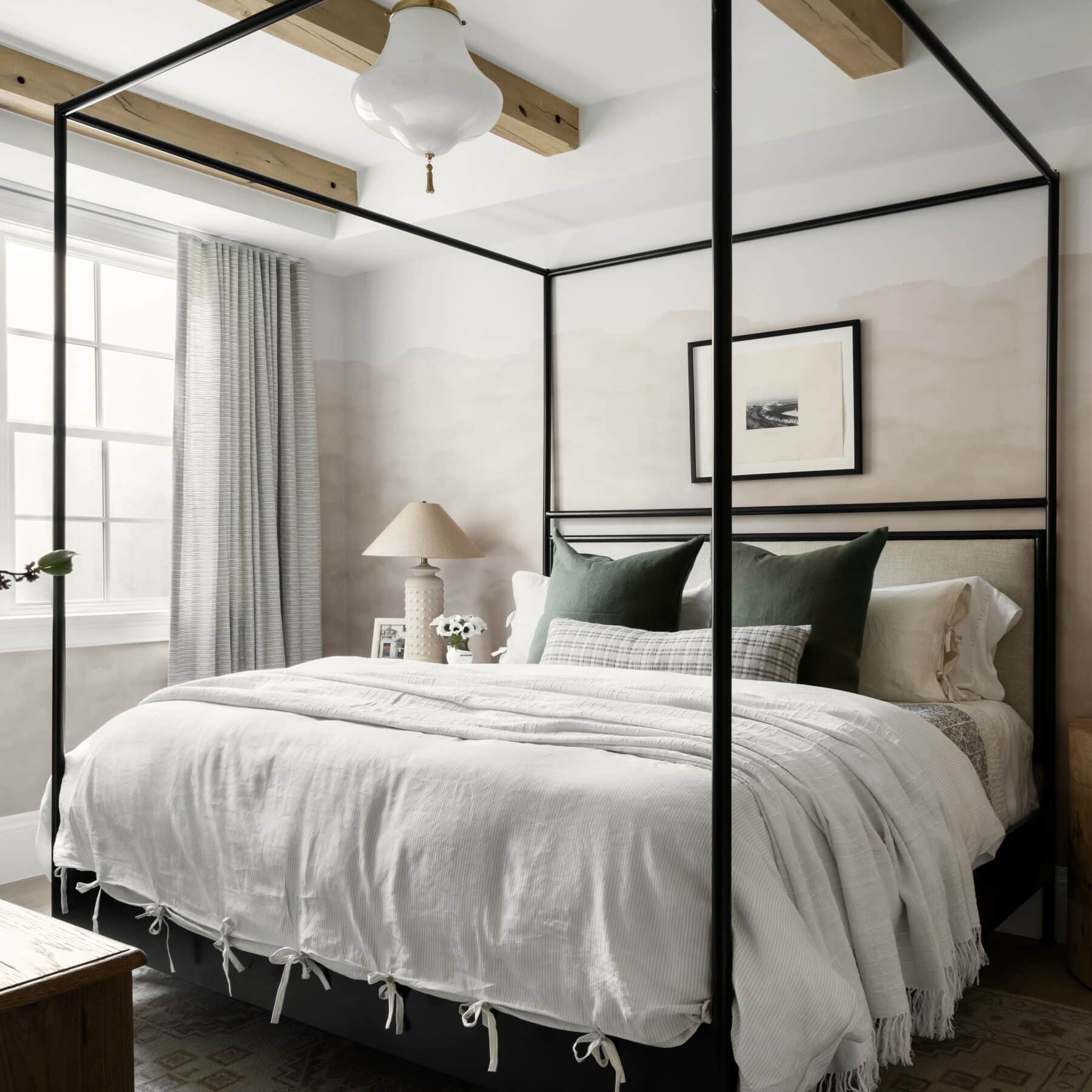
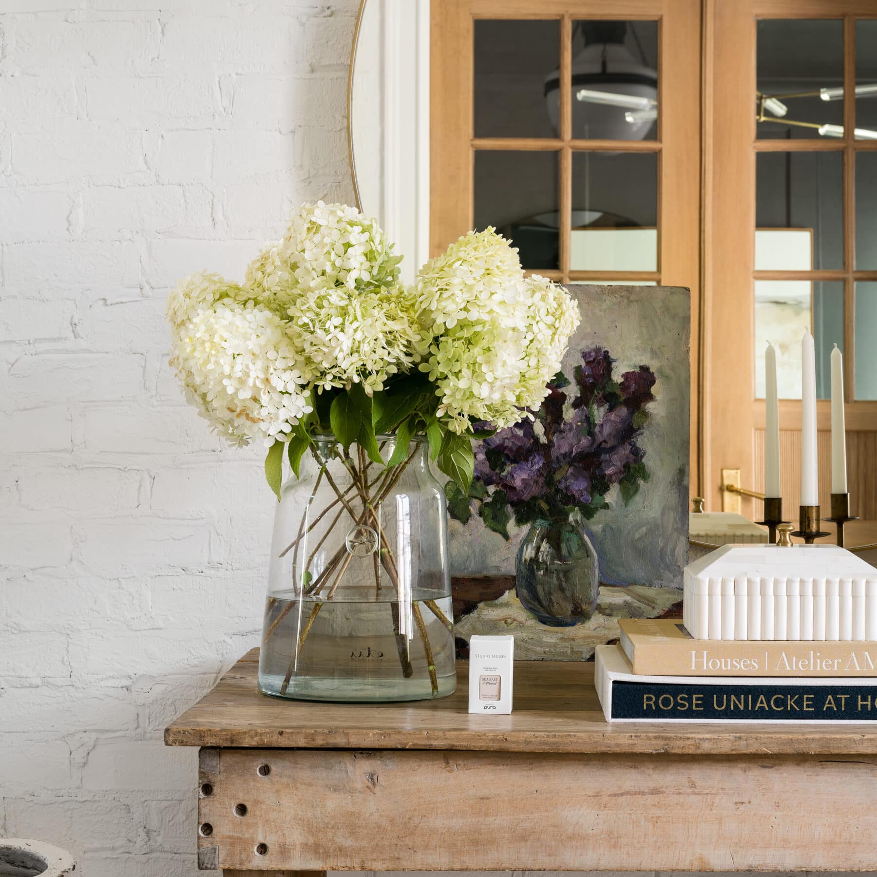
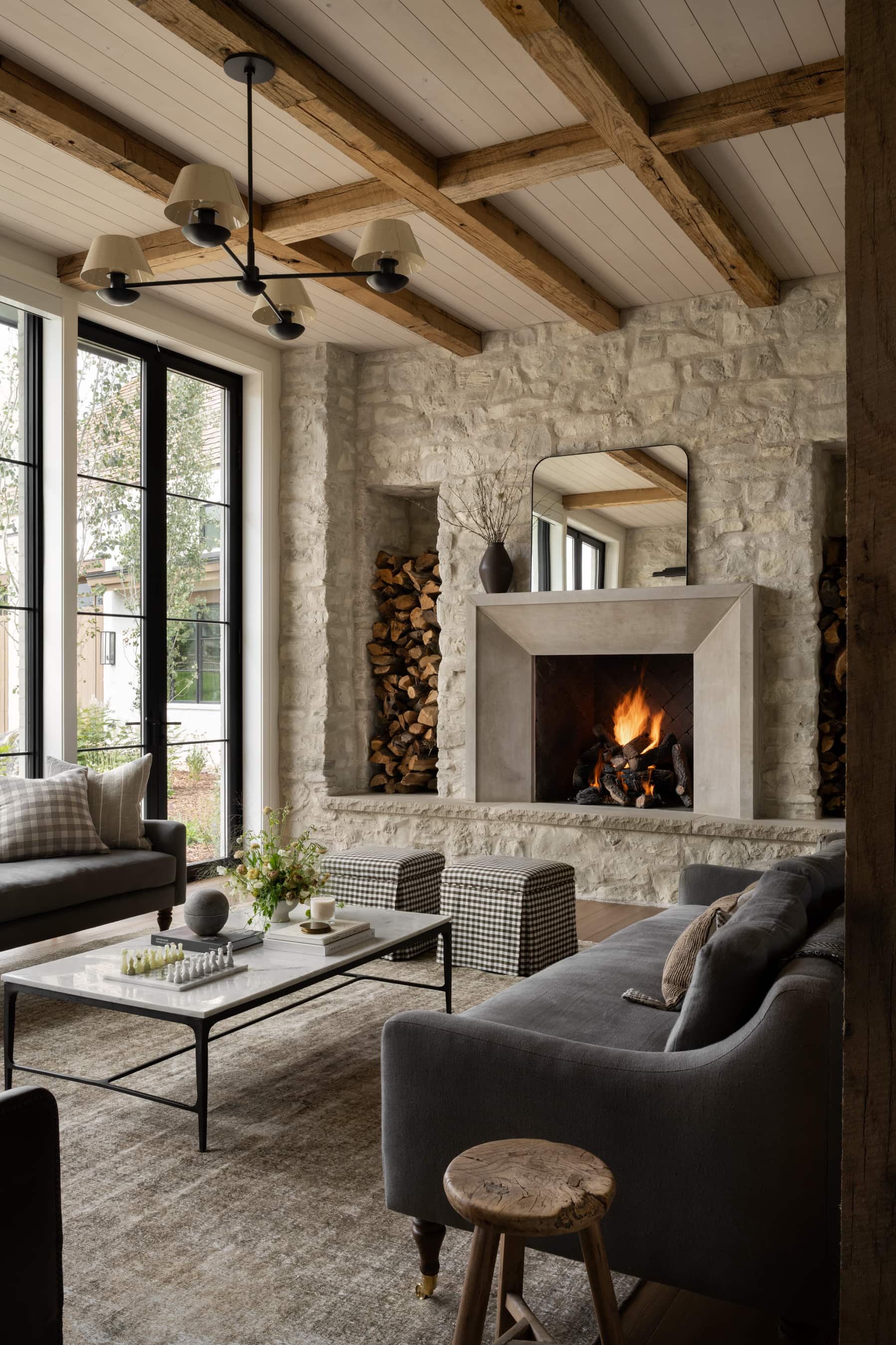
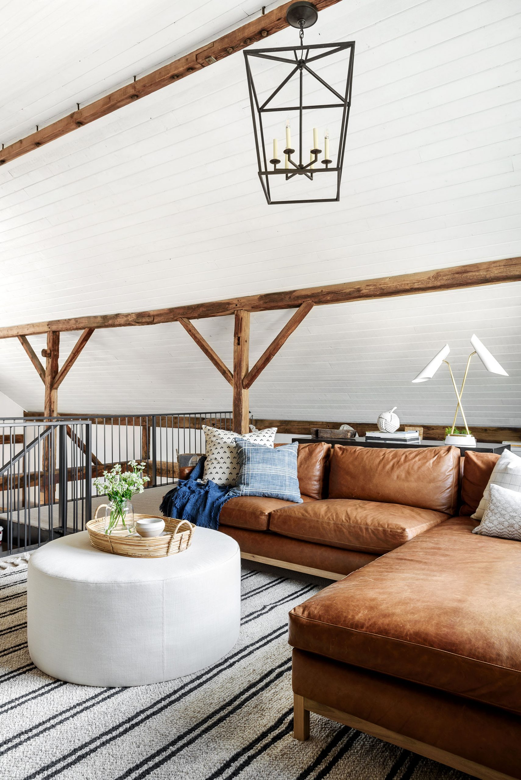
5. Embracing original elements.
Although it doesn’t work in every project, we try to embrace aspects of a home’s original elements when possible.
In Episode 5, “Historic Home Renovation,” our clients had these great wood-beamed ceilings that they wanted to maintain but brighten. By whitewashing them in a transparent shade, we were able to honor their history while still giving them something fresh.
Our clients in Episode 4, “Los Angeles Hideaway,” had a modern, brick fireplace that we decided to design around and incorporate. It turned out so beautiful with their remodel, and we love how it brought a sense of modern character to their updated living space.
From Episode 4, “Los Angeles Hideaway”
From Episode 5, “Historic Home Renovation,
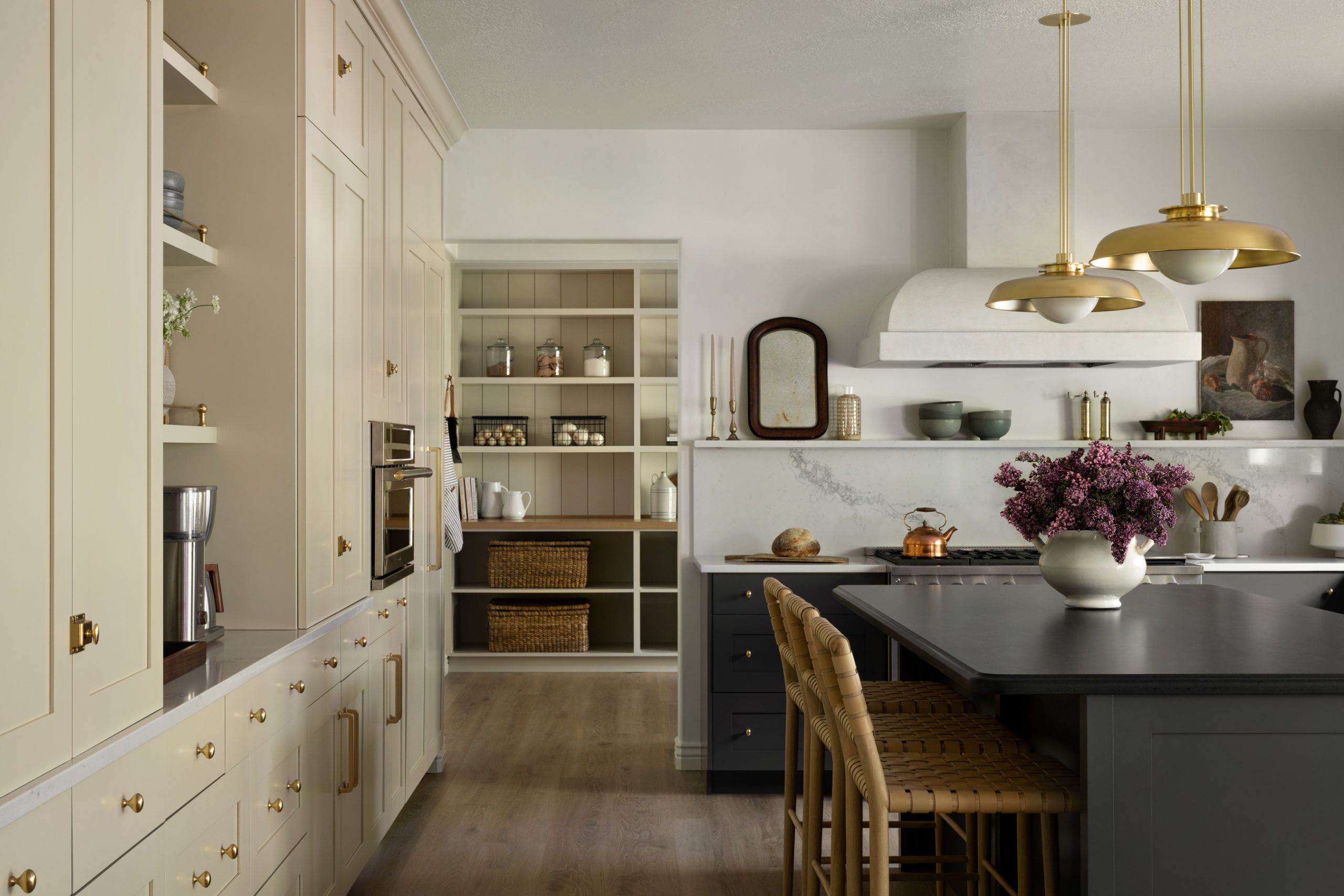
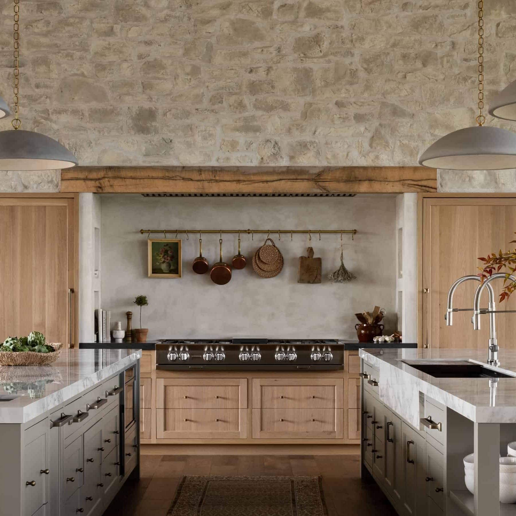
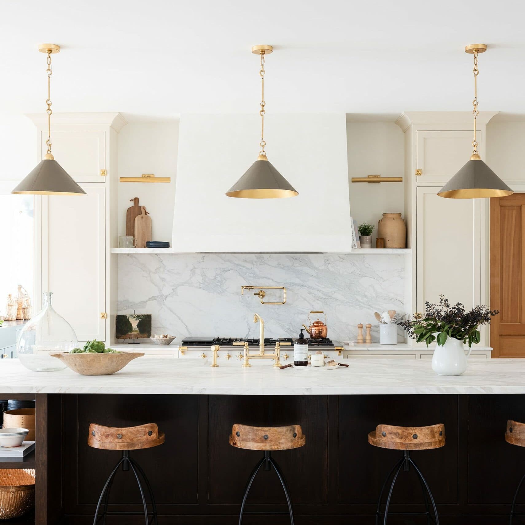
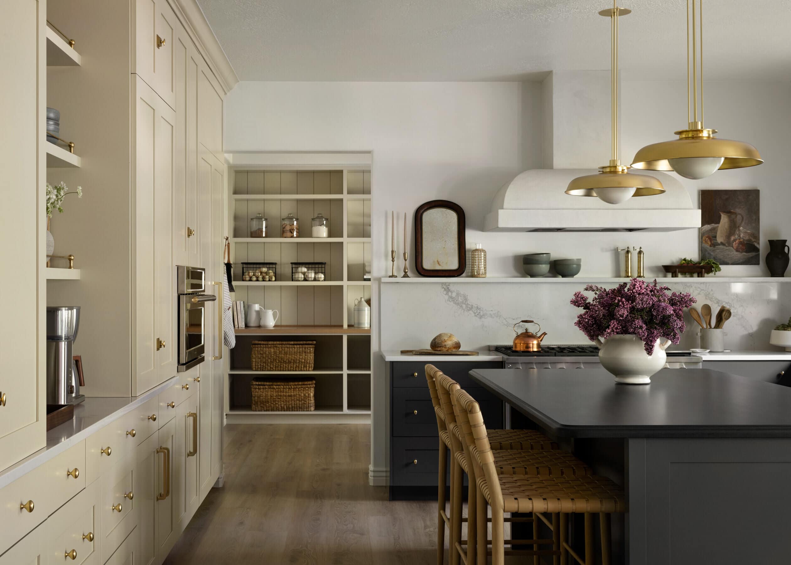
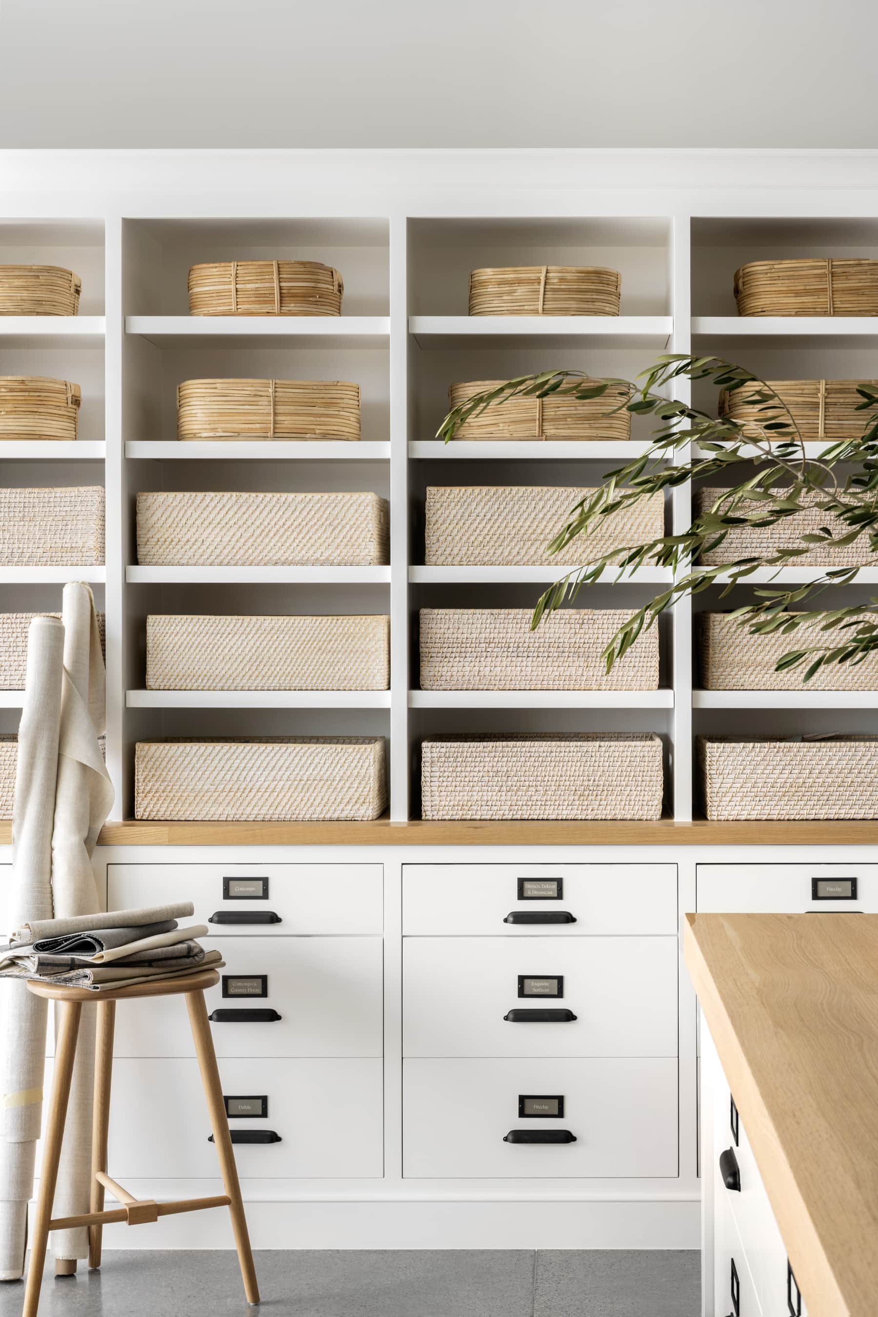
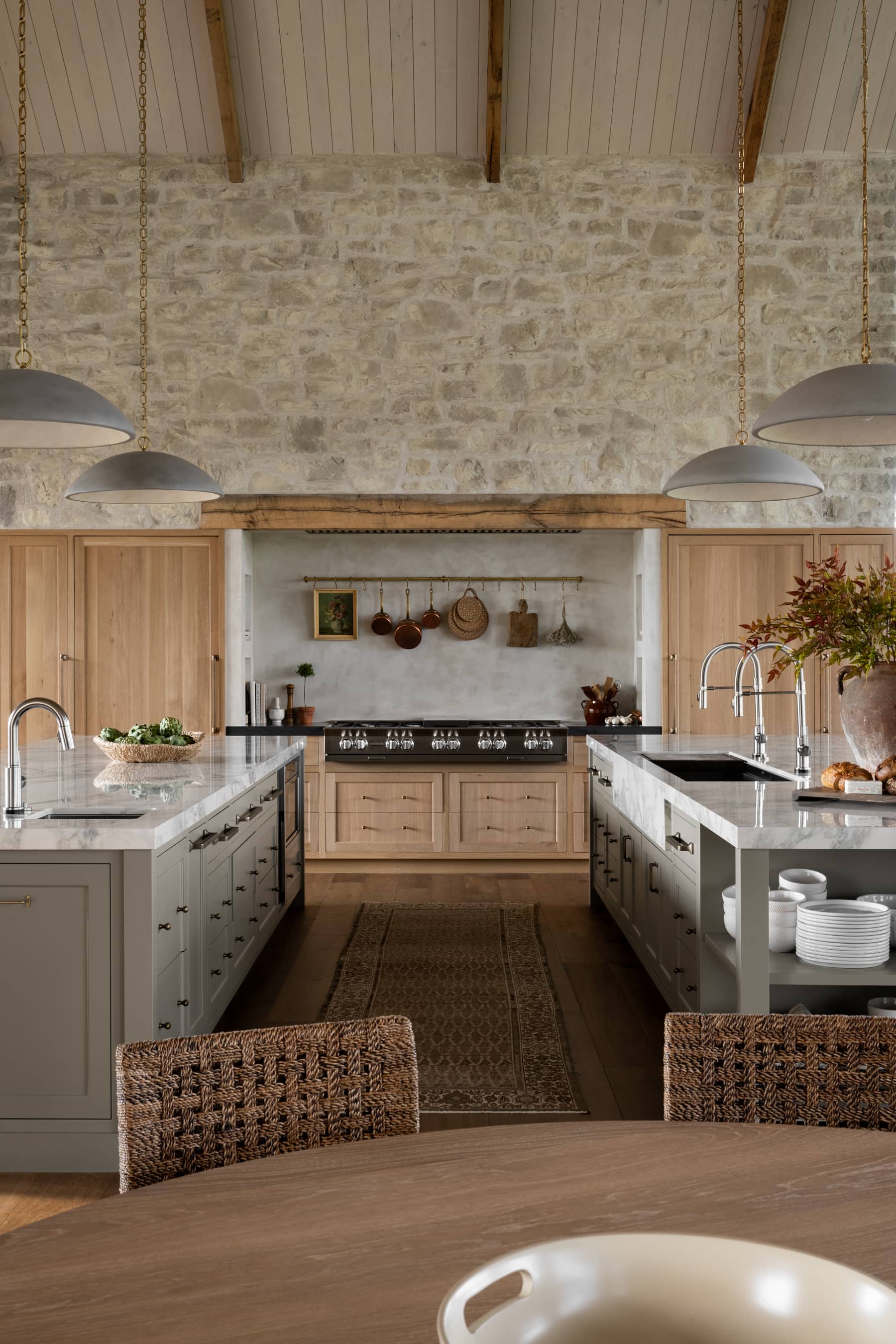
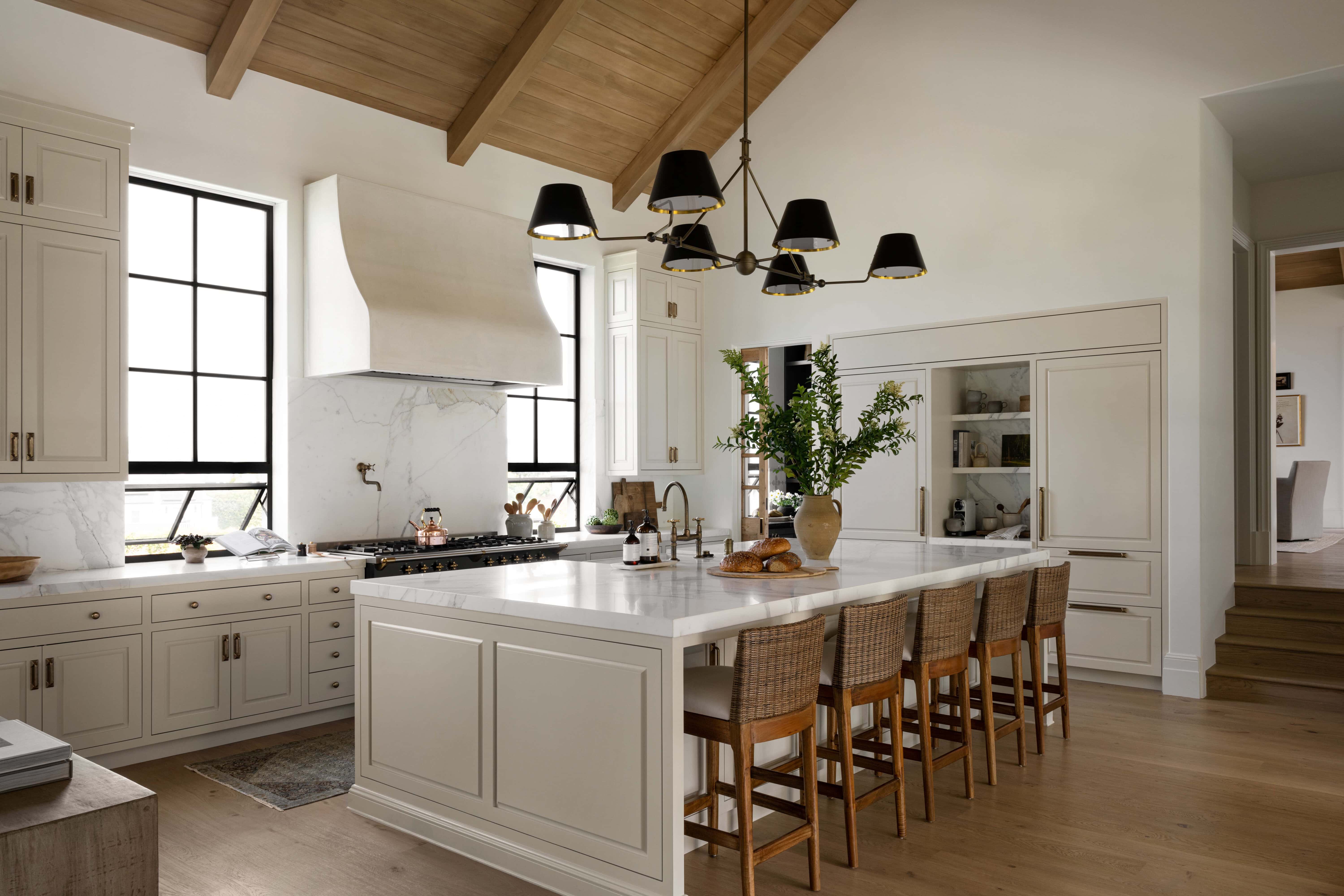
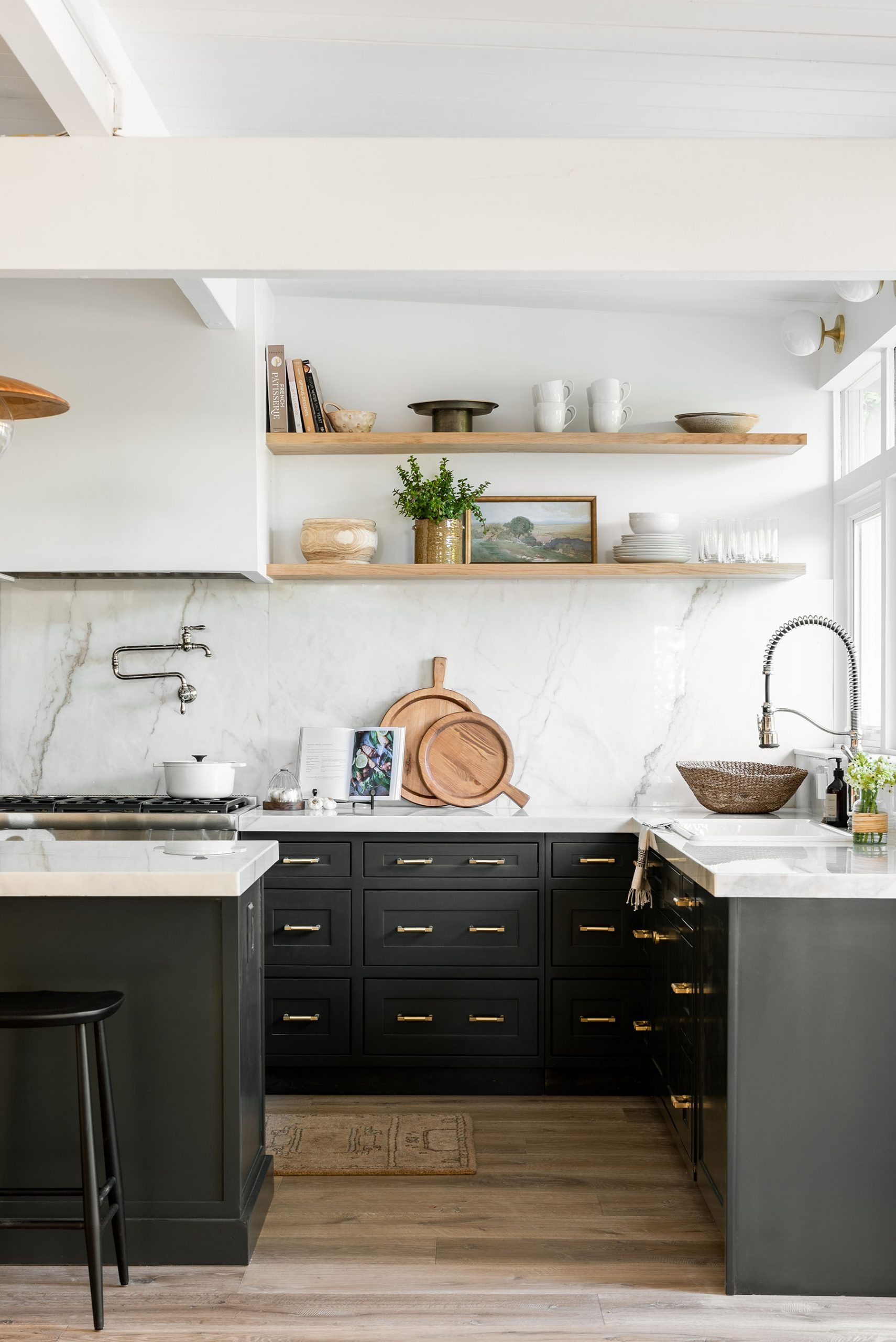
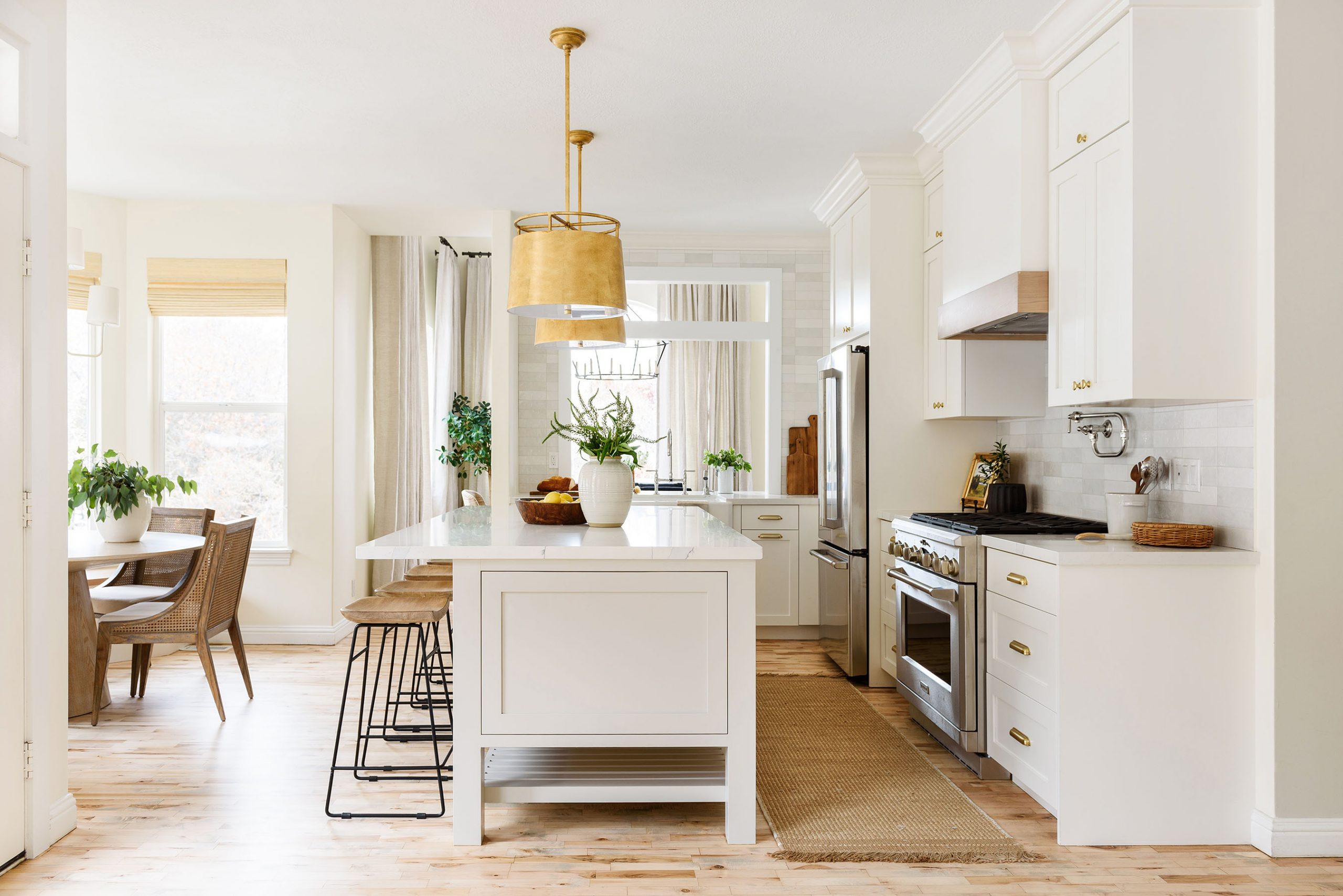
6. Merging form with function
In any design, it’s crucial to think about how to merge form with function. When designing kitchens and seating areas, we’re always considering how we can create more storage rather than less, but it can be a challenge when you’re trying to “open up” a room.
In Episode 6, “Grand Kitchen Remodel,” our clients had a closed-in kitchen that they wanted to bring more space and light into. By adding an island and more cabinet space, we were able to make up for a lost corner pantry that blocked off the pathway between their kitchen and dining space.
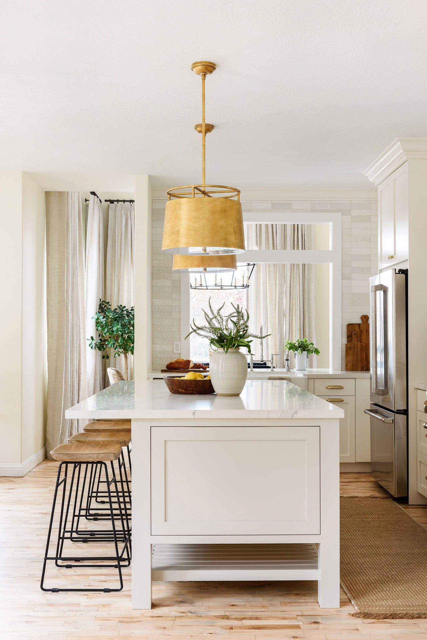
From Episode 6, “Grand Kitchen Deployment”
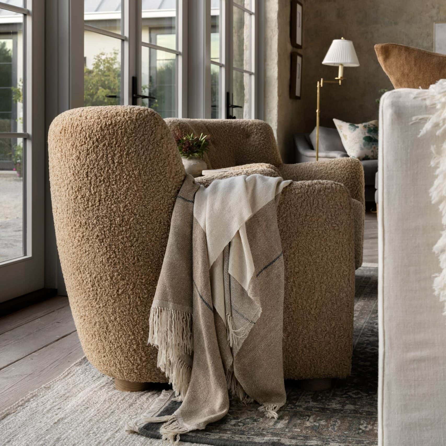
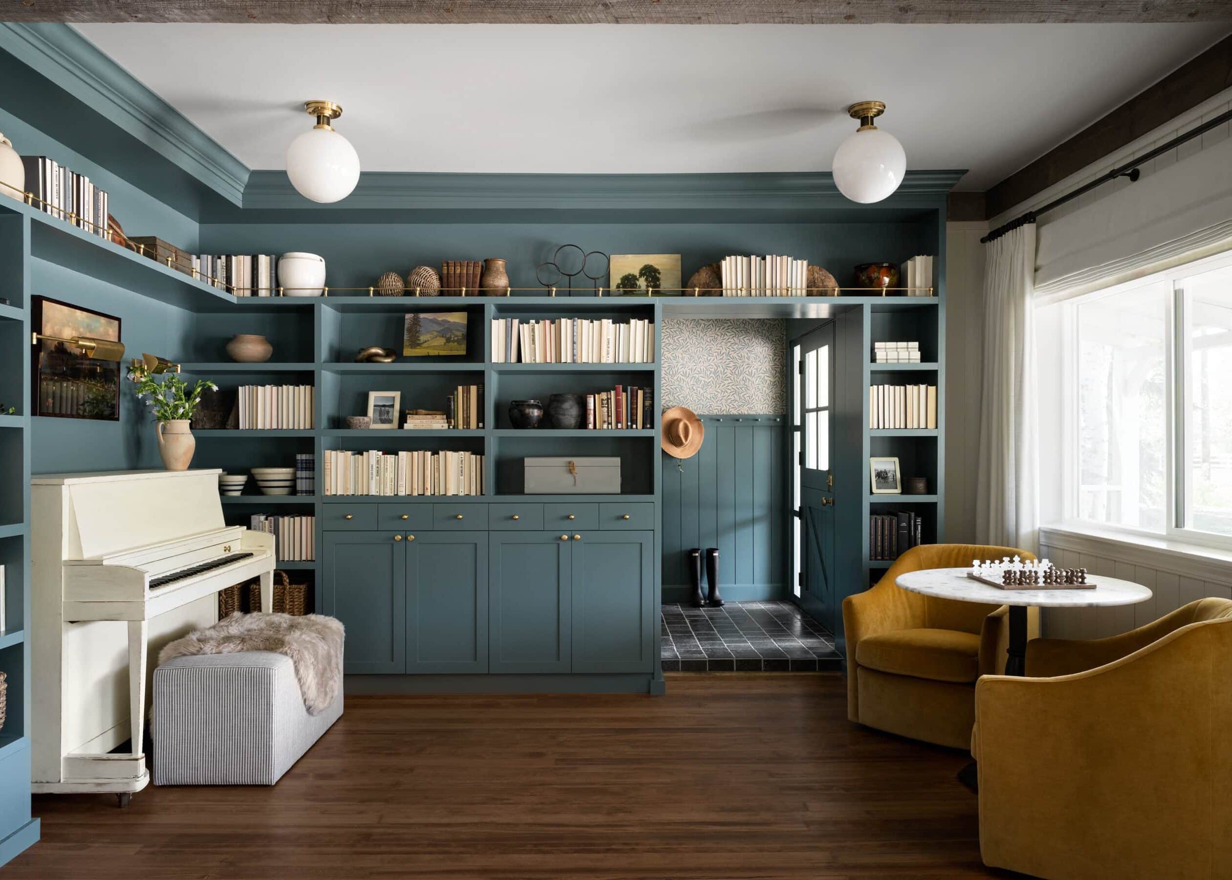
7. Add texture to bring neutral tones to life
We’re not afraid to admit it; we love using neutrals in our designs! Not only do neutral finishes and pieces tend to hold more longevity, but we love the calming, peaceful feeling they bring to a space.
Adding textures to a neutral space is crucial to bring dimension, and it’s something we consider in every space we design.

Image left – Episode 6, “Grand Kitchen Deployment” Image right – The McGee Home Great Room.
8. Incorporating cohesive finishes and elements throughout a home.
Whether we’re designing a home from the ground up or doing a one-room makeover, we’re always considering how we can use cohesive elements throughout to create flow. This can be anything from wall treatments to metal finishes, but it’s helpful to think of each room as a part of a whole.
In the Call project, they had Board & Battan in their front room current living space, and when we started working on their bonus room, we knew we wanted to use that element in their new space as well. Although the two rooms look completely different, that repeating element ties them together and brings a sense of intention.
From Episode 1 “Forever Home”
You May Also Like