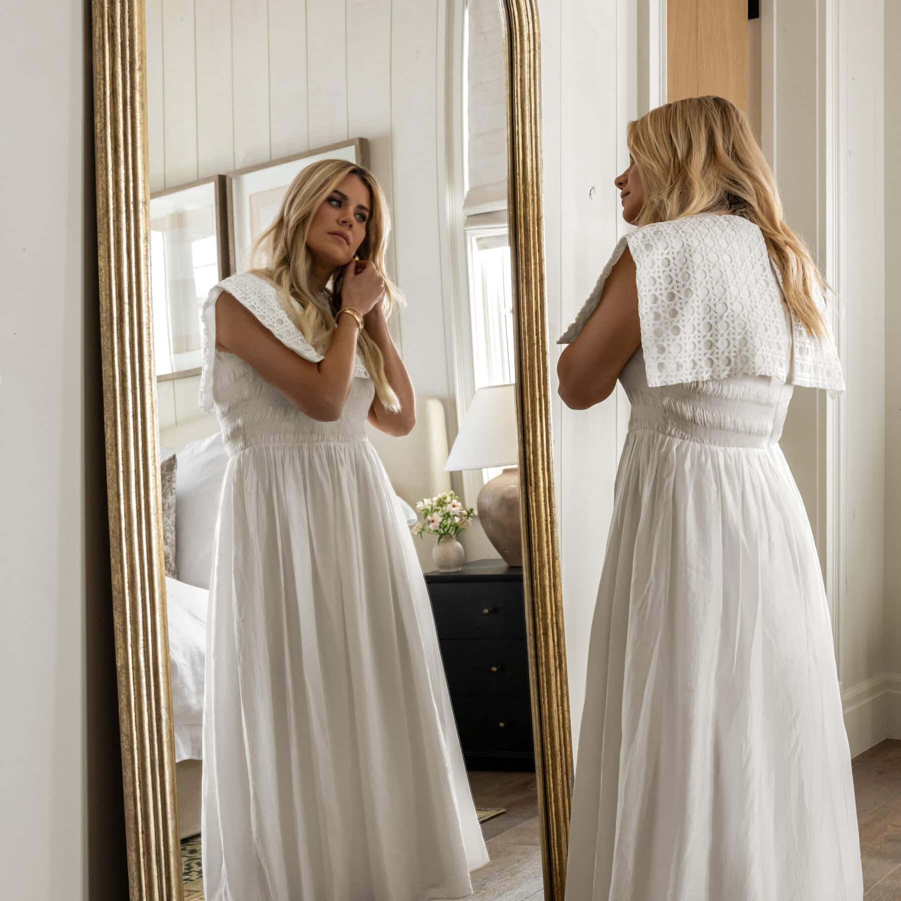


How to Avoid Styling Mistakes
A few tips to get you out of a styling rut.
28 October 2020 -
Interior styling is about so much more than laying out pretty objects in a row. Thoughtful, personal, styling can bring your space to life. We put together some of our not-so-obvious tips for styling, so you can find some inspiration for those vignettes that just feel “meh”!! Are you making any of these mistakes we try to avoid?
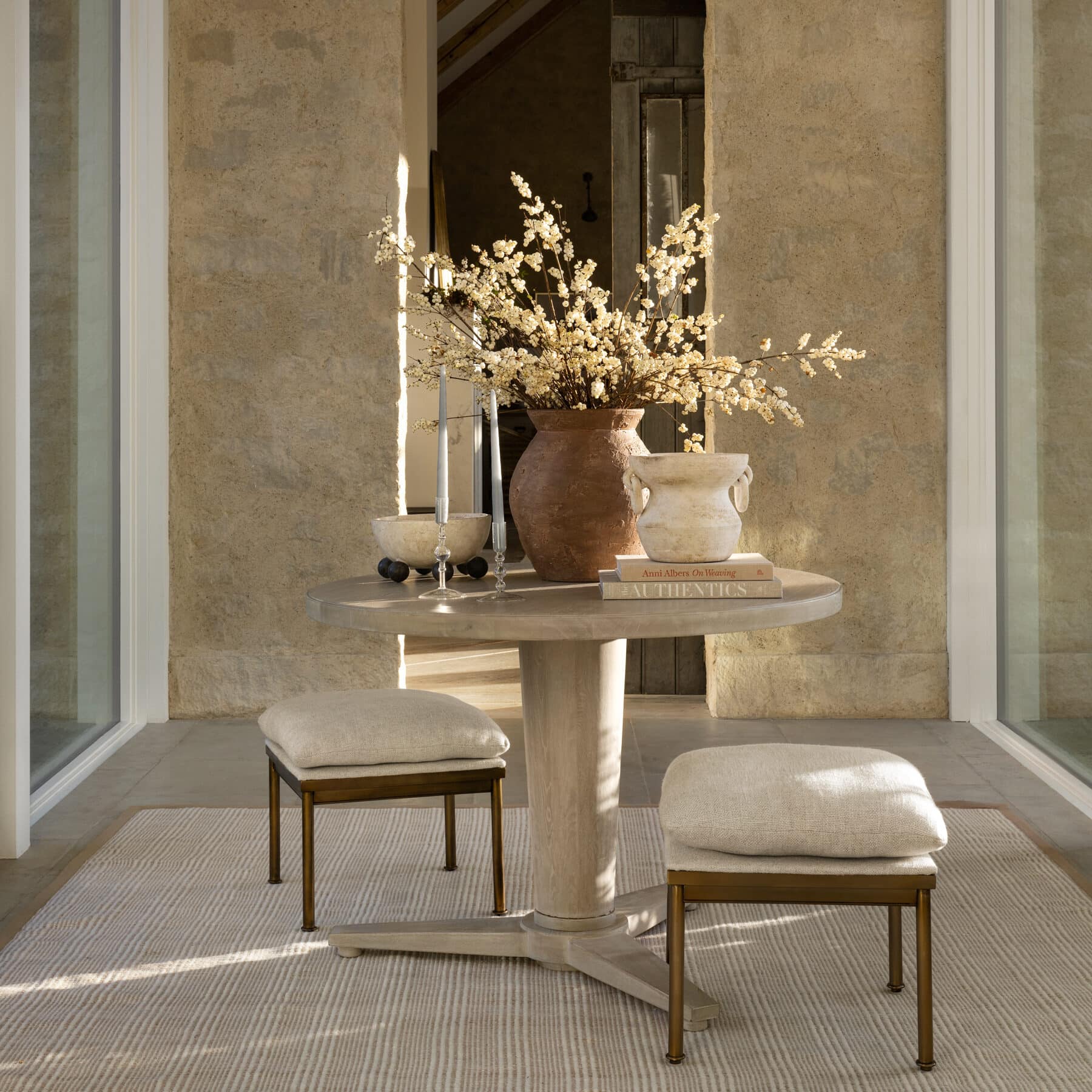
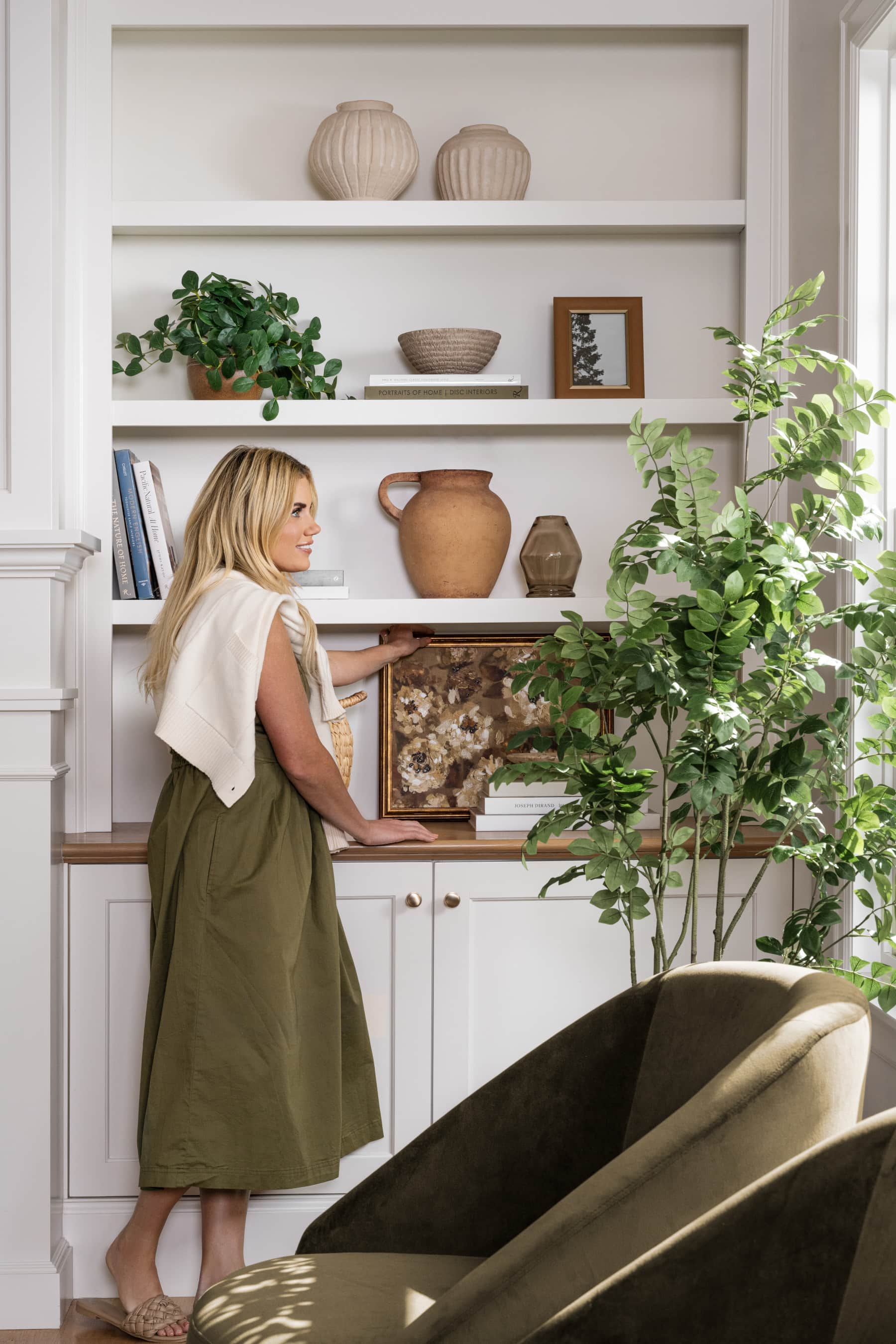
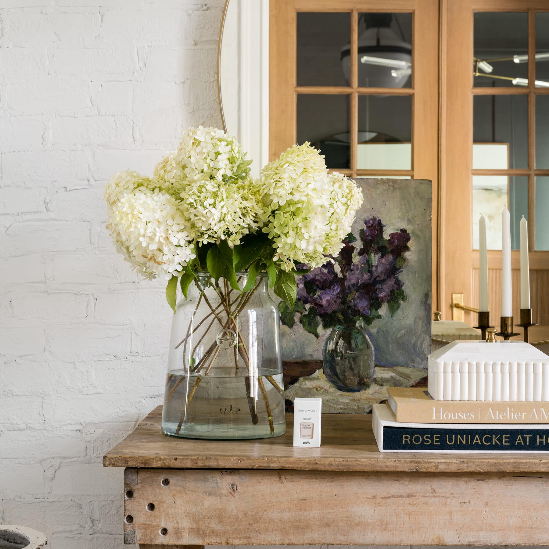
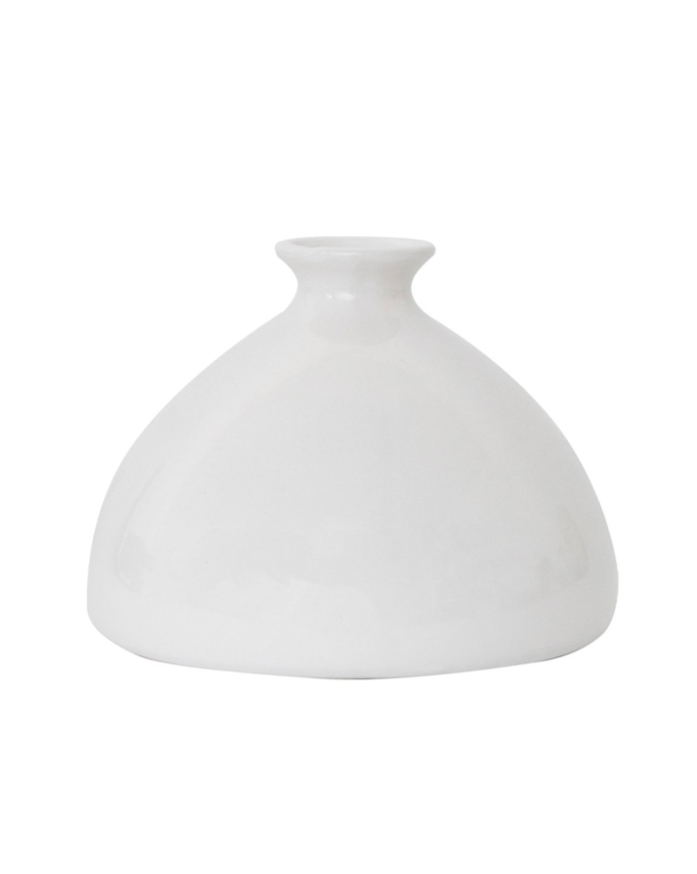
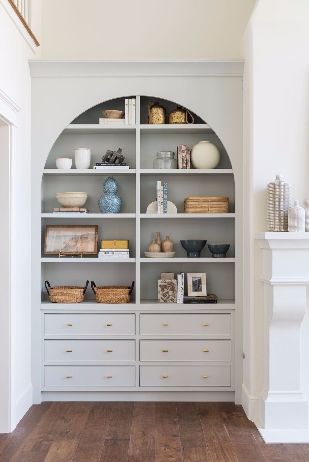
Styling Mistake No 1. Disregarding Scale
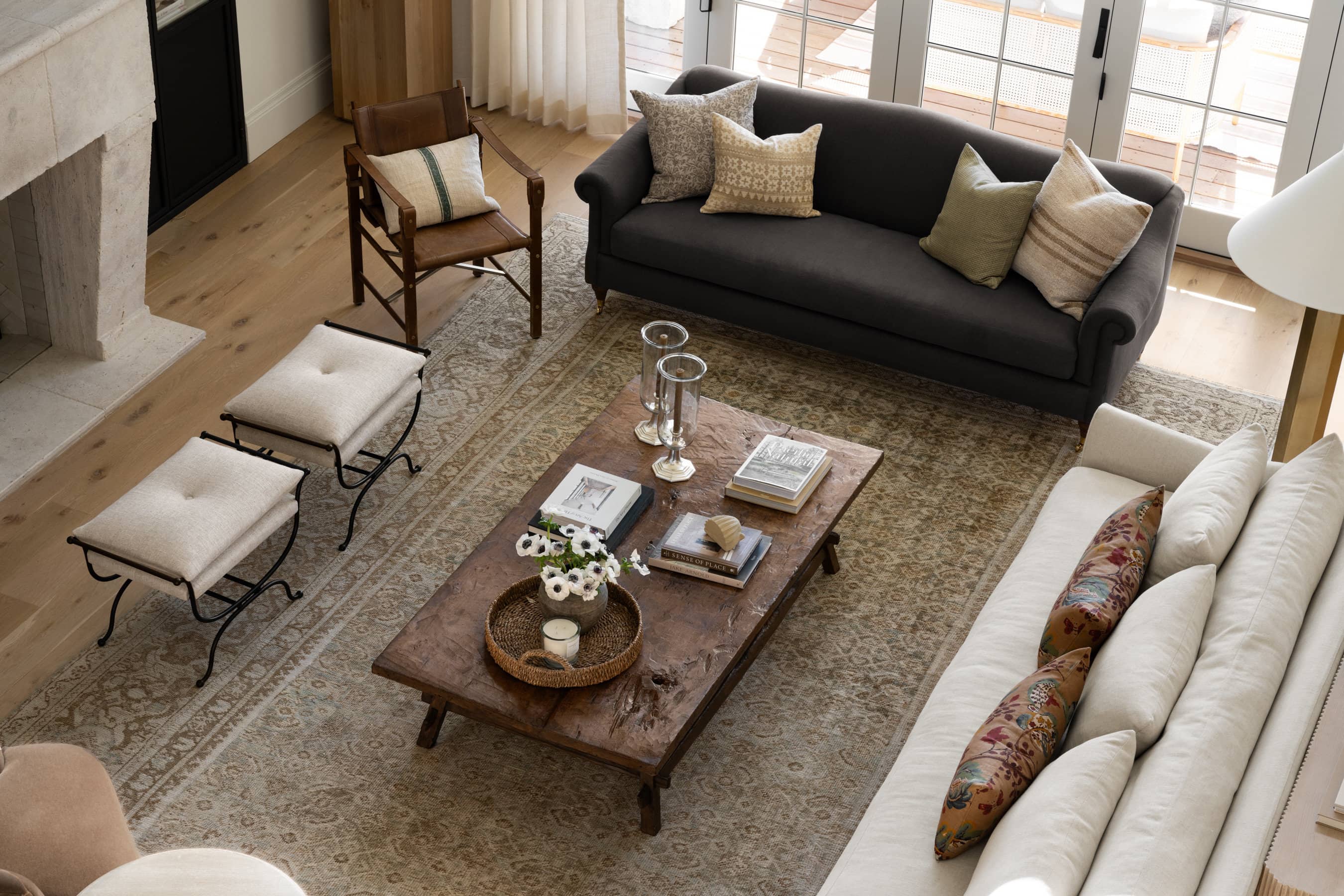
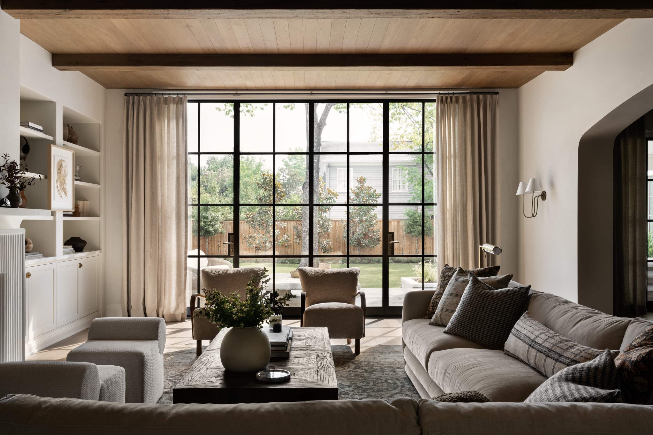
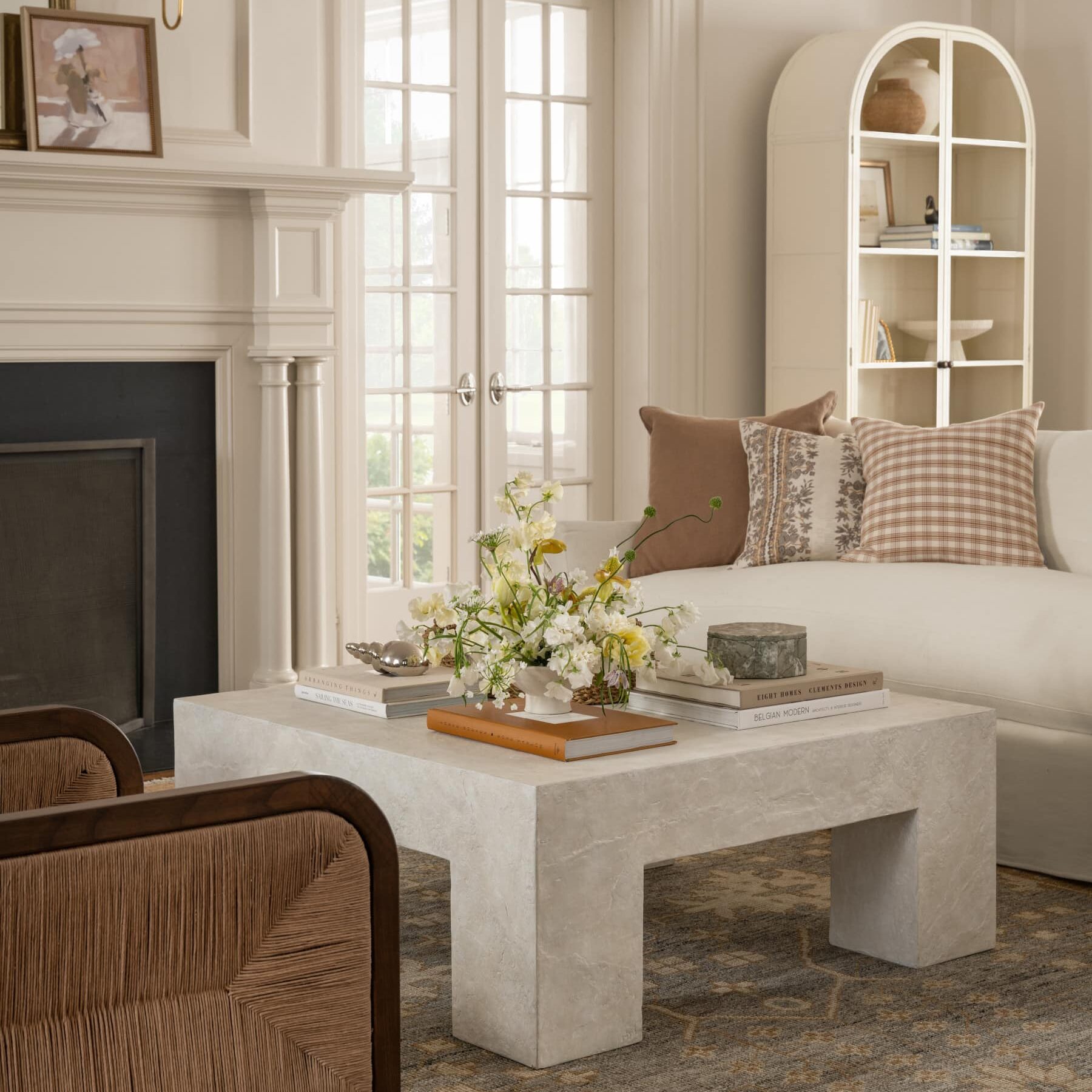
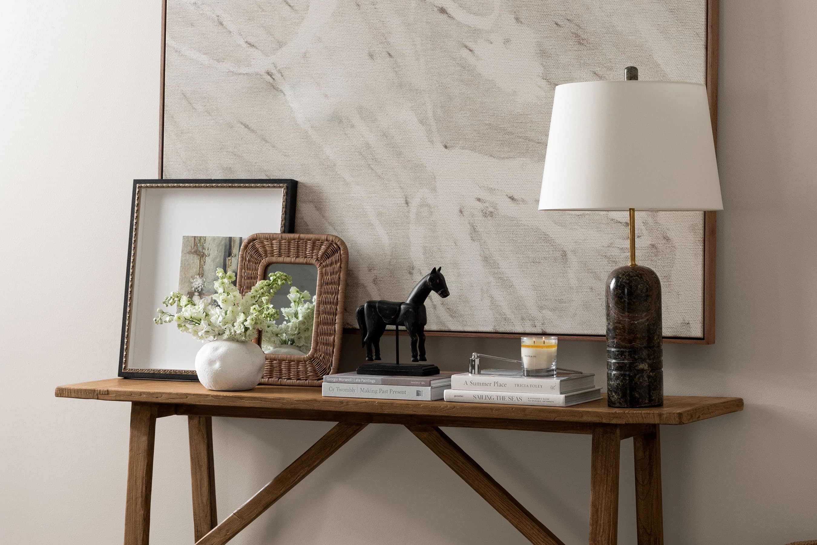
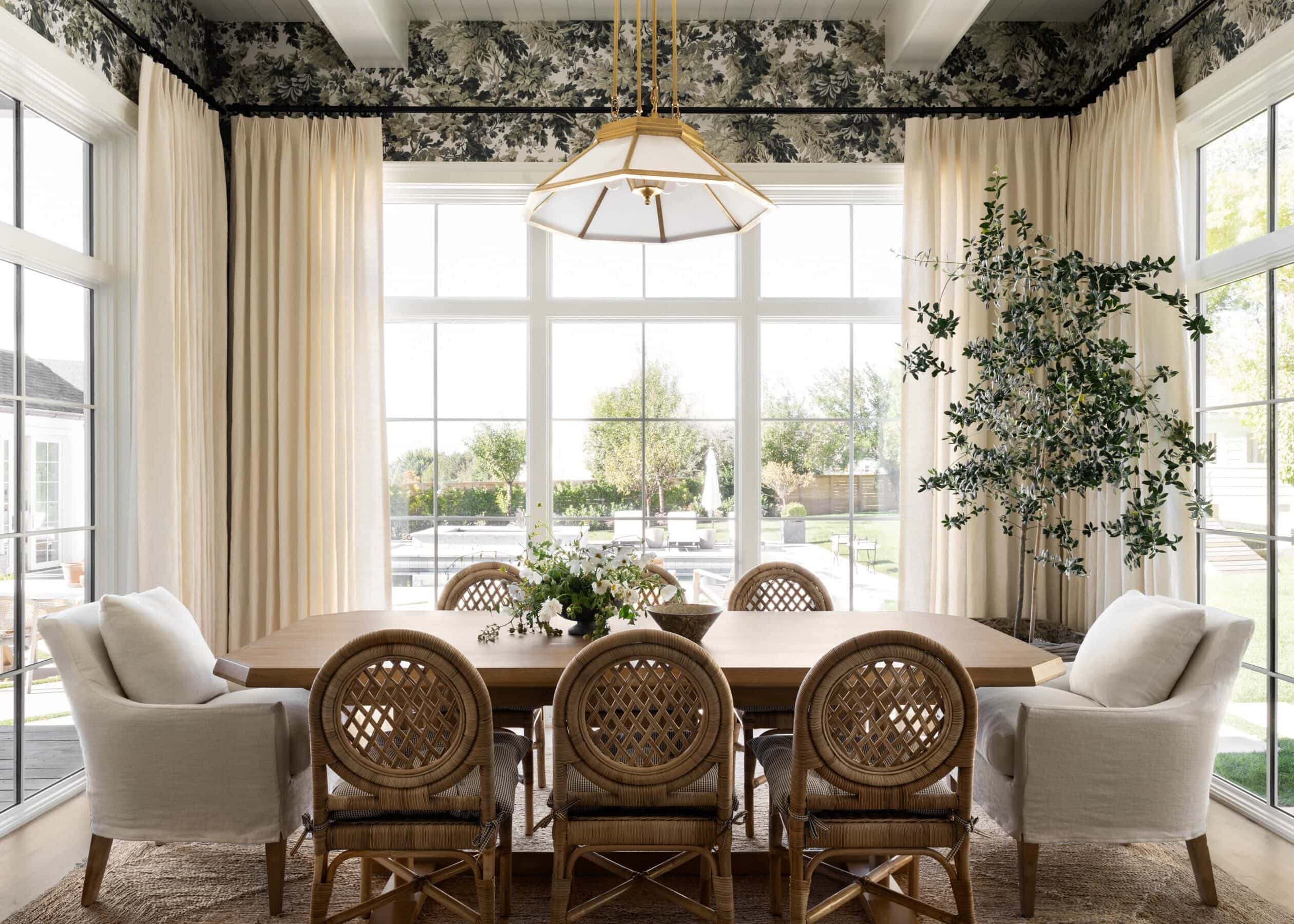
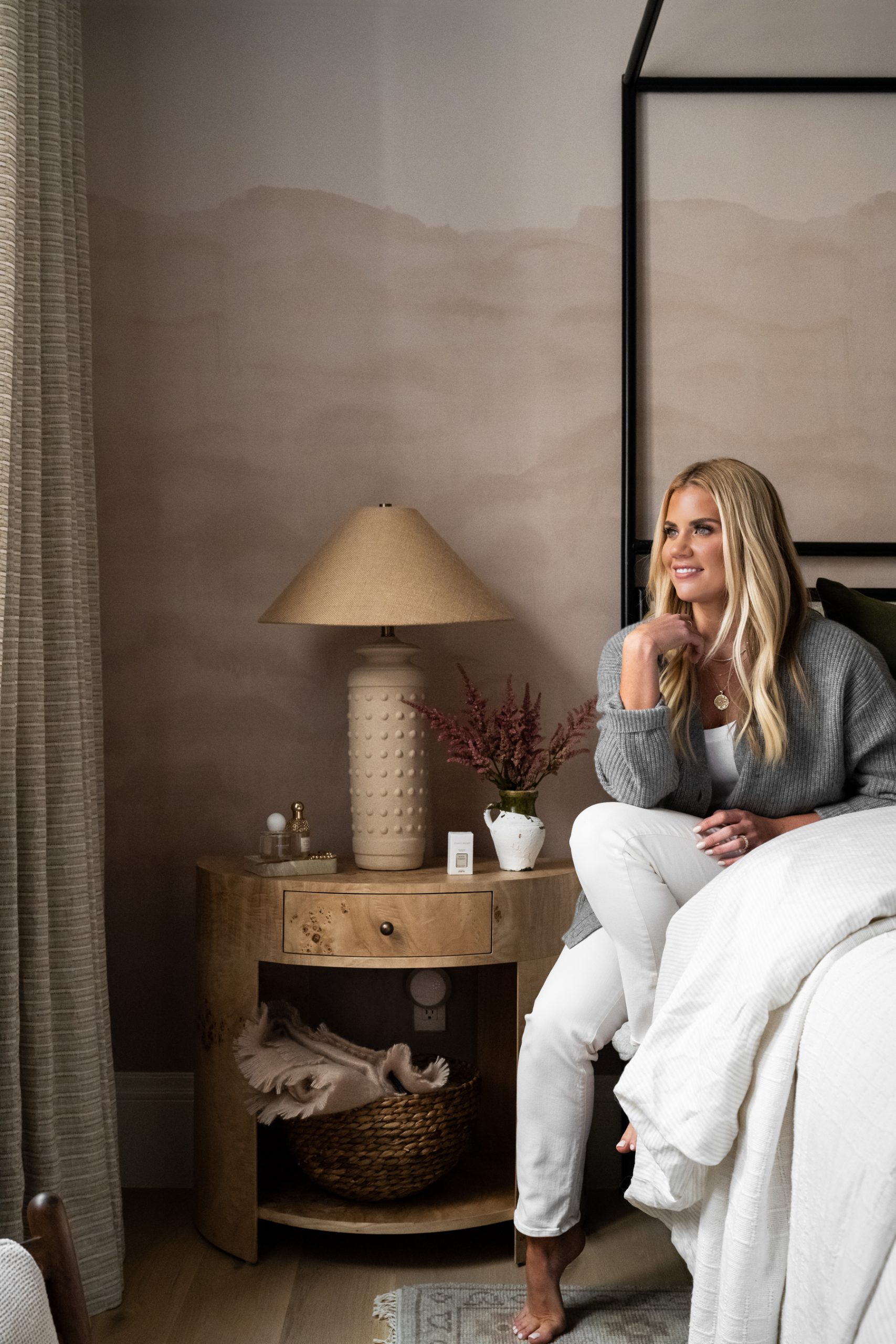
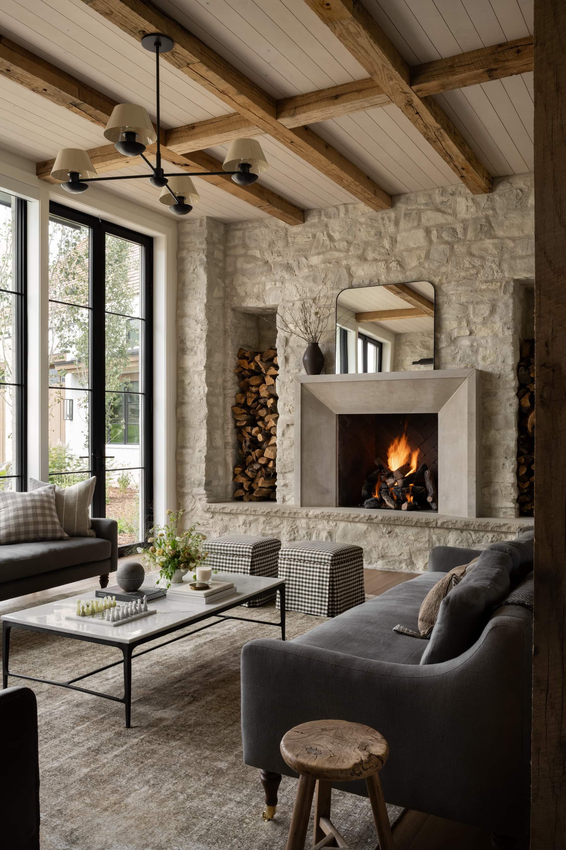
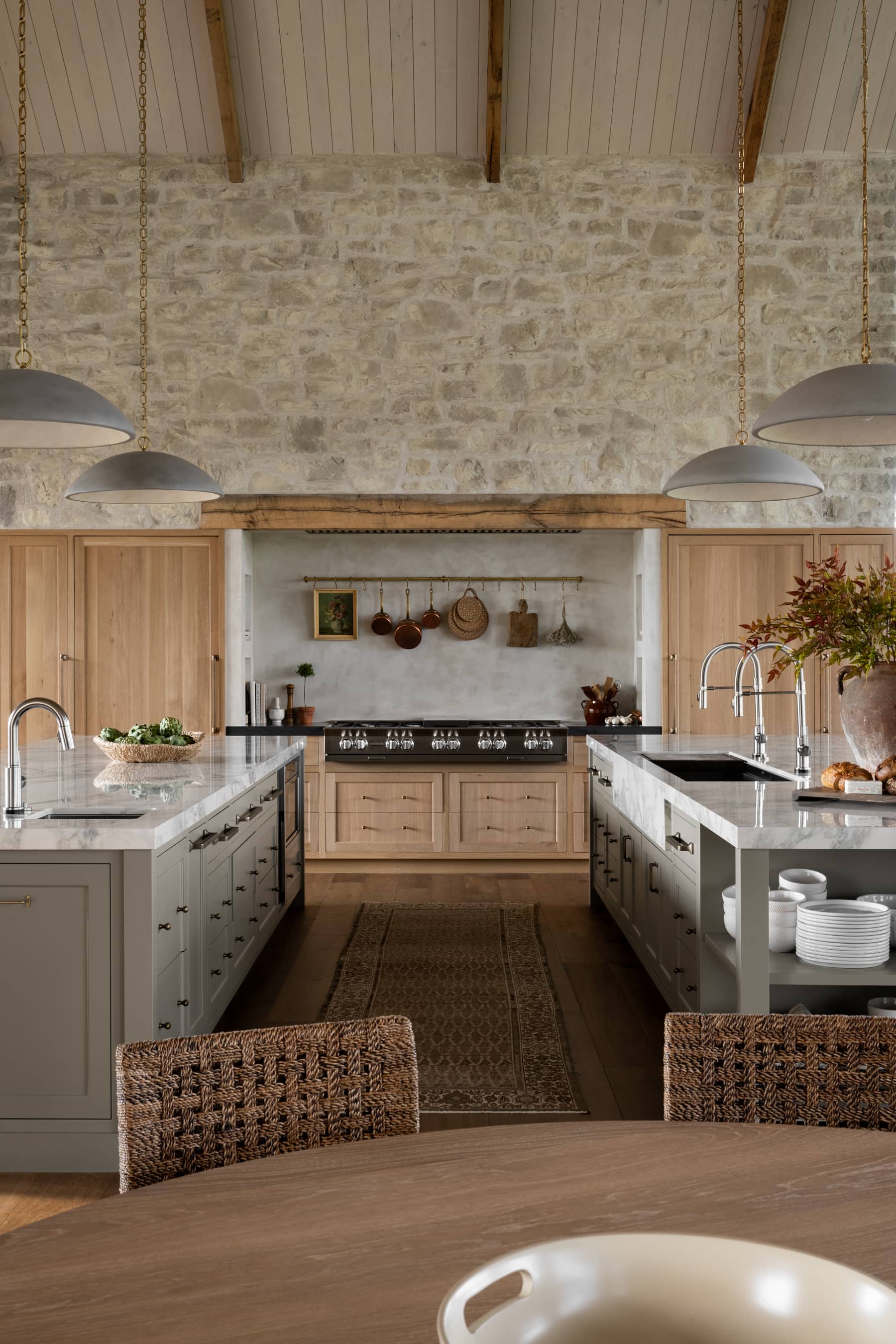
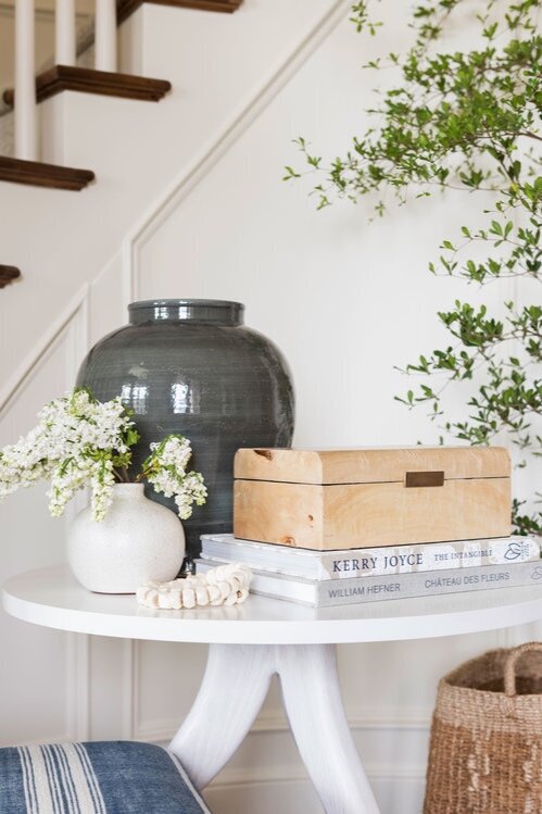
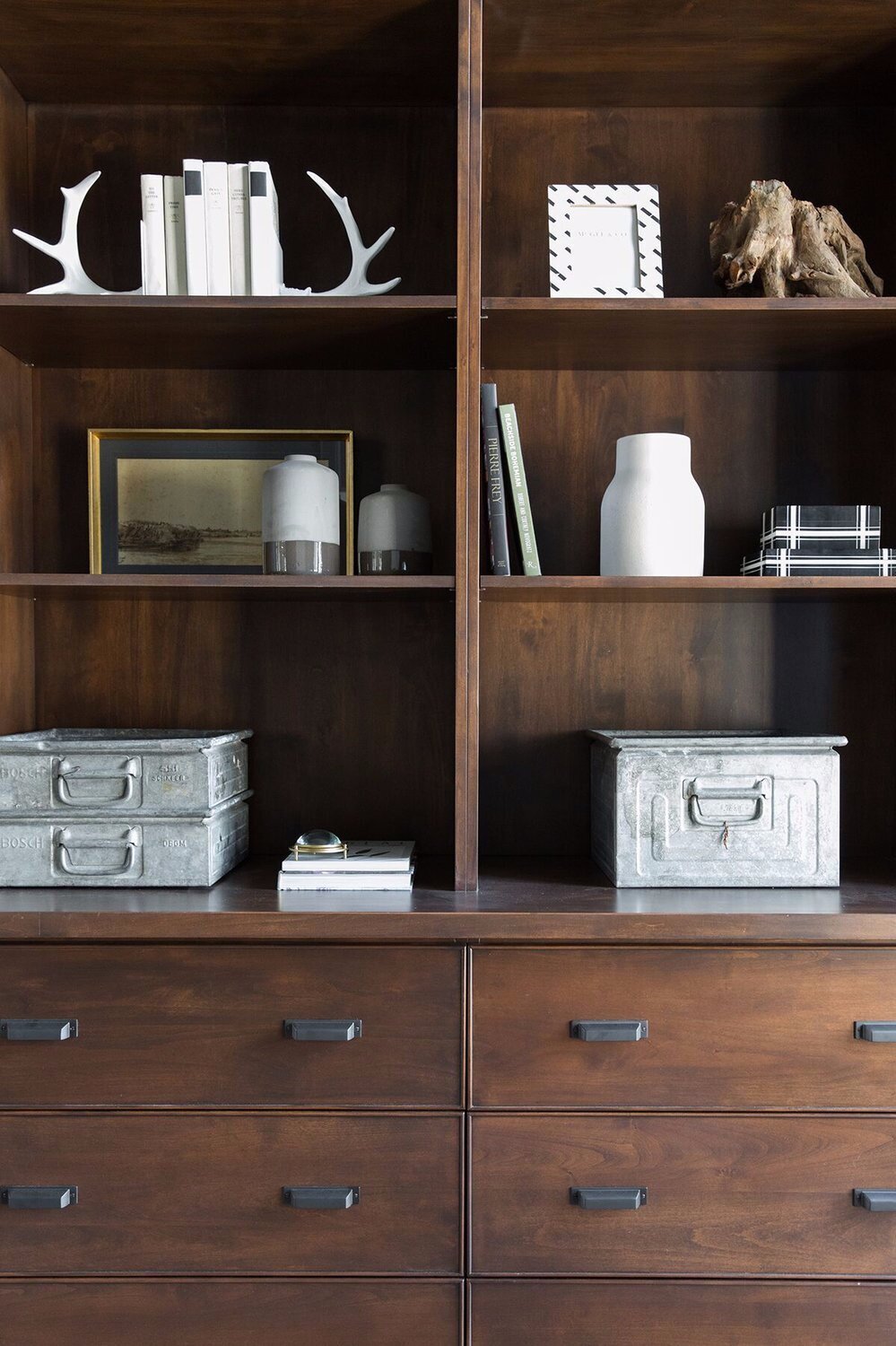
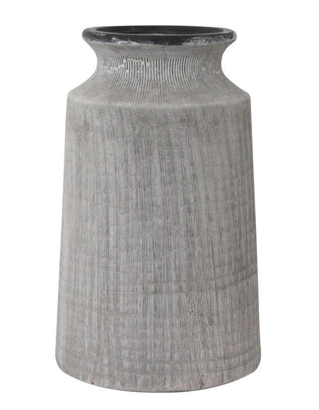
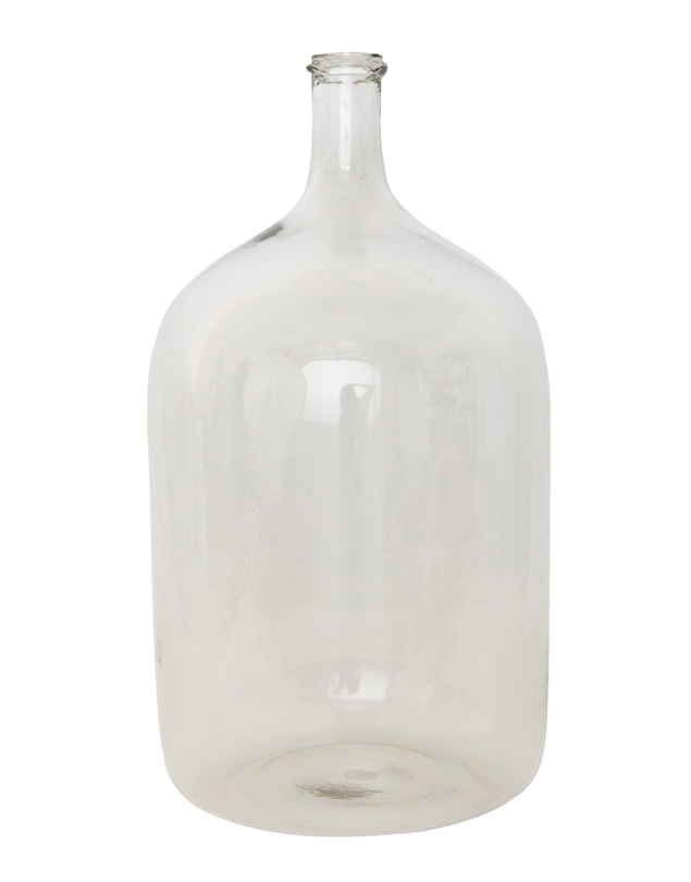
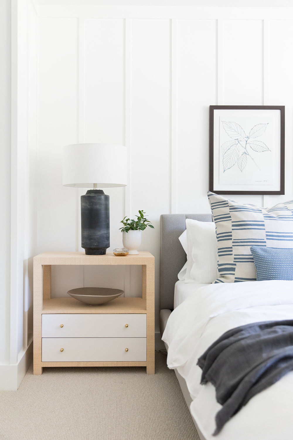
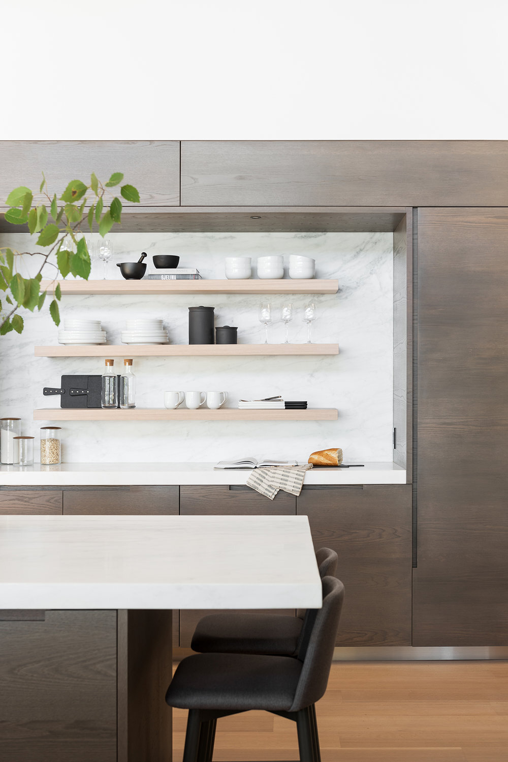
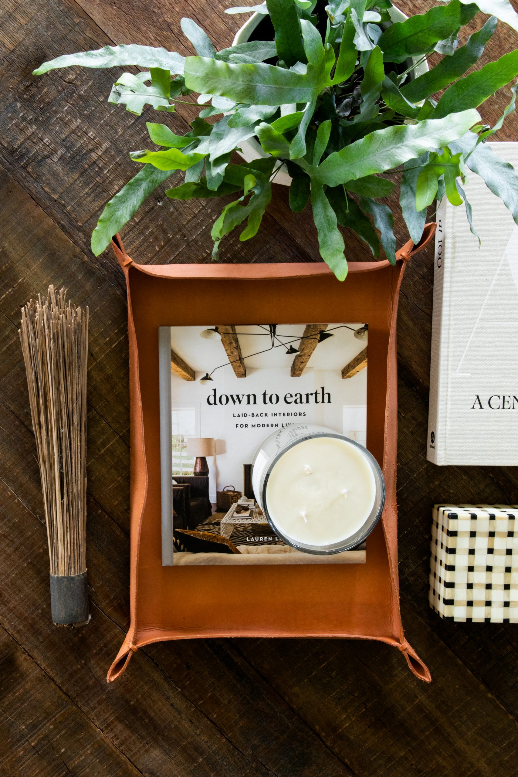
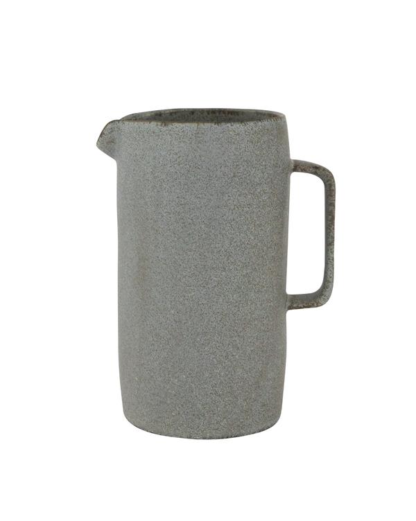
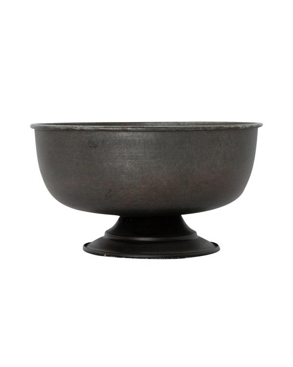
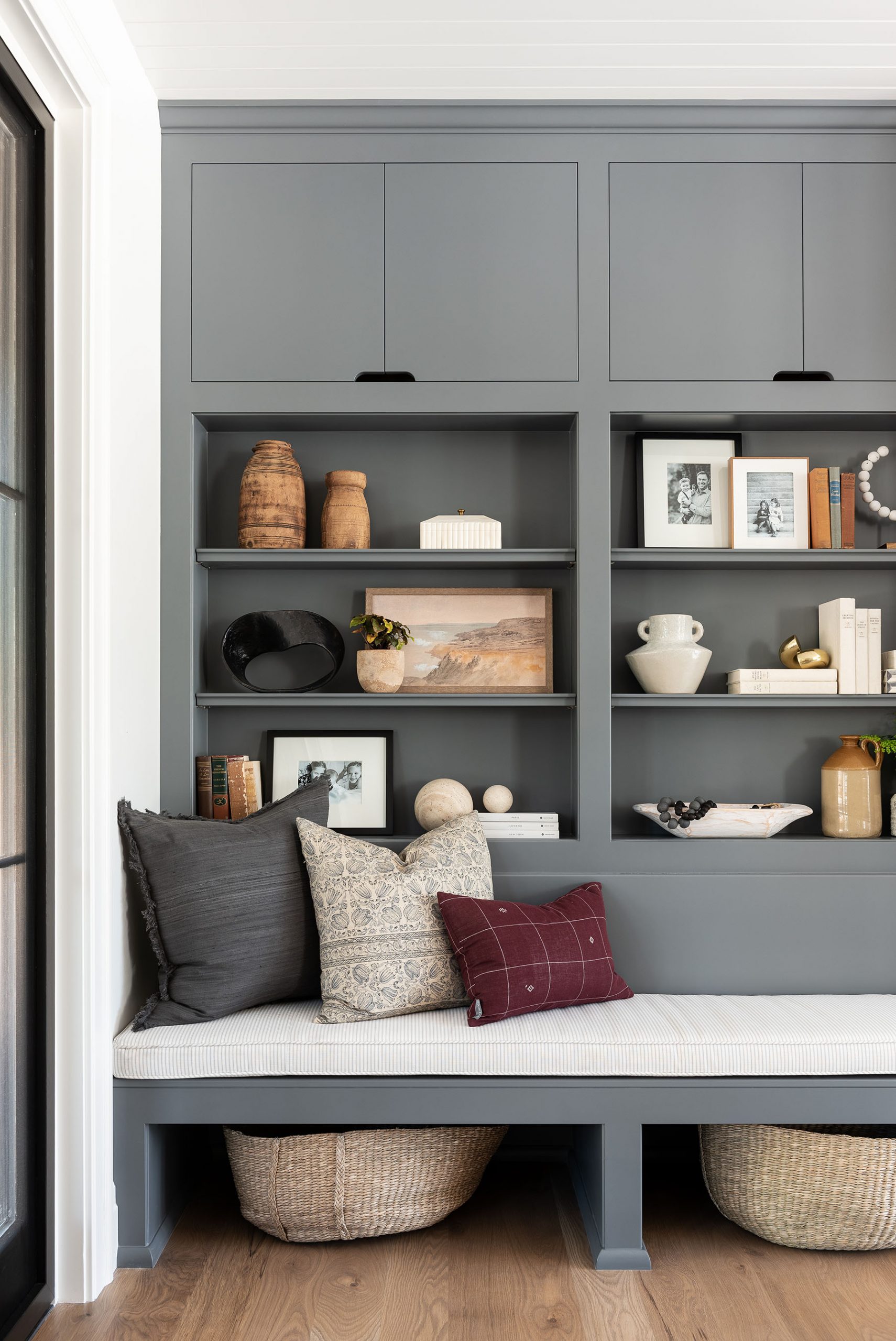
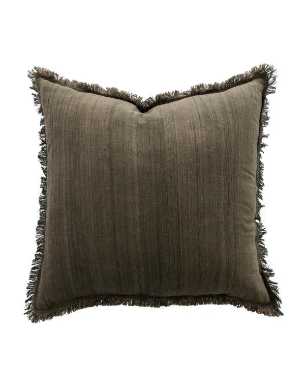
When there are a lot of tiny accessories in bookshelves, and on coffee tables, countertops, etc. it can quickly make things look cluttered and random. Instead, break up all the little objects by adding large pieces into vignettes like boxes, large vases, bowls, etc. It always helps to corral or anchor items with trays and to group small items together.
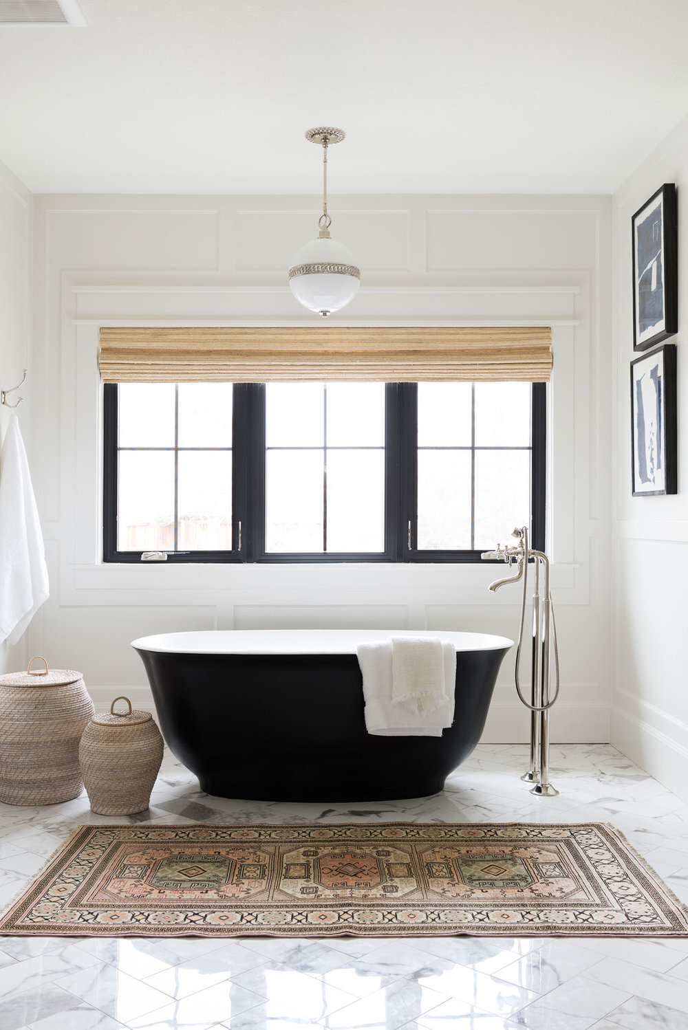
From our Northridge remodel.
Don’t be intimidated by large accessories! Not only are they substantial and grounding, but the grand scale can bring out the smaller items in your home.
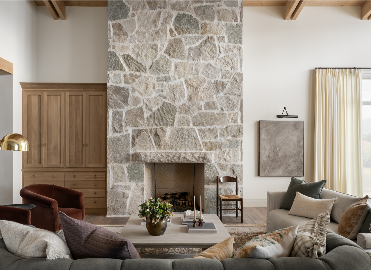
From our Orange County Ranch Remodel.
From our Cove Remodel.
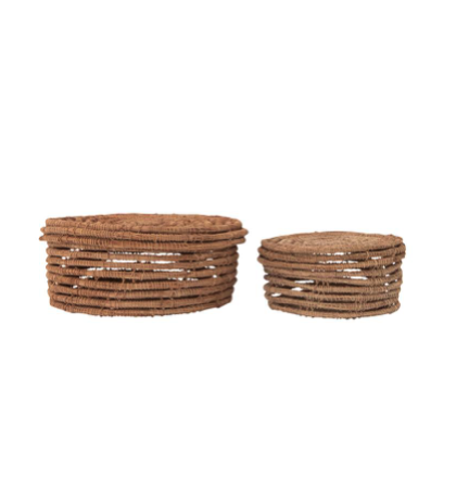
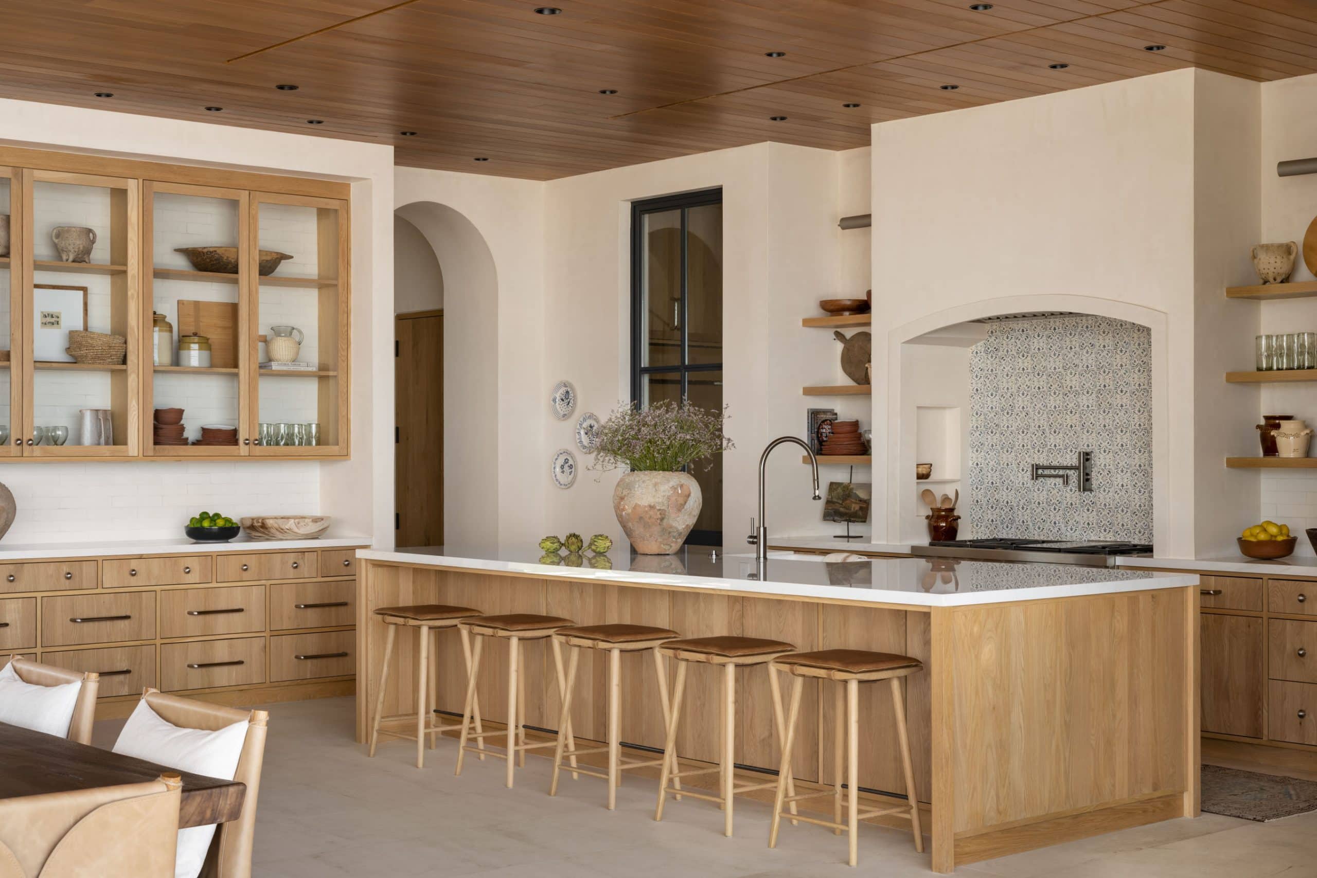
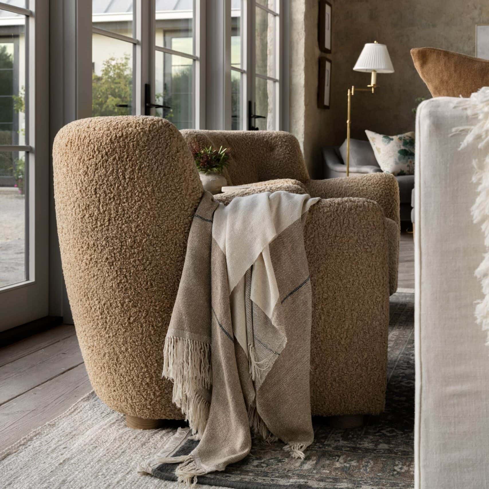
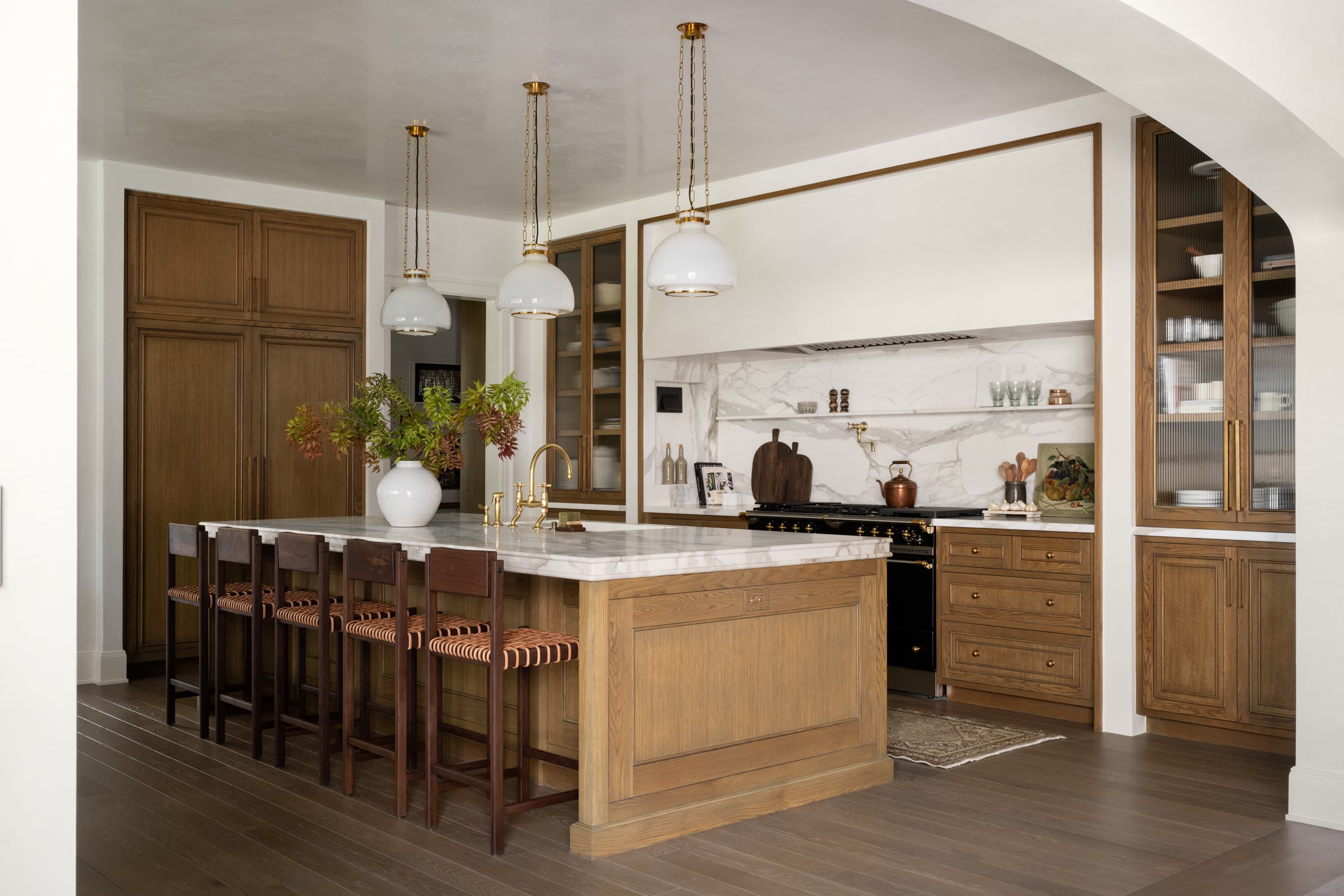
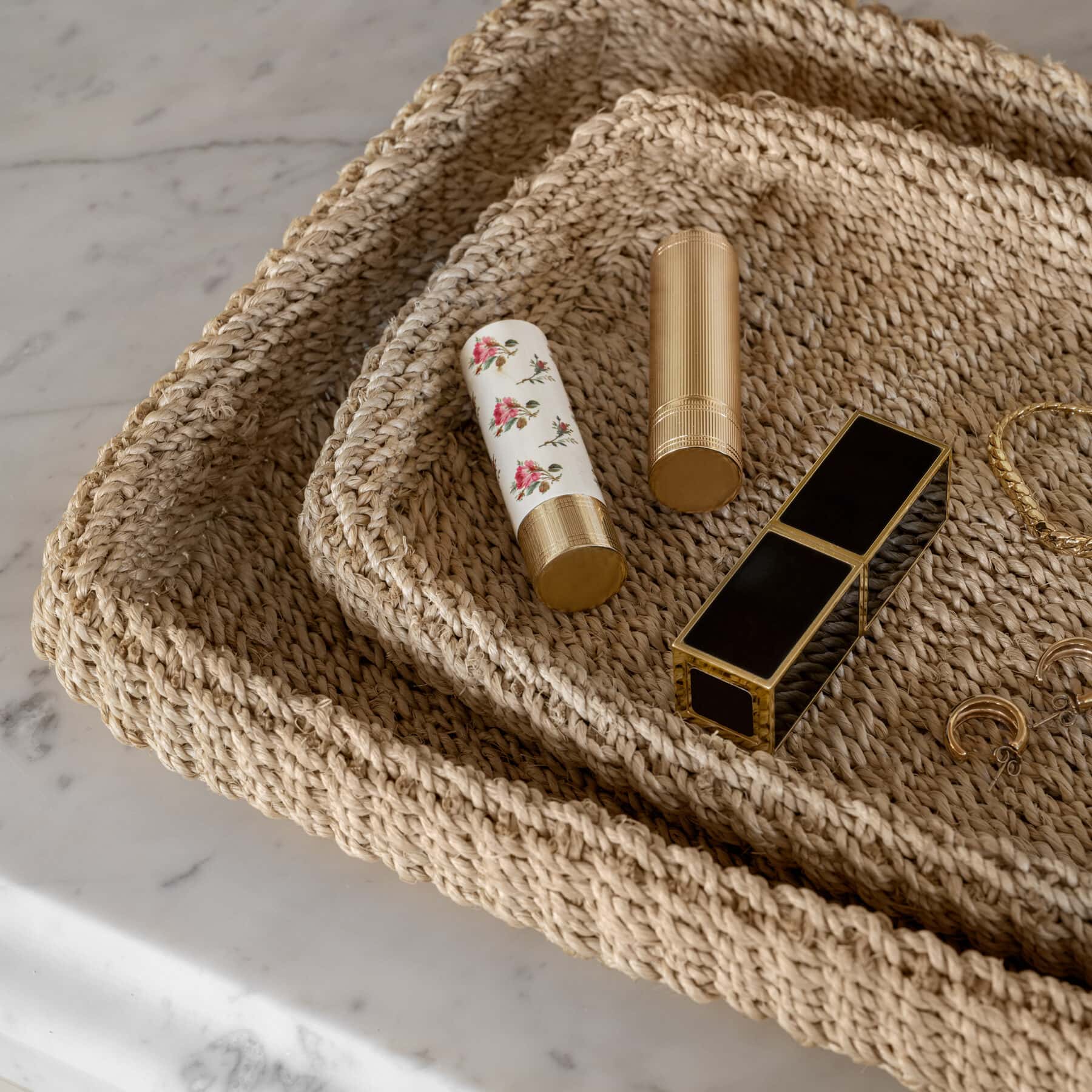
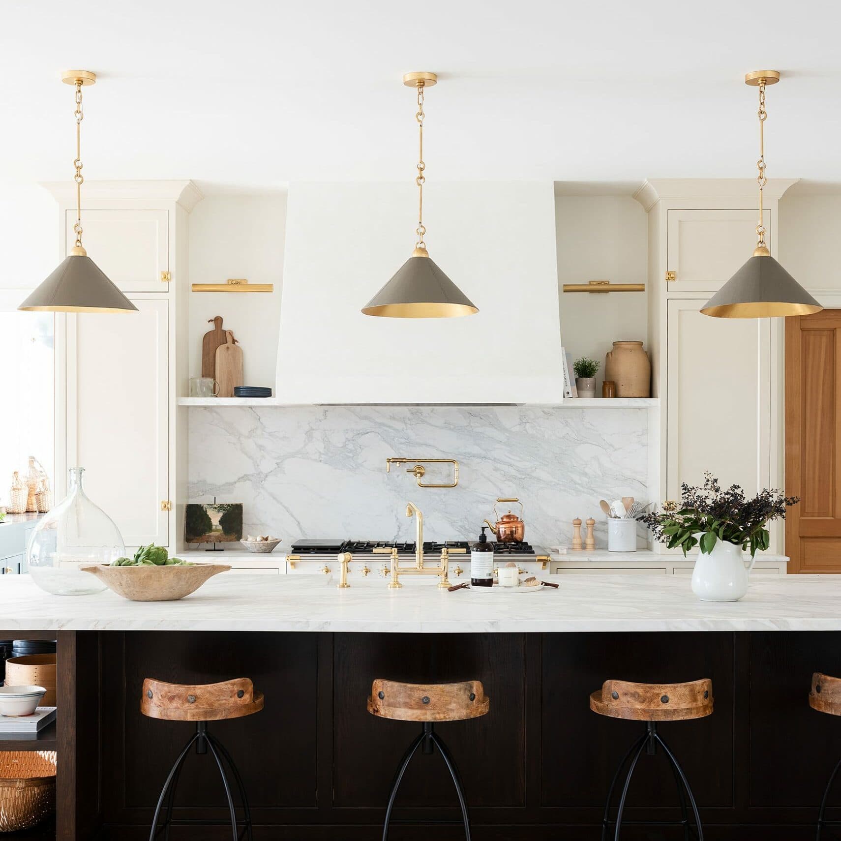
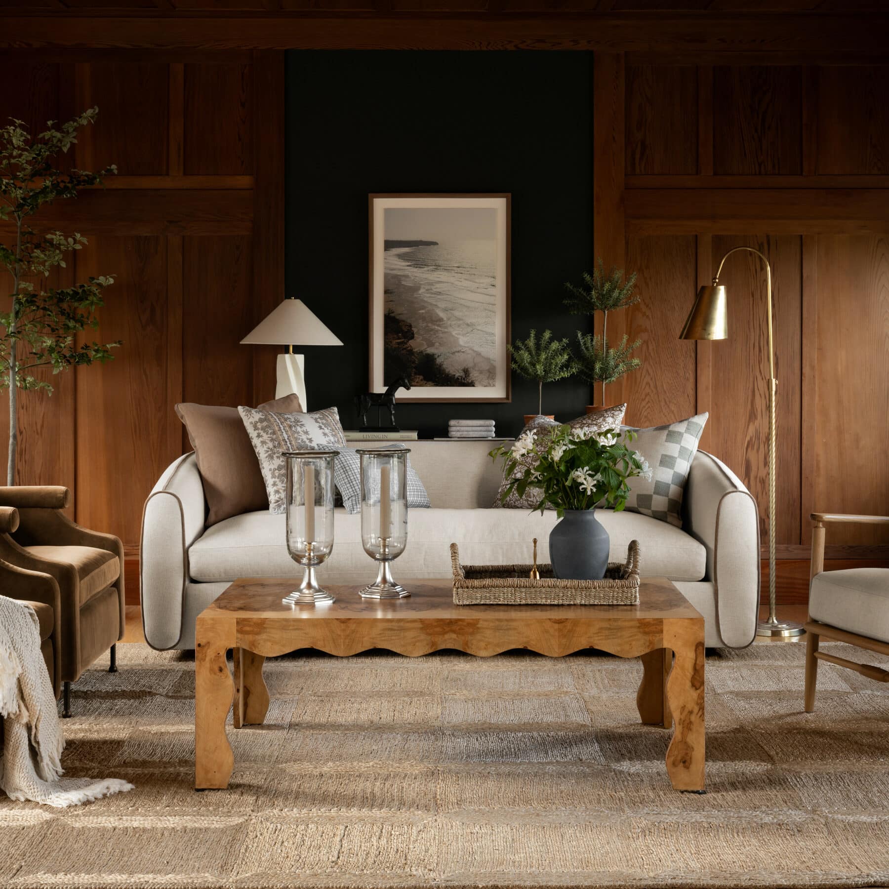
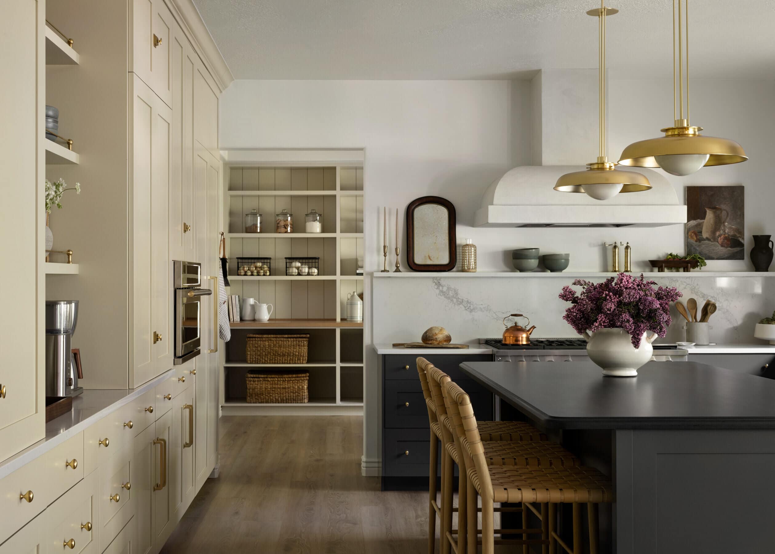
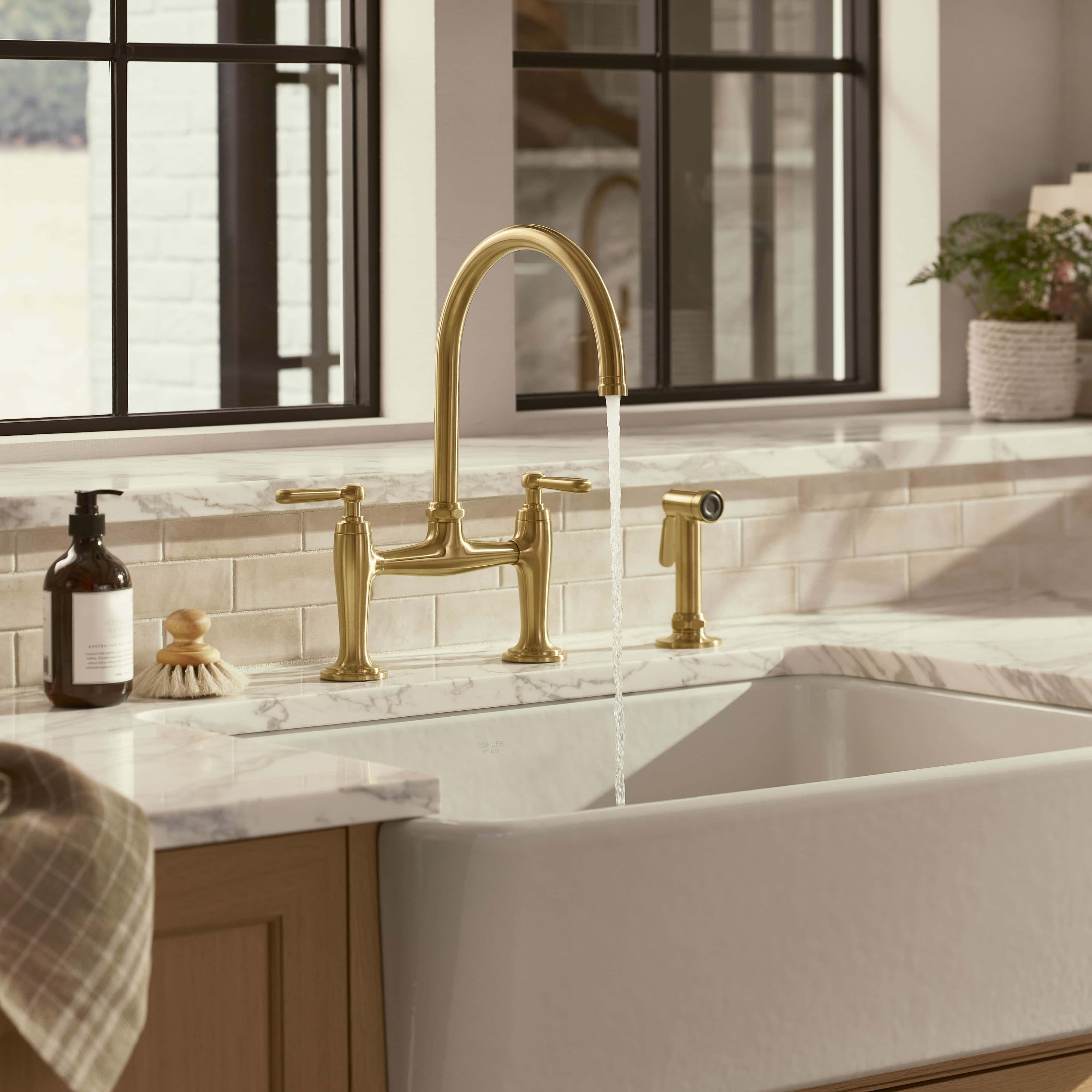
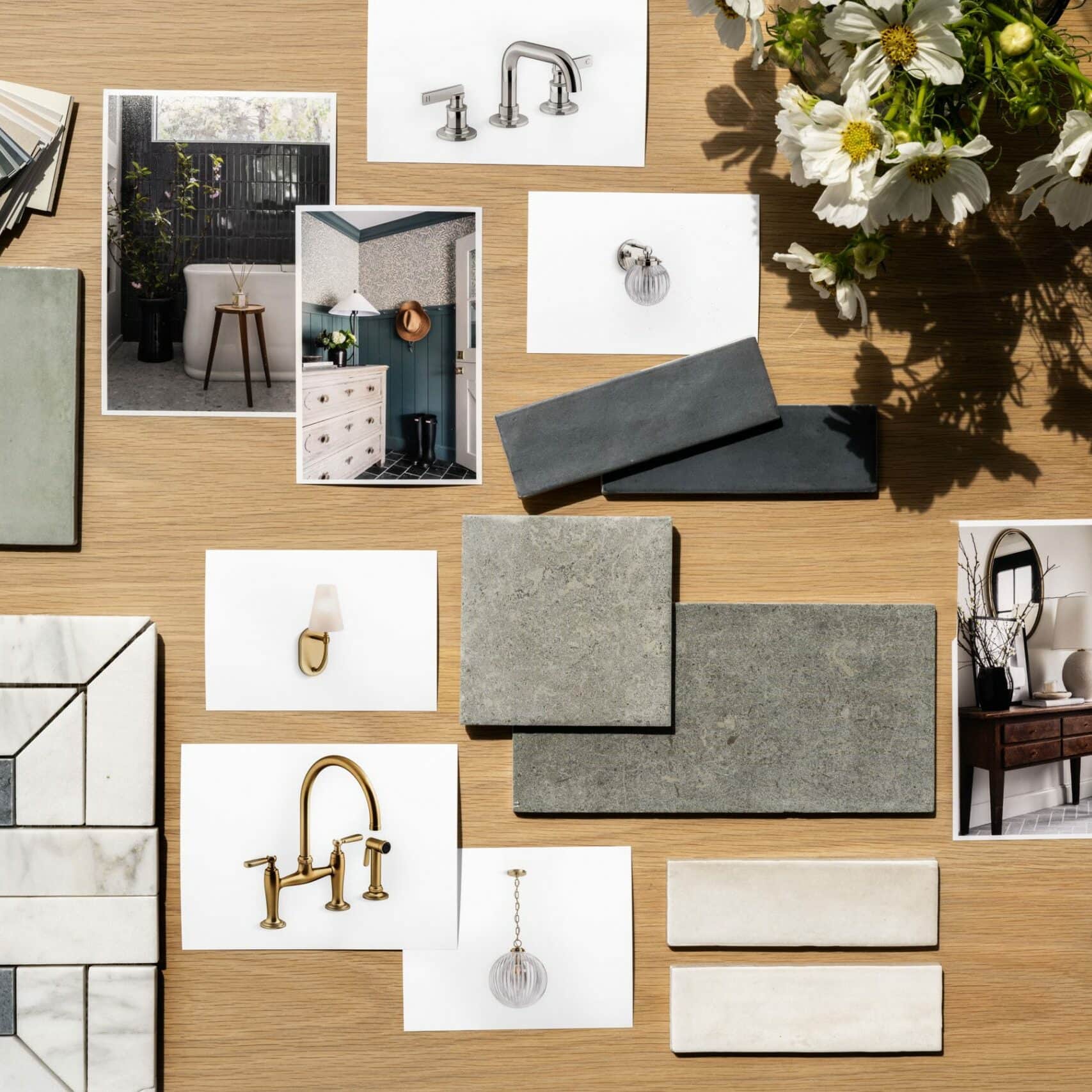
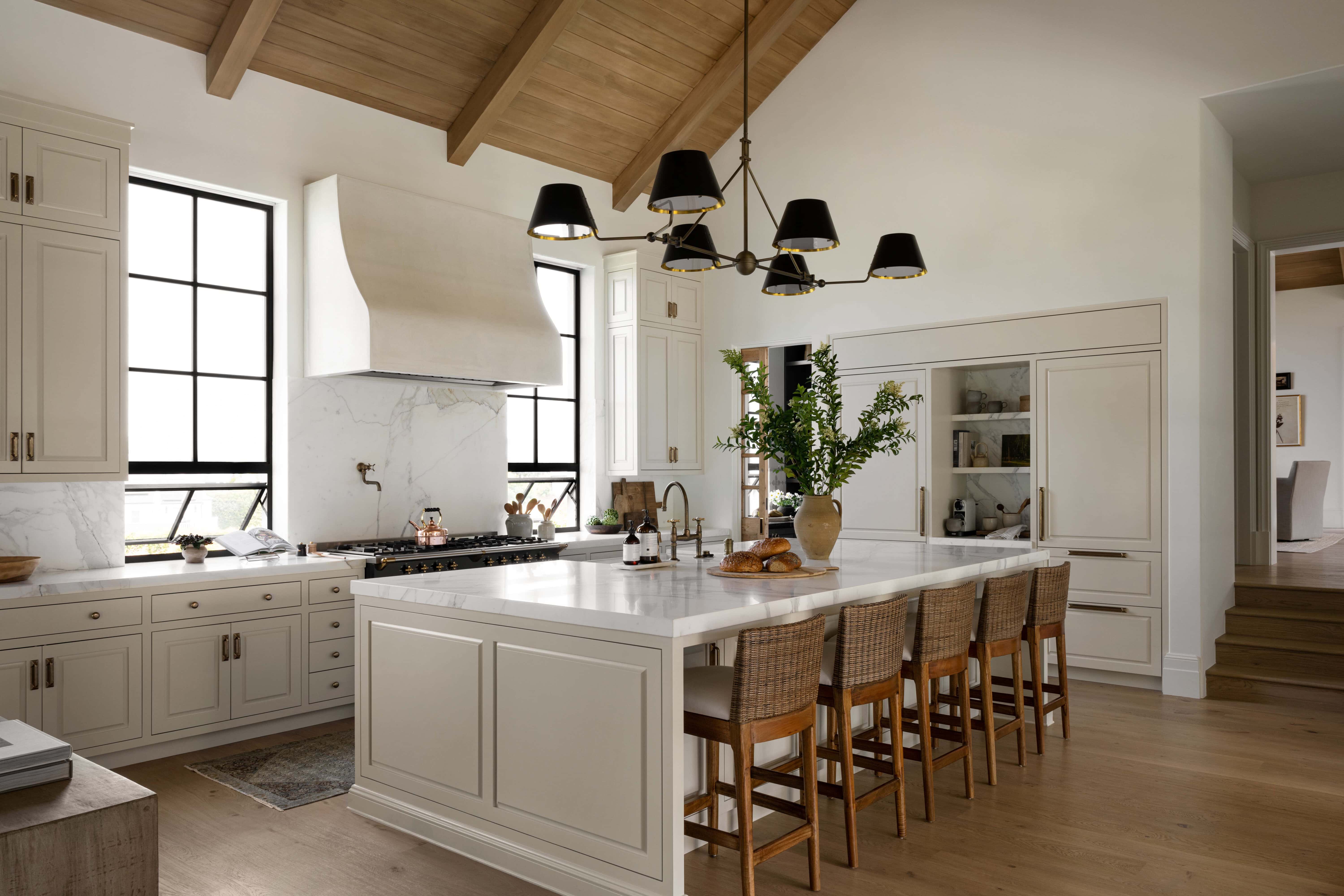
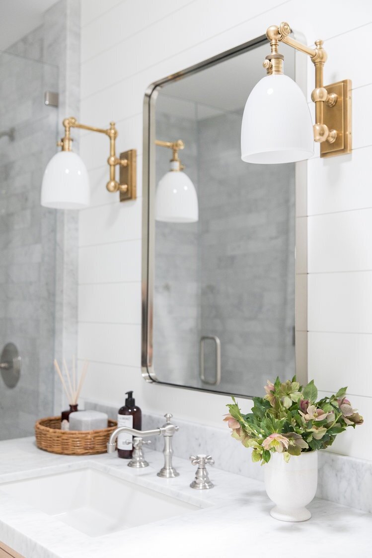
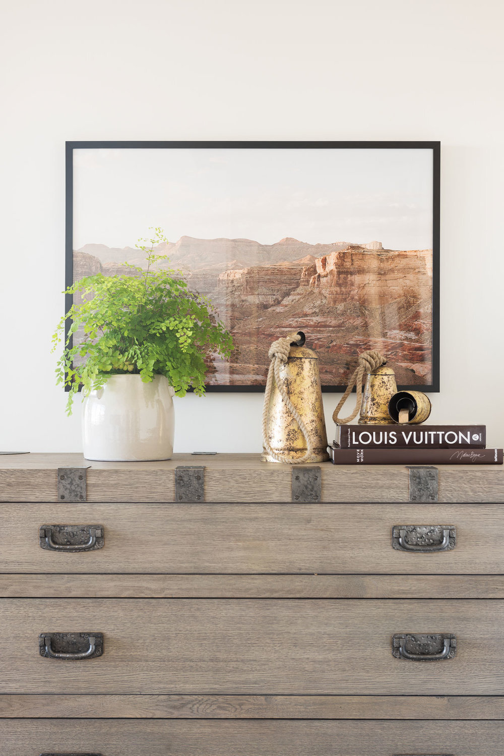
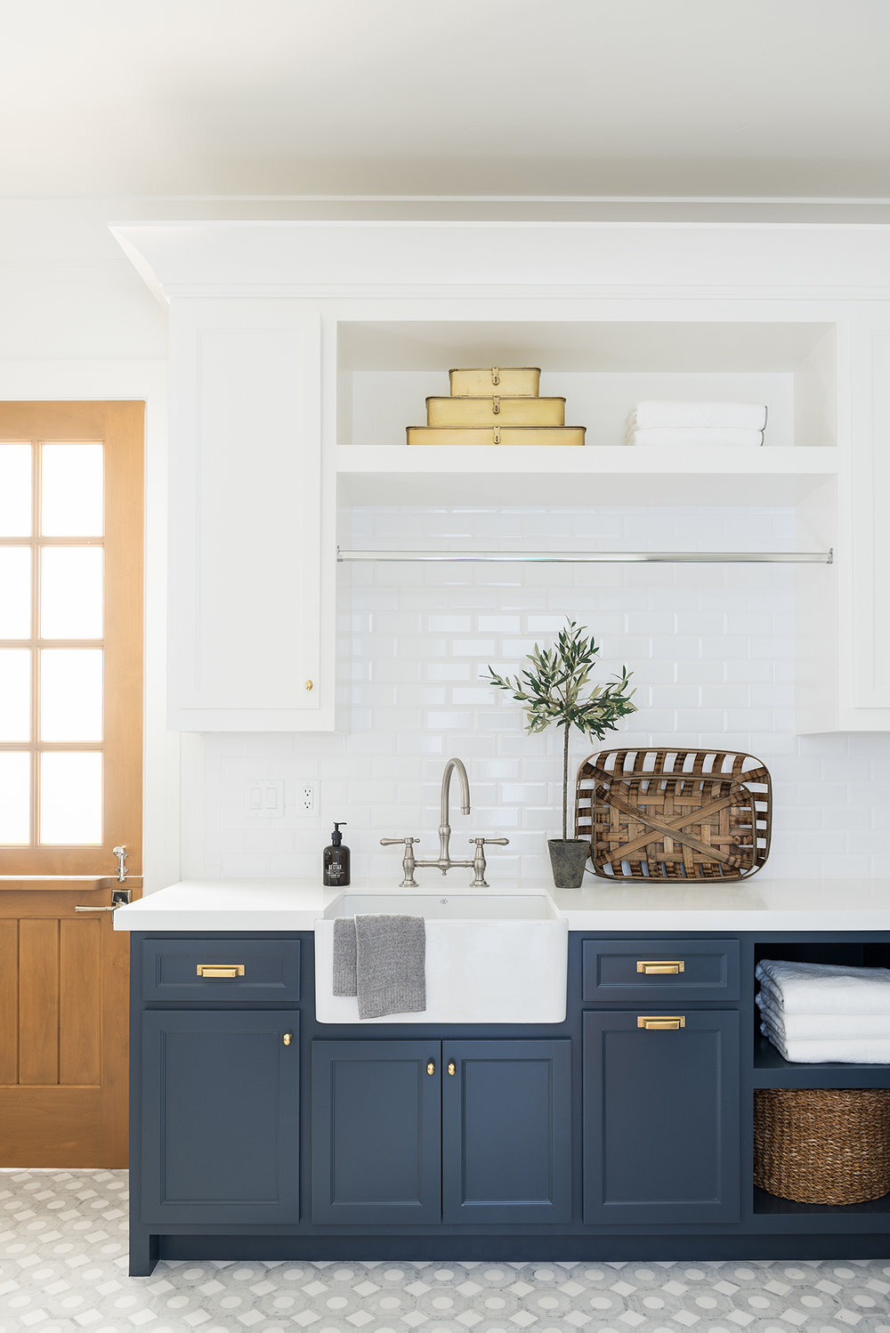
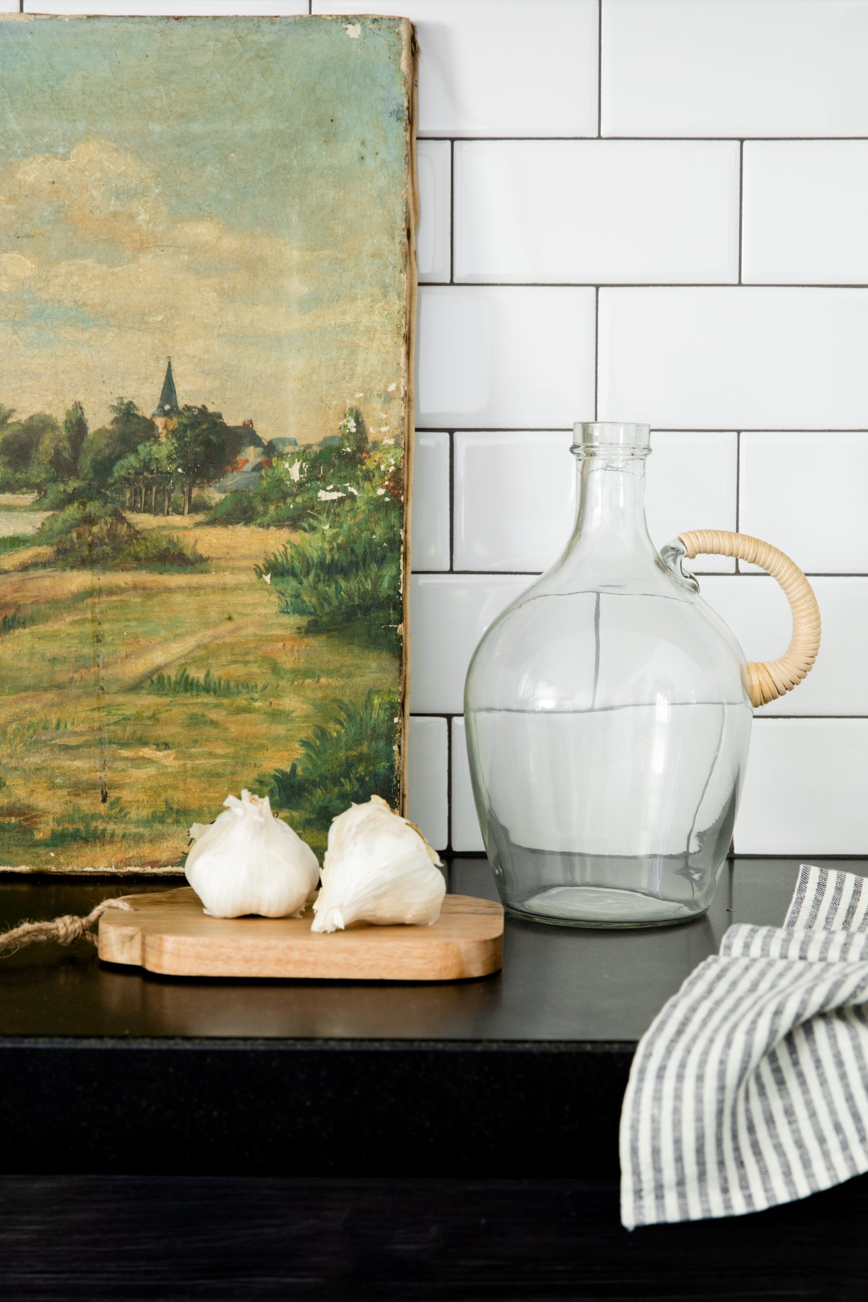
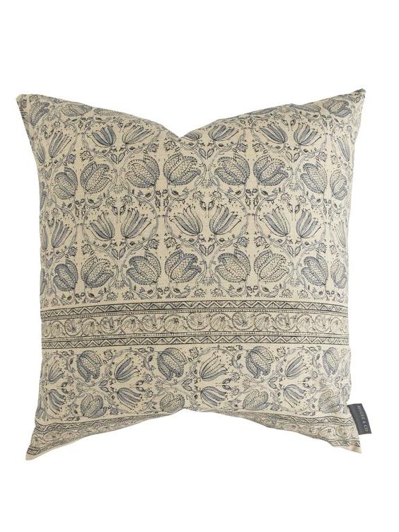
Styling Mistake No 2. Not Mixing Materials
If you love brass, not every accessory has to be brass. We love to juxtapose natural elements with sleek metals and vice versa. We see this a lot in kitchens and bathrooms. Soften metallics with woven, rattan, or other natural materials.
From our Orange County Ranch Remodel.
From our SM Ranch House.
From our Orange County Ranch Remodel.
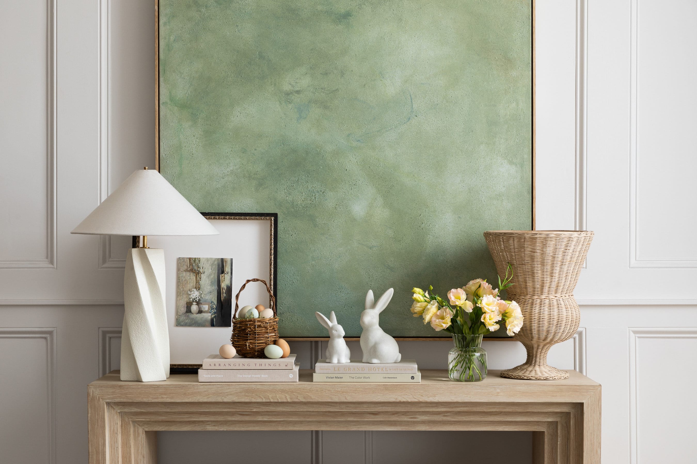
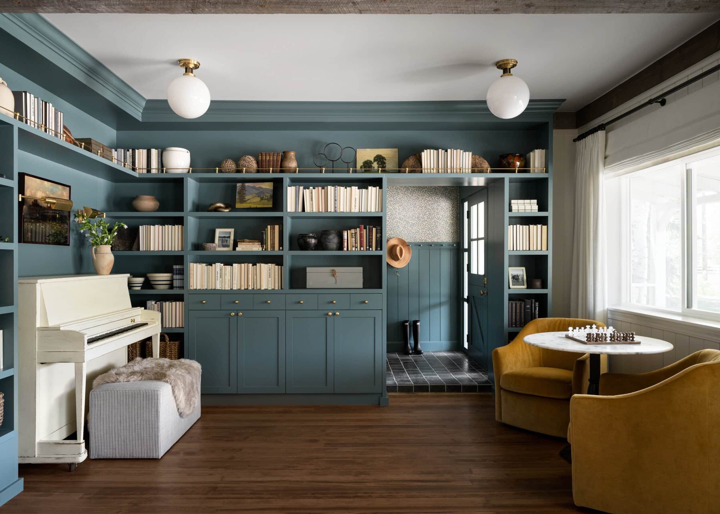
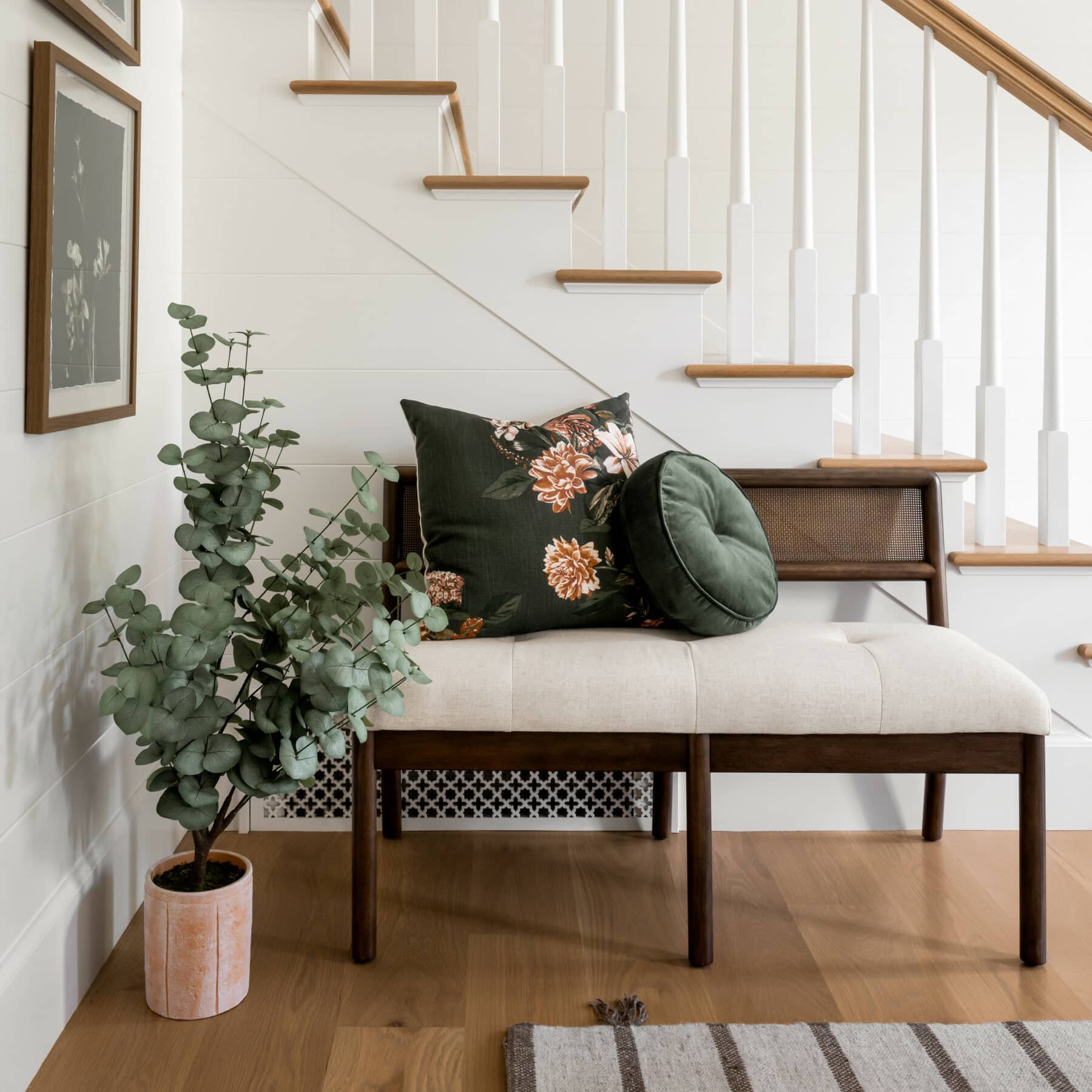
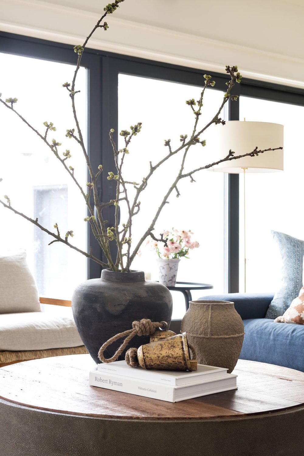
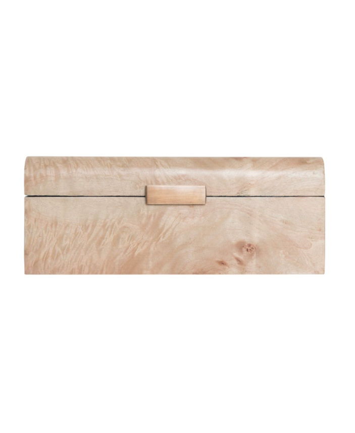
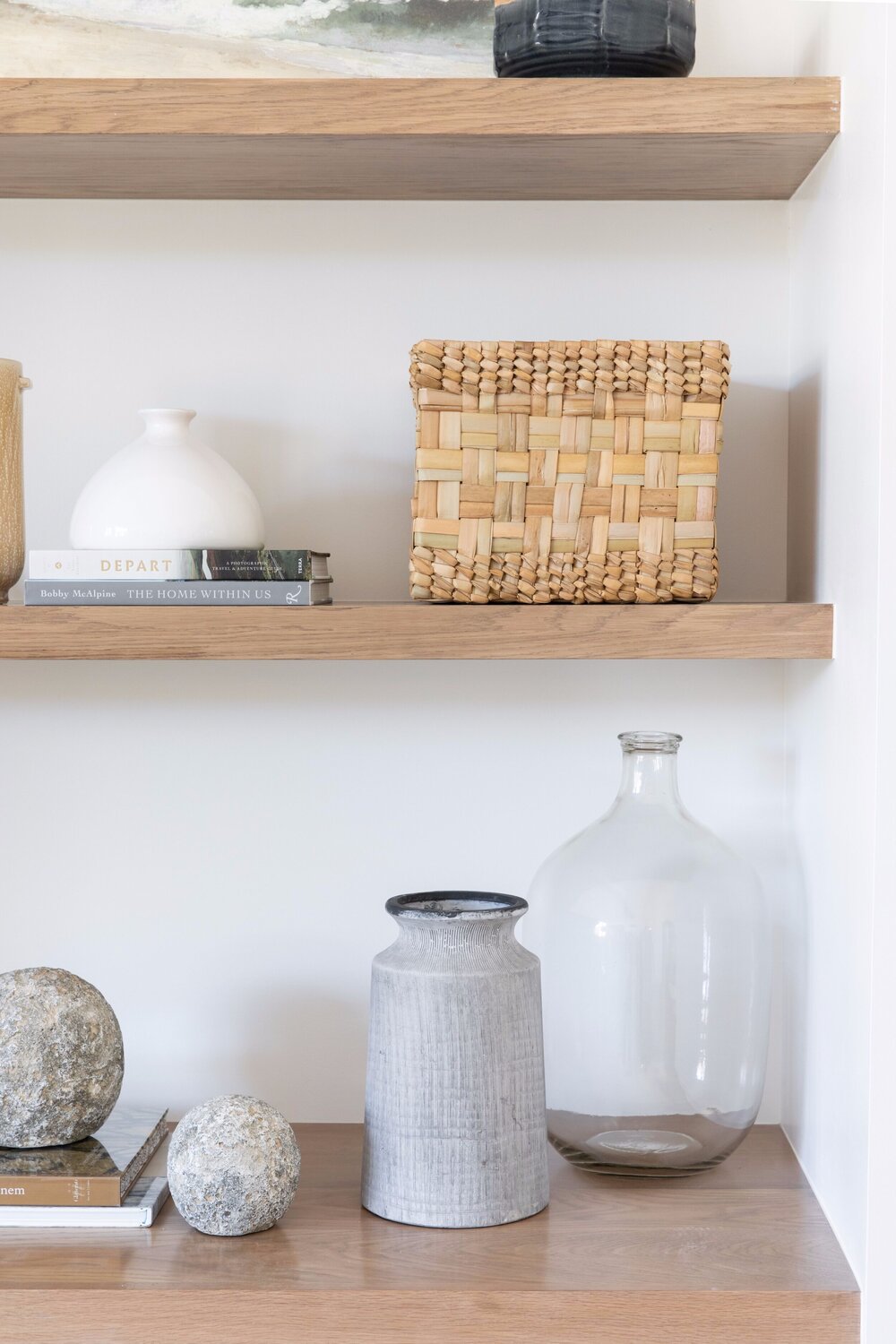
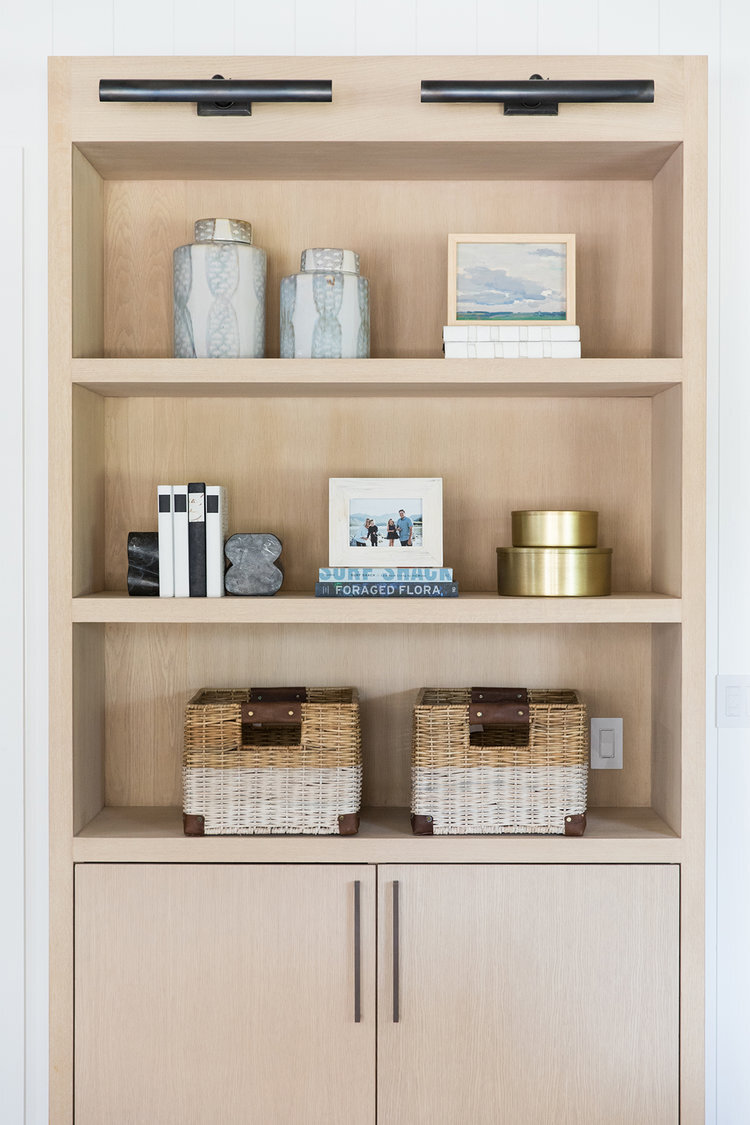
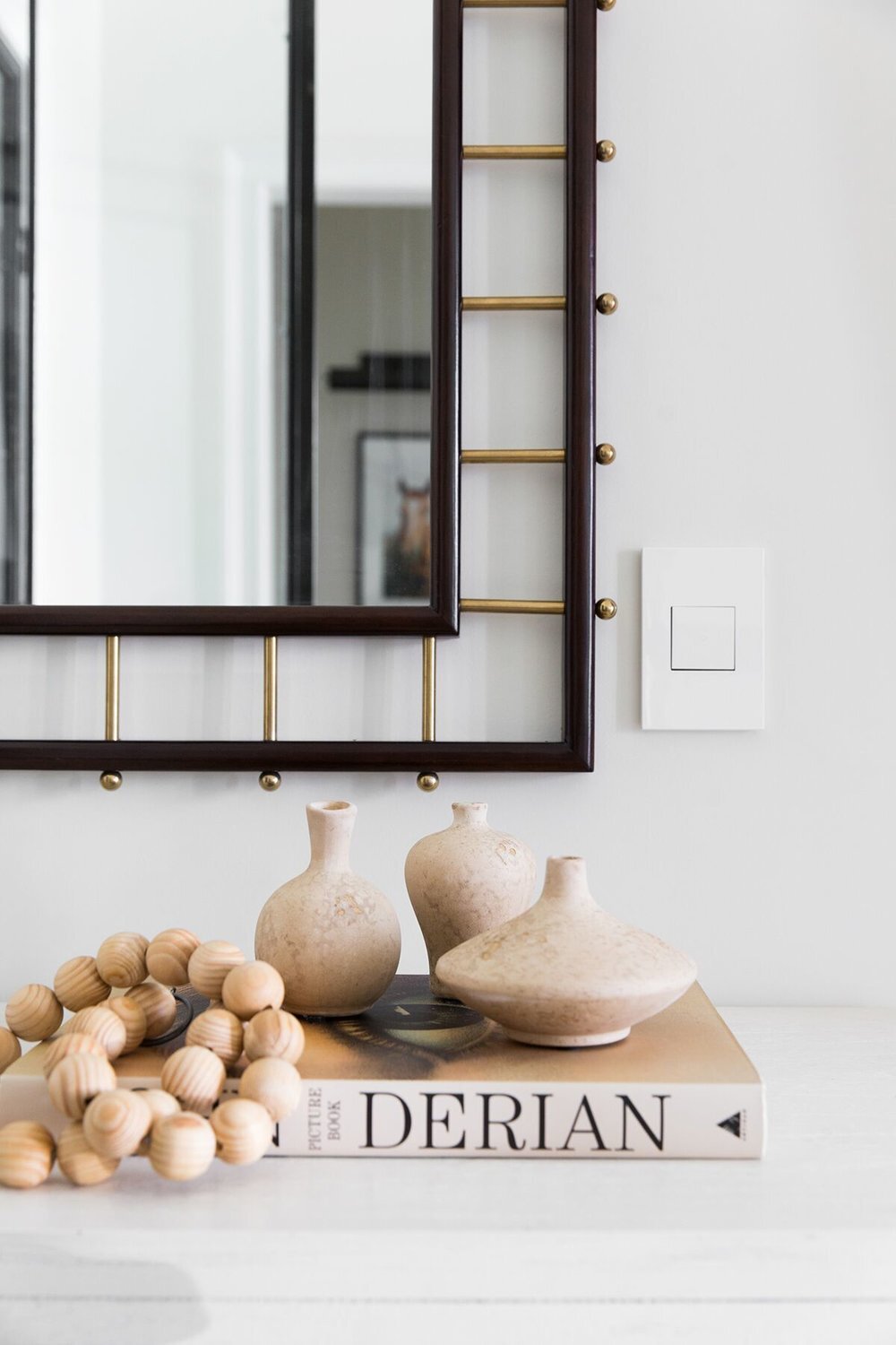
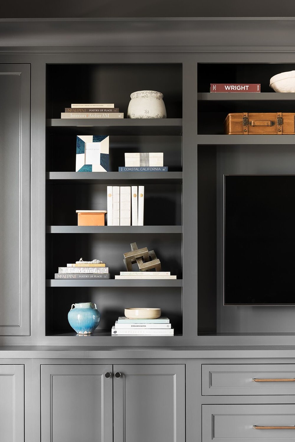
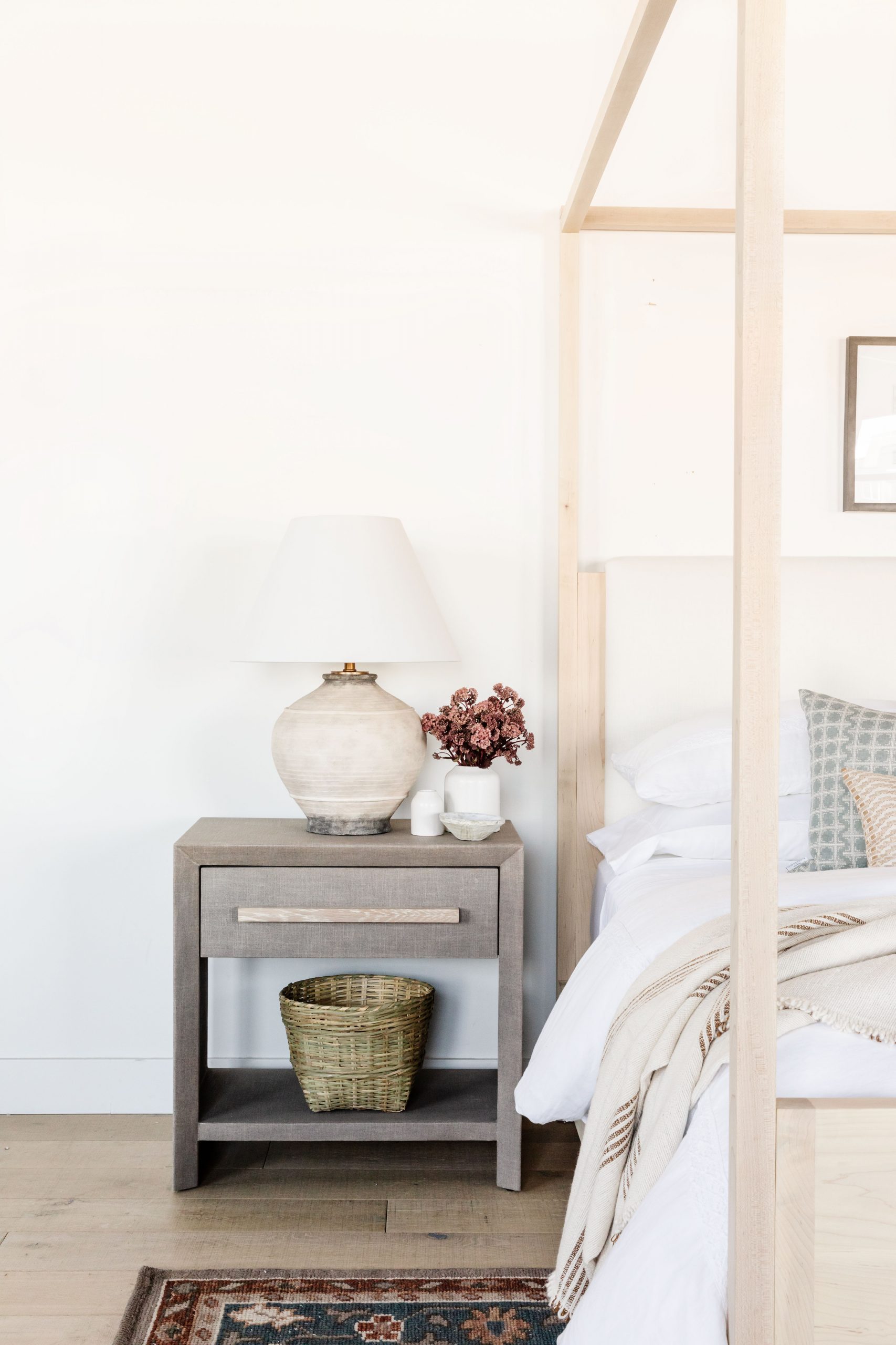
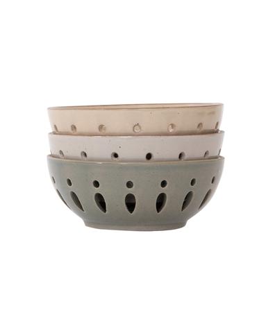
Styling Mistake No 3. Using Too Much of the Same Shape
Whether you’re decorating on a tabletop or filling a built-in, thinking in terms of shapes can help your flow. Soften the angles of boxes and books with vases and decorative objects. If you find that you have too many small objects, use stacked books or trays to anchor the pieces and give them a space to gather.
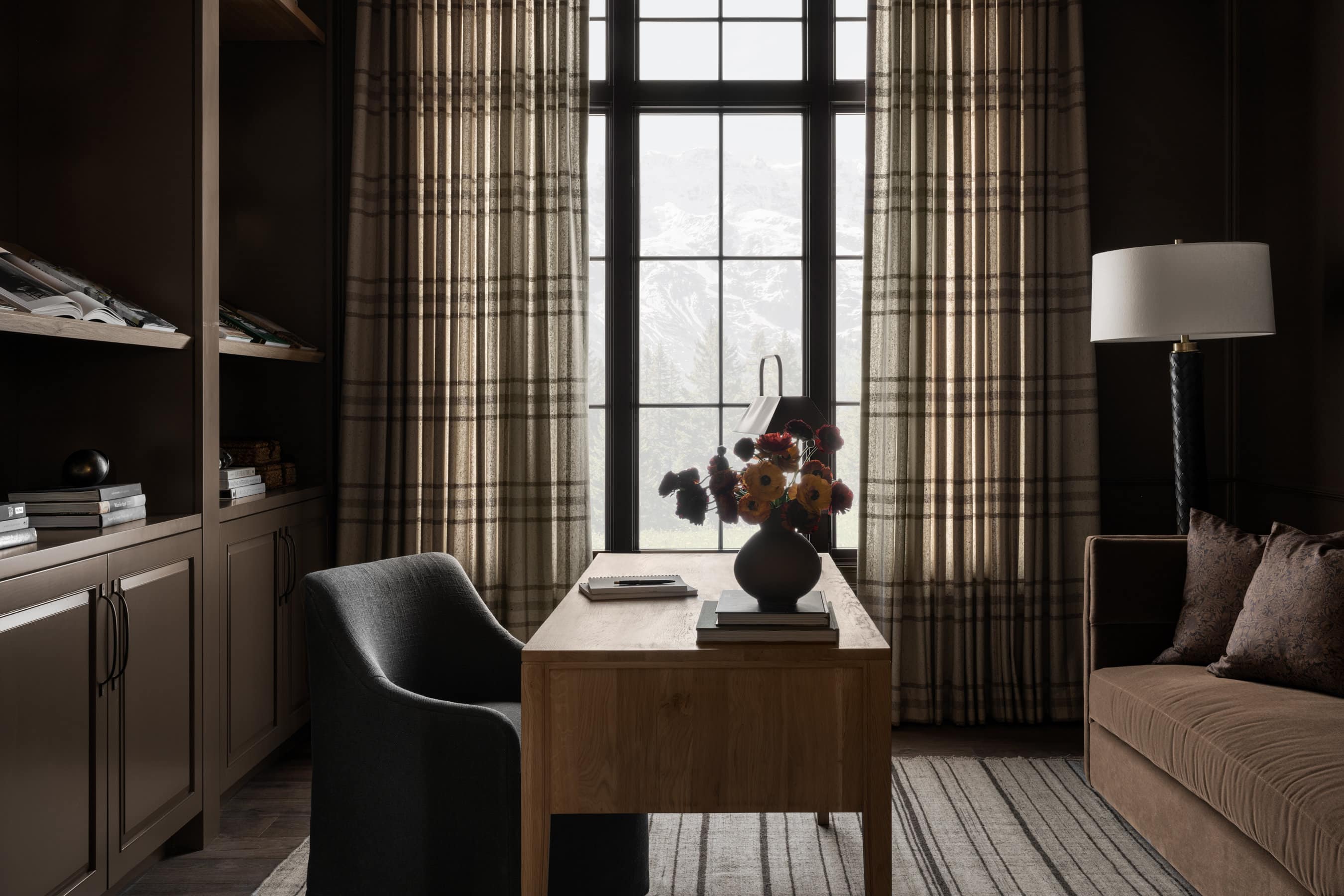
From our Modern Mountain Home.
From our Modern Lake House.
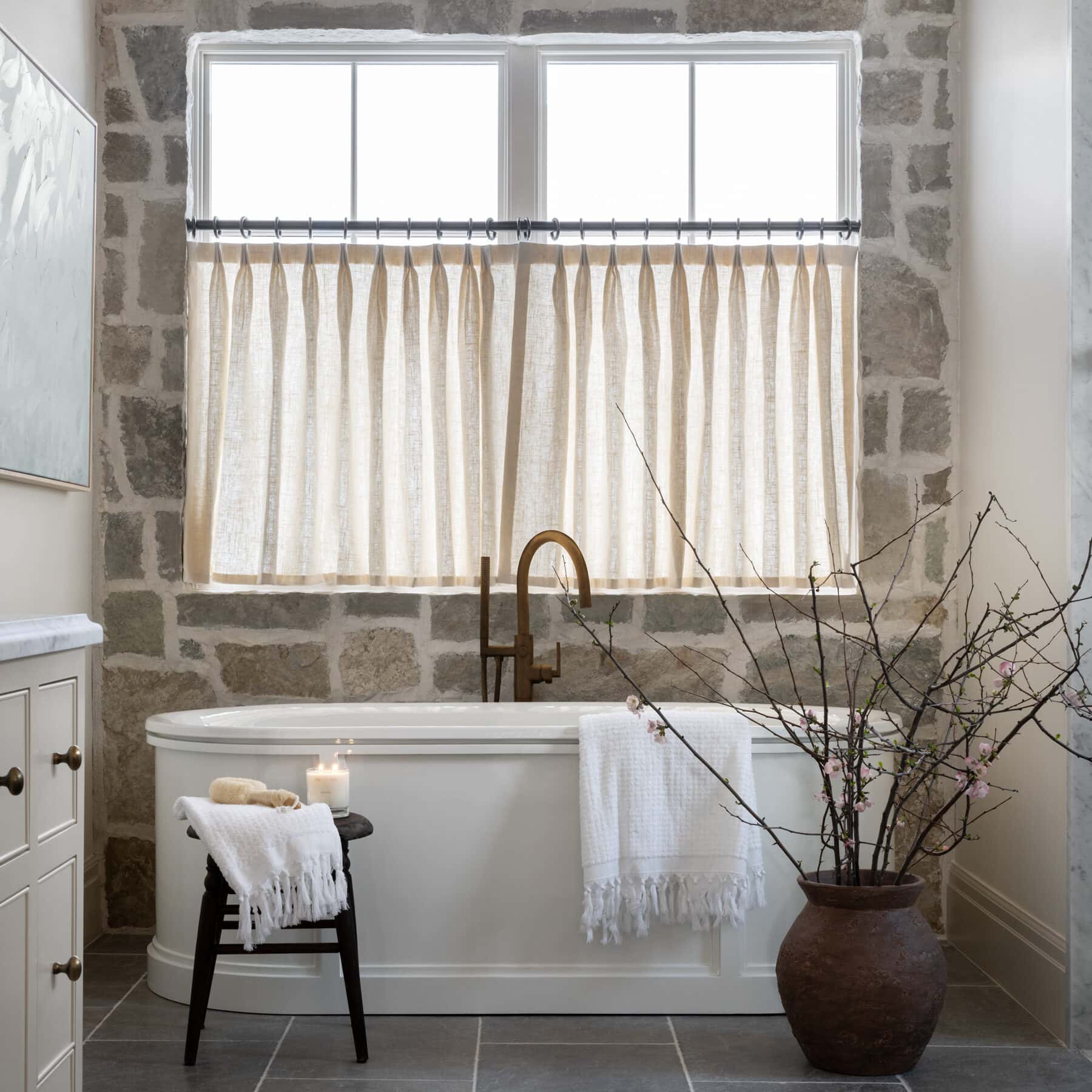
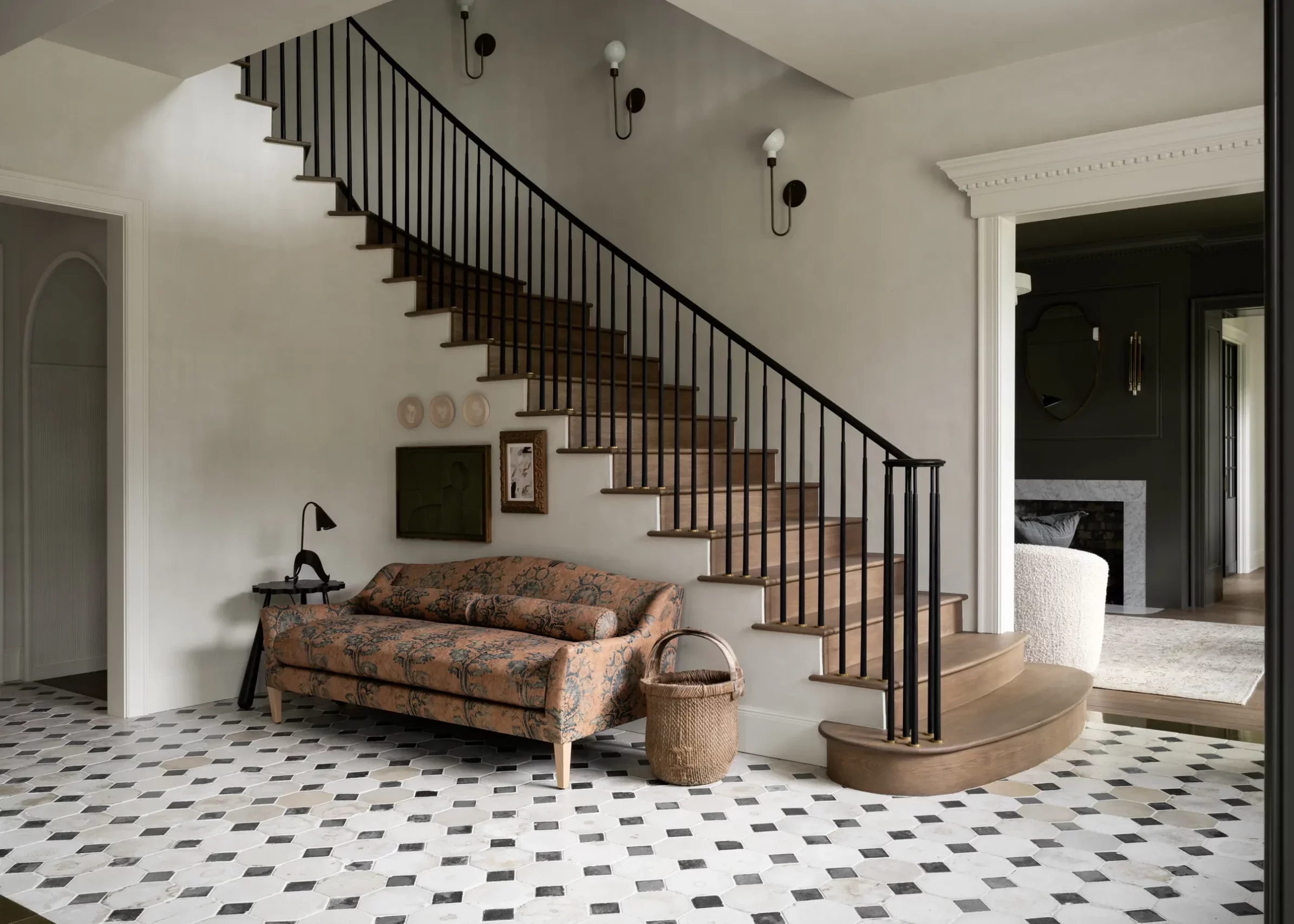
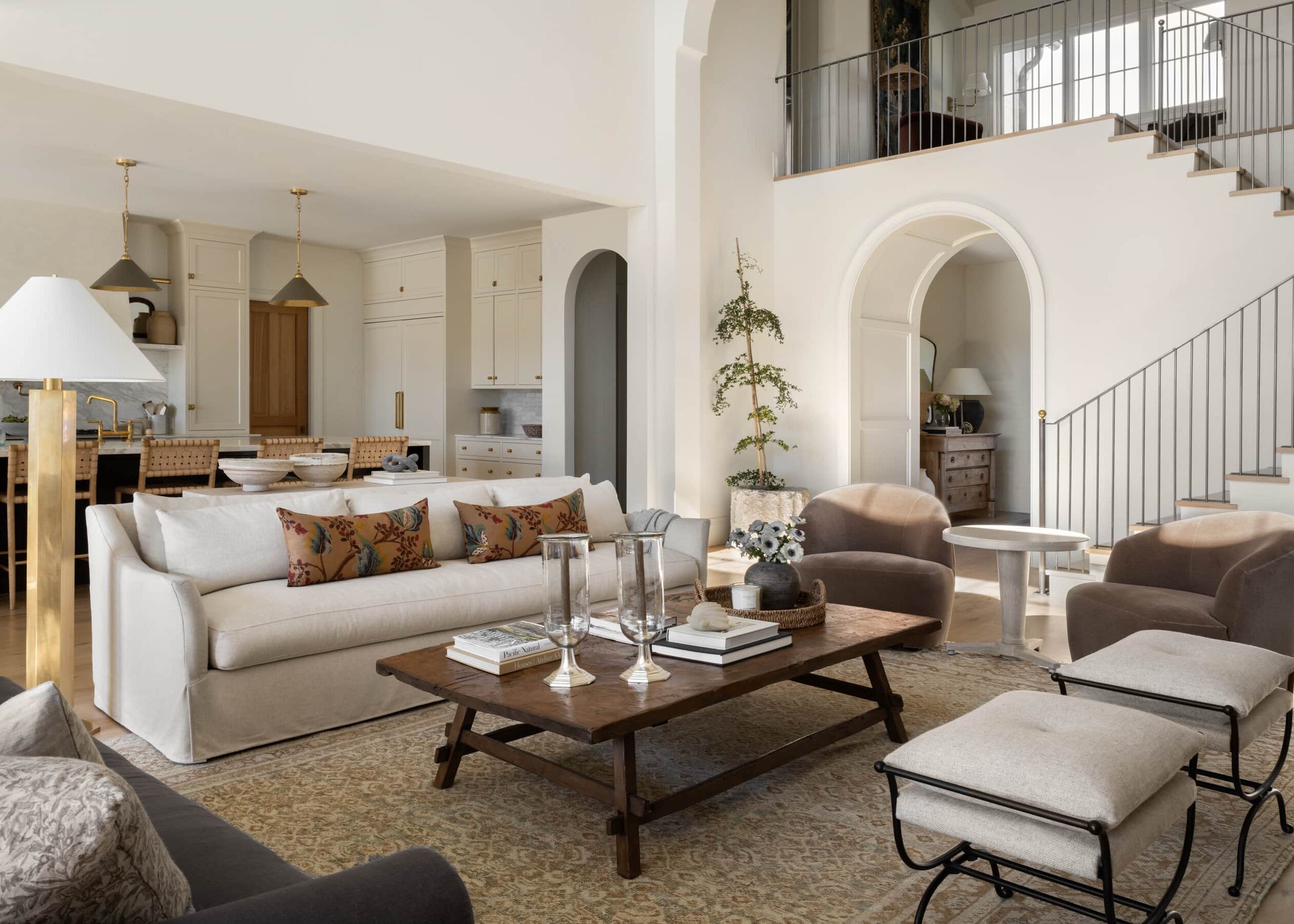
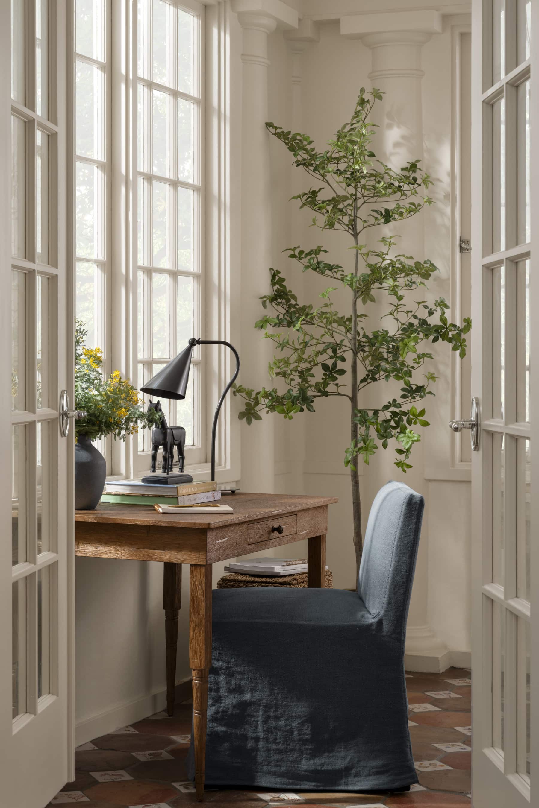
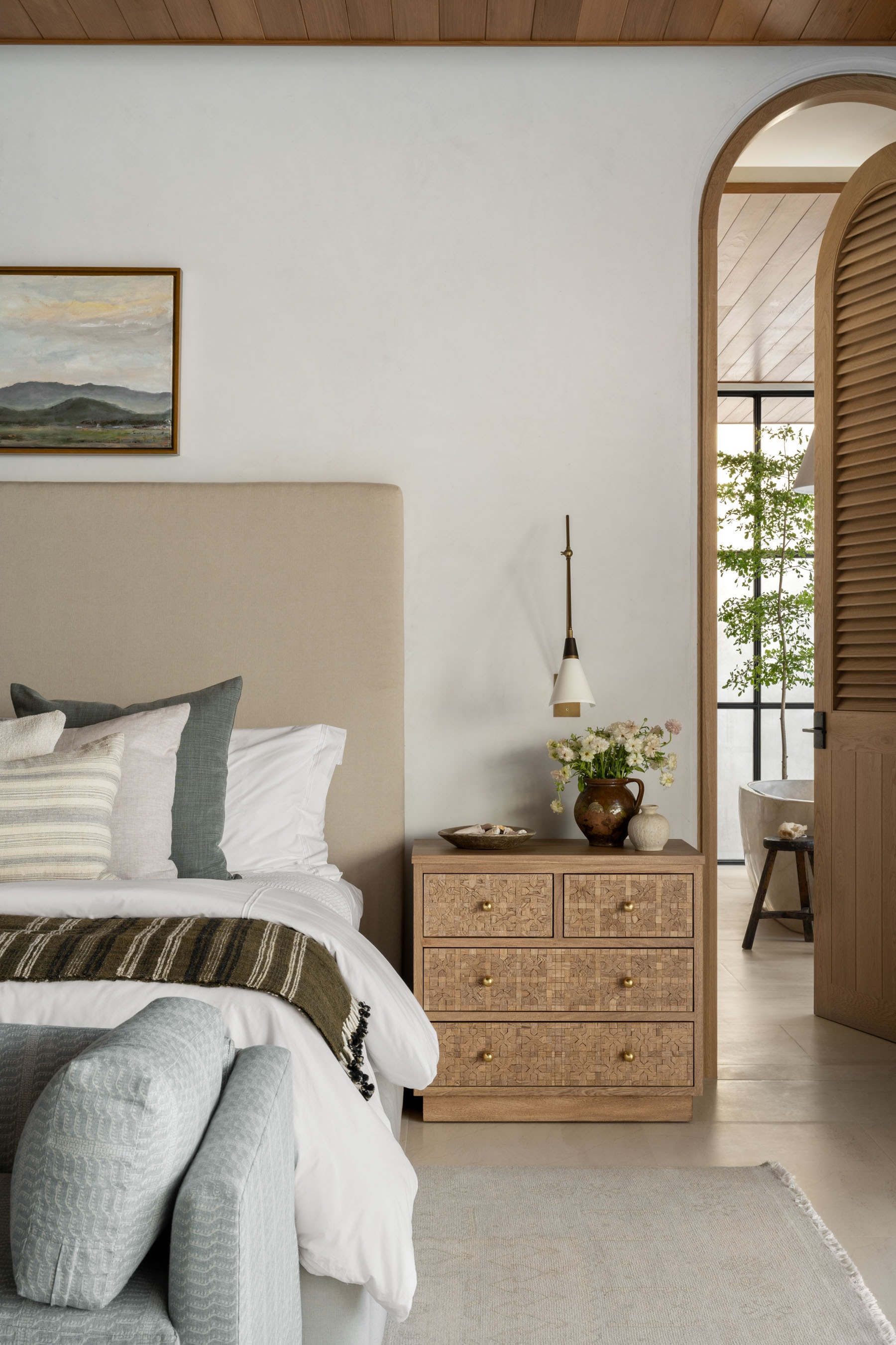
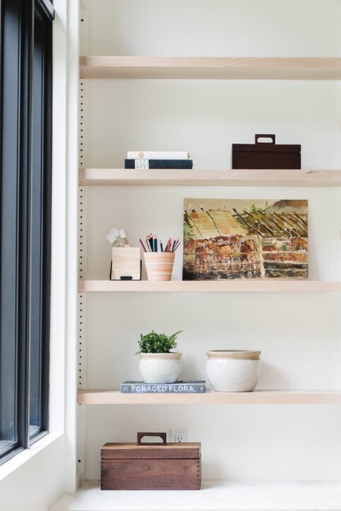
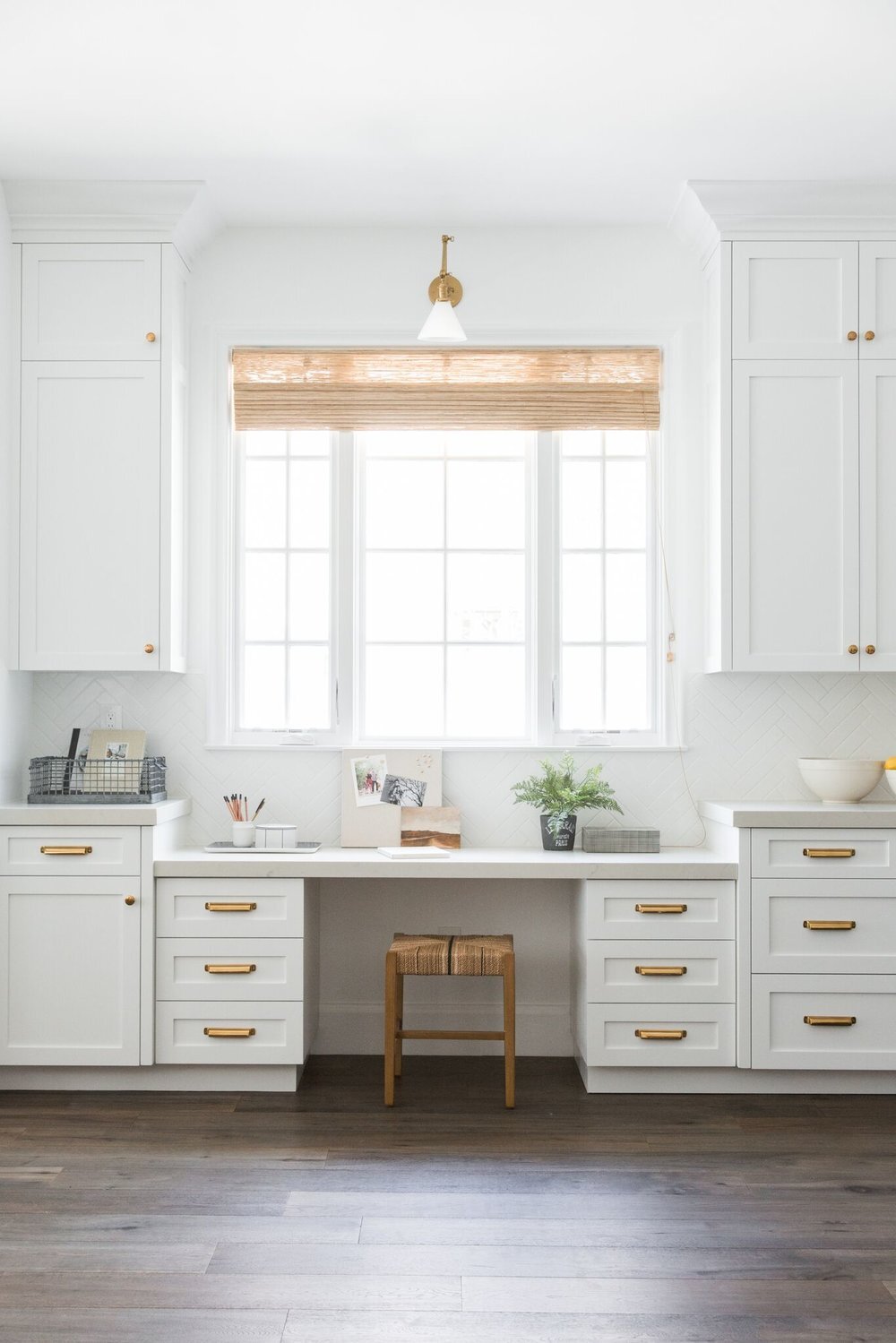
Styling Mistake No 4. Not Giving your space room to breathe
White space is crucial if you want your space to feel calm and composed. We love decor, but never aim for an explosion of accessories. If you don’t give your eyes a place to rest, your hard work goes unnoticed.
Styling Mistake No 5. Involving Too Many Trends
Let your personality show through in your aesthetic. Focus more on what you love rather than what is “in or out.” Avoid buying different versions of the same piece because you love that look. Instead, try to find a few items that really speak to a moment in design you’re attracted to and incorporate timeless transitional pieces to let it shine. This also helps you not tire through trends as quickly!
We like to think of styling as the cherry on top of the design process. It’s the final touch in elevating a space and telling a story.
Styling is about so much more than laying out pretty objects in a row. Thoughtful, personal styling can really bring your space to life.
“Mistakes” in design are always subjective, but there are a few things we notice tend to make a vignette feel a little one-note, and so today, we’re sharing a few things we’ve learned to try to avoid over the years.
Styling mistake no 1. — Disregarding scale.
When there are a lot of tiny accessories in bookshelves, on coffee tables, on countertops, etc. it can quickly make things look cluttered and random. Instead, we like to break up all the little objects by adding large pieces into vignettes like boxes, large vases, bowls, etc. If you get stuck, try corralling small items together by anchoring them with trays or in groupings.
Don’t be intimidated by large accessories! Not only are they substantial and grounding, but the grand scale of them can bring out the smaller items surrounding them as well!

How to Avoid Styling Mistakes


Styling mistake no 2. — Not Giving your space room to breathe.
White space is crucial if you want your space to feel calm and composed. We love decor, but never aim for an explosion of accessories. If you don’t give your eyes a place to rest, your hard work goes unnoticed.

Styling mistake no 3. — Using too much of the same shape.
Whether you’re decorating on a tabletop or filling a built-in, thinking in terms of shapes can help your flow. Soften the angles of boxes and books with vases and decorative objects.
If you find that you have too many small objects, use stacked books or trays to anchor the pieces and give them a space to gather.

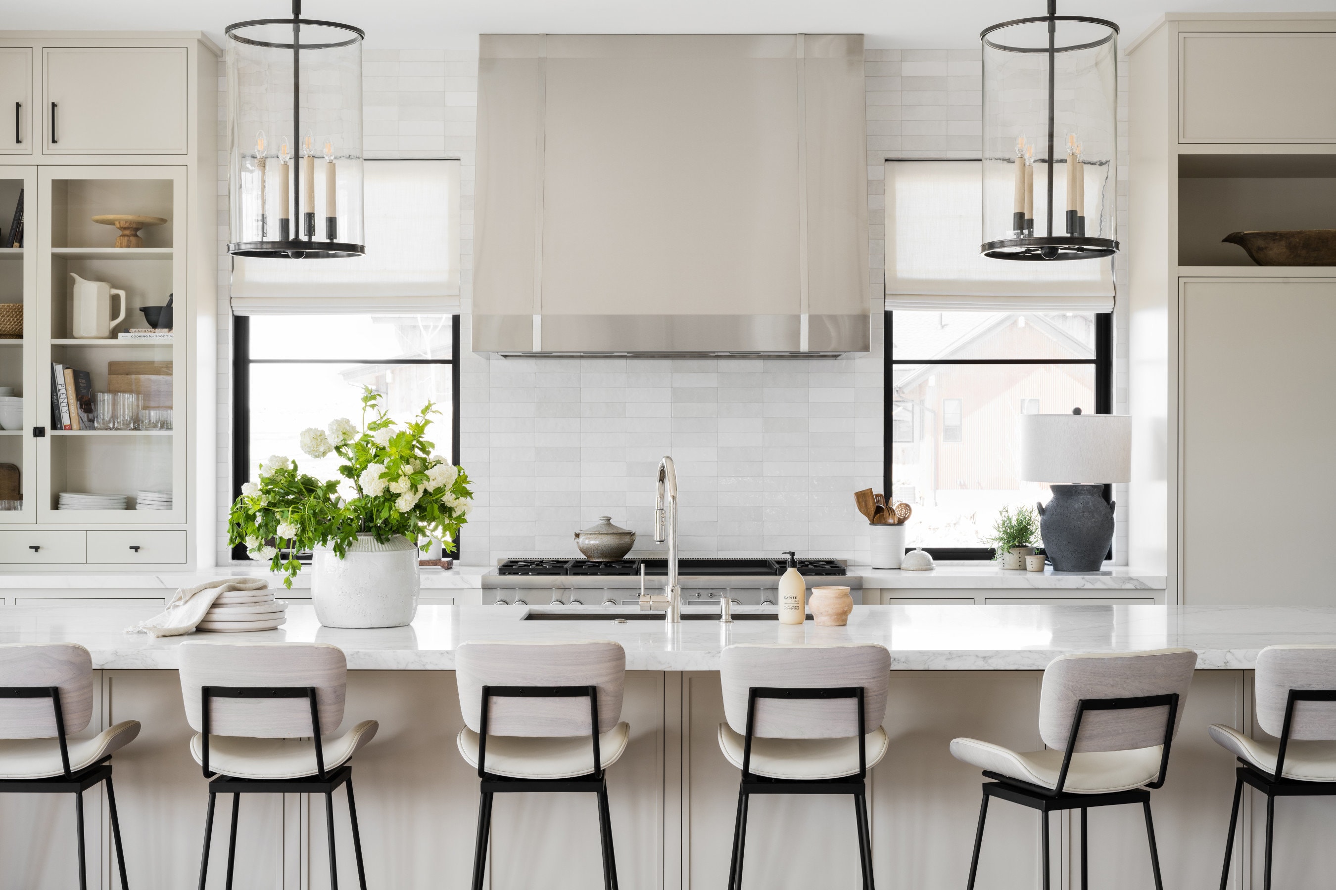
Styling mistake no 4.—Using too much of the same material.
In a lot of kitchens and bathrooms, we notice that people tend to use too much of one material they love, which can end up overpowering a room. For example, you might love brass, but if every accessory in your kitchen is brass, it can end up blending together.
We love to juxtapose our materials to create a well-balanced look that allows our favorite pieces to shine. Softening a metallic with rattans, wovens, or other natural materials can make sleek elements stand out even more, and vice versa.

How to Avoid Styling Mistakes

Styling mistake no 5. — Involving too many trends.
Let your personality show through in your aesthetic. Focus more on what you love rather than what is “in or out.” Avoid buying different versions of the same piece because you love that look. Instead, try to find a few items that really speak to a moment in design you’re attracted to and incorporate timeless transitional pieces to let it shine. This also helps you not tire through trends as quickly!

How to Avoid Styling Mistakes

This post has been updated from its original version.

You May Also Like