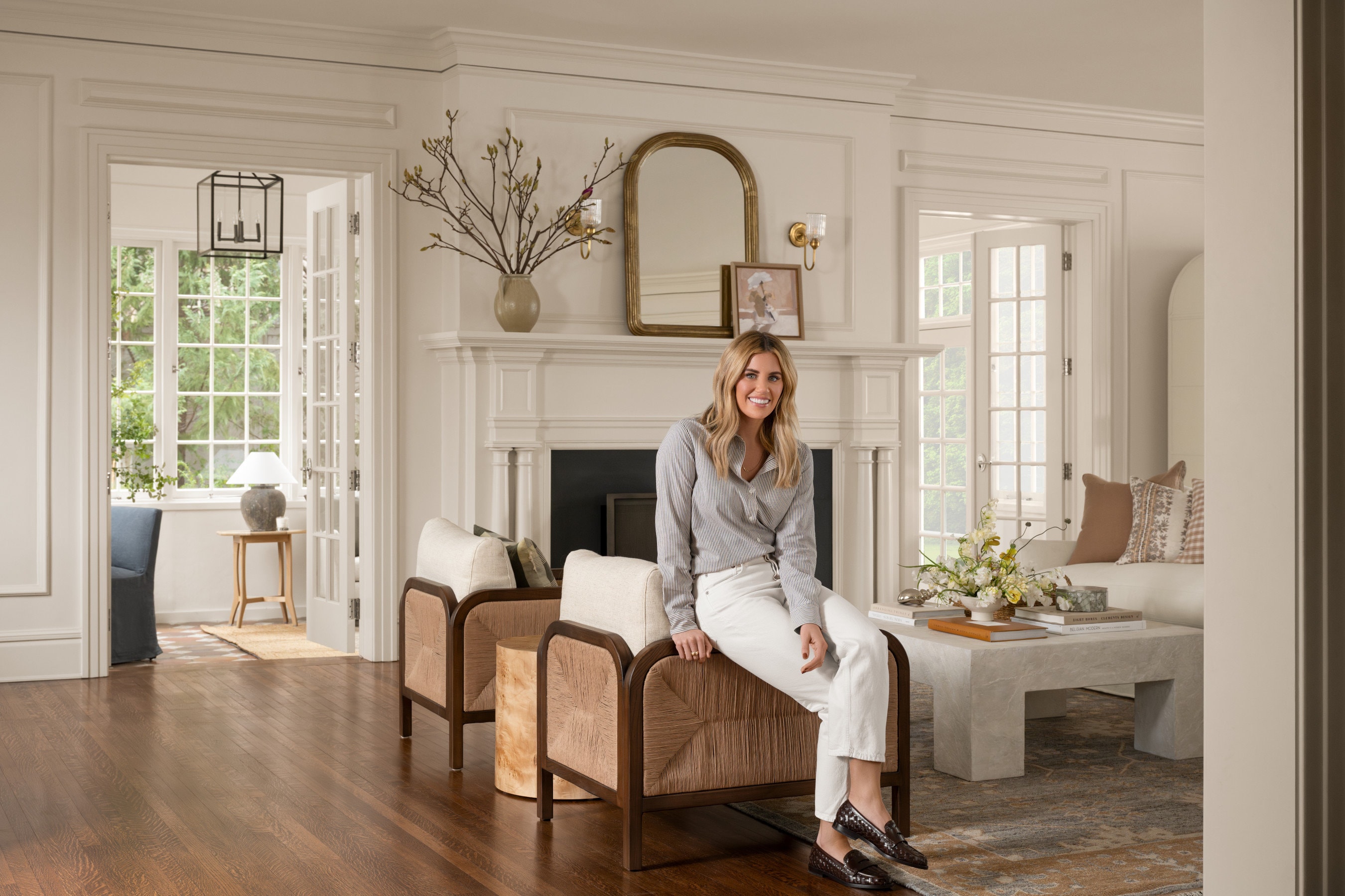
Promontory Project: Great Room, Kitchen
Tour the entry, great room, and kitchen of the Promontory Project!
25 April 2017 -
There are too many rooms and pictures to reveal the Promontory Project in one day!
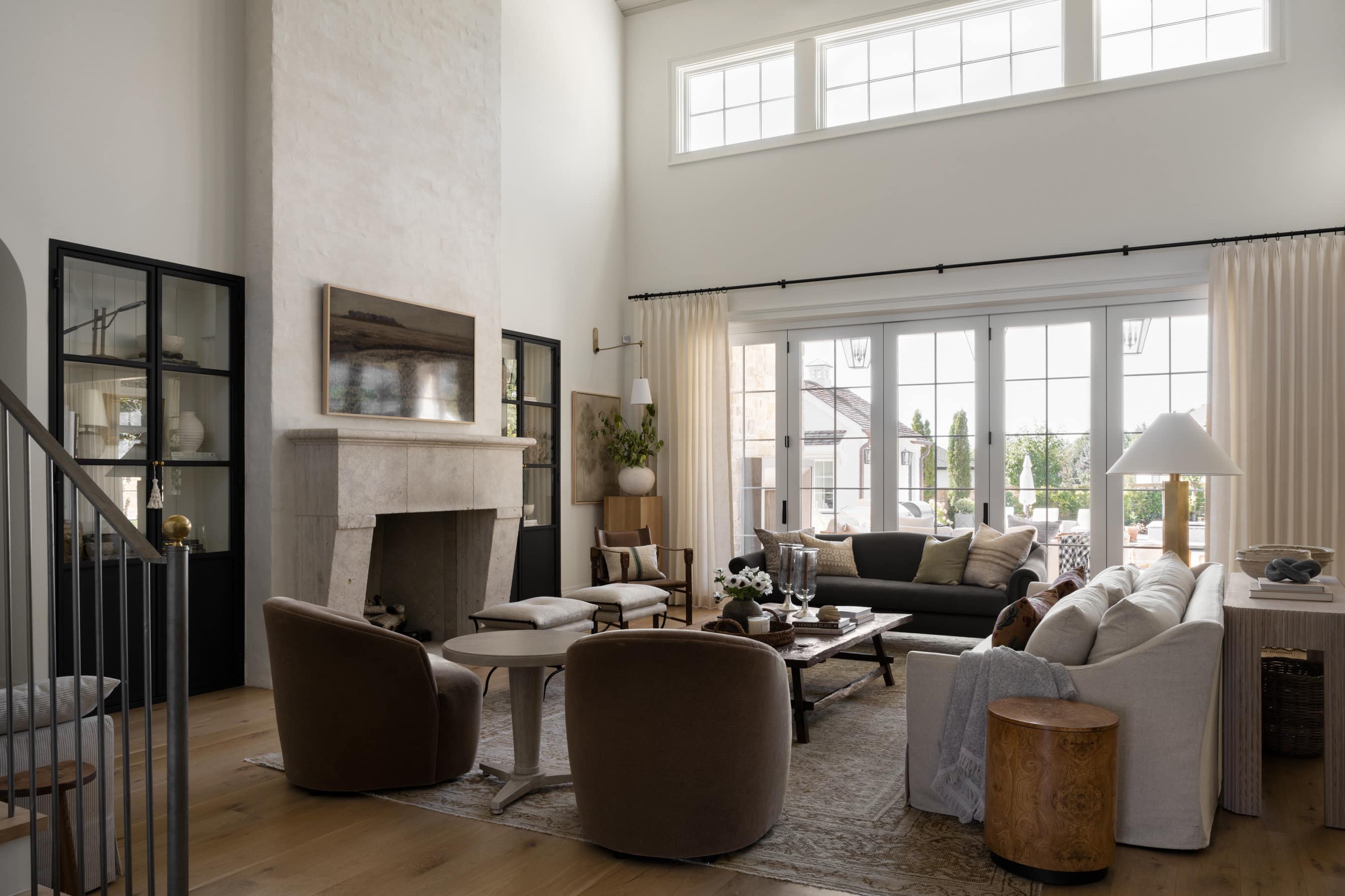
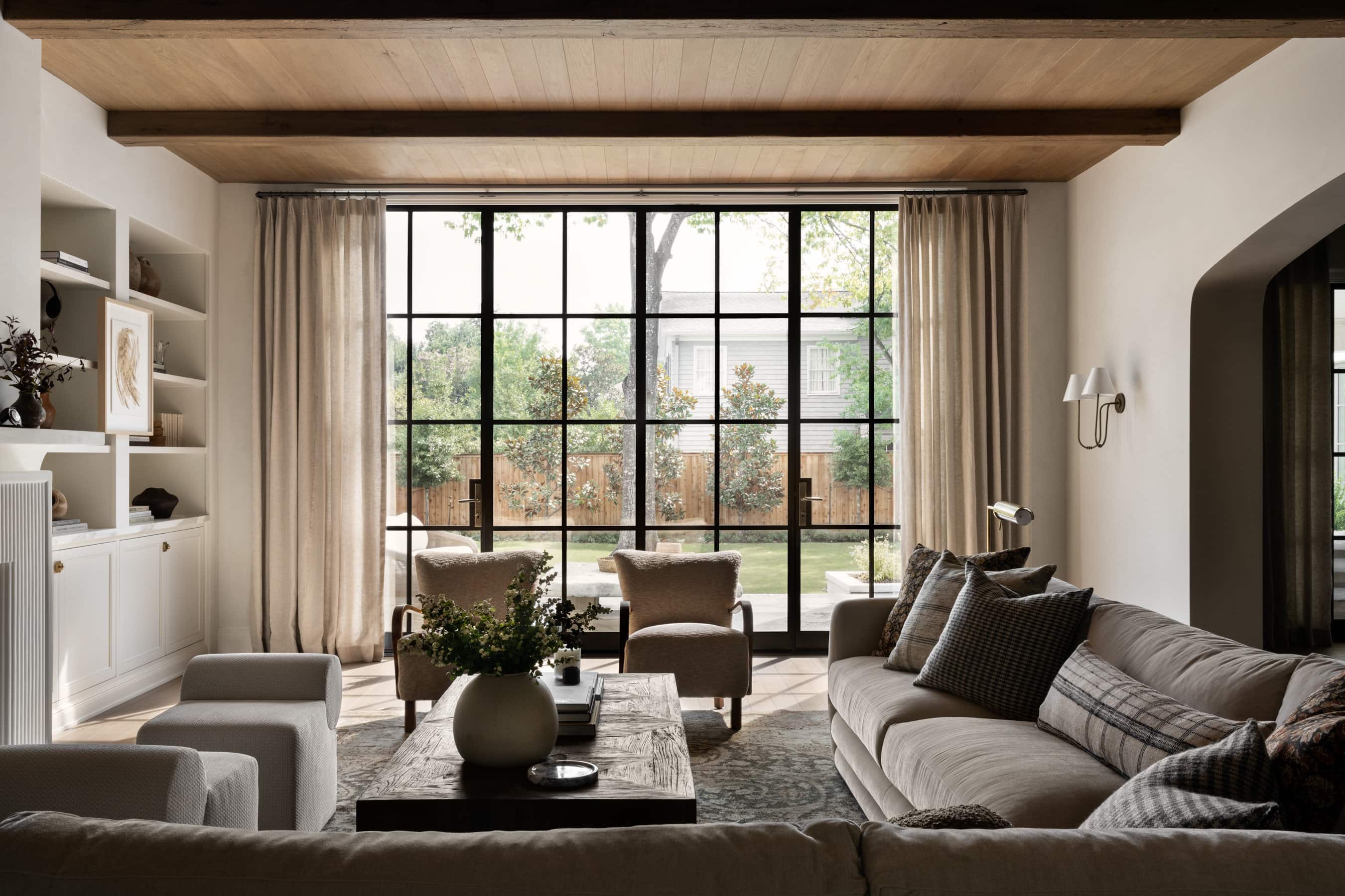
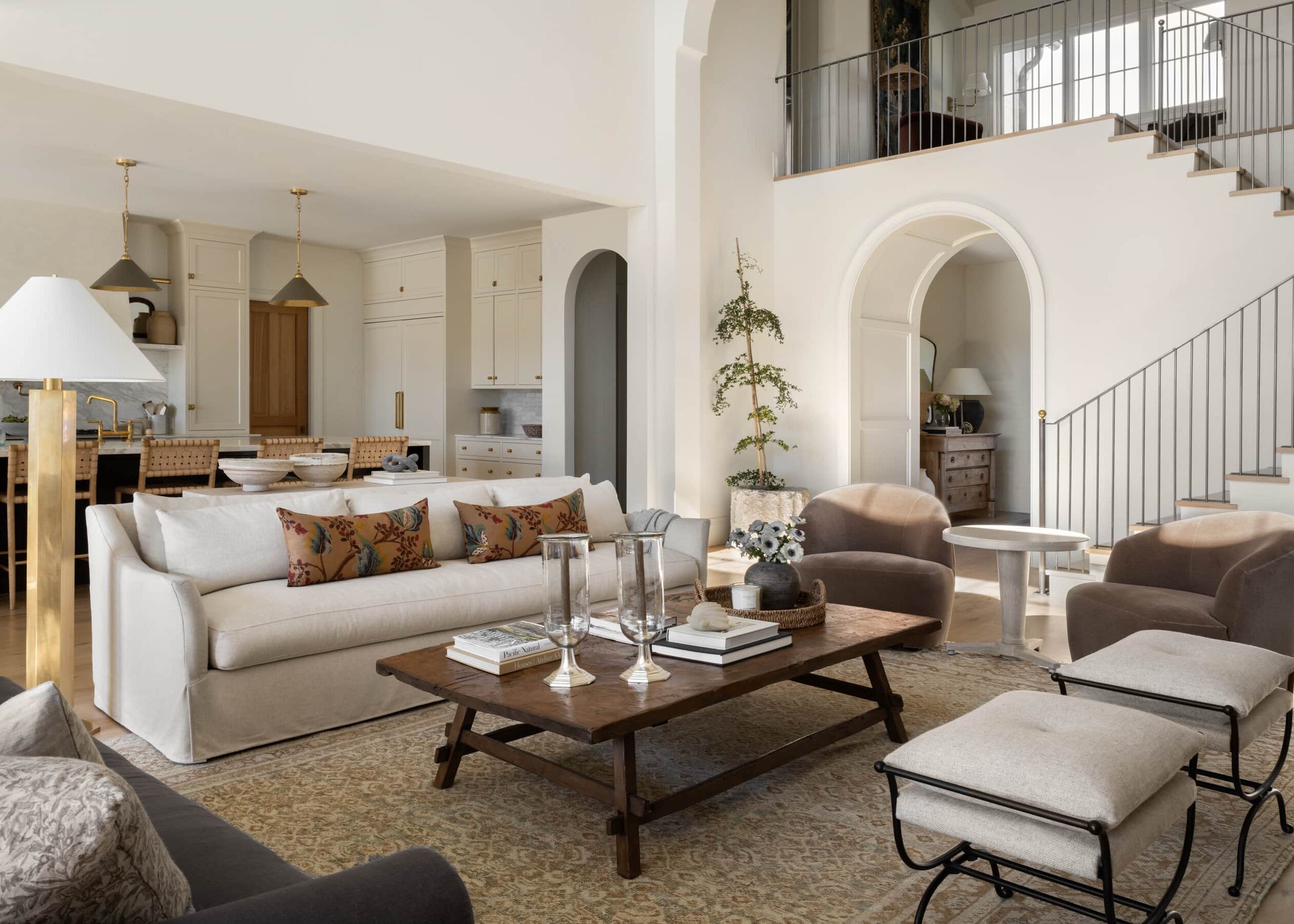
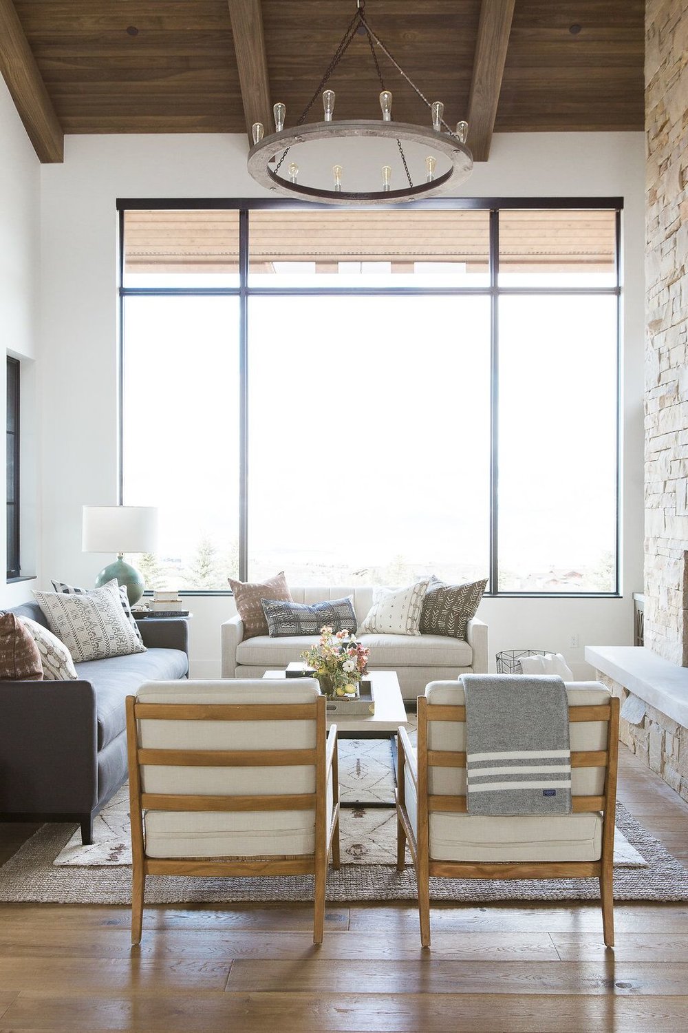
Yesterday we gave you a glimpse of the project with a webisode and paint colors so we’re excited to show you a full photo tour this week. Today, we’ll start with the entrance, great room, and kitchen. You’ll notice throughout the space that we chose a lot of natural finishes, but found ways to balance the space and not make it dark and heavy like you’ll commonly see in mountain homes. You can tour the downstairs/office, and the main floor/master suite when you’re done! For the exterior, we mixed materials for a cabin home that feels more modern instead of a kitschy and typical. We wanted it to feel cozy and familiar, but not look like a predictable mountain exterior.


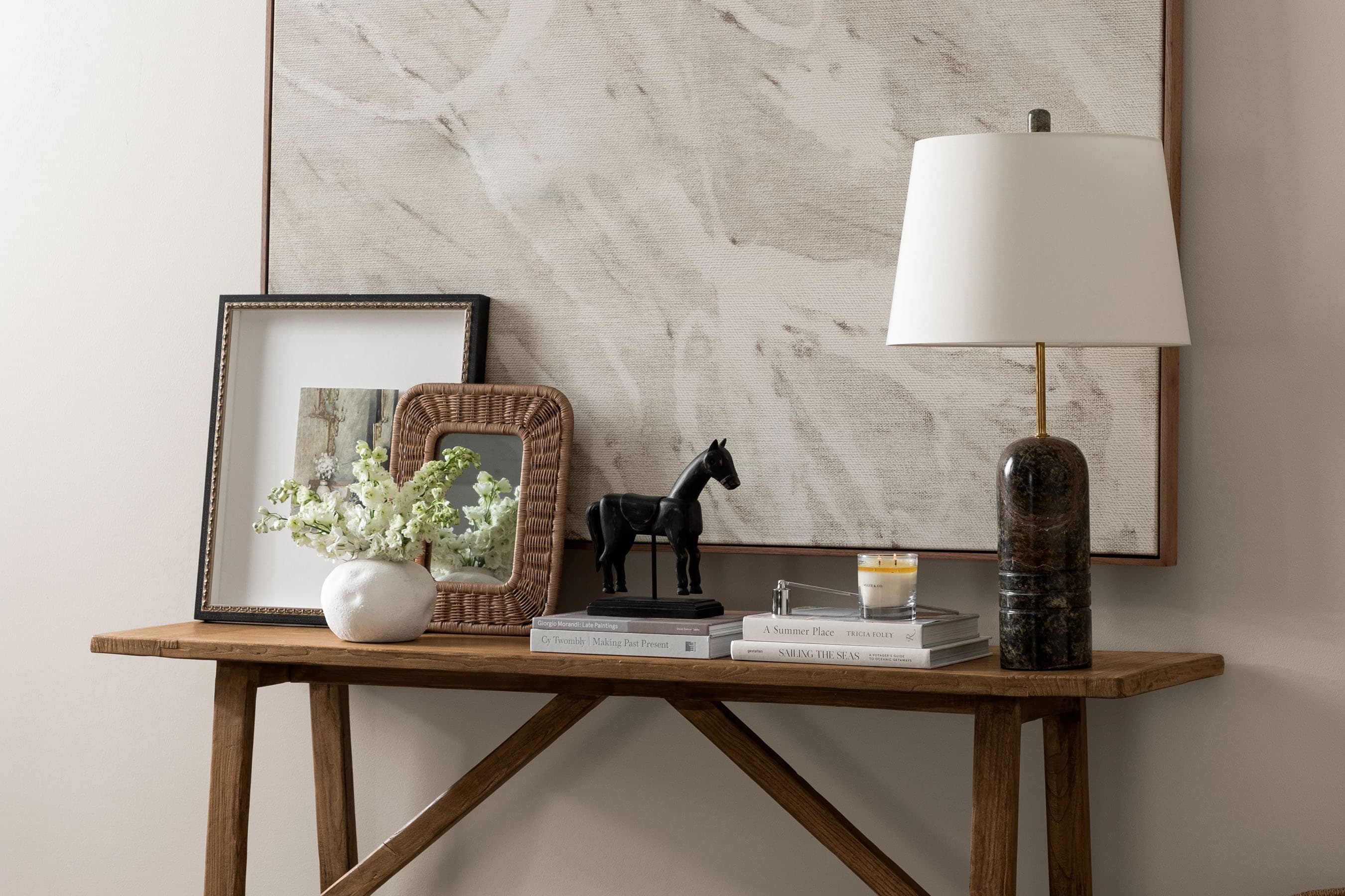
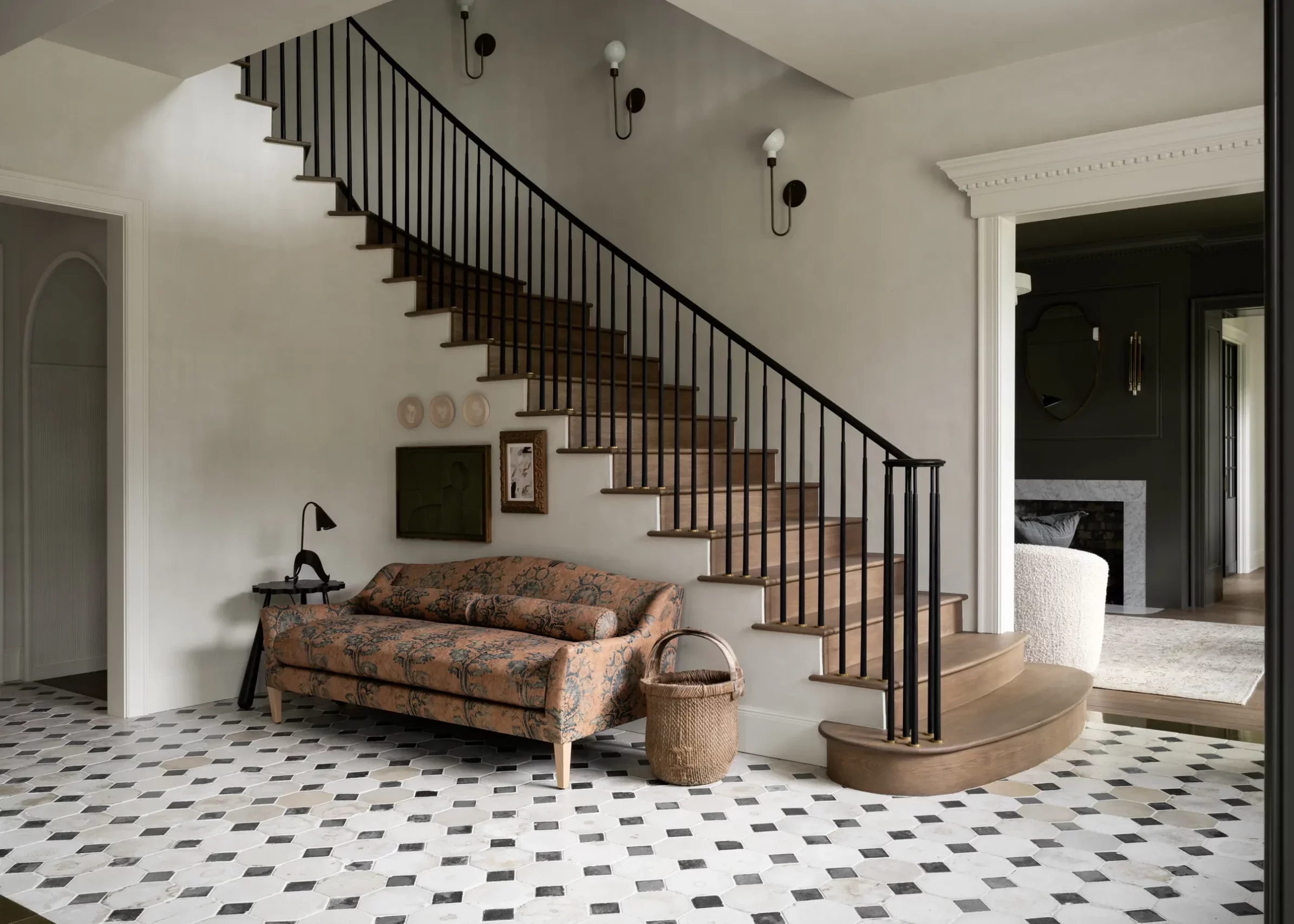
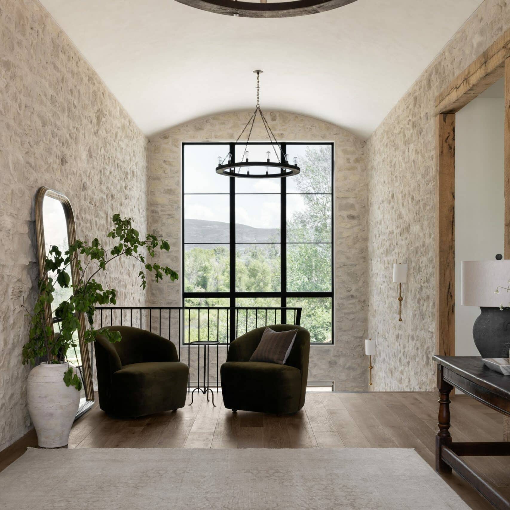
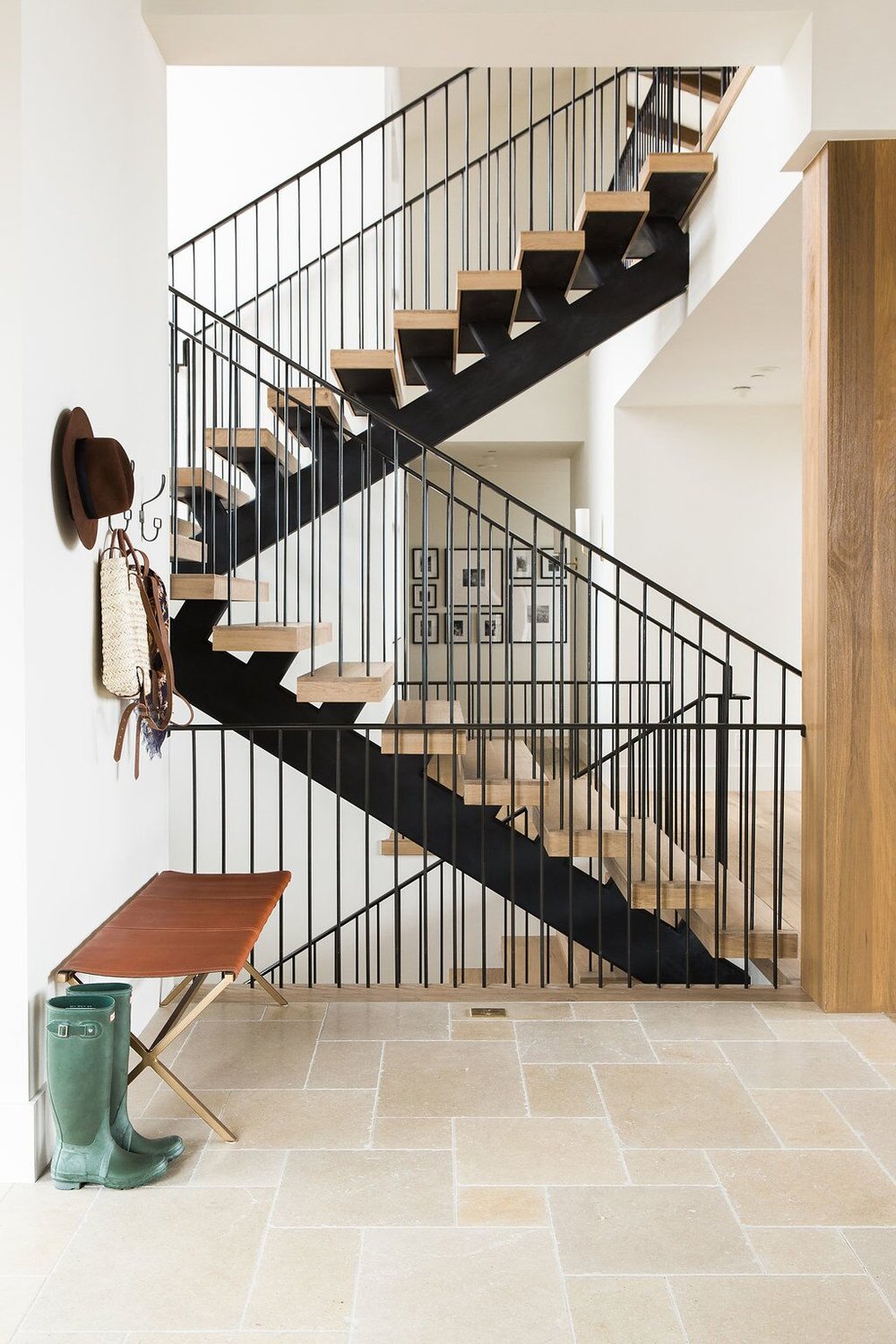
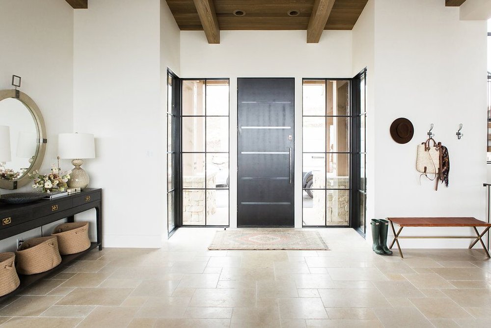
As you come into the entry, you can see that we skipped the statement lighting. For the home, we wanted the space to feel open and not take away from the beautiful ceiling detail. We added a statement console with our Gannet Table Lamps and Blackwell Mirror. We used tile to define the entry space and mirrored the colors and style found in the stone fireplace. Since it’s a mountain home, the flooring needs to be functional and durable to receive wet boots, skis, etc.


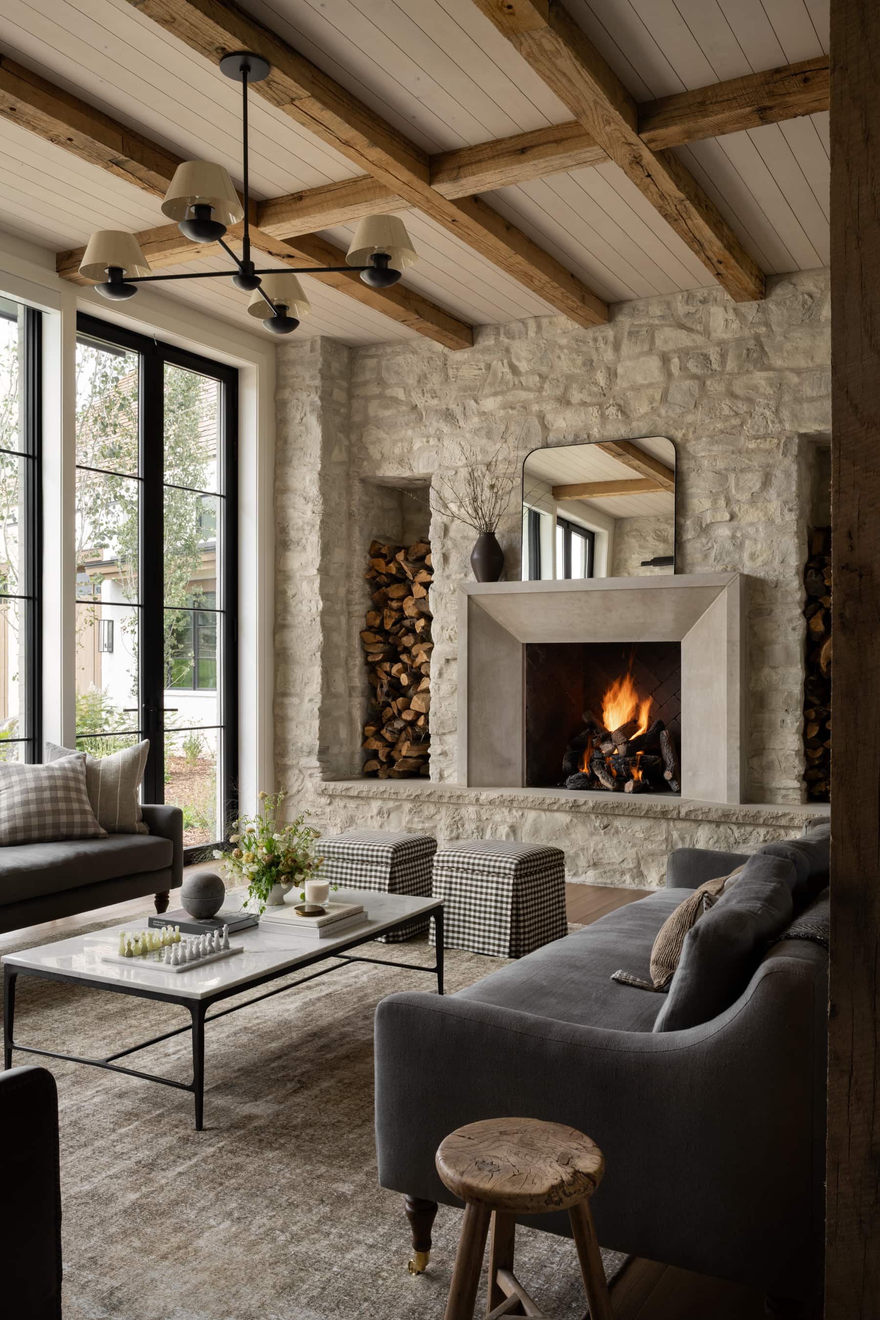
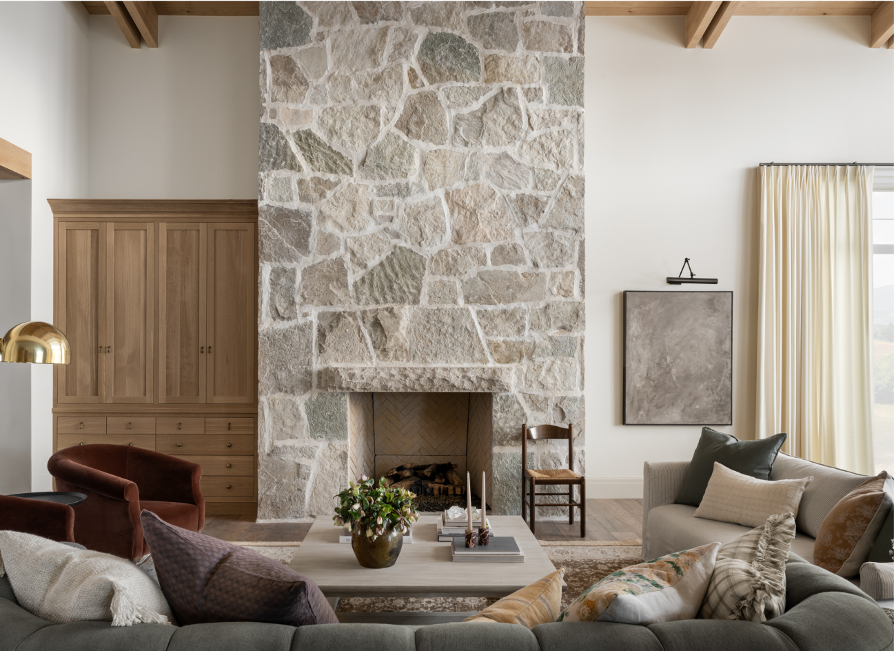
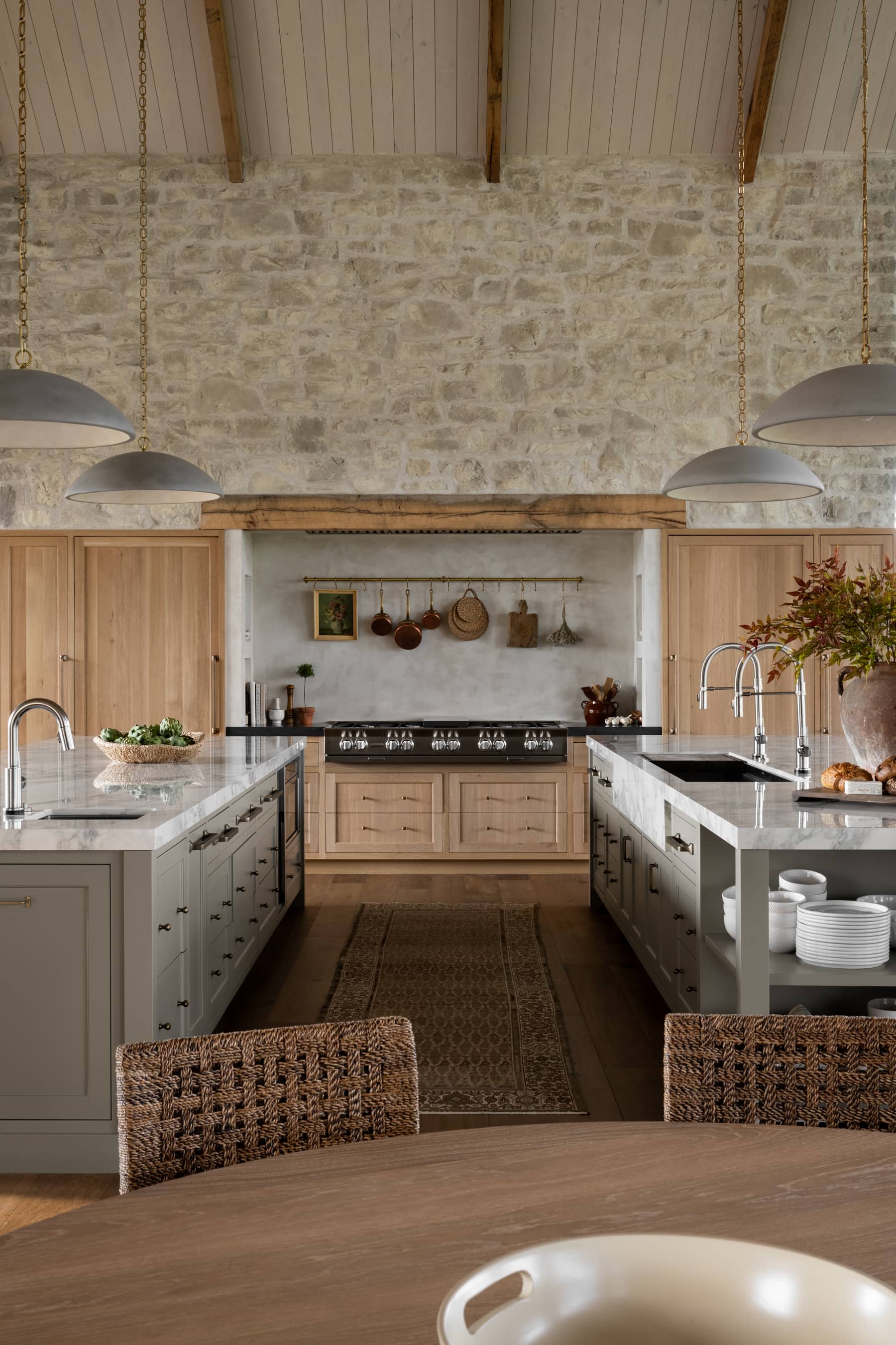
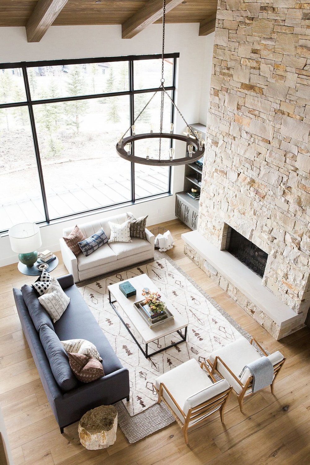
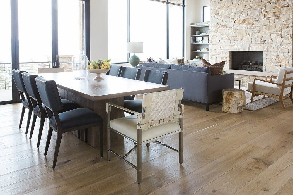
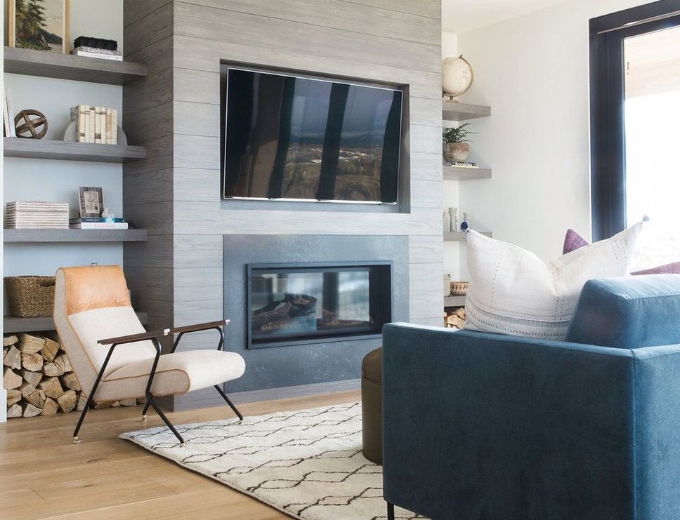
The stone fireplace is a huge detail that feels very mountain home. We took the stones all the way to the ceiling for a dramatic effect. The interesting part of this fireplace is the stone color. We needed to hand select a lot of the stones used to really control the range of color used. It needed to feel warm, but not dark and heavy.
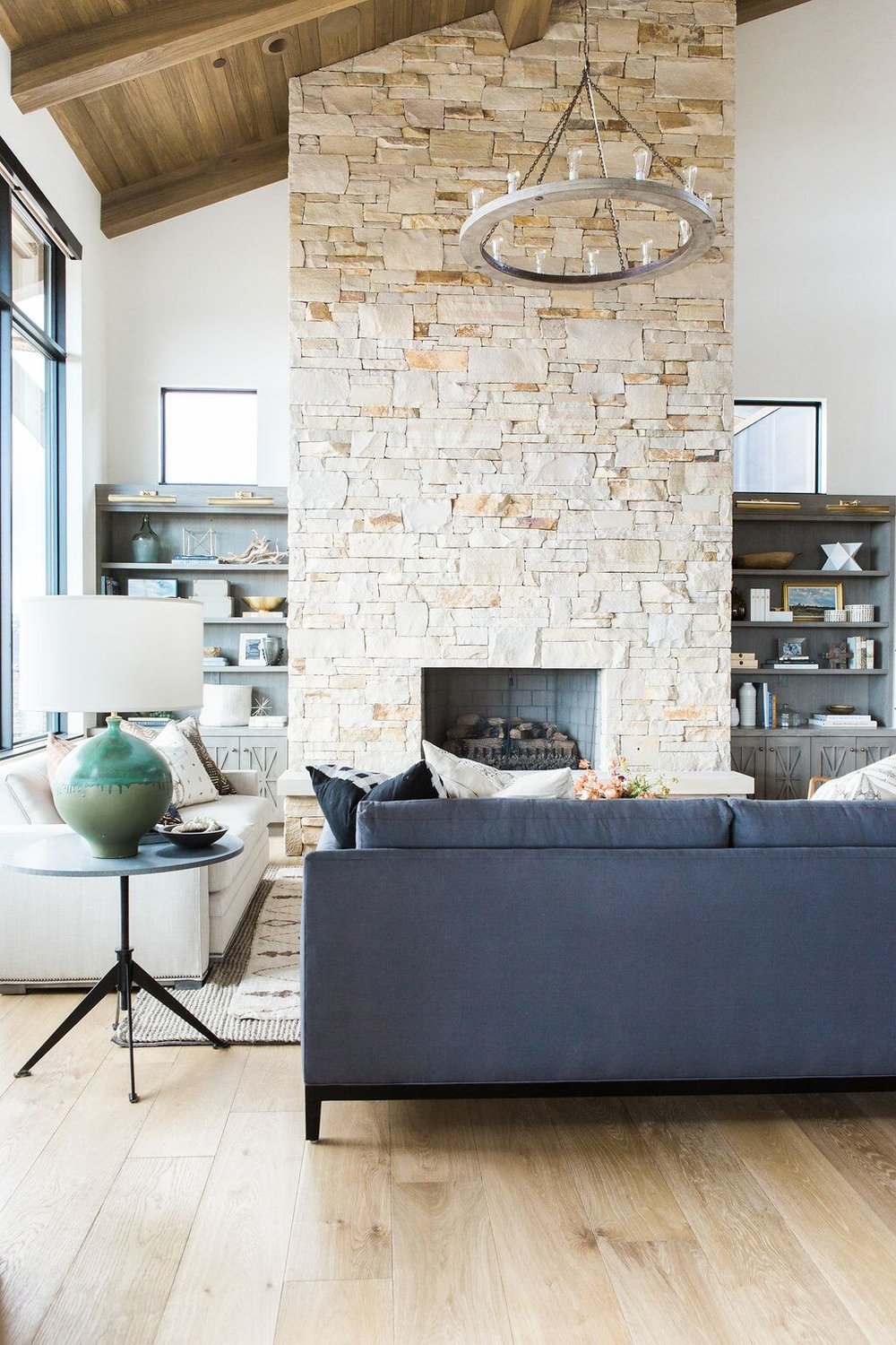
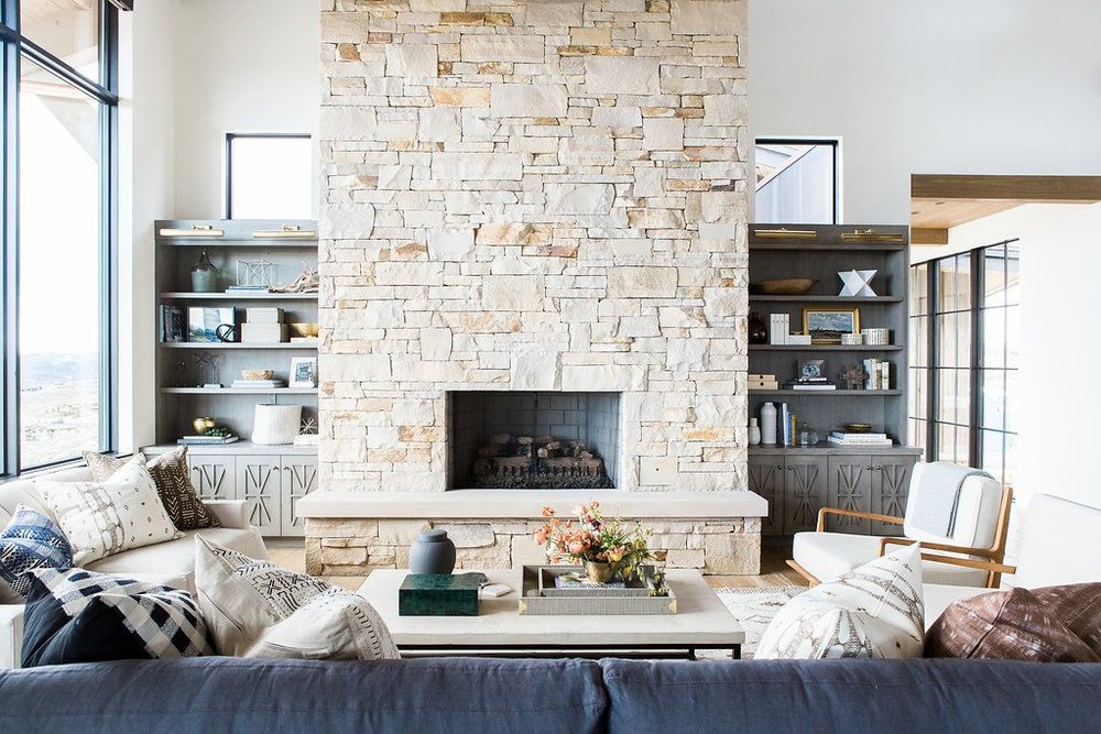
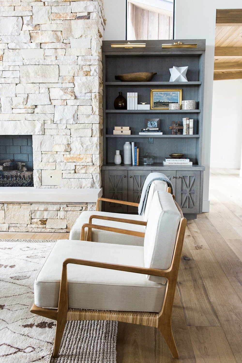


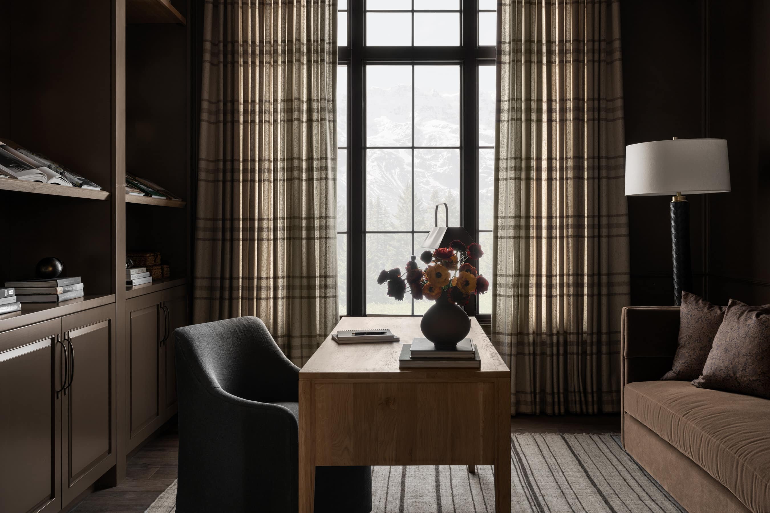
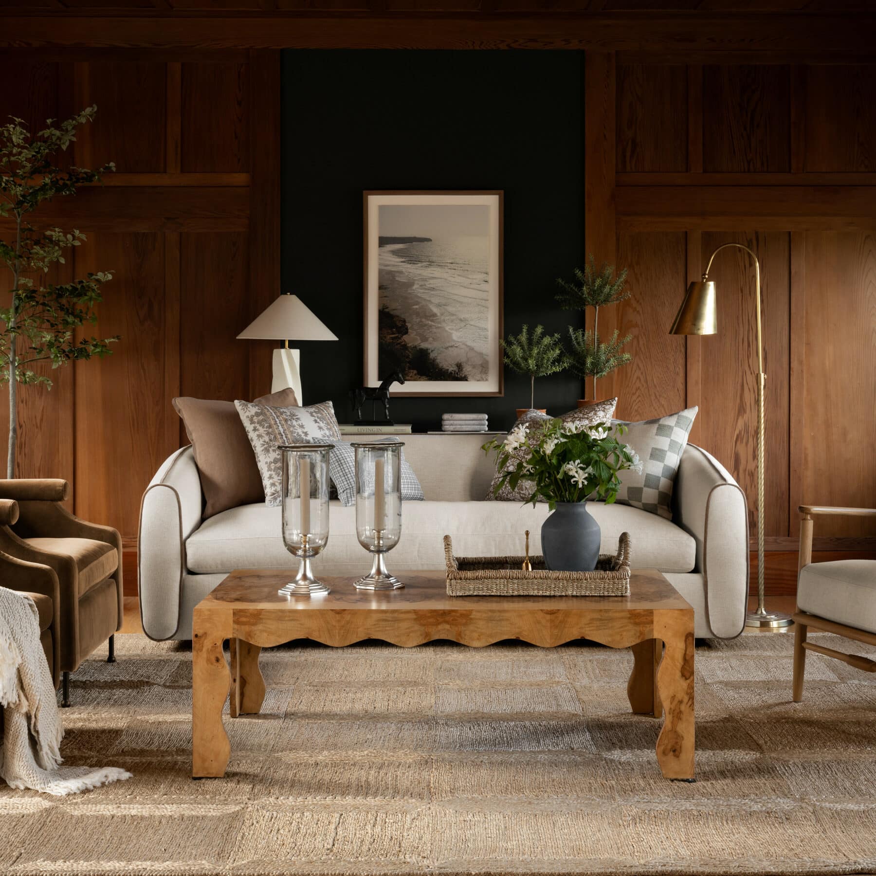
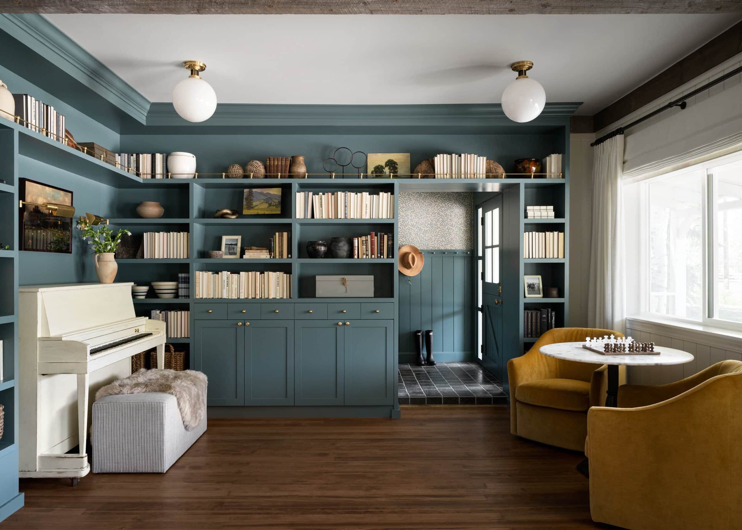
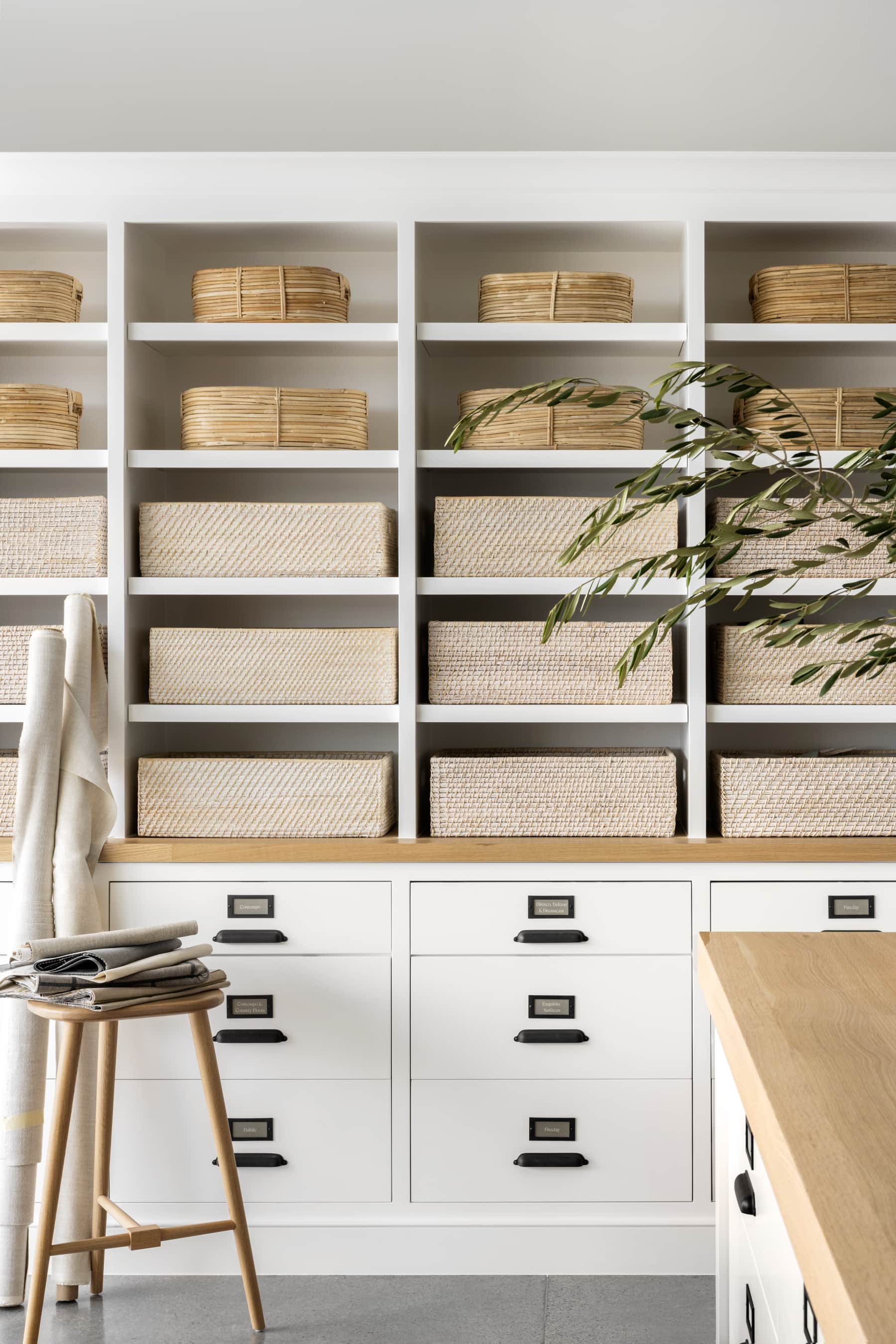
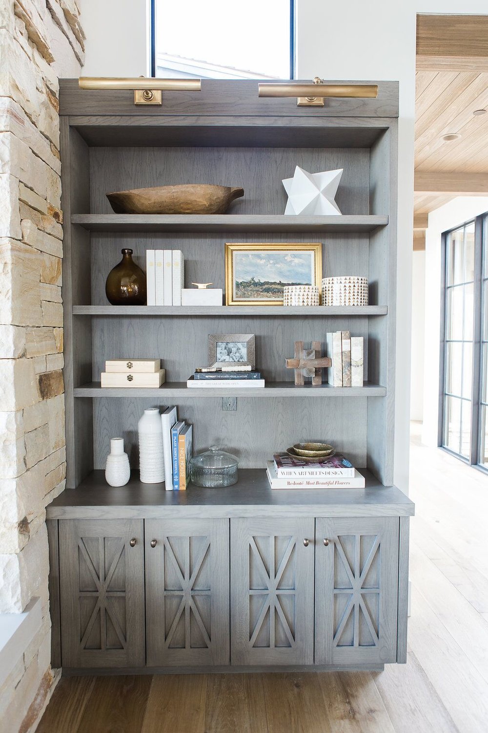
The built-in cabinets were a chance to really set the tone for the home. We used natural wood for a very mountain feel, but we chose a very modern stain and details to update the look. The brass sconce added to the rustic charm of the corner and lights up all our favorite features. We filled it with some of our favorite accessories like our wood boxes, glass lidded dish, white matte star, cubist object, triangle round boxes, and magnifying glass.
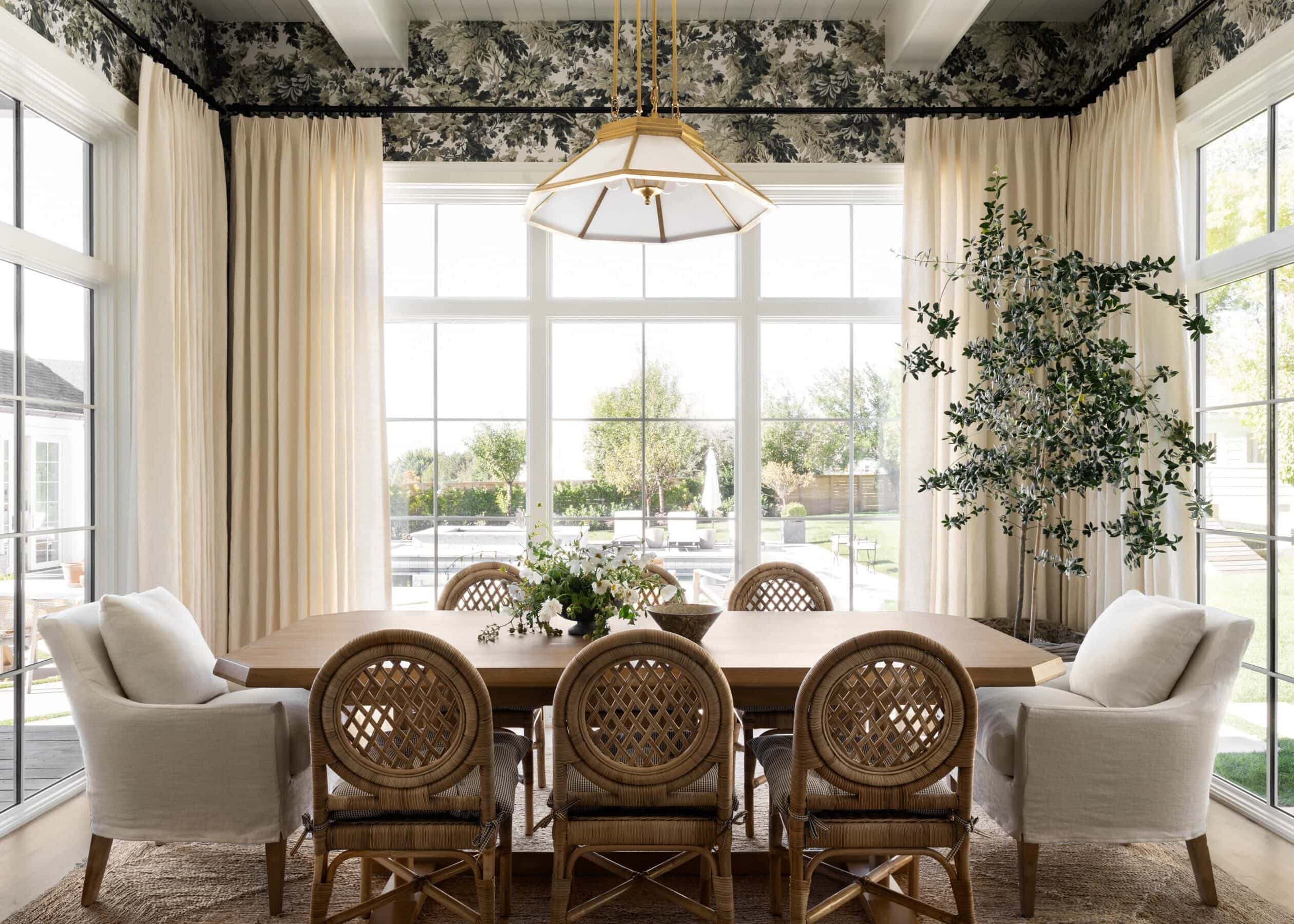
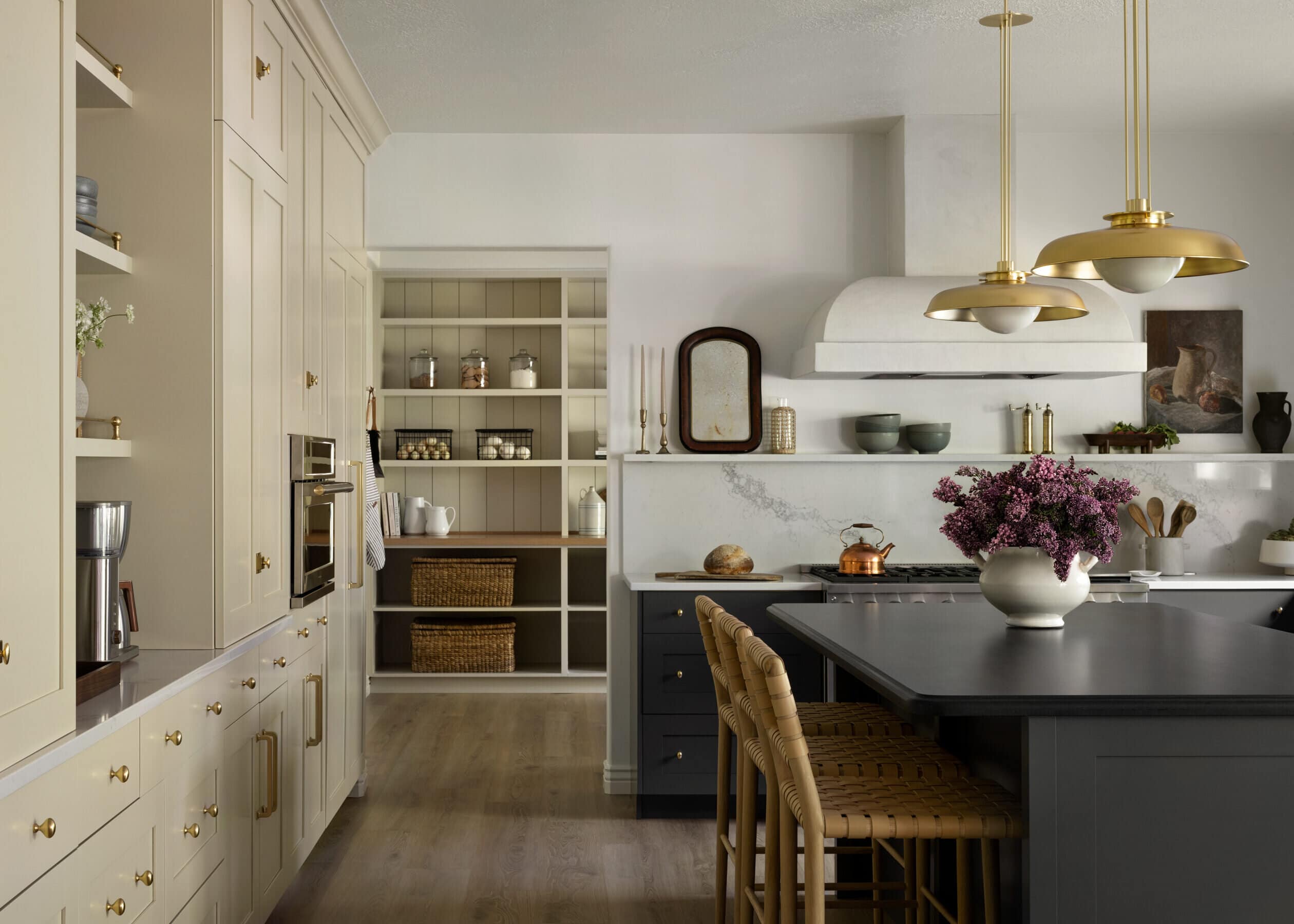
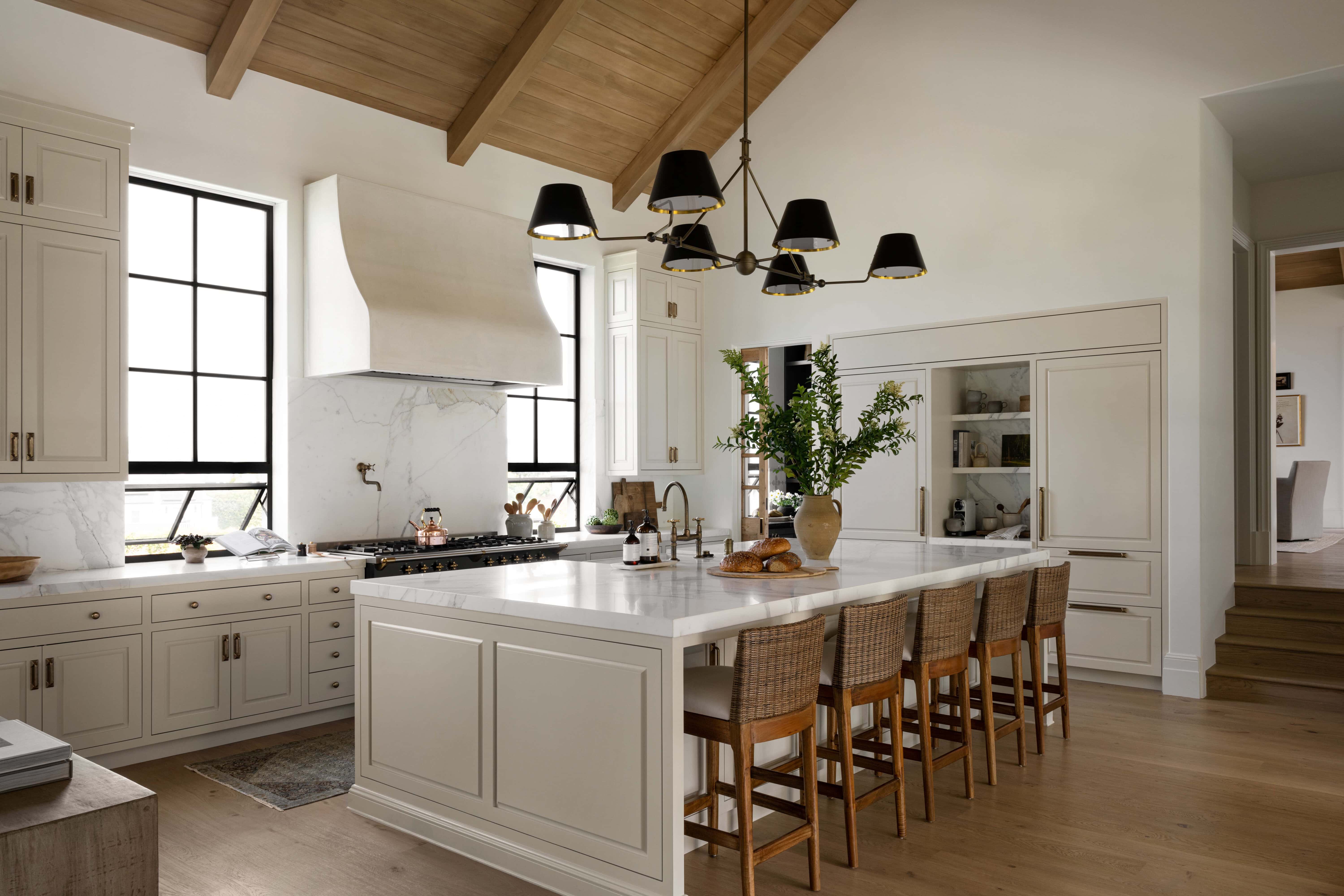
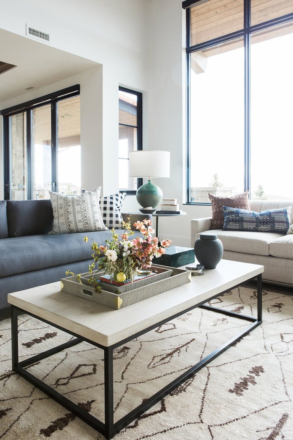
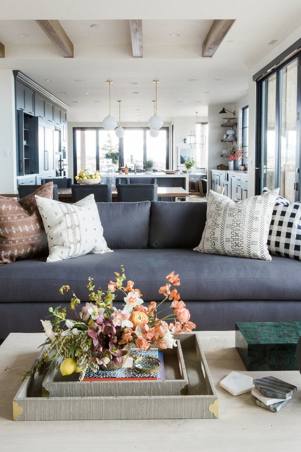
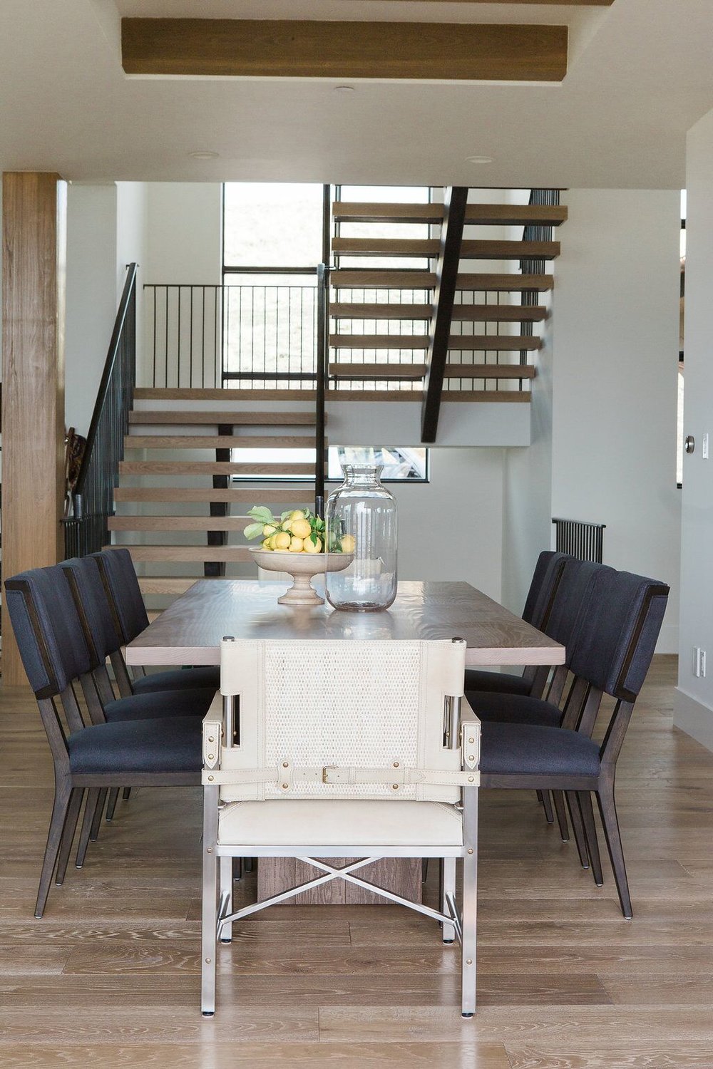
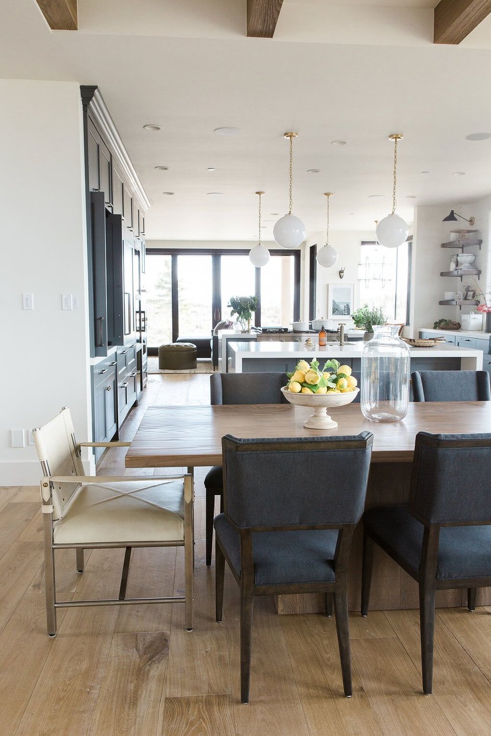
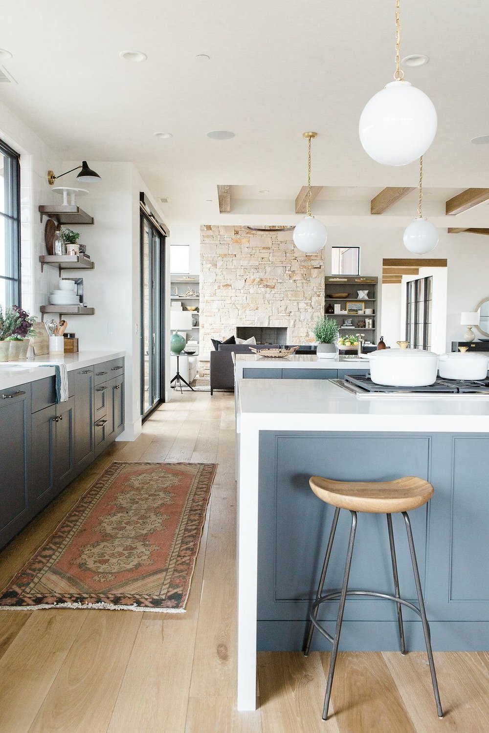
Just like the entry way, we chose not to do lighting above the dining table. Especially because you can see right into the kitchen and we didn’t want those lights to compete with the rest of the space.
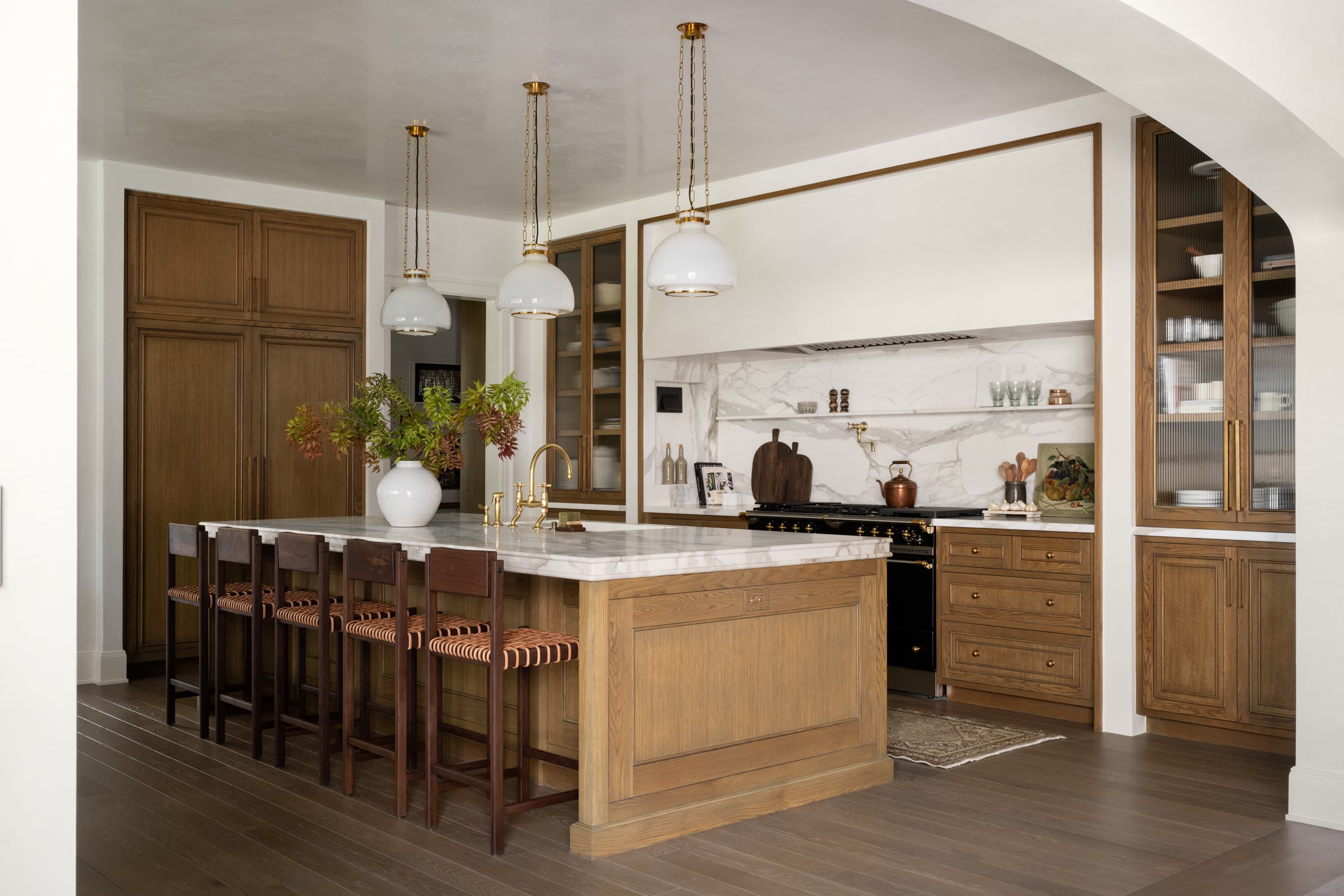
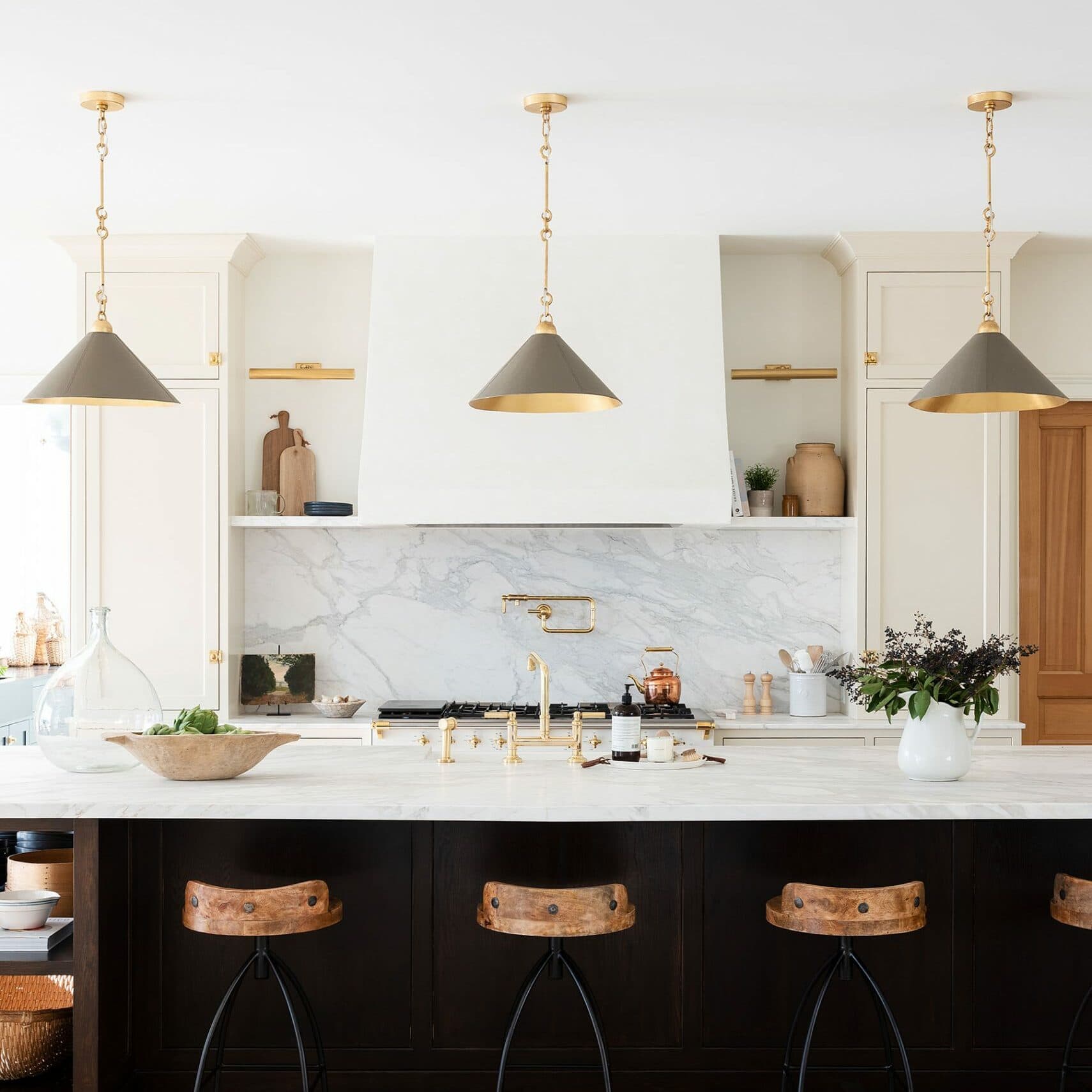
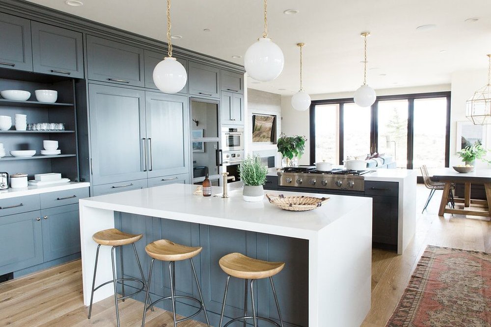
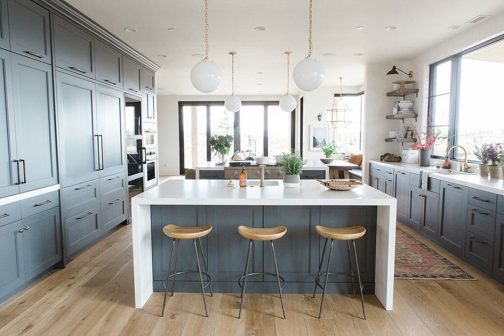
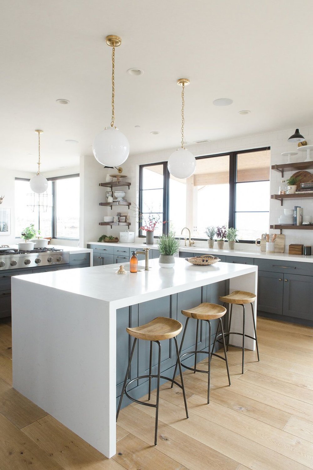
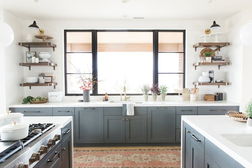
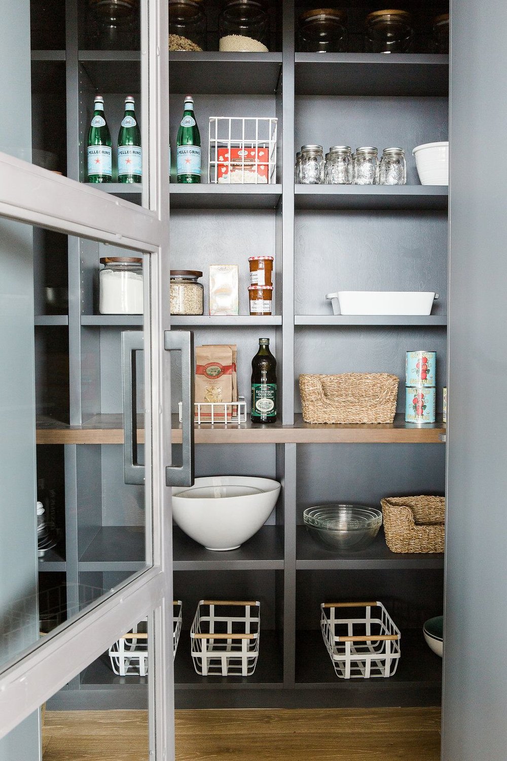
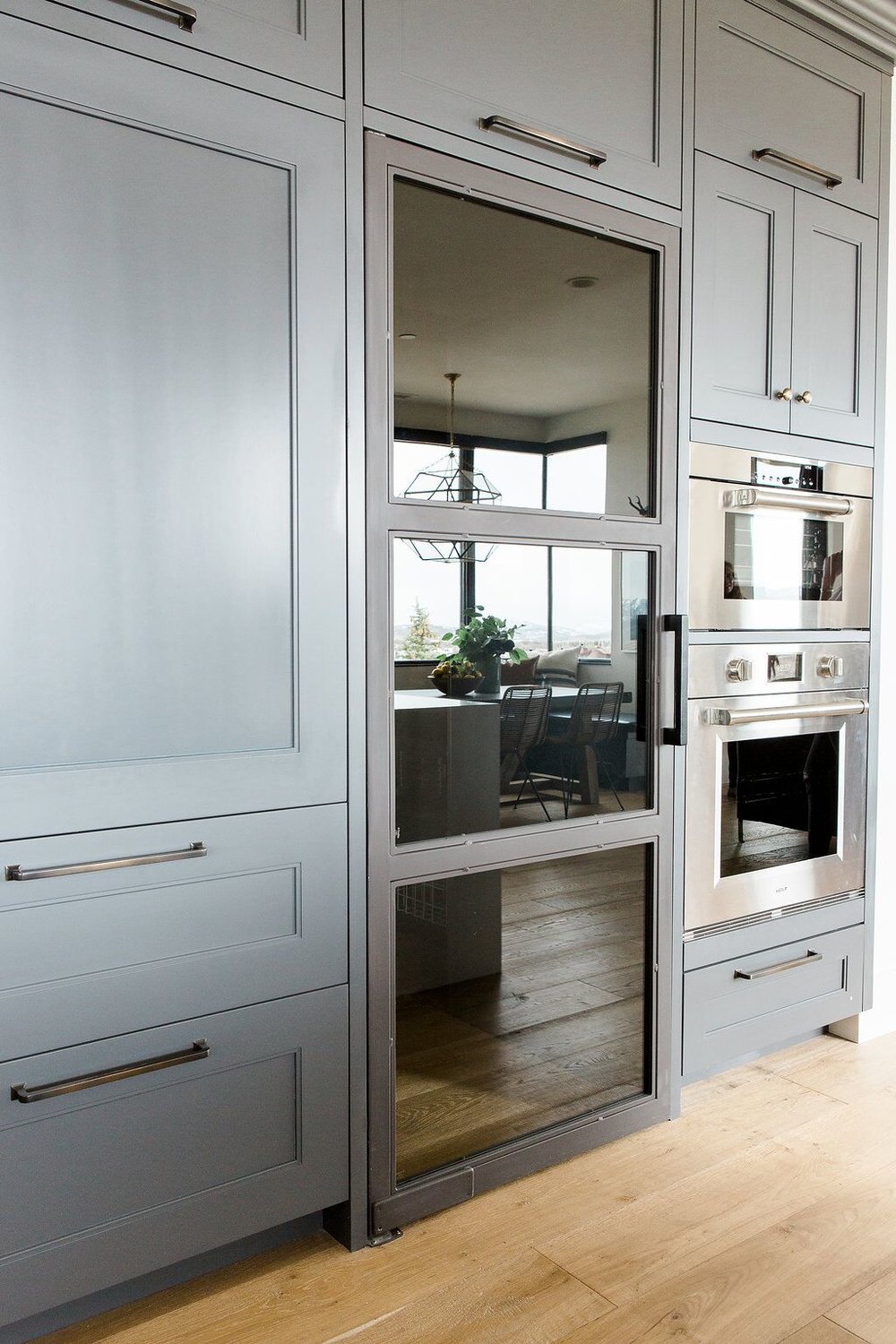
We get so many requests for white kitchens that we were ecstatic to go a little darker for this home. The cabinets were lightened up with white countertops with waterfall edges and white pendants that helped brighten the space. The natural wood barstools brought in warmth and texture and the deep walnut shelving helps connect the kitchen with the natural wood beams and ceiling in the great room. The open shelving was placed opposite of the wall of cabinetry to give the space balance.


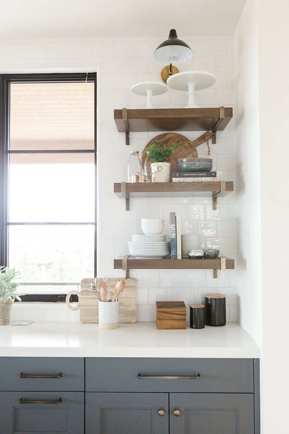
We may have had less shelving space here, but we still took advantage of the open shelving and filled it with accessories. A wooden cutting board, our go-to crock, black canisters, a recipe box, stoneware cans, and another unique cutting board also kept things warm and bright. We love to top it all off with a killer sconce!
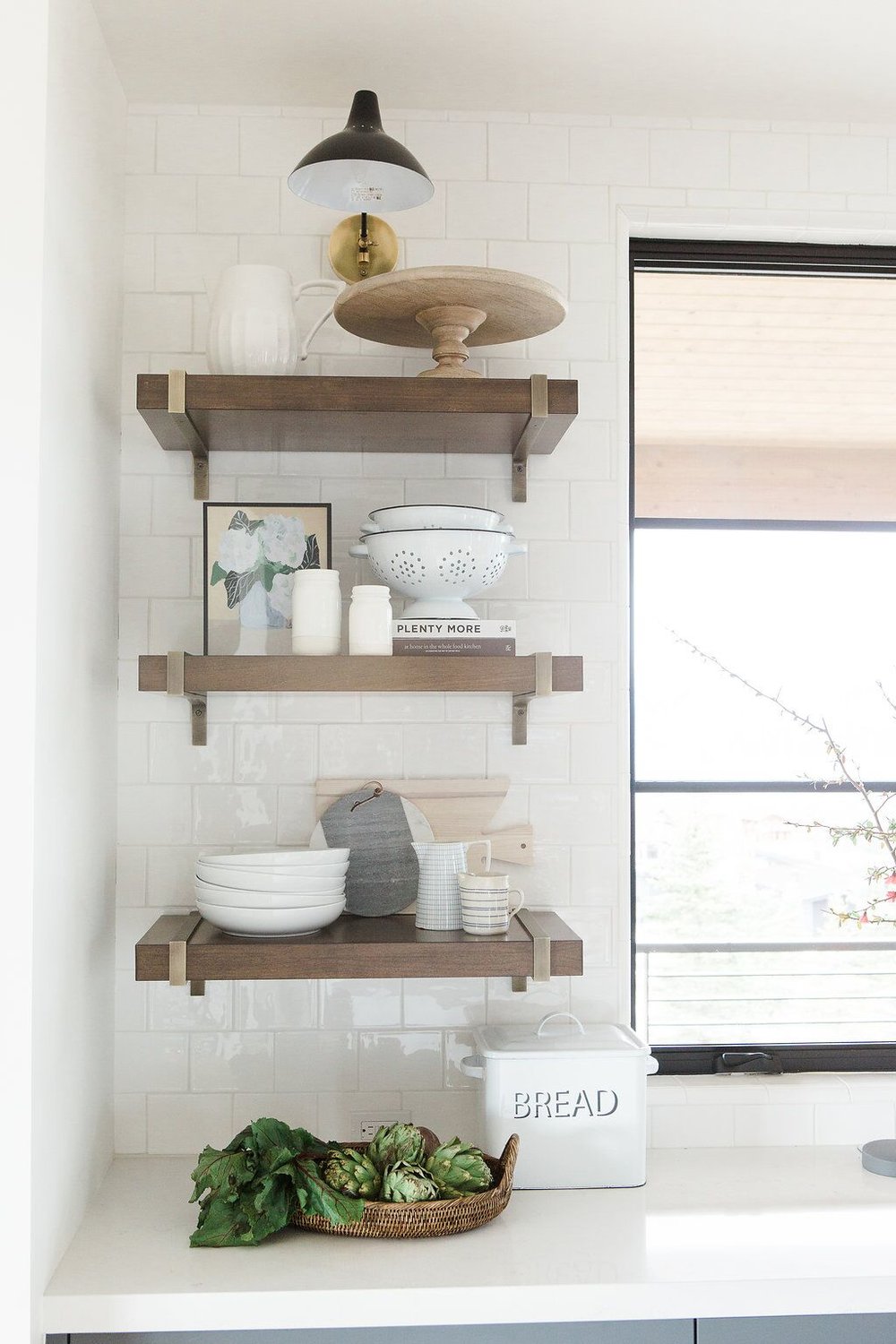
On this side we displayed vintage corianders, a wooden pedestal, a marble cheese board, ash breadboard, lined and gridded creamers, and bread box.


Photography: Travis J Photography | Architect: Otto/Walker Architects | Builder: Craig Construction
You May Also Like